


This week, we looked at the latest report from the New York Federal Reserve’s Household Debt and Credit Report. They produce this report every quarter, looking at the types of debt — car loans, student loans, mortgages, credit cards, and the like — and telling us how much debt Americans have taken on.
The NY Fed's HHDC report, including background information, is here:
https://www.newyorkfed.org/microeconomics/hhdc
You can download the specific report about household debt and credit as a nicely edited PDF file containing a large number of charts:
/content/files/medialibrary/interactives/householdcredit/data/pdf/hhdc_2023q4.pdf
If you want to get a picture (no pun intended) of how much Americans are borrowing, and if they’re up to date with their payments, then this is a great report to read. But of course, here at Bamboo Weekly, we’re interested in the data itself, not in the charts that the Fed has worked so hard to produce.
Data and six questions
Fortunately, the NY Fed makes their raw data available in an Excel spreadsheet:
/content/files/medialibrary/interactives/householdcredit/data/xls/hhd_c_report_2023q4.xlsx
This document contains a very large number of sheets, alternating between the graphics found in the report and the data used to create those graphics. We’ll be looking at the data, reconstructing some of those reports.
You probably won’t need it, but a data dictionary describing the data is downloadable from:
/content/files/medialibrary/interactives/householdcredit/data/pdf/data_dictionary_hhdc.pdf
This week, I gave you six tasks and questions. Below are my solutions; as usual, a link to my Jupyter notebook follows the final answer.
Create a dictionary of data frames from the Excel spreadsheet; the keys should be the sheet names from the Excel file, and the values should be data frames containing the data. Only keep those with the word "Data" in their names. Make sure that each data frame's column names are taken from the sheet, and that the first column is turned into the index.
Before we do anything else, we’ll need to import Pandas:
import pandas as pdWith that out of the way, we’ll read the Excel file into Pandas using “read_excel”. It’s easy to think that Excel files are similar to CSV files, because they also contain rows and columns. But there are at least two differences:
- CSV files are text files. This means that Pandas needs to figure out what dtype to use for each column it reads from the file, or we can give it some hints. By contrast, data in Excel file is typed, no guessing needed. When you read data from Excel into Pandas, “read_excel” knows what dtype to assign to each column.
- An Excel document can contain one or more sheets, each of which is a spreadsheet in and of itself. If you use “read_excel” on a multi-sheet Excel document and don’t specify which sheet you want, you’ll get the first one. You can pass the “sheet_name” keyword argument to indicate that you want one or more other sheets (by passing the integer index of the sheet you want, the string name of the sheet you want, or a list of either integers or strings for multiple sheets).
We can load all of the sheets by passing None to “sheet_name”:
all_dfs = pd.read_excel(filename, sheet_name=None)Asking for multiple sheets returns a dictionary whose keys are the sheet names and whose values are data frames. I asked you to load all of the sheets with “Data” in their names. I’m not sure how “read_excel” did this, but it actually did most of the work we requested for us, ignoring the sheets containing the charts. We’ll filter through them more thoroughly in a moment.
I also asked you to ensure that the column names would come from Excel. Looking through the first few sheets, it seems like the column names are in Excel row 4. But of course, Excel uses 1-based indexing, whereas Python uses 0-based indexing. We thus indicate that Excel’s row 4 should be used for our headers by passing “header=3” to “read_excel”:
all_dfs = pd.read_excel(filename, sheet_name=None, header=3)Finally, I also asked you to use the first column (what Excel would call “A”) as the index to our data frame. We can do that most easily by using the numeric index:
all_dfs = pd.read_excel(filename, sheet_name=None, header=3, index_col=0)This is close to the end, but not quite: All of the dict keys in “all_dfs” are of the form “Page x Data” except for the first, called “TABLE OF CONTENTS”. We could remove it most easily by just removing that key-value pair with “del”:
del all_dfs["TABLE OF CONTENTS"]But I asked you to remove any key-value pair whose key doesn’t include the word “Data”. How can we accomplish that?

At first, it might seem like we can just iterate through the key-value pairs with a “for” loop, deleting any pair that doesn’t match our criteria:
for one_key in all_dfs:
    if 'Data' not in one_key:
        del all_dfs[one_key]
However, if you try this, you’ll discover that it doesn’t work:
RuntimeError: dictionary changed size during iterationAs the exception says, you cannot modify a dict’s size while you’re iterating over it. (This is in contrast with lists, which do allow for that — although to be honest, it’s often a bad idea anyway.)
What we’ll do instead is iterate over a list that we create based on the keys. Because we’re iterating over the list, rather than over the dict itself, we can then remove whichever keys we want:
for one_key in list(all_dfs):
    if 'Data' not in one_key:
        del all_dfs[one_key]
When we’re done, we only have the data-related sheets in our dict.
From the data frame describing the chart on page 3 of the report, create a stacked bar plot replicating that chart. Use the same colors as the NY Fed's chart. Show all of the index values (on the x axis), but rotate them 60 degrees, make the chart larger, and the font size smaller, so that all are visible.
The chart on page 3 shows a stacked bar plot, indicating the contribution that each type of debt adds to the overall US consumer debt picture. The index of that data frame represents quarters, in the format of “YY:QN”, using the final two digits of each year and numbers 1-4 for the quarters.
To get our data frame and retrieve just the columns we want, we can say:
(
    all_dfs['Page 3 Data']
    [['Mortgage', 'HE Revolving',
      'Auto Loan', 'Credit Card', 'Student Loan', 'Other']]
)
I should note that we’re fortunate the data was already sorted in chronological order, saving us from having to invoke “sort_index”.
If we want to create a bar plot, we can do that by invoking “plot.bar”. However, given that we have 84 rows and six columns, that would mean asking Pandas (and Matplotlib) to draw six bars at each of the 84 index points. Which

To avoid this, and also to get a more useful plot, I asked you to stack the bars. That means that instead of plotting the six values for each axis point next to one another, we’ll combine them together to get one tall bar. We’ll also be able to see how much each of these types of debt contributes to the overall picture in the US.
To do that, we can simply pass “stacked=True” to “plot.bar”:
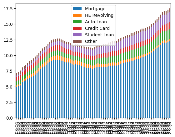
This is definitely better! But I decided to challenge you a bit further with this, to make it more readable, and to resemble the NY Fed’s chart.
I asked you:
- To make the figure bigger. We can do that by passing a two-dimensional tuple of integers to the “figsize” keyword argument.
- To reduce the font size of the x-axis labels. We can do that by passing an integer to the “fontsize” keyword argument.
- To rotate the x-axis labels to 60 degrees. We can do that by passing 60 to the “rot” keyword argument.
- Finally, I asked you to set the colors as was done by the NY Fed. We can do that by passing the “color” (yes, singular!) keyword argument, along with a list of color names.
The resulting query is:
(
    all_dfs['Page 3 Data']
    [['Mortgage', 'HE Revolving',
      'Auto Loan', 'Credit Card', 'Student Loan', 'Other']]
    .plot.bar(stacked=True, rot=60, figsize=(8, 8), fontsize=5,
              color=['darkorange', 'purple', 'green',
                     'blue', 'red', 'gray'])
)
And the resulting plot:
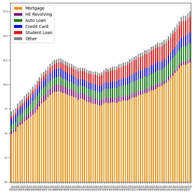
And yes, it’s still hard to read the labels at this size (in the newsletter), but I promise that they’re more readable than before.
We can see that the bulk of American debt is in mortgages, with auto loans and student loans far behind. Moreover, we can see that overall debt has been rising in the last decade, after dropping between 2008 and 2013 — the “Great Recession,” as it is sometimes known, and its aftermath.
I was honestly expecting to see credit-card debt be a much larger part of American debt, but it makes sense that paying for a house, car, or university education will always be more than someone’s credit-card limit.
Again, from the page 3 data: How often, as a percentage, was there a quarter in which the amount of household debt declined vs. increased when compared against the previous quarter?
I then asked you to tell me how often did the total debt rise vs. fall, as a percentage of the quarters whose data we have available.
First, I started by just grabbing the “Total” column:
(
    all_dfs['Page 3 Data']
    ['Total']
)
I then invoked the “diff” method, a window function that calculates by how much each row was greater or less than the previous row. (The first row of the resulting data frame will always be NaN.)
(
    all_dfs['Page 3 Data']
    ['Total']
    .diff()
)
We now have the difference between each row and its predecessor. But we wanted to know how many rows were higher, and how many were lower. To do that, we’ll need to translate these positive and negative numbers into False and True values. I can do that by invoking “apply” with a lambda function that simply returns True if the number is negative, and False if it’s positive:
(
    all_dfs['Page 3 Data']
    ['Total']
    .diff()
    .apply(lambda s_: s_<0)
)
Wait a second: Wouldn’t it be easier to follow if we had “higher” and “lower”, rather than True and False? Yes, so let’s use that instead:
(
    all_dfs['Page 3 Data']
    ['Total']
    .diff()
    .apply(lambda s_: 'lower' if s_<0 else 'higher')
)
Here, I’m using Python’s loose equivalent of the trinary operator frequently used in other languages. I normally try to avoid it, but there’s little option here, because lambdas always use expressions.
Finally, I invoke “value_counts”, passing “normalize=True” in order to get percentages:
(
    all_dfs['Page 3 Data']
    ['Total']
    .diff()
    .apply(lambda s_: 'lower' if s_<0 else 'higher')
    .value_counts(normalize=True)
)
The result:
Total
higher    0.77381
lower     0.22619
Name: proportion, dtype: float64
In other words, in about 77 percent of the quarters tracked by the NY Fed, the total amount of household debt among Americans increased.
Now let's look at data from page 10 of the report, which shows (among other things) the total credit available to Americans on their credit cards, and how much of that is being used. Create a line plot showing these two measures ("CC Balance" and "CC Limit"), but plot one point for each year, calculating the mean on a year-by-year basis. Note that the data frame will require some cleaning; what was in the original Excel file that would cause this trouble?
If you look at the data frame as it is, you’ll see that it’s a bit messed up. Every other index value is NaN. Moreover, wherever the index contains the usual year and quarter, we have values in the first three columns and NaN in the last three columns. And where we have NaN in the index, we have NaN in the first three columns and values in the last three columns.
What gives?
It turns out that the Excel spreadsheet from which we read our data was a bit messed up. Each quarter was actually entered on two lines in Excel, with data for columns B-D on odd-numbered rows, and columns E-G on even-numbered rows. The “read_excel” method did the best it could to turn this into a data frame, but the resulting data frame is… a mess:
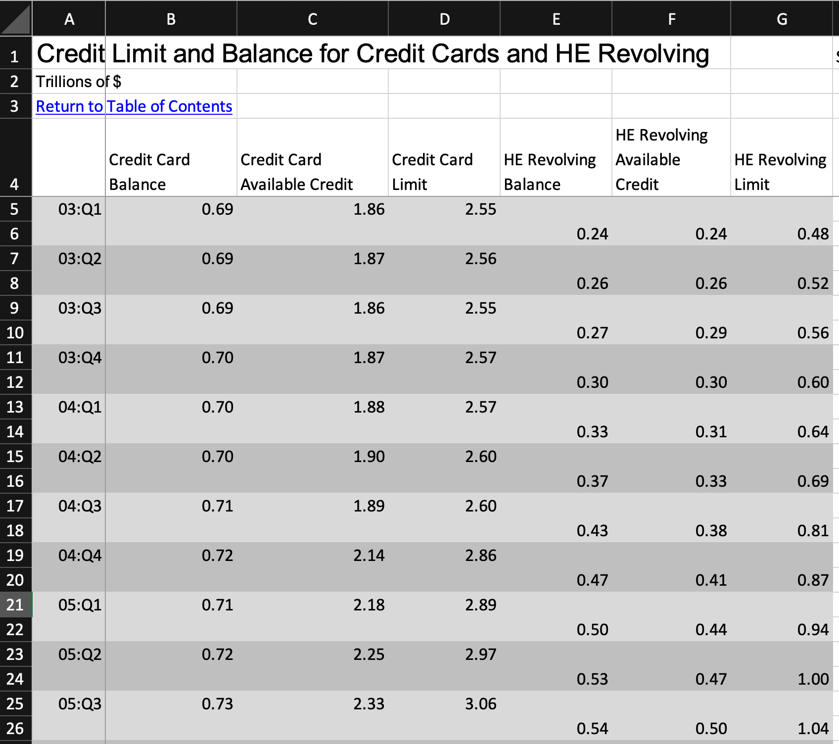
Fortunately, I only asked you to work with the data having to do with credit cards, namely columns B-D, which makes the problem easier to deal with. But this sort of problem with data input is always going to arise, and it’s important to keep your eyes open for it.
To solve this, we can first grab only the columns of interest to us:
(
    all_dfs['Page 10 Data']
    [['Credit Card Balance', 'Credit Card Limit']]
)
We have a lot of NaN values, thanks to the multi-line Excel file. But because we’re using columns that are aligned with the index, and we don’t care about those NaN values, we can just get rid of them by invoking “dropna”:
(
    all_dfs['Page 10 Data']
    [['Credit Card Balance', 'Credit Card Limit']]
    .dropna()
)
Next, if I want to group by year, I’ll need to do some surgery on our index. The easiest way to do that is to turn the index into a regular column via “reset_index”. Then, once it’s a regular column, we can grab just the two-digit year via “str.slice”. Note that “slice(None, 2)” is the same as the syntax “[:2]” on a Python sequence, starting at the beginning and stopping before index 2.
I apply “str.slice” to the “index” column via a lambda function I invoke using “assign”.
In other words: Once I have “index” as a regular string column, I use “str.slice” to grab the year from it. I assign the results to a new column, “year”, which I create using “assign”:
(
    all_dfs['Page 10 Data']
    [['Credit Card Balance', 'Credit Card Limit']]
    .dropna()
    .reset_index()
    .assign(year=lambda df_:df_['index'].str.slice(None, 2))
)
I then remove the “index” column, which I don’t need any more. Truth be told, the only reason I’m getting rid of it is to prevent it from causing me trouble when I run my “groupby”. We can remove it with “drop”; don’t forget to specify that the axis is “columns”:
(
    all_dfs['Page 10 Data']
    [['Credit Card Balance', 'Credit Card Limit']]
    .dropna()
    .reset_index()
    .assign(year=lambda df_:df_['index'].str.slice(None, 2))
    .drop('index', axis='columns')
)
I now have three columns in my data frame: “year”, which contains the year for each of the quarters in our data set, and then “Credit Card Balance” and “Credit Card Limit”. I can run “groupby” on the year, calculating the mean of the other two columns:
(
    all_dfs['Page 10 Data']
    [['Credit Card Balance', 'Credit Card Limit']]
    .dropna()
    .reset_index()
    .assign(year=lambda df_:df_['index'].str.slice(None, 2))
    .drop('index', axis='columns')
    .groupby('year').mean()
)
I have now calculated the mean credit-card balance and credit-card limit for each year in the data set. I can now plot these against one another using “plot.line”:
(
    all_dfs['Page 10 Data']
    [['Credit Card Balance', 'Credit Card Limit']]
    .dropna()
    .reset_index()
    .assign(year=lambda df_:df_['index'].str.slice(None, 2))
    .drop('index', axis='columns')
    .groupby('year').mean()
    .plot.line()
)
Here’s the result:
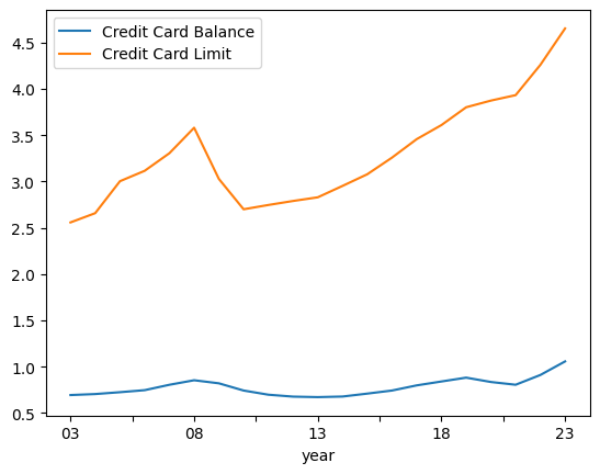
We can see that people’s credit-card balances have increased in the last two years. But we can also see that their credit-card limits have gone up at what seems like an even steeper angle.
Now let's consider data from page 12. The "ALL" column describes the percentage of all loans 90+ days unpaid in that quarter; the other columns break that down into loan types, and add up to that "ALL" column. Calculate the mean percentage that each loan type takes up for each year. Then find, for each year, the loan type that constituted the greatest proportion of debt. Which loan type has most often been the highest percentage of delinquent loans?
One of the big considerations with loans and credit is: Will the borrower pay back the money they borrowed? On page 12 of the NY Fed report, we see which types of loans are at least 90 days delinquent for each quarter.
I asked you to calculate the proportion that each loan takes up for each year. Since the data frame already contains percentages, the issue here is (once again) to group the data by year, rather than breaking it out by quarter. We can thus repeat the technique we did in the previous question:
(
    all_dfs['Page 12 Data']
    [['MORTGAGE', 'HELOC', 'AUTO', 'CC', 'STUDENT LOAN', 'OTHER']]
    .reset_index()
    .assign(year=lambda df_:df_['index'].str.slice(None, 2))
    .drop('index', axis='columns')
    .groupby('year').mean()
)
We now have the mean percentage that each loan type contributed in each year (rather than each quarter). I wanted to know, for each year, which type of loan was the largest part of 90+ day delinquent loans.
I decided to use the “idxmax” method, which normally tells us which index corresponds to the greatest value in a column. However, by passing axis to be “columns”, we can find out which column name corresponds to the greatest value in a row:
(
    all_dfs['Page 12 Data']
    [['MORTGAGE', 'HELOC', 'AUTO', 'CC', 'STUDENT LOAN', 'OTHER']]
    .reset_index()
    .assign(year=lambda df_:df_['index'].str.slice(None, 2))
    .drop('index', axis='columns')
    .groupby('year').mean()
    .idxmax(axis='columns')
)
Here’s what I got back:
year
03              CC
04              CC
05              CC
06              CC
07              CC
08              CC
09              CC
10              CC
11              CC
12              CC
13    STUDENT LOAN
14    STUDENT LOAN
15    STUDENT LOAN
16    STUDENT LOAN
17    STUDENT LOAN
18    STUDENT LOAN
19    STUDENT LOAN
20              CC
21              CC
22              CC
23              CC
dtype: object
I asked you to count how often each of these appears. We can do that with “value_counts”:
(
    all_dfs['Page 12 Data']
    [['MORTGAGE', 'HELOC', 'AUTO', 'CC', 'STUDENT LOAN', 'OTHER']]
    .reset_index()
    .assign(year=lambda df_:df_['index'].str.slice(None, 2))
    .drop('index', axis='columns')
    .groupby('year').mean()
    .idxmax(axis='columns')
    .value_counts()
)
The result:
CC              14
STUDENT LOAN     7
Name: count, dtype: int64
In other words, in the 21 years for which we have data, the most common 90+ day delinquent loan type was credit cards, followed by student loans.
Remember, though, that we earlier saw that mortgages are by far a larger percentage of American household debt. Why would people not pay off their credit cards and student loans, but would pay their mortgage?
My guess is that it has something to do with the consequences: If you don’t pay your mortgage, you lose your house. The same is true for failing to pay an auto loan. It’s still bad to avoid paying your credit card or your student loans, but aside from restricting your use of the card, there are fewer immediate implications. And if you don’t pay your student loans? Again, things get bad, but they can’t take your education away.
Page 32 of the report shows the total debt balance, per capita, in 10 different states, as well as the overall rate for the United States. However, our import from Excel used the first row as column names. Fix that problem, setting (or resetting) the column names to be correct and using the states as the index. Interpolate NaN values. Show which states' residents have had the greatest total cumulative increase in per-capita debt over the years.
Finally, I asked you to look at data from page 32 of the report, which looks at the total debt balance, per capita, in 10 different states.
But before we can do that, we have to fix things up. You see, we told “read_excel” that the headers are on row 4 (i.e., Pandas index 3) on each sheet. But it turns out that wasn’t actually the case everywhere.
Now, we could just re-read the sheet. But I thought it would be good practice to fix things here. How can we do that?
Basically, we’ll first reset the index, so that all of the columns are back as regular columns:
df = all_dfs['Page 32 Data'].reset_index()Then I created a very small (1-row) data frame from the columns, which were actually data:
first_row = pd.DataFrame([df.columns])I then reset the column names on our data frame to be numbers, just to avoid issues:
df.columns = range(len(df.columns))I now have two data frames, first_row and df. Combined, they’ll give me the full data set I wanted to begin with. So I use “pd.concat” to create a single data frame from them:
df = pd.concat([first_row, df])All is great now, right? Well, almost — it turns out that column 84 had a footnote, which got turned into “.1” at the end of one data cell. That value is preventing us from turning it into a float dtype. So we’ll fix that:
df[84] = df[84].str.removesuffix('.1').astype(float)With that in hand, we can do some more cleaning and (finally) some analysis. First, let’s keep only the first 11 rows, since the rest are irrelevant and/or NY Fed summaries. Then let’s turn the first column (currently named 0) and turn it (back) into our index:
(
    df
    .iloc[:11]
    .set_index(0)
)
It turns out that there are some NaN values in our data frame. These aren’t terrible, but they will mess up our attempt to calculate the percentage change from quarter to quarter. We can use “interpolate” to replace NaN values with the mean of the two adjoining values. (So if there’s a 10, NaN, and 12, the NaN will be replaced by 11.) Note that I have to indicate I want to interpolate from left to right, rather than top to bottom, by specifying the “axis”
(
    df
    .iloc[:11]
    .set_index(0)
    .interpolate(axis='columns')
)
Now that we have the full data, we can calculate the percentage change across the columns (i.e., over time) in each of the states (which are our index). We can use “pct_change”, a window function similar to “diff” — and here as well, we need to specify that the axis is “columns”:
(
    df
    .iloc[:11]
    .set_index(0)
    .interpolate(axis='columns')
    .pct_change(axis='columns')
)
I then asked you to sum these up, to total the percentage change over time for each state. We can do this with “sum”, but we’ll once again need to indicate that we’re calculating across the columns.
Following that, we can just call “sort_values” on the resulting series:
(
    df
    .iloc[:11]
    .set_index(0)
    .interpolate(axis='columns')
    .pct_change(axis='columns')
    .sum(axis='columns')
    .sort_values()
)
The result:
0
MI    0.435904
OH    0.474876
IL    0.526168
NJ    0.615974
NV    0.653029
PA    0.682538
CA    0.685939
NY    0.729880
FL    0.768946
AZ    0.809509
TX    0.852415
dtype: float64
We can see that Texas, Arizona, and Florida are the three states that have shown the greatest increase in per-capita debt over these years. From what I understand, these are the only states that report such data, meaning that other states might be worse (or better), but don’t have any information to share.
And that’s it!
Here’s the Jupyter notebook I used to solve this week’s problems: https://drive.google.com/file/d/1LICCjln56u7en2AQIdSL2fNYSONUaPpG/view?usp=sharing
Reuven