


This week, as the Eurovision song contest plans to hold its final rounds, we’re looking at data describing previous entries into the contest. Moreover, we’re doing it through the lens of visualization — and specifically, the use of the Seaborn library to produce our plots.
Seaborn is a wrapper around Matplotlib, the best-known Python plotting library out there. As I mentioned in yesterday’s post, Matplotlib is undoubtedly powerful and flexible. However, its interface is far from intuitive, at least to me, and the results that I produce with it tend to look a bit shabby.
I’ve found that Seaborn gives me the best of all worlds: I have the power of Matplotlib under the hood, but I don’t need to think about making things aesthetically pleasing, because Seaborn has made a lot of good default decisions. Seaborn also encourages me to think about what I’m trying to show with my data, rather than how I’m trying to present it. Once I know what relationships I’m trying to illustrate, Seaborn then gives me a variety of options.
All of this is great — but Seaborn has its own ways of doing things, and they tend to be quite different from the usual Matplotlib ways. That’s why I decided to concentrate on Seaborn this week, to give you some practice working with this amazing package.
Between the music of Eurovision and the visuals of Seaborn, this week was a truly multi-colored issue!
Let’s now dive into the data, as well as answering the questions that I posed.
Data and questions
The data set this week comes from the Eurovision dataset at https://github.com/Spijkervet/eurovision-dataset/blob/master/README.md, created by Janne Spijkervet.
There are two main CSV files of interest in that data set. The one that I asked you to download lists all contestants and entry songs through 2020. You can most easily retrieve it from https://github.com/Spijkervet/eurovision-dataset/releases/download/2020.0/contestants.csv.
Here are the questions I asked you to answer, along with my solutions:
Read the entire contestant CSV file data into a data frame.
For starters, I set up Pandas, along with an import of Seaborn:
import pandas as pd
import seaborn as sns
Just as it’s traditional to import pandas with an alias of “pd”, it’s also traditional to import Seaborn with an alias of “sns”. The Seaborn documentation says that this is an internal joke relating to the TV show “The West Wing”; one of the characters there was named Sam Seaborn, and he had monogrammed shirts with the initials SNS on them. I’m not sure how this relates to Python, Pandas, or data analytics, but I’ve always been curious about this, and figured that I might as well share my discovery.
I downloaded the contestants.csv file from GitHub, put it in the same directory as Jupyter, and then ran the following:
filename = 'contestants.csv'
df = pd.read_csv(filename)
Notice that I’m just reading the entire CSV file into memory, using all of the defaults of “read_csv”. In other words, we’re assuming:
- the field separator is a comma,
- Pandas will do a good job of guessing the dtype of each column,
- we want all of the columns,
- none of the coulmns should be turned into an index,
- the first line of the file is a header row, naming the columns,
- we don’t want to rename any of the columns from the names in that header row,
- none of the columns should be interpreted as datetime values, and
- the file is small enough that we can read it into memory at once, without chunking it.
Even though it only took 21 ms to load the CSV file into memory, I decided to see how much faster it would be to use the “pyarrow” engine for reading CSV files. Turns out, it took less than 1/3 the time, at only 6 ms. So if you have PyArrow installed (and you can/should, with “pip install pyarrow”), you can save yourself a few milliseconds with the following:
filename = 'contestants.csv'
df = pd.read_csv(filename, engine='pyarrow')
The resulting data frame has 1,603 rows and 21 columns. We won’t use all of the columns, and if the data frame were a bit bigger, then perhaps I would think about specifying which ones I want more explicitly. But the total memory used is only 3.3 MB, so I’m not going to waste too much time on it.
Create a line plot showing how many countries participated in Eurovision each year.
In Matplotlib, and also when using the Pandas plotting interface, your first consideration is what kind of plot you want to create.
In Seaborn, the first questions you should be asking are: What kind of data am I working with? And what sort of information am I trying to show about them?
In this case, I asked you to show the number of countries that participated in Eurovision each year. In other words, we want to show the relationship between two numbers: The years (along the x axis) and the total number of participating countries (along the y axis).
When we want to show the relationship between two sets of numbers, Seaborn uses the “relplot”, short for “relational plot.” We use replot for several kinds of plots, including scatter plots (which we’ll get to later), and also for line plots. I hadn’t really thought much about the fact that line plots and scatter plots are basically the same thing, except for the lines, before Seaborn brought this to my attention.
The thing is, our data frame doesn’t have the information that I’ve asked. There is a single row for each entry in each Eurovision contest, and each of those entries has a country name (in the “to_country” column). In order to create our plot, we’ll need to transform that into a data frame in which the years are in one column, and the number of countries are in another column.
This is a perfect job for the “groupby” method, which has three parts:
- The argument to “groupby” is a categorical column. The unique values in this column will be the index in the object returned by our “groupby”. Here, it’ll be the “year” column.
- We then specify which column we want to count inside of square brackets.
- Finally, we specify the aggregation method we want to run. Here, it’ll be “count”, since we want to know how many values there are for each year.
Here’s how our query can look:
df.groupby('year')['to_country'].count()This will return a new series, one with an index (the years) and values (the count per year). We can pass this to “relplot”, specifying that the data should come from our series:
sns.relplot(data=df.groupby('year')['to_country'].count(), kind='line')Notice that we need to tell Seaborn that the data will come from our groupby, by passing the keyword argument “data”. And yes, it’s just fine to pass a series here, and Seaborn will do the right thing, treating the index as the values for its “x” axis and the counts as its values for the “y” axis.
In order to get a line plot, rather than the default scatter plot, we pass “kind=’line’”. There are more specific methods that we could use, but I find it easier to use the overall “relplot” method, in no small part because it also lets me pass more arguments to the underlying Matplotlib library, if I want.
The resulting plot is great, but it’s missing one thing that I had mentioned in my question, namely that I’d like to see the plot on a white background with gray grid lines. In order to get this, we need to set a global Seaborn parameter:
sns.set_style("whitegrid")With this in place, I can make my plot, and I get quite a nice result:
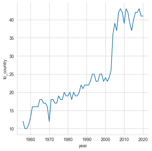
As you can see, the number of participating countries each year grew at a steady pace until the early 2000s, when there was quite a jump.
Create a horizontal bar plot showing how many times each country participated in Eurovision.
To answer this question, I asked you to create a bar plot. But think how a bar plot operates: It basically takes one categorical column and one numeric column, and plots the number associated with each category. For that reason, it’s part of the “catplot” method, which is all about categorical data.
For “catplot” to work, we’ll need to again perform a groupby:
- We’ll group on the country names, in the “to_country” column
- We’ll count the number of rows with a “year” column defined
- We’ll use the “count” aggregation method
As before, the result of our call to “groupby” will be a series. And while we can figure out what to do in this case, Seaborn cannot. We need to give it a data frame, so that we can specify which column should be used for the x axis, and which should be used for the y axis.
We’ll thus need to take our index, and turn it back into a column. We can do that by invoking “reset_index” on our series, returning a new data frame along the way.
We can pass this newly created data frame to “catplot”, specifying three additional keyword arguments:
- “x” will be our “year” column, containing the total number of times each country participated
- “y” will be our “to_country” column
- “kind” is “bar”, indicating a bar plot.
I also made the plot a bit bigger by passing additional keyword arguments, namely “height” and “aspect”. The first indicates how tell the plot should be, and the second indicates what widgth should be used, relative to the height. The resulting code is thus:
sns.catplot(data=df.groupby('to_country')['year'].count().reset_index(),
            x='year', y='to_country', kind='bar', height=10, aspect=1.5)
Sure enough, this works great:

Notice that the countries are alphabetized? How did that happen, when I didn’t invoke “sort_index” anywhere? By default, grouping will sort the index of the series or data frame it creates. And so, without us having to lift a finger, we got it sorted.
But wait: It turns out that we’ve done a lot of hard work for nothing. Because Seaborn knows that this kind of plot is likely to crop up again and again. Rather than perform a groupby and pass it to relplot with the “bar” option, we can just create a special “count” plot, which will group things for us:
sns.catplot(data=df.sort_values('to_country'), kind='count',
            y='to_country', height=10)
In other words, we can just pass our data frame, sorted by country names, to catplot. We can indicate that we want to count how many times each country appears, and that we want to see the country names on the y axis. And voila, we get our plot:

Create a new column, winning_position, which contains a 1, 2, or 3 indicating the final place, and the string "None" otherwise.
I decided to create this column in order to make some of the following queries a bit easier. I first found the rows containing a 1st, 2nd, or 3rd place finish, using the “isin” method:
df['place_final'].isin([1.0, 2.0, 3.0]Then I got the “place_final” column’s value in those rows:
df.loc[df['place_final'].isin([1.0, 2.0, 3.0]),'place_final']Finally, I assigned the values in those rows to a new column, “winning_position”:
df['winning_position'] = df.loc[df['place_final'].isin([1.0, 2.0, 3.0]),'place_final']What about the rows in that column to which I didn’t assign a value? Those will have NaN values. I decided to assign those a “None” value (not to be confused with NaN):
df['winning_position'] = df['winning_position'].fillna('None')Now I have my “winning_position” column with values of 1, 2, 3, or None for each entry.
Create a bar plot showing how many times each country won Eurovision.
How often did each country win Eurovision? With “winning_position” in place, it’ll be fairly straightforward to find this out. I just need to grab the rows in which there’s a 1 in winning_position, and pass that along to catplot:
sns.catplot(data=df.loc[df['winning_position'] == 1,
                          ['to_country']], kind='count')
The above works, producing a good plot, but the country names aren’t sorted. Remember that we didn’t have to sort things before, because the “groupby” was doing it for us. That’s not the case any more. Fortunately, we can stick a “sort_values” call to the end of our call to “df.loc”:
sns.catplot(data=df.loc[df['winning_position'] == 1,
                           ['to_country']].sort_values('to_country'),
            kind='count', y='to_country')
A little long, but it works! Our counting plot produces the following values:

Create a strip plot showing how many votes (points_final) each country has gotten over the years.
Your first question might be: What the heck is a strip plot?
Consider that in a histogram, we see how values are distributed — but we don’t see each individual value. Rather, we see how many values fit into each of the “bins” in the histogram.
A strip plot is kind of like a histogram, except that we plot a single dot for each data point. We can thus see the precise distribution of the data points.
For example, if a student’s grades during the year are 85, 90, 92, 87, and 98, then a strip plot of those grades should show the axis, from 0 to 100, with dots at each of those five numbers. We would then see where they cluster, and could make some judgments about their distribution.
Strip plots are once again about seeing values per category, so we get them via “catplot”, as before. We’ll pass our data frame to catplot, specifying a categorical column (to_country) for the y axis and a numeric category (points_final) to the x axis. We’ll thus be able to see, for each country, what point totals they got during each year they participated in Eurovision:
sns.catplot(data=df.sort_values('to_country'), kind='strip',
            y='to_country', x='points_final', height=10)
Notice that before passing our data frame to sns.catplot, I invoked sort_values on it, so that we would be sure to have the countries sorted in alphabetical sorder.
However, I asked you to color the dots based on whether the country got 1st, 2nd, or 3rd place. That’s easy to do in Seaborn, by passing the “hue” keyword parameter, along with a column name that it should use to determine the hue:
sns.catplot(data=df.sort_values('to_country'), kind='strip',
            y='to_country', x='points_final', height=10,
            hue='winning_position')
The result? You can see it here for yourself:

Create a scatter plot showing the relationship between the final points granted by phone voters and the final points granted by the juries. Include a regression line in your plot.
Next, I asked you to create a scatter plot. We’ve already talked about scatter plots, at least in passing; they’re part of the “relplot” method. And indeed, we could create a scatter plot without too much trouble there.
But I asked you to go a bit further, producing not only the scatterplot, but also a regression line. This is a pretty common request that I get from my students when they produce scatter plots; they would like to see the trend indicated by the data.
And so, while I could use “relplot” and “kind=’scatter’”, I’m instead going to use one of the specialized methods that Seaborn provides, namely “regplot”.
There isn’t much to say about creating this plot:
- We pass a data frame,
- We indicate which numeric column should be used for the “x” axis,
- We indicate which numeric column should be used for the “y” axis.
sns.regplot(data=df, x='points_tele_final', y='points_jury_final')We get not only a scatter plot, but a nice regression line, too:

Create this same plot, but now include histograms along the axes showing the distribution of values.
What if I want a scatter plot, and also the regression line, and also see the distribution of values for each of these numeric fields?
Seaborn provides support for this, too, in the form of a “jointplot”. We do have to indicate that the jointplot will have a kind of “reg”, namely that we want the inside to use our regplot from above. But other than that, our code is pretty similar to the previous one:
sns.jointplot(data=df, x='points_tele_final', y='points_jury_final', kind='reg')The resulting plot looks like this:

Create a scatter plot showing the relationship between the length of a song's lyrics and its place in the final.
I was curious to know whether shorter songs — actually, songs with fewer lyrics — did better than longer songs in Eurovision. That sounds like a simple matter of producing a scatter plot. However, I’ll first have to find out how many words are in each song’s lyrics.
I can do this with the “str” accessor, which lets me run string methods on elements in a column, including “split”. That’ll return a column containing Python lists, and while Pandas doesn’t have direct support for lists, I can run many string methods on lists by again using “str”, and this time calling “len” to get the length:
df['lyrics_length'] = df['lyrics'].str.split().str.len()As you can see, I assigned the number of lyrics to a new numeric column, “lyrics_length”.
Now I can run our “regplot” method from before:
sns.regplot(data=df, x='place_final', y='lyrics_length')The resulting plot would already clearly indicate that there isn’t any relationship between the number of lyrics and a song’s place at the end of Eurovision. But the regplot’s regression line lies almost completely flat, making that even clearer:

10. Create a boxplot showing the distribution of points for final points.
(Note that the e-mail that I sent out yesterday had the wrong question here; I’ve updated it on the Web site.)
A boxplot is a visual version of the “describe” method, summarizing our data in a way that lets us understand where it starts and ends, and how it compares with other values. Seaborn also puts it in “catplot”, because it uses one categorical column and one numeric column.
Here’s what I’m going to do:
- I’ll pass the data frame, sorted by “to_country”
- I’ll indicate that we want a boxplot with “kind=’box’”
- I’ll tell Seaborn to put the country names along the y axis, and the points along the x axis
- Finally, I’ll ask for a height of 10, so it’s easier to read.
All together, my code looks like this:
sns.catplot(data=df.sort_values('to_country'),
            kind='box', y='to_country', x='points_final', height=10)
Here’s what my plot looks like:

I only learned about boxplots when I took a statistics class in graduate school. I really like them, and find them to be especially useful when comparing values against one another, as here.
Create a histogram showing the number of final points first-place songs received over the years.
Finally (hooray!), I asked you to create a histogram showing how many points first-place songs received. Because we’re looking at the distribution of values, this falls under Seaborn’s “displot”:
- We’ll retrieve only those rows where “winning_position” is 1
- We’ll ask displot to create the histogram based on “points_final”
The code looks like this:
sns.displot(data=df.loc[df['winning_position'] == 1, 'points_final'])And the plot? It looks like this:

As we can see, most winning songs got 100-200 points. However, it’s possible that this number reflects pre-2000 years of Eurovision, which had many fewer participating countries. It’s worth looking into!
However, I’ve already blown past the number of words I wanted to write. And Substack is telling me that the e-mail is so big that you’ll need to view it on the Substack site or app to see everything. Whoops!
But I do hope that you now have a better understanding of Seaborn. And maybe, just maybe, also a better understanding of Eurovision.
Comments? Thoughts? Share them in the comments!
Here’s my Jupyter notebook for the week: https://drive.google.com/file/d/1qxLX9ku-JyqeaeFR9oD1KY5fAid_FPSt/view?usp=drive_link
I’ll be back next week with another real-world problem set.
Reuven