


The fallout from the weekend’s massive terrorist attack on Israel continues to dominate world news, and also (for obvious reasons) my day-to-day life here in Israel.
This week, in the wake of the massive terrorist attack that took place in Israel, I decided that it would be appropriate to look at the Global Terrorism Index (https://www.visionofhumanity.org/maps/global-terrorism-index/), published by Vision of Humanity (https://www.visionofhumanity.org) using data from the Institute for Economics and Peace (https://www.economicsandpeace.org/), both in Sydney, Australia.
We here in Israel talk, think, and worry about terrorism quite a bit, and I was curious to see what the trends looked like over the years, whether terrorist attacks had become more or less deadly over time, and whether certain parts of the world are more dangerous than others.
Data and eight questions
The "Global Terrorism Index" has an annual report, but we here at Bamboo Weekly aren’t going to look at a report that someone else wrote, right? No, we’re going to download the raw data and play with it for a while. The GTI data, along with data from other, related reports, is available here:
https://www.visionofhumanity.org/public-release-data/The data itself is downloadable as an Excel file:
/content/files/wp-content/uploads/2023/06/gti-2023-overall-scores-2011-2022.xlsxThis week, I asked you eight questions. Let’s go through them, little by little; a link to the Jupyter notebook I used to solve the problems follows the final answer:
Load the data into a data frame. We're interested in the "Overall scores" sheet from the Excel file, with the "Country" column as the index, and the columns whose names end in the word "rank".
First and foremost, we’ll need to load Pandas:
import pandas as pdWith that out of the way, we want to load the Excel file. The standard way to do this in Pandas is with the “read_excel” method, which returns a data frame based on an Excel file. We can thus say:
filename = 'GTI-2023-Overall-scores-2011-2022.xlsx'

df = (
    pd.read_excel(filename)
)
Except that this actually won’t work. That’s because our Excel file contains several sheets. If you don’t specify which sheet you want, then you get the first one — which, in our case, is labeled “overview,” and indeed contains a basic overview of the data.
We want the sheet named “Overall Scores,” which we can read by specifying it in our call to read_excel:
df = (
    pd.read_excel(filename,
                  sheet_name='Overall Scores')
)
Now we have the right data, and a data frame — but things aren’t quite right yet here, either. That’s because read_excel assumes that the headers are in the top row, and that the data in each column is of a single type. That’s not the case here; the first few rows contains information about the Institute for Economics and Peace, and the headers are only on line 7. We can tell read_excel to ignore those first few rows here:
filename = 'GTI-2023-Overall-scores-2011-2022.xlsx'

df = (
    pd.read_excel(filename,
                  sheet_name='Overall Scores',
                  header=6)
)
Notice that the headers are on line 7 of the spreadsheet. But whereas Excel starts counting with 1, Python and Pandas start with 0, Which means that we need to specify header=6, if we want to use row 7 as it appears in the spreadsheet.
I asked you to set the “Country” column to be the index. We can do this by specifying the “index_col” keyword argument:
filename = 'GTI-2023-Overall-scores-2011-2022.xlsx'

df = (
    pd.read_excel(filename,
                  sheet_name='Overall Scores',
                  header=6,
                 index_col='Country')
)
With the above in place, we now have a data frame. But it contains more columns than we’ll want or need. How can we keep only those columns with a particular year and the word “Rank” in their names?
One way would be to explicitly specify the names we want in our call to read_excel, with the “usecols” keyword argument. Another way would be to use double square brackets on the data frame we get back, indicating which we want.
But in this case, we want a bunch of columns that have similar names. We could even say that we just want all of the columns that end with the word “Rank”.
Enter the “filter” method, which lets us choose rows or columns from a data frame whose values fit a particular pattern. In this case, I’m going to use a regular expression, passing it to the “regex” keyword argument for “filter”:
filename = 'GTI-2023-Overall-scores-2011-2022.xlsx'

df = (
    pd.read_excel(filename,
                  sheet_name='Overall Scores',
                  header=6,
                 index_col='Country')
    .filter(regex='.*Rank$')
)
The regular expression I pass here is “.*Rank$”. That means:
- Any character (.), zero or more times
- The literal characters “Rank”
- The word “Rank” must be at the end of the string
I get back a data frame with 13 columns, the GTI ranks from 2012 through 2022.
(By the way, if you think that regular expressions are difficult or impossible to learn, they aren’t! I have a free e-mail course on the subject (Regexp Crash Course), complete with exercises, at https://RegexpCrashCourse.com/.)
We now have the data frame that we want and need, with a row for each country and a column for each year.
In 2022, what countries were ranked in the top 10% of those having terrorist problems? Display the countries and their names, sorted by score, with #1 at the top.
Now that we have our data, let’s find out which countries are in the top 10% of those with terrorism problems. This is a slightly different problem than I typically ask; usually I want to see the top 5 or top 10 results, for which we can use a combination of sort_values and head. Here, I want to see the top 10% of results. How can we get only that percentage?
We can use the “quantile” method on the “2022 Rank” column. That’ll return the value which marks that quantile. If we run “quantile(0.5)”, then we’ll get the median score, because it’s precisely at the 50% mark. If we run “quantile(0.25)”, then we’ll get the value at the 25% mark. Here, we want the 10% of countries with the greatest terrorism problems. You might thus think that we should run “quantile(0.9)”, to get those at the 90% mark. But the rankings are actually inverted from that, with 1 being the most-terror-struck country. We thus want to get rows whose 2022 rank is less than the 10% quantile.
We first do this by creating a boolean series, thanks to a comparison:
df['2022 Rank'] < df['2022 Rank'].quantile(0.1)We can then pass that boolean series as a mask index to “loc”. This will return only those rows of df whose ranks are in the lowest 10% of ranks:
(
    df
    .loc[df['2022 Rank'] < df['2022 Rank'].quantile(0.1)]
)
But actually, we only care about the “2022 Rank” column. “loc” can take two arguments, the first being a row selector an the second being a column selector. We can thus select only one column:
(
    df
    .loc[df['2022 Rank'] < df['2022 Rank'].quantile(0.1),
         '2022 Rank']
)
This returns a single series. We can sort them in order, from lowest score to highest:
(
    df
    .loc[df['2022 Rank'] < df['2022 Rank'].quantile(0.1),
         '2022 Rank']
    .sort_values()
)
The result that I get is as follows:
Country
Afghanistan                          1
Burkina Faso                         2
Somalia                              3
Mali                                 4
Syria                                5
Pakistan                             6
Iraq                                 7
Nigeria                              8
Myanmar                              9
Niger                               10
Cameroon                            11
Mozambique                          12
India                               13
Democratic Republic of the Congo    14
Colombia                            15
Egypt                               16
Chile                               17
Name: 2022 Rank, dtype: int64
Some of those (e.g., India and Chile) surprised me quite a bit. Others, such as Afghanistan and Syria, didn’t surprise me in the slightest. But using “quantile” allows us to grab a particular slice not based on a hard number, but rather based on a percentage of the values.
What 20 countries' ranks changed (up or down) by the greatest amount between 2021 and 2022? Between 2012 and 2022?
One of the most common things we want to do with a data frame is calculate changes across readings. If each row represents a different years, then you can use the “diff” method; the resulting data frame has the same index and columns as the original one, but contains the difference between the previous row and the current one. Because the top row isn’t compared with anything else, it gets NaN values across all columns.
In this case, we want to do something similar, finding out by how much the rankings changed from one year to the next. We can still use “diff”, but we’ll need to specify that we want to do it across columns, rather than rows. We can do that by passing axis=“columns” as a keyword argument to diff:
(
    df
    .diff(axis='columns')
)
This returns a data frame with the same index and columns as “df”. But we don’t care about most of them; we care about only the 2022 ranking, and how much it changed from the previous year, 2021. We can thus use square brackets to retrieve just that column, as a series:
(
    df
    .diff(axis='columns')
    ['2022 Rank']
)
This gives us the change in rank in the last year. But if I want to find the 20 that changed by the greatest degree, I’ll need to sort the values. I can do that by invoking “sort_values”:
(
    df
    .diff(axis='columns')
    ['2022 Rank']
    .sort_values()
)
But actually, that won’t quite work. That’s because I asked you to find the 20 countries whose ranks changed the most — positive or negative — in the last year. Which means that we can’t just sort the values. We need to sort the values by their absolute values. We can do that by passing the builtin “abs” function with the “key” keyword argument. That’ll invoke “abs” on each element before it is compared; the result, combined with ascending=False, will give us the countries in descending order of change:
(
    df
    .diff(axis='columns')
    ['2022 Rank']
    .sort_values(ascending=False, key=abs)
)
If you aren’t familiar with the use of the “key” keyword argument in Python sorting, then you might want to look at a talk I gave at EuroPython 2020, “How to sort anything”:
Finally, we’ll take the 20 first elements that come out of that sort, using “head”:
(
    df
    .diff(axis='columns')
    ['2022 Rank']
    .sort_values(ascending=False, key=abs)
    .head(20)
)
The result:
Country
Djibouti                   -52
Togo                       -49
Slovakia                   -38
Norway                     -31
Uzbekistan                 -26
China                       25
Benin                      -23
United Arab Emirates       -20
Bahrain                     14
Central African Republic   -12
Japan                      -12
Finland                     11
Belgium                    -11
Mexico                      10
Ukraine                     10
Sudan                        9
Switzerland                  9
Saudi Arabia                 9
Ecuador                      8
Jordan                       8
Name: 2022 Rank, dtype: int64
We can see that Djibouti, Togo, Slovakia, Norway, and Uzbekistan all changed for the worse (i.e., had a lower-numbered rank, which means more terrorism). China, by contrast, had a higher rank, meaning that they had significantly less terrorism.
Remember that this doesn’t indicate how much terrorism goes on in a country, but rather how much there is relative to the previous year.
What if we want to find out by how much countries’ ranks changed between 2012 and 2022? Normally, “diff” compares side-by-side rows. You can indicate how many records it should skip when comparing with the “periods” keyword argument, but another way is to retrieve only two columns from the original data frame. Then “diff” will do its job:(
df
[['2012 Rank', '2022 Rank']]
.diff(axis='columns')
['2022 Rank']
.sort_values(ascending=False, key=abs)
.head(20)
)The result of this query are:
Country
Burkina Faso   -110
Mozambique      -94
Togo            -85
Benin           -84
Tanzania        -74
Chad            -72
Djibouti        -68
Sudan            68
New Zealand     -66
China            63
Belarus          57
Georgia          52
Bulgaria         51
Niger           -50
Chile           -47
Cameroon        -47
Kazakhstan       46
Guatemala        45
Slovakia        -45
Netherlands     -45
Name: 2022 Rank, dtype: int64
Notice, in both of the lists that we get back, that some of the numbers are positive, while others are negative. That’s precisely what we wanted, to sort the rank changes by absolute value. Sorting with the “abs” key function changes the value that is used in sorting, but not the actual value in the series.
Download the CSV file from Kaggle of countries and continents, retrievable from https://www.kaggle.com/datasets/folaraz/world-countries-and-continents-details/ . Which continent has the lowest (i.e., worst) mean terrorism rank in 2022?
What if I’m not interested in finding out which country had the worst year in terrorism, but rather which continent? The data set that we got only lists countries, so if we want to learn that, we’ll need to find some other data set that connects countries to continents.
Kaggle provides us with such a data set — a CSV file that includes tons of information about a lot of different countries. I asked you to read that CSV file into a data frame. Here’s the query I used to do so, using “read_csv”:
continents_filename = 'countries and continents.csv'

continents_df = pd.read_csv(continents_filename,
                            index_col=0,
                            usecols=[0, 22],
                            skiprows=3,
                            names=['country', 'continent'])
Notice all of the keyword arguments that I pass to read_csv:
- index_col, indicating which column in the CSV file should be turned into the index of our data frame. I use a numeric index here, because we’re messing around with the names, and this makes it easier.
- usecols, indicating which columns from the original file we want to read in. We’ll use columns 0 and 22; the first will be turned into our index, and the second will provide us with our data.
- skiprows indicates how many rows in the file should be ignored before we start to read the data
- names lets us assign strings to the column names, rather than using whatever names were in the file
We now have a data frame whose index contains the country names, and whose values are the continent abbreviations. We can now join the two data frames together; wherever the index in one matches the index in the other, we’ll get a long row back containing the values from both data frames:
(
    df
    .join(continents_df)
)
We have effectively added a new column, “continent”, to our original data frame. This means that we can use “groupby” to calculate the mean rank in 2022 by continent:
(
    df
    .join(continents_df)
    .groupby('continent')['2022 Rank'].mean()
)
Finally, we can sort the mean values in ascending order:
(
    df
    .join(continents_df)
    .groupby('continent')['2022 Rank'].mean()
    .sort_values()
)
Here is my result:
continent
AS    59.227273
AF    60.400000
SA    60.727273
OC    75.250000
EU    76.085714
Name: 2022 Rank, dtype: float64
Remember that the lower the score is, the more terrorism that continent had. So Asia had the most, followed by Africa, South America, Oceania, and (finally) Europe.
Wait a second… did you notice that there’s a missing continent here? Yes, it’s North America! Why? Because it was listed as “NA” in the data, which “read_csv” interprets as a NaN value. So we’ll need to try again, this time being explicit about what strings should be interpreted as NaN.
(A shout-out here to reader Benoit Bawlz, who noticed my mistake in the original version of my solutions. I’ve updated my Jupyter notebook to include these fixes.)
We can do this by passing two additional keyword arguments:
- keep_default_na=False, indicating that read_csv shouldn’t use its defaults for reading in NaN values, and
- na_values, which takes a list of strings. I read the documentation for read_csv, and copied all of the values except for “NA”.
The resulting query is:
continents_df = pd.read_csv(continents_filename,
                            index_col=0,
                            usecols=[0, 22],
                            skiprows=3,
                            names=['country', 'continent'],
                            keep_default_na=False,
                            na_values=["#N/A", "#N/A", "N/A",
                                       "#NA", "-1.#IND", "-1.#QNAN",
                                       "-NaN", "-nan", "1.#IND",
                                       "1.#QNAN", "<NA>", "N/A",
                                       "NULL", "NaN", "None", "n/a",
                                       "nan", "null"])
(
    df
    .join(continents_df)
    .groupby('continent')['2022 Rank'].mean()
    .sort_values()
)
The result from this query is now:
continent
AS    59.227273
AF    60.400000
SA    60.727273
OC    75.250000
EU    76.085714
NA    88.000000
Name: 2022 Rank, dtype: float64
Create a line plot showing the mean terrorism score per continent across all years, such that the x axis shows the year, and the y axis shows the mean rank for that continent.
Next, let’s create a line plot showing how the mean terrorism score per continent has shifted over the years. We’re once again going to start by joining our data frame with the “continents_df”. We’re also going to run “groupby” again, but this time we won’t specify which column or columns we want back — we want the aggregation method (mean) to be run on all of them:
(
    df
    .join(continents_df)
    .groupby('continent').mean()
)
The result is a data frame whose rows are the continent abbreviations, and whose columns are the rankings per year — from 2012 through 2022.
We could, in theory, plot this data. And technically, it’ll work. But when you run a line plot in Pandas, the index (rows) is typically used for the x axis, whereas the columns are typically used for the y axis. Let’s swap those by using T, the alias for the transpose method:
(
    df
    .join(continents_df)
    .groupby('continent').mean()
    .T
)
Now that things are in the right order, we can plot our values by calling plot.line:
(
    df
    .join(continents_df)
    .groupby('continent').mean()
    .T
    .plot.line()
)
And it works! Well, sort of…
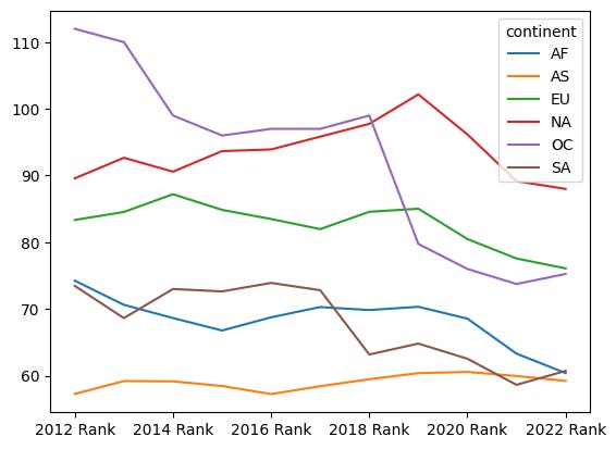
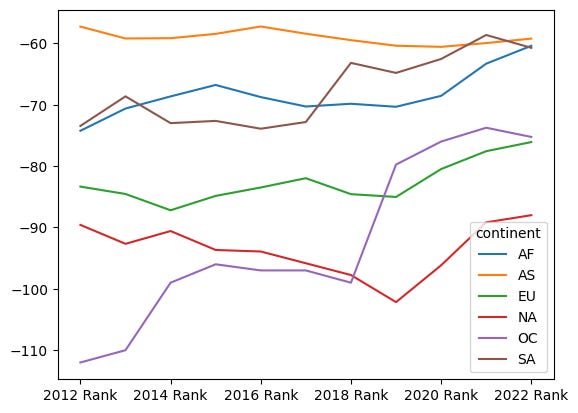
The above graph is technically just fine. But I think it’s a bit misleading, because (once again) a higher score means less terrorism, and a lower score means more terrorism. I think it might make more sense to have the y axis go the other way, such that higher means more terrorism.
How can we do that? Very simply, by multiplying the data frame by -1. We could, in theory, use * to multiply, but because we’re using methods, we can stick with “mul”, the method implementation of that operator:
(
    df
    .join(continents_df)
    .groupby('continent').mean()
    .T
    .mul(-1)
    .plot.line()
)
And here’s the result:
What countries are in the continent that had the worst (i.e. lowest) mean score? And what were their terrorism ranks in 2022?
In order to answer this, we’ll need to find out which continent had the worst (i.e., lowest) mean rank.
We can calculate this by again joining df with our continents_df, and again running groupby on the “continent” column, calculating the mean per “2022 Rank” column:
most_terrorism_continent = (
    df
    .join(continents_df)
    .groupby('continent')['2022 Rank'].mean()
)
Then we can just sort the continents by value, and taking the first item from the index:
most_terrorism_continent = (
    df
    .join(continents_df)
    .groupby('continent')['2022 Rank'].mean()
    .sort_values()
    .index[0]
)
We now have the string (“AS”) indicating which continent has lowest (i.e., worst) mean terrorism rank.
Now I want to find out which countries are in that continent, and get their scores. What I can do is again join the two data frames, select only the two columns “2022 Rank” and “continent”, and then use “loc” to select only those rows where “continent” matches the value of “most_terrorism_continent”:
(
    df
    .join(continents_df)
    [['2022 Rank', 'continent']]
    .loc[lambda df_: df_['continent'] == most_terrorism_continent]
)
This will give us all of the countries in Asia. We really only care about the country name (which is the index) and the rank, so we can select that column:
(
    df
    .join(continents_df)
    [['2022 Rank', 'continent']]
    .loc[lambda df_: df_['continent'] == most_terrorism_continent]
    ['2022 Rank']
)
Sure enough, we get the following response:
Country
Afghanistan              1
Armenia                 93
Azerbaijan              93
Bahrain                 79
Bangladesh              43
Bhutan                  93
Cambodia                93
China                   93
Georgia                 93
India                   13
Indonesia               24
Iran                    21
Iraq                     7
Israel                  25
Japan                   62
Jordan                  68
Kazakhstan              93
Kuwait                  93
Laos                    93
Lebanon                 52
Malaysia                75
Mongolia                93
Myanmar                  9
Nepal                   36
North Korea             93
Oman                    93
Pakistan                 6
Palestine               33
Philippines             18
Qatar                   93
Saudi Arabia            63
Singapore               93
South Korea             93
Sri Lanka               29
Syria                    5
Taiwan                  93
Tajikistan              50
Thailand                26
Turkey                  23
Turkmenistan            93
United Arab Emirates    76
Uzbekistan              70
Vietnam                 89
Yemen                   22
Name: 2022 Rank, dtype: int64
Load the 2022 tab from the Excel file into a data frame. In which 10 countries were there the most fatalities and injuries per terrorist incident?
Our main data set is in an Excel file, and we already saw that the file contains a number of sheets. Let’s now look at the sheet for 2022 (the latest year), in which they specify not only how many terrorist incidents there were per country, but also how many fatalities and injuries per accident. You can imagine a terrorist incident in which a small number of people are hurt or killed, or (as we saw in Israel this past Saturday) one in which a large number were hurt or killed.
So, how can we figure this out?
First, we’ll load the data from the Excel file. Once again, we’ll indicate the sheet name (“2022”), we’ll have to tell is which row contains the headers (5), we’ll specify that “Country” is the index column, and we’ll only use a handful of the columns in the spreadsheet:
(
    pd.read_excel(filename,
                 sheet_name='2022',
                  header=5,
                  index_col='Country',
                  usecols=['Country','Rank',
                           'Score', 'Incidents',
                           'Fatalities', 'Injuries'])
)
Then we’ll need to find out how many fatalities there were per incident. Fortunately, we have the information we’ll need to make that calculation, in the “Fatalities” and “Incidents’ columns. We can divide one by the other, and put that calculation into a new column.
I could use regular ol’ assignment for that, but I’ll use the “assign” method, which returns a new data frame and lets us use method chaining:
(
    pd.read_excel(filename,
                 sheet_name='2022',
                  header=5,
                  index_col='Country',
                  usecols=['Country','Rank',
                           'Score', 'Incidents',
                           'Fatalities', 'Injuries'])
    .assign(fatalities_per_incident=
             lambda df_: df_['Fatalities'] /
                         df_['Incidents'])
)
Then we’ll sort our data frame based on the column we just created, take the top 10 values, and retrieve only the “fatalities_per_incident” column:
(
    pd.read_excel(filename,
                 sheet_name='2022',
                  header=5,
                  index_col='Country',
                  usecols=['Country','Rank',
                           'Score', 'Incidents',
                           'Fatalities', 'Injuries'])
    .assign(fatalities_per_incident=
             lambda df_: df_['Fatalities'] /
                         df_['Incidents'])
    .sort_values('fatalities_per_incident', ascending=False)
    .head(10)
    ['fatalities_per_incident']
)
Here’s what I get:
Country
Democratic Republic of the Congo    8.000000
Djibouti                            7.000000
Chad                                6.000000
Iran                                6.000000
Togo                                5.200000
Niger                               3.666667
Burkina Faso                        3.661290
Indonesia                           3.571429
Mali                                3.470588
Nigeria                             3.208333
Name: fatalities_per_incident, dtype: float64
In other words, we see that in the DRC, Djibouti, and Chad, there were an average of 8, 7, and 6 fatalities per terrorist incident.
What about injuries? We can get those, too, just by performing a slightly different calculation:
(
    pd.read_excel(filename,
                 sheet_name='2022',
                  header=5,
                  index_col='Country',
                  usecols=['Country','Rank',
                           'Score', 'Incidents',
                           'Fatalities', 'Injuries'])
    .assign(injuries_per_incident=
             lambda df_: df_['Injuries'] /
                         df_['Incidents'])
    .sort_values('injuries_per_incident', ascending=False)
    .head(10)
    ['injuries_per_incident']
)
The result:
Country
Norway         21.000000
Turkey         10.700000
Chad           10.333333
Iran            9.714286
Djibouti        6.000000
Afghanistan     3.986667
Ethiopia        3.500000
Somalia         3.347826
Togo            3.200000
Indonesia       3.142857
Name: injuries_per_incident, dtype: float64
Wow — I would have expected there to be a very strong correlation between the two lists, but we can see that Norway (!) had the greatest number of people injured per incident, followed by Turkey.
In 2022, how many people were killed in the five largest terrorist attacks? In what countries did those take place?
Finally, let’s find the number of people killed in the largest terrorist attacks in 2022, and where they took place. Again, we’ll read in the Excel sheet for 2022, choosing only the “Country” and “Fatalities” columns:
(
    pd.read_excel(filename,
                 sheet_name='2022',
                  header=5,
                  index_col='Country',
                  usecols=['Country', 'Fatalities'])
    .sort_values('Fatalities', ascending=False)
    .head(5)
    ['Fatalities']
)
We sort the values by “Fatalities”, take the top 5, and retrieve the column, and we get the following:
Country
Burkina Faso    1135
Mali             944
Somalia          755
Pakistan         643
Afghanistan      633
Name: Fatalities, dtype: int64
It would seem that in 2022, Burkina Faso suffered from the largest terrorist attack, with over 1,000 people killed — and the number of people killed was lower than what we had in Israel this past weekend.
You can view my notebook here: https://drive.google.com/file/d/1pXnryqQQEYxmt2YvVQ3xX1ta3j2Tz50E/view?usp=sharing
I’ll be back next week with a cheerier topic — but as always, with a data set related to current events that we’ll explore with Pandas.
Until then, I wish you a good, safe, and peaceful week.
Reuven