


This week’s problems use data from the World Uncertainty Index (WUI, at https://worlduncertaintyindex.com and https://www.imf.org/en/Publications/fandd/issues/2020/03/imf-launches-world-uncertainty-index-wui-furceri) a metric that tries to describe how worried we should be about the world in general, or certain regions and countries in particular.
Perhaps that’s unfair; I tend to associate “uncertainty” with “worry,” but you can just say that the situation is unknown — for good or for bad. I tend to be an optimist, but even I understand how when you start to talk about uncertainty, things can look problematic. And even the researchers behind the WUI admit that a large dose of uncertainty can serve as a predictor of trouble in a nation.

This week, we looked at the WUI data. Can we identify times when uncertainty in the world went up? Which countries are more reliably uncertain? And how do Israel and Taiwan compare, with each other and with other countries in the world?
Data and seven questions
This week, I posed seven questions that we can answer with the WUI data set. It consists of a single Excel file with a number of different sheets, each with a different piece or collection of uncertainty data. You can get it from:
/content/files/wp-content/uploads/2023/06/wui_data.xlsxThe learning goals for this week include breaking up date information, multi-indexes, method chaining, lambda and assign, and plotting.
Here are my seven tasks and questions for this week:
Read tab T1 into a data frame. Turn the "Year" column into a multi-index consisting of the year and quarter, both integers, and also remove the original "Year" column. Also: Do it all in a single, chained query starting with a call to "read_excel".
Before we can do anything else, we’ll need to load up Pandas. I’m going to do my longish, three-line intro that I always like to do, just to be prepared:
import numpy as np
import pandas as pd
from pandas import Series, DataFrame
With that out of the way, I downloaded the Excel file onto my system and wanted to read it into a data frame. If an Excel file contains only a single sheet, then calling read_excel returns a data frame. But if it contains multiple sheets, then the result is a list of data frames, one for each sheet.
Since we know which sheet we’ll want, we can just indicate that by passing the “sheet_name” keyword argument:
pd.read_excel(filename, sheet_name='T1')Sure enough, that returns a data frame. Because of how the Excel file is structured, the data frame has columns, based on the column names in the first row. So far, so good. But I indicated that I want to take the “Year” column and turn it into two integer columns, one with the year and one with the quarter. How can we do that?
Well, let’s first look at the values in that column:
1990q1
1990q2
1990q3
1990q4
1991q1
1991q2
1991q3
1991q4
As you can see, each value in this column is a four-digit year, the letter “q”, and then the quarter of that year for which we have data. How can we break that apart, so that we can have separate values for the year and quarter?
If we had a regular Python string containing “1990q1”, how would we break it apart? The answer is str.split, a string method that returns a list of strings. We could say “s.split('q')” and get back a list of two strings, first the year and then the quarter.
We can do this in Pandas via the str accessor, which gives us all of the builtin string methods, as well as some special, additional ones. Given a series s, we can say “s.str.split('q')”. The result will be a new series, each of whose values is a two-element list of strings.
That’s great, but… then what? Well, while we normally think of the “str” accessor as only working on string, it actually works on any kind of Python object, assuming that we invoke a method that the object supports. Given that str.split returns a list, we can then run “str.get(0)” on that resulting list to get the first element. In other words:
s.str.split('q').str.get(0)The above will return a series of strings, each of which contains the four-digit year from the series “s”. We can similarly use “get(1)” to get the quarter number.
But wait — we now have a series of strings. We actually want a series of integers. How can we change that? Easy; we use the “astype” method to get back a new series based on the original, whose values are the dtype we want. Given that we want integers, and that those 4-digit integers will all fit into 16 bits, we can say:
s.str.split('q').str.get(0).astype(np.int16)Note that if you do this with “np.int8”, it will seem to work… until you discover that 8-bit integers aren’t sufficient for a four-digit year, and that they’ve been transformed into negative numbers.
It’s now clear how I can take the original data frame and get two new series of integers from it, one for the year and one for the quarter. But I asked you to do this using chained methods. How would that look and work?
In general, we can create a new column by using the “assign” method on a data frame. Assign takes any number of keyword arguments; the name of the kwarg is the name of the new column, and the value we give contains the values. The value can be a series, but it can also be a function that returns a series. It’s not unusual to use lambda, a Python construct that creates an anonymous function object.
Here’s how we can do it:
- We call “assign” on the data frame
- We name the column as the name for the keyword argument
- The value is lambda, which takes a single argument that is often called df_ (not to be confused with df), because it’s a data frame object but is also temporary — this is passed the data frame on which we run the method, and the series returned by the lambda is then set as the column’s value
Here’s how that code would look:
(
    pd
    .read_excel(filename, sheet_name='T1')
    .assign(Y=lambda df_: df_['Year'].str.split('q').str.get(0).astype(np.int16),
            Q=lambda df_: df_['Year'].str.split('q').str.get(1).astype(np.int8))
)
This gives us back a data frame with all of the Excel sheet’s original data, plus the two new columns Y and Q. We can make Y and Q into an index — specifically, a multi-index — by invoking set_index:
(
    pd
    .read_excel(filename, sheet_name='T1')
    .assign(Y=lambda df_: df_['Year'].str.split('q').str.get(0).astype(np.int16),
            Q=lambda df_: df_['Year'].str.split('q').str.get(1).astype(np.int8))
    .set_index(['Y', 'Q'])
)
Notice that we pass a list of two elements (‘Y’ and ‘Q’) to set_index, thus ensuring that it’s a multi-index with the primary index element being the year, and the secondary being the quarter number.
Finally, let’s get rid of the original “Year” column by invoking “drop”:
(
    pd
    .read_excel(filename, sheet_name='T1')
    .assign(Y=lambda df_: df_['Year'].str.split('q').str.get(0).astype(np.int16),
            Q=lambda df_: df_['Year'].str.split('q').str.get(1).astype(np.int8))
    .set_index(['Y', 'Q'])
    .drop('Year', axis='columns')
)
The final result is a data frame with the columns we want, and the rows and values we want — without invoking explicit Python assignment even once.
Which of the final five columns (comparing regions) currently has the greatest uncertainty? Does this strike you as a reasonable region to be the most uncertain in the world? Looking at the absolute numbers, what do you see with the measurement?
One of the nice things about using chained methods is that we can take the work we’ve already done and just add a handful of lines to them in order to get the results we want.
To compare the regions (the final five columns) in the data frame in the most recent collection of data, we’ll use iloc, which lets us retrieve rows via the index. The final row is (as per normal Python tradition) -1. We can also use slice syntax to grab the final five rows, making our call look like “iloc[-1, -5:]”:
(
    pd
    .read_excel(filename, sheet_name='T1')
    .assign(Y=lambda df_: df_['Year'].str.split('q').str.get(0).astype(np.int16),
            Q=lambda df_: df_['Year'].str.split('q').str.get(1).astype(np.int8))
    .set_index(['Y', 'Q'])
    .drop('Year', axis='columns')
    .iloc[-1, -5:]
)
That gives us the row that is of interest to us. And as usual in Pandas, when you get a single row back, it comes as a series. We can thus run series methods on it, including “max” to get the maximum value. But we don’t want the highest value; we want the index (i.e., the label) for that highest value. For that, we’ll use “idxmax”, which returns the index for the highest value:
(
    pd
    .read_excel(filename, sheet_name='T1')
    .assign(Y=lambda df_: df_['Year'].str.split('q').str.get(0).astype(np.int16),
            Q=lambda df_: df_['Year'].str.split('q').str.get(1).astype(np.int8))
    .set_index(['Y', 'Q'])
    .drop('Year', axis='columns')
    .iloc[-1, -5:]
    .idxmax()
)
We see that “Western Hemisphere” is the region with the greatest uncertainty. When I first saw that, I thought it must be a mistake. After all, shouldn’t there be more mentions of uncertainty in other regions of the world? But then I realized that the T1 data isn’t normalized; it’s just a strict numeric count of how often the word “uncertainty” is mentioned in Economist Intelligence Unit articles. And they probably write a lot more about countries in the Western Hemisphere than elsewhere.
So yes, by absolute count, that region has the greatest mentions of uncertainty. But that doesn’t mean we should use this measure. And indeed, other measures in this spreadsheet normalize the numbers — for example, looking at the number of mentions of uncertainty as a proportion of all words written, rather than as an absolute measure.
Now read tab T2 into a data frame, again turning the year into a multi-index containing both year and quarter as integers, and again doing it all in a single, chained query starting with a call to "read_excel". What 10 countries had the greatest degree of uncertainty 10 years ago, in 2013 q2? What 10 countries have the greatest degree of uncertainty according to the latest data, in 2023 q2?
Reading tab T2 into a data frame is very similar to what we’ve already done. First, we’ll again read in the data, do our year and quarter assignments, turn them into a multi-index, and remove the original “year” column. Note that in this sheet, “year” is lowercase:
(
    pd.read_excel(filename, sheet_name='T2')
    .assign(Y=lambda df_: df_['year'].str.split('q').str.get(0).astype(np.int16),
            Q=lambda df_: df_['year'].str.split('q').str.get(1).astype(np.int8))
    .set_index(['Y', 'Q'])
    .drop('year', axis='columns')
)
Now that we have created our data frame, we want to get the data from the 2nd quarter of 2013. If a multi-index has two parts, and we know what values we want from each part, we can pass them as a tuple to “loc”:
(
    pd.read_excel(filename, sheet_name='T2')
    .assign(Y=lambda df_: df_['year'].str.split('q').str.get(0).astype(np.int16),
            Q=lambda df_: df_['year'].str.split('q').str.get(1).astype(np.int8))
    .set_index(['Y', 'Q'])
    .drop('year', axis='columns')
    .loc[(2013, 2)]
)
This returns a series whose index is country abbreviations, and whose values are the uncertainty scores:
AFG    0.196232
AGO    0.000000
ALB    0.198472
ARE    0.104351
ARG    0.231535
         ...
VNM    0.276932
YEM    0.190024
ZAF    0.616958
ZMB    0.258699
ZWE    0.476100
Name: (2013, 2), Length: 143, dtype: float64
We wanted the 10 countries with the highest scores. To do that, we’ll run sort_values, and then grab the top 10 values with head:
(
    pd.read_excel(filename, sheet_name='T2')
    .assign(Y=lambda df_: df_['year'].str.split('q').str.get(0).astype(np.int16),
            Q=lambda df_: df_['year'].str.split('q').str.get(1).astype(np.int8))
    .set_index(['Y', 'Q'])
    .drop('year', axis='columns')
    .loc[(2013, 2)]
    .sort_values(ascending=False)
    .head(10)
)
The result:
NPL    1.180384
LSO    0.852100
LBN    0.747733
GNB    0.733061
BOL    0.679117
BGR    0.674894
GIN    0.638638
KEN    0.625626
ZAF    0.616958
HUN    0.523670
Name: (2013, 2), dtype: float64
Notice that these are three-character country names; if you’re looking for an extra challenge, then you can use the code-to-name data on sheet T7 of this Excel spreadsheet. But the countries with the highest scores are the sorts of places you might expect — Lesotho (LSO), Lebanon (LBN), Guinea-Bissau (GNB), and Bolivia (BOL). (We’ll do some of that in a later question.)
I was curious to know if the high-uncertainty countries had changed in the last decade. I thus asked you to look at this year (2023), also in the second quarter:
(
    pd.read_excel(filename, sheet_name='T2')
    .assign(Y=lambda df_: df_['year'].str.split('q').str.get(0).astype(np.int16),
            Q=lambda df_: df_['year'].str.split('q').str.get(1).astype(np.int8))
    .set_index(['Y', 'Q'])
    .drop('year', axis='columns')
    .loc[(2023, 2)]
    .sort_values(ascending=False)
    .head(10)
)
My query was unchanged, except for the year I put in the call to “loc”. The results, however, were quite different:
ECU    1.050420
ZWE    0.816084
CHL    0.795782
NPL    0.646747
LBY    0.594342
USA    0.584966
TUR    0.581549
GTM    0.570776
CHE    0.552995
TKM    0.543380
Name: (2023, 2), dtype: float64
Here, we see that Ecuador (ECU), Zimbabwe (ZWE), and even Chile (CHL) had high degrees of uncertainty.
What countries, if any, were in the top-10 uncertain in both 2013 q2 and 2023 q2?
Given the different lists in 2013 q2 and 2023 q2, I wondered: Are any countries on both lists?
With 10 countries in each, we could obviously just eyeball it. But surely there’s some automated way we could do this, right? I asked you to do just that. And it turns out that if we use the “intersection” method not on a series, but rather on an index object, we can find the common values in both.
I thus took the previous two queries, adding a call to “index” on each of them. I then ran the “intersection” method on the first index, passing the second as an argument to it. The result was:
(
    pd.read_excel(filename, sheet_name='T2')
    .assign(Y=lambda df_: df_['year'].str.split('q').str.get(0).astype(np.int16),
            Q=lambda df_: df_['year'].str.split('q').str.get(1).astype(np.int8))
    .set_index(['Y', 'Q'])
    .drop('year', axis='columns')
    .loc[(2013, 2)]
    .sort_values(ascending=False)
    .head(10)
    .index
).intersection(
    pd.read_excel(filename, sheet_name='T2')
    .assign(Y=lambda df_: df_['year'].str.split('q').str.get(0).astype(np.int16),
            Q=lambda df_: df_['year'].str.split('q').str.get(1).astype(np.int8))
    .set_index(['Y', 'Q'])
    .drop('year', axis='columns')
    .loc[(2023, 2)]
    .sort_values(ascending=False)
    .head(10)
)
This looks like a really long query — until you see that it’s almost exactly the same query twice, joined together with the call to “intersection” in the middle.
And the result:
Index([], dtype='object')Nothing! No countries were in the top 10 of uncertainty both now and 10 years ago. I guess you could say that uncertainty is a fairly volatile measure.
Create a line graph showing the mean uncertainty score per year for Israel, Taiwan, the US, and UK. Which two countries have the highest uncertainty scores? Which has the lowest?
My interest in uncertainty began, as I wrote above, with the fact that I live in Israel and was planning to go to Taiwan, two places that we would normally think of as having a lot of uncertainty. How do these countries compare with two long-established powers, the US and UK?
To create this line graph, we’ll need to have our data frame with the years as the index (on the rows), and the country names as the columns.
I’ll start by narrowing the countries to the four that interest us, passing a list of strings inside of the square brackets.
(
    pd.read_excel(filename, sheet_name='T2')
    .assign(Y=lambda df_: df_['year'].str.split('q').str.get(0).astype(np.int16),
            Q=lambda df_: df_['year'].str.split('q').str.get(1).astype(np.int8))
    .set_index(['Y', 'Q'])
    .drop('year', axis='columns')
    [['ISR', 'TWN', 'USA', 'GBR']]
)
With that done, I then want to get the average score per year, rather than per quarter. We can do this with “groupby” on the “Y” column, invoking the “mean” method:
(
    pd.read_excel(filename, sheet_name='T2')
    .assign(Y=lambda df_: df_['year'].str.split('q').str.get(0).astype(np.int16),
            Q=lambda df_: df_['year'].str.split('q').str.get(1).astype(np.int8))
    .set_index(['Y', 'Q'])
    .drop('year', axis='columns')
    [['ISR', 'TWN', 'USA', 'GBR']]
    .groupby('Y')
    .mean()
)
We now have the annual mean uncertainty score for each of these four countries. The only thing left to do is create a line plot:
(
    pd.read_excel(filename, sheet_name='T2')
    .assign(Y=lambda df_: df_['year'].str.split('q').str.get(0).astype(np.int16),
            Q=lambda df_: df_['year'].str.split('q').str.get(1).astype(np.int8))
    .set_index(['Y', 'Q'])
    .drop('year', axis='columns')
    [['ISR', 'TWN', 'USA', 'GBR']]
    .groupby('Y')
    .mean()
    .plot.line(figsize=(12,9))
)
The only odd thing about the above plot is that I gave it a “figsize” of 12 x 9. I wanted it to fill my screen, and it was wider than it was tall, so that worked for me. The result is as follows:
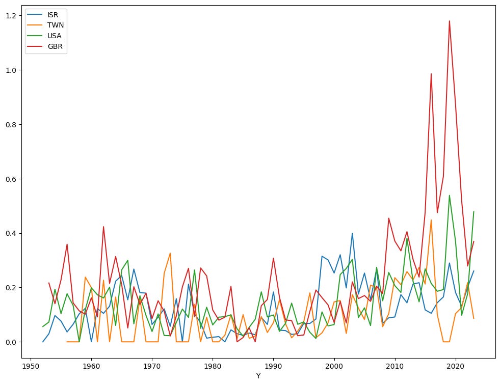
As you can see, the last few years have been extremely full of uncertainty in the UK. Which isn’t a surprise; between Brexit, the pandemic, and the various shakeups in the UK government, I can only guess how often the word “uncertainty” appeared in reports. The US has not been quite as active, but it has been pretty high — higher, in fact, than either Israel or Taiwan.
True, Israel’s uncertainty score has risen in the last few months, thanks in no small part to major demonstrations (in which I participate) against the current government’s policies. But its scores remain lower than the UK and US.
But the lowest-uncertainty country in this selection? Taiwan, which seems to be doing pretty well overall.
So the next time someone asks you if you’re really sure you want to travel to Taiwan, your answer should be, “Certainly!”
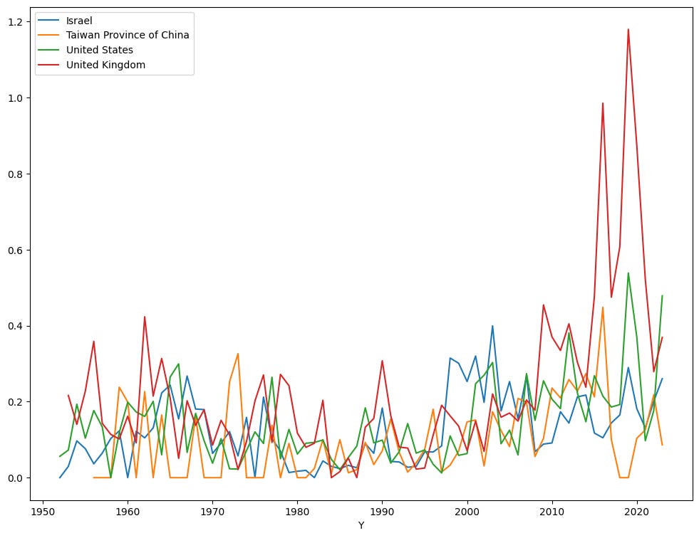
Load the data from tab T7 into a data frame. Use the data there to repeat our graph, but with country names rather than abbreviations.
One annoying aspect of the above graph is that the legend uses the three-letter abbreviations. How can we replace those with the country names?
As I indicated earlier, the T7 sheet has a full conversion table between three-letter country codes and country names. First, then, I’ll read that sheet into a data frame:
(
    pd.read_excel(filename,
                  sheet_name='T7')
)
But really, I only want the “iso_code” and “country_name” columns, and I’d like the “iso_code” column to be the index. So I can say:
(
    pd.read_excel(filename,
                  sheet_name='T7',
                  usecols=['iso_code', 'country_name'])
    .set_index('iso_code')
)
Finally, I want to turn this data frame into a dictionary. I can do that with the “to_dict” method, making sure to retrieve the column by its name. I also assign the result to a variable, which I call “country_codes”:
country_codes = (
    pd.read_excel(filename,
                  sheet_name='T7',
                  usecols=['iso_code', 'country_name'])
    .set_index('iso_code')
).to_dict()['country_name']
With this “country_codes” dictionary, I can now invoke the “replace” method, changing the column names to something else. I’ll take the code from the previous question, sticking my call to “replace”
(
    pd.read_excel(filename, sheet_name='T2')
    .assign(Y=lambda df_: df_['year'].str.split('q').str.get(0).astype(np.int16),
            Q=lambda df_: df_['year'].str.split('q').str.get(1).astype(np.int8))
    .set_index(['Y', 'Q'])
    .drop('year', axis='columns')
    [['ISR', 'TWN', 'USA', 'GBR']]
    .groupby('Y')
    .mean()
    .rename(columns=country_codes)
    .plot.line(figsize=(12,9))
)
The result is a graph that’s almost identical to the previous one, but with a more understandable legend:
Does any quarter have a clearly higher or lower uncertainty rate than the others? Let's find out by loading sheet F1 into a data frame. We only need the quarter number and the WUI score. Find the mean per quarter, across all years. Does any of them have a clearly higher or lower value?
Finally, I was curious to know if any one quarter during the year has a greater level of uncertainty than the others. Given that this is all based on articles about various countries, maybe they’re all going to talk about uncertainty at the end of the year, or even at its beginning.
I thus wanted to get the mean of the scores for each quarter. To do this, I made the index the quarter number, and the value the uncertainty score. This means that after loading our Excel sheet, I only used “assign” to create a single column, “Q”. Then I dropped the original “year” column:
(
    pd
    .read_excel(filename,
                sheet_name='F1',
                header=2,
               usecols=['year', 'WUI'])
    .assign(Q=lambda df_: df_['year'].str.split('q').str.get(1).astype(np.int8))
    .drop('year', axis='columns')
)
With this in place, I then performed a “groupby” operation, asking for the mean score for each quarter value:
(
    pd
    .read_excel(filename,
                sheet_name='F1',
                header=2,
               usecols=['year', 'WUI'])
    .assign(Q=lambda df_: df_['year'].str.split('q').str.get(1).astype(np.int8))
    .drop('year', axis='columns')
    .groupby('Q')['WUI'].mean()
)
The result:
Q
1    18581.961794
2    17615.368824
3    17483.226667
4    17856.440576
Name: WUI, dtype: float64
Wow! I wasn’t sure if there was going to be a difference between quarters when I posed this question, but I see a pretty clear indication here that the first quarter of each year is higher. Maybe, just maybe, it’s because of all the New Year articles talking about the uncertainty of the coming year? I’m not sure, but I’m intrigued by the results.
And that’s it for this week! Any comments or questions?
Here’s the Jupyter notebook that I used: https://drive.google.com/file/d/15ec1OBf3_nkmGFwWc62g53VL5fYDC7Ms/view?usp=sharing
All the best,
Reuven
Reuven