


REMINDER: This week, we're doing our first-ever Bamboo Weekly Community Contest! It's open to all BW subscribers (free and paid). The rules are here, but the basic idea is (a) on a public GitHub repo, solve one of the problems better than I did, or (b) come up with a new, interesting question for this data set and solve it. Put a link to your GitHub repo by Monday morning. I'll announce the winners on Tuesday.
I look forward to seeing your entries, and to learning from you!
And now, back to this week's topic:
In my travels around the world, I've heard many stories about how global warming is affecting people's lives. But this week, I heard a story on Slate Money (https://slate.com/podcasts/slate-money/2026/08/business-trump-defangs-the-corporate-transparency-act) about how global warming is affecting the production, and cost, of Parmesan cheese.
Not only do cows produce less milk in hot weather, but the facilities that store the cheese also need to spend more on cooling systems. In Italy, these storage facilities are often run by cheese "banks," which lend money to the cheesemakers, using the aging cheese wheels as collateral against those loans. Higher costs mean lower margins for these cheese banks.
You can read more about this here: https://edition.cnn.com/2026/05/02/food/italy-cheese-bank-parmigiano-reggiano-intl
I couldn't get any direct information about Italian cheese production, and how it is being affected by rising temperatures. But I did find a number of other data sets that, put together, can give us an interesting window into the world of Parmesan cheese.
Data and five questions
First, we'll look at the max daily temperature information for the cheesemaking cities of Parma and Reggio Emilia, Italy from 1950 until today. Those are the cities mentioned in the story. When researching this issue of BW, I accidentally started to look at Reggio Calabria, in the very south of Italy. No famous cheeses are made there (so far as I know), but I thought it would be interesting to compare a city in Italy's south with the two northern, more famous ones.
To get this data, you can go to https://open-meteo.com/en/docs/historical-weather-api, giving you access to historical data. You'll want:
- From January 1, 1950 until today
- Time zone is Europe/Berlin, aka Central European Time (and yes, we would normally specify it as Europe/Rome, but that isn't an option in their menu)
- You want the daily maximum temperature
- Specify three different cities:
- Parma: Latitude 44.802905123655684, longitude 10.32299074087261
- Reggio Emilia: Latitude 44.70736734971976, longitude 10.635165657656081
- Reggio Calabria: Latitude 38.11539126274953, longitude 15.666539088745575
For each set of coordinates, you can then download either a CSV file or an Excel file.
The second data set reflected how much milk is being produced, as reported by Eurostat (https://ec.europa.eu/eurostat/). Go to their site for apro_mk_colm, the measurement for the quantity of milk being provided:
- Location: Italy
- Product obtained
- Raw cows' milk delivered to dairies
- Unit of measure: Thousands of tonnes
I downloaded an Excel file with footnotes and summary in a separate sheet, using the "download" button.
Finally, I downloaded wholesale electricity price data for the EU from Ember. I retrieved the CSV file with monthly price data from https://files.ember-energy.org/public-downloads/price/outputs/european_wholesale_electricity_price_data_monthly.csv .
Paid subscribers, both to Bamboo Weekly and to my LernerPython+data membership program (https://LernerPython.com) get all of the questions and answers, as well as downloadable data files, downloadable versions of my notebooks, one-click access to my notebooks, and invitations to monthly office hours.
Learning goals for this week include working with Excel and CSV files, dates and times, data cleaning, joins, and plotting.
Here are this week's five questions, as well as my solutions and explanations. And don't forget — I'd love to see you do better solving these, as well as suggest your own, more interesting questions, in our first-ever community contest!
Download the daily max temperature information for all three cities from open-meteo.com, and put them into a single Pandas data frame. The index should be the dates as datetime values. Create a line plot showing the annual mean for the max temperature in each city.
As usual, my first steps were to import both Pandas and Plotly:
import pandas as pd
from plotly import express as px
Next, I wanted to import the data that I had downloaded from open-meteo.com. It's a CSV file, which means that I used read_csv to create a Pandas data frame from it – but I couldn't just read it right away:
- The file did contain column names, but only on the 6th line (i.e., line 5, if you count the first row as 0). I used
header=5to skip those first rows, and get the column names. - I wanted the first column to be seen as a
datetimevalue. I thus used theparse_dateskeyword argument, telling - I also wanted that
datetimevalue to be used as an index. I thus passedindex_col=0. - But wait: Why did I use integers to refer to columns, rather than names? Didn't I say that the column names were available? Yes, and we actually managed to get them, too. But I decided that the default names were too long and hard-to-write, and thus decided to replace them by passing the
nameskeyword argument. This has the side effective of forcing us to specify columns in other keyword arguments with integers. - Here's the full query for loading weather data from Parma:
parma_max_temp_filename = 'data/bw-184-parma.csv'

parma_max_temp_df = (
    pd
    .read_csv(parma_max_temp_filename, header=5,
              parse_dates=[0],
              names=['time', 'maxtemp_parma'],
              index_col=0)
)
This gave me a 1-column data frame with 27,984 rows. I similarly loaded weather data for Reggio Calabria and Reggio Emilia:
reggio_calabria_max_temp_filename = 'data/bw-184-reggio_calabria.csv'

reggio_calabria_max_temp_df = (
    pd
    .read_csv(reggio_calabria_max_temp_filename, header=5,
              parse_dates=[0],
              names=['time', 'maxtemp_calabria'],
              index_col=0)
)
And:
reggio_emilia_max_temp_filename = 'data/bw-184-reggio_emilia.csv'

reggio_emilia_max_temp_df = (
    pd
    .read_csv(reggio_emilia_max_temp_filename, header=5,
              parse_dates=[0],
              names=['time', 'maxtemp_emilia'],
              index_col=0)
)
Notice that in all three data frames, the second column name is not just maxtemp, but maxtemp_PLACENAME. I did that because we want to join these data frames together, and join tries to ensure that the output columns won't have identical names.
When you join two data frames together, it gives you the option of providing suffixes for the left- adn right-side data frames. But (spoiler alert!) if you invoke join with three data frames, then they need to have different names before performing the join.
Speaking of which, I can invoke join on parma_max_temp_df, passing a list of two other data frames. Remember that join operators on the index, so it's a good thing that all three local data frames are using a datetime index. I'm able to join things together as follows:
df = parma_max_temp_df.join([reggio_calabria_max_temp_df,
                             reggio_emilia_max_temp_df])
In other words: Pandas will match rows up by the index, giving us a three-column data frame. Sure enough, the resulting data frame has the max temperature for each day from each of Parma, Reggio Calabria, and Reggio Emilia.
I then wanted to create a line plot, showing the temperatures in each of these cities over the years. However, creating a line plot with the daily max temperature is going to be far too messy, and might also take a long time to calculate and render. That's why I asked to plot the mean max temperature for each year, giving us one point on the plot per year.
To get the mean value for each year's worth of daily max temperature reports, we can use resample, a sort of groupby operation for data frames with datetime indexes. After resampling, I then invoked px.line, using pipe so that px.line acts as if it were a data-frame method:
(
    df
    .resample('1YE').mean()
    .pipe(px.line)
)
The result:
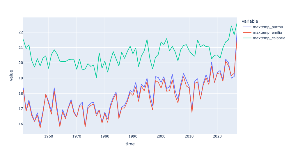
We can indeed see that Parma and Emilia, which are very close to one another, have similar maximum temperatures. Calabria, in Italy's south, has consistently higher temperatures than the other two. But we do see a sharp rise in max temperatures in the last few years.
Calculate the mean of each city's max temperatures in each decade. Have the temperatures changed over time? Create a bar plot showing the mean of these max temps for each decade. Repeat these queries, but only between the months of April and October; does that make any difference? Do the cities' temperatures seem to have changed to a similar degree?
Now, instead of calculating the annual mean of the max temperature, we want the 10-year mean of the max temperature. And then we don't want the temperatures themselves, but to know by how much they changed from decade to decade.
We can do this with a combination of resample (using 10YE for per-decade resampling) and diff:
(
    df
    .resample('10YE').mean()
    .diff()
)
I then wanted to be able to compare the per-city changes in temperature, which would be easier to understand then the raw numbers. I decided to create a bar plot:
(
    df
    .resample('10YE').mean()
    .diff()
    .pipe(px.bar, barmode='group')
)
Notice that I invoke px.bar here via pipe, much as I did before with px.line. However, to avoid having a stacked bar plot, I specified barmode='group'. Any positional or keyword arguments passed to pipe are passed along to the method it invokes on our behalf.
Here's the plot I got:
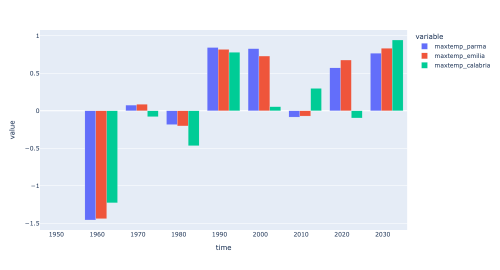
As expected, you can see that Parma and Reggio Emilia have had similar rises in temperature over the last two decades. There was a slight dip in their max temperatures in the 2010s, but since 1990, the max temperature has gone up, on average, about 0.75 degrees. That might not sound like much, but over time, it can become quite an issue.
The thing is, it's only really hot during the spring and summer. I thus thought that it might be interesting to look in the changes in max temperature only between April and October.
I managed to do this using loc and pd.col to keep only those rows in which the month in the time column was in that range. However, because time was in use as our index, I first needed to use reset_index before I could retrieve it. I so reset the index, filtered by month, moved the index back with set_index, and then did the combination resample and diff.
(
    df
    .reset_index()
    .loc[pd.col('time').dt.month.isin(range(4, 11))]
    .set_index('time')
    .resample('10YE').mean()
    .diff()
)
I also created a graphical (i.e., bar plot) version of it, with the following code:
(
    df
    .reset_index()
    .loc[pd.col('time').dt.month.isin(range(4, 11))]
    .set_index('time')
    .resample('10YE').mean()
    .diff()
    .pipe(px.bar, barmode='group')
)
Here's what I got:
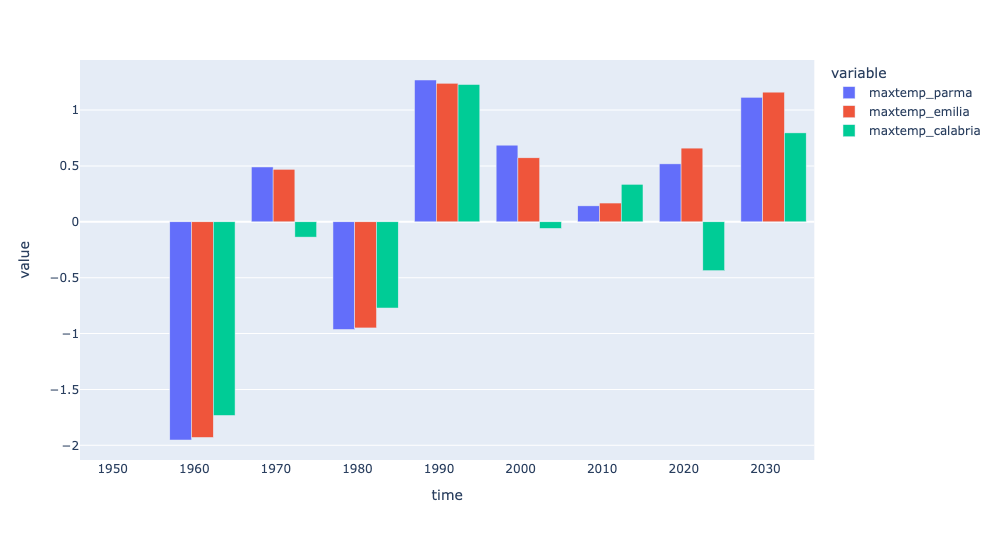
Look at that – the max temperature in the spring and summer has risen by more ethan 1 degree in this decade, and about half of a degree in the previous before that. Summer temperatures seem to be on an upswing (except in the 1980s and 2010s, to say nothing of the 1960s).