


This week, we looked at young people in the US, and some of the results from the latest Harvard Youth Poll (https://iop.harvard.edu/youth-poll/45th-edition-spring-2023). The poll asked so many interesting questions that it was hard to choose just a few topics — but I hope that it gave you a taste for this data, and that you even started to look at some of the other topics it surveyed.

Data and questions
The Harvard Youth Poll’s data is reported in a single Excel document. This Excel document was messier than most I’ve seen, because it put all of the answers, to dozens of questions, in a single spreadsheet document, on a single sheet. Which meant that reading the document was… challenging and messy. But you wouldn’t be reading Bamboo Weekly if you weren’t up for a challenge, right?
I posed eight questions and tasks. Let’s get to them:
Download the Excel file.
This was, by far, the easiest task of the week! I first started up Pandas:
import pandas as pdThen I downloaded the Excel file from the Harvard Youth Poll’s site:
/content/files/sites/default/files/2023-05/harvard-20iop-20youth-20poll-20spring-202023-20crosstabs.xlsx Now I was ready to start working with the data itself.
Grab the data from the "Likely voter 2024" question (starting on line 168 of the Excel file) into a data frame. Set the answers ("Definitely will be voting", etc.) to be the index. Remove the "All" column and the rows for "weighted N" and "unweighted N".
The Excel document provided by HYP has two sheets. You can think of each sheet as a separate document, sort of like a zipfile with numerous CSV files inside of it. In this case, the first sheet was a list of the questions asked in the poll, and the second sheet contained the results. The questions on the first sheet were all hyperlinks to the second sheet, which was a nice touch, I’ll admit.
Let’s start with reading the second sheet into a data frame, using read_excel:
likely_voter_2024_df = pd.read_excel(filename,
                                     sheet_name=1)
The above tells Pandas to read the entire second sheet (because the first has an index of 0) into a data frame. But it turns out that we don’t really want the entire sheet. That’ll give us the data, but not in any form that we can or will use. We need the values in a column to be of the same dtype to avoid having it labeled as “object”, and the headers for each of the sub-tables in the spreadsheet are the same everywhere, we want and need to snip out just a limited number of rows for the answers to each question.
This means that we’ll need to tell Pandas:
- Ignore all of the rows up to where the desired snippet begins
- Ignore the rows after where that snippet ends
We can accomplish this via a combination of the “skiprows” and “nrows” keyword arguments. The first tells Pandas how many rows to skip before starting to read from the file, and the second tells Pandas how many rows to read once it has begun. We can thus say:
likely_voter_2024_df = pd.read_excel(filename,
                   sheet_name=1,
                  skiprows=166,
                  nrows=6)
This works! Moreover, I asked for just 6 rows, which cuts off the bottom two rows from that analysis, namely the weighted and unweighted numbers.
But wait: I also asked you to treat the first column as the index. To do that, I’ll need to use the index_col keyword argument:
likely_voter_2024_df = pd.read_excel(filename,
                   sheet_name=1,
                  skiprows=166,
                  index_col=0,
                  nrows=6)
This is all good, but what about the column labels? The way that this data is structured, the columns will be a multi-index, with main headers and subheaders. Normally, we can pass an integer value to the “header” keyword argument, to indicate which row should be treated as a header. To get a multi-index, we simply pass a list of integers:
likely_voter_2024_df = pd.read_excel(filename,
                   sheet_name=1,
                   header=[0,1],
                  skiprows=166,
                  index_col=0,
                  nrows=6)
We have now loaded our data, have the answers in the index, and a multi-index of columns. This is all great, except for one thing, namely the “All” column at the start of the data frame. And yes, we could just live with it there, but I thought it might be nice to get rid of it.
Normally, we could use the “drop” method to get rid of a column. But doing that with a multi-index is annoying; there’s only a name at the multi-index’s lower level. So how exactly can we drop that column?
Well, it turns out that “drop” lets us specify the level at which we want to match the name. So by saying “All” (the value in the lower level) and then passing level=1 along with axis="columns", we’ll be all set:
likely_voter_2024_df = pd.read_excel(filename,
                   sheet_name=1,
                   header=[0,1],
                  skiprows=166,
                  index_col=0,
                  nrows=6).drop('All', level=1, axis='columns')
Sure enough, this creates a data frame with the rows and columns we want, ready for analysis.
If you opened the file in Excel, by the way, you might have noticed that the numbers were all percentages. Why are they not displayed with percent signs in Pandas? Anyway, shouldn’t they be strings, if they have percent signs?
The answer is that Excel distinguishes between its data and how it’s displayed. (We can do that in Pandas to some degree, also, I’ll admit.) So when you see something with a % after it in Excel, it’s still a float, just being shown as a percentage. And when the data is read into Pandas, it’s kept as a float — and then displayed as one. So you don’t need to turn it from a string into a float, or the like.
What race/ethnicity has the highest percentage of people saying they'll definitely be voting? Which has the highest percentage saying they definitely *won't* be voting?
Now that we’ve created a data frame based on the information in the Excel spreadsheet, let’s do a bit of analysis: Among young Americans, which race/ethnicity has the highest percentage of people saying they’ll definitely be voting?
Our data frame’s index has a row labeled “Definitely will be voting”. So we can use loc to retrieve that row:
likely_voter_2024_df.loc['Definitely will be voting']However, we aren’t interested in all of the columns; we just want those under race/ethnicity.
Here, we can use the two-argument version of loc, where the first argument is the row selector, and the second argument is the column selector.
But wait — if I ask for the column “Race/Ethnicity Category,” that’s the top level of a two-level multi-index. I’ll get each of the columns under it, for the row “Definitely will be voting.”
Of course, that’s precisely what we want. Here’s my query:
likely_voter_2024_df.loc[
 "Definitely won’t be voting",
  'Race/Ethnicity Category']
Here’s the result I get from this query:
Likely voter 2024
White       0.073537
Black       0.153782
Hispanic    0.146848
Mixed       0.065671
AAPI        0.044558
Name: Definitely won’t be voting, dtype: float64
I asked for a single row and a single column, but the column was the top level of a multi-index. As a result, I get back not a single value, but a series — all of the values in the row I requested, and in all of the second level of the multi-index.
How, though, can I then find out which group has the highest percentage? I could find the max value, and then find the index associated with that max value. Or I can just use the “idxmax” method, which does that for me, returning the index of the maximum value:
likely_voter_2024_df.loc['Definitely will be voting', 'Race/Ethnicity Category'].idxmax()The result that I get back is “White”.
Which ethnicity gives the highest percentage saying that they definitely won’t be voting? I’ll retrieve a different row (for definitely won’t be voting), and again ask for the idxmax:
likely_voter_2024_df.loc["Definitely won’t be voting", 'Race/Ethnicity Category'].idxmax()The result here is “Black.”
Now grab the data from the "Sources for current events" question, starting on line 669, putting it into a data frame. Again, set the answers to be the index. Remove the "All" column and the rows for "weighted N" and "unweighted N".
Once again, we need to retrieve just part of the Excel file, and turn it into a data frame. We’ll use the same techniques as before:
current_events_df = pd.read_excel(filename,
                   sheet_name=1,
                   header=[0,1],
                  skiprows=667,
                  index_col=0,
                  nrows=13).drop('All', level=1, axis='columns')
Once again, I read from sheet 1, asking to skip 667 rows, and then to read 13 rows, ignoring the “weighted N” and “unweighted N” rows. We turn the first column (with the answers to our questions) into the data frame’s index, and then drop the “All” column that we don’t care about.
While I wasn’t thrilled by the way in which the poll put all of the data into a single spreadsheet, I did at least appreciate the fact that they were consistent in their labeling and columns. Once I figured out how to read answers from one question into a data frame, I could reliably read any answer into a data frame.
That said, the answers to these questions were a bit different than some of the others. Rather than giving an answer on a sliding scale, from “strong yes” to “strong no,” with several options in between. In this question, they were asked to identify the sources from which they followed current events. The fact that the percentages added up to more than 100% tells me that people filling out the survey were allowed to choose more than one option. We thus aren’t seeing young people’s only source of news, but rather their main sources (plural) of news.
Among young people who are registered to vote, what are the three most common sources for them to learn about current events? What about for people who are *not* registered to vote?
Whereas our answer to the previous question meant that we first had to select a row, here we need to start with a column. That’s because we’re interested in all of the rows for that column — the percentages reported by people registered to vote. How can I retrieve that column?
Once again, we have to contend with the fact that we are working with a multi-index. If we retrieve the column “Registered to vote”, we’ll actually get a data frame with two columns, “Yes” and “No”, whose index contains all of the news sources from the original data frame.
If we only want to grab the “Yes” sub-column from under the “Registered to vote” column, we will have to use square brackets, because that’s how we retrieve via a column. But we cannot use inner square brackets to indicate the two levels, because that would imply that we want to retrieve multiple columns from the data frame.
Rather, we’ll use a tuple inside of the square brackets:
current_events_df[('Registered to vote', 'Yes')]That returns the following series:
Facebook           0.247087
Twitter            0.246778
Instagram          0.295357
Snapchat           0.135264
TikTok             0.245527
Fox News           0.156436
Parler             0.005272
MSNBC              0.090426
CNN                0.173032
TV News            0.262550
Podcasts           0.164811
YouTube            0.365424
Barstool Sports    0.020335
Name: (Registered to vote, Yes), dtype: float64
To find the top 3 items, we’ll first want to sort the series in descending value order, using sort_values:
current_events_df[('Registered to vote', 'Yes')].sort_values(ascending=False)That returns the following:
YouTube            0.365424
Instagram          0.295357
TV News            0.262550
Facebook           0.247087
Twitter            0.246778
TikTok             0.245527
CNN                0.173032
Podcasts           0.164811
Fox News           0.156436
Snapchat           0.135264
MSNBC              0.090426
Barstool Sports    0.020335
Parler             0.005272
Name: (Registered to vote, Yes), dtype: float64
Finally, we then take the top three items using “head”:
current_events_df[('Registered to vote', 'Yes')].sort_values(ascending=False).head(3)We can see, very clearly, that YouTube, Instagram, and TV news (in that order) are the sources that young, registered voters turn to:
YouTube      0.365424
Instagram    0.295357
TV News      0.262550
Name: (Registered to vote, Yes), dtype: float64
What about people who aren’t registered to vote? What patterns do they show? My query will be identical, except that instead of asking for the “Yes” column in our column-selection tuple, I’ll ask for the “No” column:
current_events_df[('Registered to vote', 'No')].sort_values(ascending=False).head(3)The results are as follows:
YouTube      0.309390
Instagram    0.269399
TikTok       0.243190
Name: (Registered to vote, No), dtype: float64
I found this quite interesting, actually — that the two top sites for registered and unregistered voters alike were YouTube and Instagram. But then, coming up in third place, we see that registered voters watched the news, whereas unregistered voters went to TikTok. Correlation isn’t causation, as we know, but it is at least a little bit interesting to see.
Now take the data from the "I don't believe my vote will make a real difference" question, starting on line 1315. Again, set the answers to be the index. Remove the rows with net answers, as well as for weighted and unweighted N, and the "All" column. What education status believes ("strongly agree" or "somewhat agree") that their vote does *not* make a difference?
Time to load answers from another question! This time, we’ll grab data from the question that asked whether young people don’t believe their vote makes a real difference.
My data-frame creation started similarly to what we had done before:
vote_no_difference_df = pd.read_excel(filename,
                   sheet_name=1,
                   header=[0,1],
                  skiprows=1313,
                  index_col=0,
                  nrows=8).drop('All', level=1, axis='columns')
We skipped 1,313 rows. We got a two-row header for the columns. We turned the answers into the index. And we read 8 rows, avoiding the weighted and unweighted Ns. Then we dropped the “All” column.
But this answer also included two rows that attempted to summarize the others, and I didn’t want these. There are a few ways that I can remove rows based on their text, but I opted to use the simplest approach — I knew that they were at the top, and thus used “tail” to get rid of these two rows:
vote_no_difference_df = pd.read_excel(filename,
                   sheet_name=1,
                   header=[0,1],
                  skiprows=1313,
                  index_col=0,
                  nrows=8).drop('All', level=1, axis='columns').tail(6)
I then asked you to find which educational status believes (either “strongly agree” or “somewhat agree”) that their vote doesn’t make a difference?
The two-argument version of “loc” takes a row selector and a column selector. The row selector can be a string (describing a row), a slice, or a list of rows. Because we want to examine both “strongly agree” and “somewhat agree” rows, we’ll use a list as our row selector. Our column selector will be a simple string, for “Education status”:
vote_no_difference_df.loc[
    ['Strongly agree', 'Somewhat agree'],
    'Education Status']
But then what? We want to sort them, in order to find the education status that most agrees with this statement. But we can’t sort them yet, because we have a data frame; we’ll need to combine the values with “sum”:
vote_no_difference_df.loc[
    ['Strongly agree', 'Somewhat agree'],
    'Education Status'].sum().
The above query gives me this output:
I don't believe my vote will make real difference
College student             0.397428
Not in college/No degree    0.404229
College degree              0.452726
dtype: float64
I can now sort them, from highest to lowest:
vote_no_difference_df.loc[
    ['Strongly agree', 'Somewhat agree'],
    'Education Status'].sum().sort_values(ascending=False)
The result:
I don't believe my vote will make real difference
College degree              0.452726
Not in college/No degree    0.404229
College student             0.397428
dtype: float64
We thus see that among young people, those with college degrees are more likely than those with no degrees or currently enrolled to believe that their vote makes no difference.
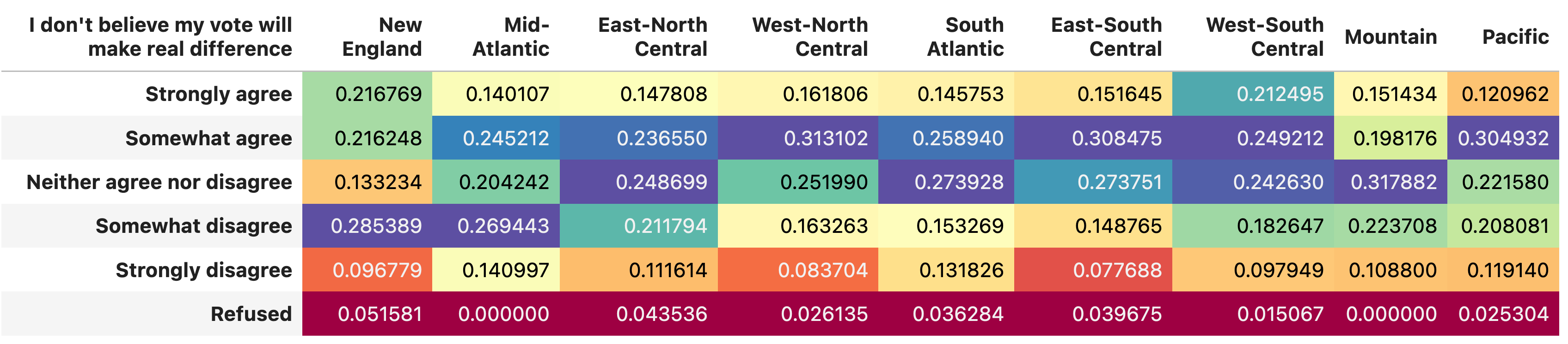
Display all of the rows from this data frame, for all regions of the US. Colorize the cells of the data frame using a gradient, , so that the lowest values are red and the highest values are violet, along a spectrum.
It isn’t widely known (at least in my experience), but Pandas has facilities to style data frames in a variety of ways, including by setting the cells of the table based on their contents. Some of the most common ways that you might want to colorize the data frame are available as methods, and that’s what we’re going to see both here and in the next question.
First, I asked you to grab only those columns for regions of the US:
vote_no_difference_df['Region (State of Residence)']Because this is the top level of a multi-indexed column, we get back a data frame — one with all of the original data frame’s rows, and each of the level 1 column names as columns.
I then asked you to colorize them along a gradient; the idea is that lower numbers will show up lightly (or in white), and higher numbers will show up darkly. We can do that by invoking the “background_gradient” method on the data frame’s “style” object:
vote_no_difference_df['Region (State of Residence)'].style.background_gradient()The above code will colorize and return the data frame in blue and white. That isn’t bad, but we can do better by selecting a different colormap. Pass a string to the “cmap” keyword argument, and Pandas will use an alternative colormap for them. For example, I used the “Spectral” colormap here:
vote_no_difference_df['Region (State of Residence)'].style.background_gradient(cmap='Spectral')The result was rather nice, I think:
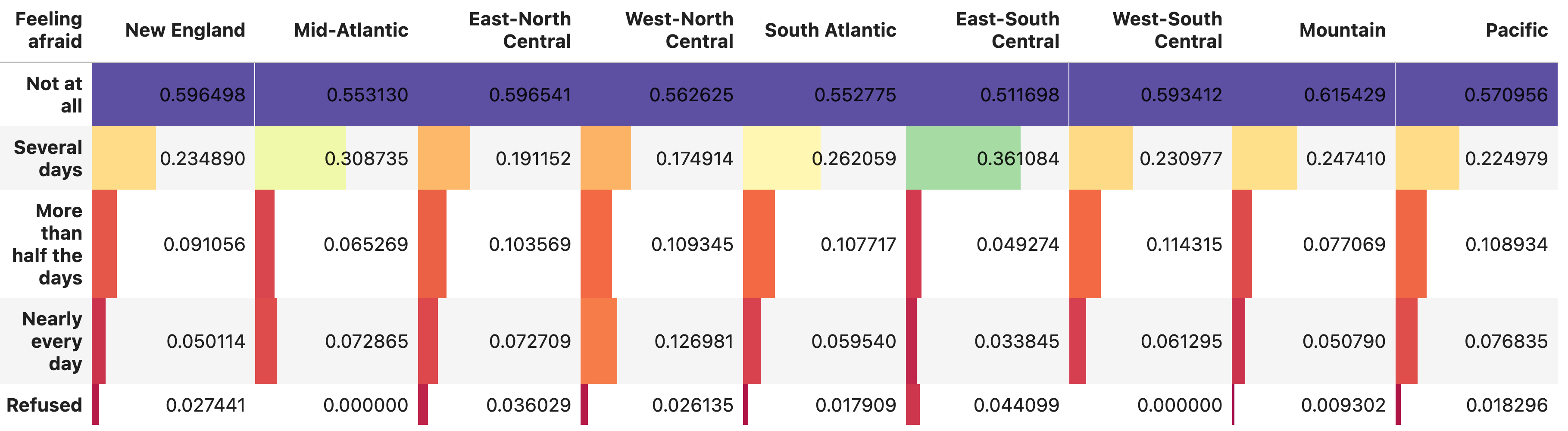
Now take data from the "feeling afraid" question, starting on line 1499, and turn it into a data frame. Turn the answers into the index. Remove the row with net answers, as well as those for weighted and unweighted N. Also remove the "All" column. Now show the answers as given for people from different regions with a colorized bar, with higher numbers having a longer colorized bar within the data frame's cell. Again, the lower numbers should be in red and the higher numbers should be in violet, as in a spectrum.
Finally, I wanted to take a brief look at the (rather disturbing, I think) result from this survey, showing how many young people report feeling afraid.
First, we’ll read the data into a data frame. By now, the code should be familiar:
feeling_afraid_df = pd.read_excel(filename,
                   sheet_name=1,
                   header=[0,1],
                  skiprows=1497,
                  index_col=0,
                  nrows=6).drop('All', level=1, axis='columns').tail(5)
With the data frame in place, I want to once again load up the locations:
vote_no_difference_df['Region (State of Residence)']But this time, I don’t just want to colorize the cells. Rather, I want to make each cell into a sort of bar graph, where higher numbers will have a longer color bar than lower numbers.
Fortunately, the “bar” method on the data frame’s styler object does this:
vote_no_difference_df['Region (State of Residence)'].style.bar()Once again, we can make the colorizing much nicer by passing a value to the “cmap” keyword argument, and specifying a colormap:
vote_no_difference_df['Region (State of Residence)'].style.bar(cmap='Spectral')The result, once again, is (I think) pretty compelling:
So, what do you think? Any insights or thoughts, about the data, techniques, or analysis? Let me know in the comments.
The Jupyter notebook that I used, and created, is here: https://drive.google.com/file/d/1SD20v6o70V0gy3V43zR5enOuRq0C6tsV/view?usp=sharing
I’ll be back on Wednesday with a new topic for us to analyze in Pandas.
Reuven