


This week’s topic: Software jobs
This week’s data set came from the GitHub repo put together by HiringLab, set up by Indeed.com. We looked at the number of job postings as a proxy for job demand.
If you’re Git savvy, then you were able to download the entire repository with “git clone”:
https://github.com/hiring-lab/job_postings_tracker
If you aren’t familiar with Git, then you can use this URL to get the data as a zipfile:
https://github.com/hiring-lab/job_postings_tracker/archive/refs/heads/master.zip
Our questions for this week are:
- Turn aggregate job postings into a data frame (aggregate_df). We're interested in the date and seasonally adjusted number of job postings, but only where “variable” is “total postings”.
- On how many days since data collection began has the index been greater than 100 (i.e., more postings than in February 2020)?
- Draw a line plot with the posting index per day.
- Create a second data frame (sector_df) from the job_postings_by_sector_US file. We're interested in the date, postings_index, and display_name columns.
- Reformat the data such that the index contains the date, and the columns are the various sectors.
- On how many days since data collection began has the index for software development been greater than 100 (i.e., more postings than in February 2020)?
- Draw a line plot with the posting index for software development per day.
- On how many days since January 1st, 2023, has the index for software development been greater than 100 (i.e., more postings than in February 2020)?
- Which two sectors' job-posting indexes are most highly correlated with software development? Which two are least correlated with software development?
- Create a line plot, showing software job openings vs. the aggregate index.
- Create a line plot, showing software job openings in the US vs. those in Australia, Canada, Germany, France, and Great Britain.
Let’s get to it!
Turn aggregate job postings into a data frame (aggregate_df). We're interested in the date and seasonally adjusted number of job postings, but only where “variable” is “total postings”.
First, I had to set up Pandas with my usual imports:
import pandas as pd
from pandas import Series, DataFrame
Once I did that, I wanted to load the CSV file into a data frame. Truth be told, I could do that with a single line of code, the “read_csv” function:
filename = 'US/aggregate_job_postings_US.csv'
aggregate_df = pd.read_csv(filename)
This would actually work, if I wanted to turn it into a simple data frame. But I only wanted selected columns, I wanted to turn the “date” column into a “datetime” object, and I wanted to make that column the index. I could do that with:
aggregate_df = pd.read_csv(filename,
                 parse_dates=['date'],
                 index_col='date')
Here, I create the data frame based on filename. I tell Pandas to parse the “date” column as a datetime when reading it in, and I also ask it to turn that column into the index.
I then modified this query to read only selected columns. I can do that with the “usecols” parameters, passing it a list of column names. But given the long names that the HiringLab people used, I thought it would be nice to rename them, which I can do by passing a list of strings as a “names” keyword argument.
But wait — if I give Pandas the names I want to use, then how can I specify which columns I want with “usecols”? That is, if I rename the columns “a”, “b”, and “c”, how can Pandas know to which of the columns in the input file it should give those names?
The answer is that we can pass “usecols” a list of integers, indicating the index (starting with 0) of the columns we want to select. Passing numbers to usecols, and then passing strings to names, allows us to choose columns and rename them.
Ah, but then we have a problem: If we set the names, then Pandas no longer assumes that the first line of the file contains column names. Rather, it assumes that the first line contains data. We need to tell it to ignore that first line, so that our data doesn’t get messed up, something we can do with the “header” keyword argument.
In the end, our call to read_csv looks like this:
aggregate_df = pd.read_csv(filename,
                 usecols=[0, 2, 4],
                 parse_dates=['date'],
                 names=['date', 'postings_index', 'variable'],
                 header=1,
                 index_col='date')
(Note that there are also two columns containing data. I decided that we would only look at the seasonally adjusted data, which takes into consideration the fact that certain jobs are seasonal. For example, summer camps hire a lot in June and then don’t hire again until September. Package-delivery companies hire in November, but not in February. By using seasonally adjusted data, economists hope to have a truer sense of what’s happening in the world.)
The data that we loaded contains two types of data for each date. One is “total postings,” indicating how many job postings there were on a given day. Another is “new postings,” indicating how many new jobs were posted on a given day. I decided that we should only look at “total postings,” in no small part because we’ll be able to compare that with the sector-specific data.
I thus asked you to keep only those rows for which “variable” contains the “total postings”. We can do it in this way:
aggregate_df = aggregate_df.loc[aggregate_df['variable'] == 'total postings']I create a boolean series by comparing the values in df[‘variable’] with “total postings”. I can then apply that boolean series to “aggregate_df.loc”. That returns a new data frame, based on aggregate_df, but only containing those rows where “variable” was equal to the string “total postings”.
With this, our aggregate data frame is in place, and we can start to perform some calculations and analysis.
On how many days since data collection began has the index been greater than 100 (i.e., more postings than in February 2020)?
The data’s first day started with a value of 100. This doesn’t mean that there were 100 job postings on that day, but rather that this was taken to be the baseline measurement. If more than that day’s job postings are online, we’ll have a value greater than 100. If fewer than that day’s job postings are online, we’ll have a value smaller than 100.
I thus wanted to know how often, since data collection was started, have we had days greater than 100.
The easiest way to calculate this is to make the comparison directly:
aggregate_df['postings_index'] > 100
This will return a boolean series in which True values represent days on which the value was greater than 100 and False values represent days on which it was 100 or less. We can find out how often each of these values occurred by using value_counts:
(aggregate_df['postings_index'] > 100).value_counts()I got the following results:
postings_index
True     802
False    352
Name: count, dtype: int64
What if I want to find out not how many there were, but rather what percentage were there? For that, I can pass normalize=True to value_counts:
(aggregate_df['postings_index'] > 100).value_counts(normalize=True)
postings_index
True     0.694974
False    0.305026
Name: proportion, dtype: float64
According to our data, on nearly 70 percent of the days in our data set there were more job postings than that first day. Assuming that job postings are a proxy for health of the economy, that means that economy has, on balance, grown since that time.
Draw a line plot with the posting index per day.
I then asked you to draw a line plot. Given that the index already contains dates in increasing order, and that we have the number of job postings for each day, we can easily get this with the Pandas plot.line method:
aggregate_df.plot.line()Even if the plotting in Pandas isn’t super sophisticated, I find that it more than meets most of my needs. That said, we’ll look at the Seaborn library, which is both easy to use and produces beautiful plots.
Here’s what I get:

Notice that huge dip toward the start of the graph? That’s when covid-19 lockdowns started. Yes, there were still job postings during that period — I taught a lot of engineers who had interviewed and been hired while they were at home — but it was clearly not a boom time for the job market.
We also see that job postings have been declining for about a year now, slowly but surely. That said, we’re still far above the point at which the data starts, back in February 2020. So yes, things are worse on this front than they were a year ago. But they’re also better than they were three years ago.
Create a second data frame (sector_df) from the job_postings_by_sector_US file. We're interested in the date, postings_index, and display_name columns.
The above data is an aggregate of all jobs postings. HiringLab also provides job-posting data broken down by sector, allowing us to see how programmers vs. doctors vs. beauticians are doing. I thus asked you to create a second data frame containing data from the per-sector US file:
sector_df = pd.read_csv(filename,
                 usecols=[0, 2, 4],
                 parse_dates=['date'],
                 names=['date', 'postings_index', 'display_name'],
                 header=1,
                index_col=['date'])
As you can see, my definition of sector_df is very similar to what I created for aggregate_df: I selected columns via their numeric indexes, I indicated that “date” should be parsed as a datetime column, I gave the columns names, I ignored the first line in favor of these names, and I asked for “date” to be the data frame’s index.
I got a data frame with a datetime index, with the number (relative to the baseline 100) for each day, and the name of each employment sector.
Reformat the data such that the index contains the date, and the columns are the various sectors.
While the sectoral data makes sense, it’s not that useful for the kind of analysis we want to run. What I would really like is a data frame in which the index continues to be the days on which we collected data, but in which each column represents a different sector.
Does this sound familiar? Consider:
- I have one column with unique categorical (datetime) values, in the index
- I have another column (“display_name”) which contains categorical values, which I would like in my columns
- I have numbers (“postings_index”) with numeric values
This is a perfect example of using a pivot table to rejigger our data into a format that’s easier to understand. And to create a pivot table, we’ll need two categorical columns and one numeric column.
Here’s the query we can run, calling “pivot_table” on sector_df:
sector_df = sector_df.pivot_table(index='date', columns='display_name', values='postings_index')This pivot table is so useful that I decided to assign it back to “sector_df”. I’ll be doing the rest of my queries with this data frame, so why not?
Notice, by the way, that “pivot_table” automatically assumes that it should calculate the mean on each of the column-row intersections. Given that there’s only one value, it doesn’t really matter, and we get the value itself. You can always specify a different aggregation method by passing “agg='method_name'” to the method.
The result is a data frame in which we can see, for each date, the relative number of job postings for a given sector. This will allow us to examine the number of postings for software jobs, vs. other types of jobs, and understand whether the downturn in software is real, and how it looks compared with other sectors.
On how many days since data collection began has the index for software development been greater than 100 (i.e., more postings than in February 2020)?
We’ve grown used to thinking that things are looking really bad in the software world. But let’s look back to the start of the data set, and ask how often things were worse, job-posting wise, than February 2020.
Remember that in February 2020, China had largely shut down, but the rest of the world was largely assuming that things would be just fine, and that we wouldn’t have to. (Even I only bought a new freezer, in advance of our worries of food shortages, in late February 2020. The freezer is great, but the food shortages thankfully didn’t happen.)
I can do this with a similar query to what we did earlier: I’ll compare the daily index for software development with our baseline of 100, getting a boolean series back. I’ll then run “value_counts” on it, to find out how often it was better than 100
(sector_df['Software Development'] > 100).value_counts()I got a result of 800 days being better than the baseline, and 355 days being at or below that baseline. We can put it in percentage terms, by passing normalize=True:
(sector_df['Software Development'] > 100).value_counts(normalize=True)We see that things have actually been very similar to the aggregate of the economy, with just under 70 percent of the days having more job postings than that first day.
Draw a line plot with the posting index for software development per day.
I then asked you to create a line plot with the software-development data. I was able to do that with the following code:
sector_df['Software Development'].plot.line()Once again, the “plot.line” method will take our series (i.e., the column), use the index for the x axis, and the values as the y axis, and display it:

As with the aggregate plot, we can see that things plummeted quickly in early 2020, then rose steadily until about a year ago, then started to come down. It would seem that we’re currently at about the same level as we were three years ago — which doesn’t mean that there aren’t any jobs, but that they aren’t as plentiful as has been the case in in the last few years.
This, by the way, is precisely what the Federal Reserve is aiming to do with its increase of interest rates: If they can make money more expensive, then companies won’t borrow as much, meaning that they won’t spend as much, and we can (hopefully) reduce the rate of inflation.
On how many days since January 1st, 2023, has the index for software development been greater than 100 (i.e., more postings than in February 2020)?
We have already looked at how often the index for software development was greater than the baseline of 100. But now I’m asking you to look only at dates since the start of 2023. Are things looking worse then?
Here, you need to take advantage of the fact that our index has a datetime dtype. In such a case, we can retrieve values based on the dates, including in a slice.
Here’s how I made this calculation:
(sector_df.loc[
    '2023-01-01':,
    'Software Development'
    ] > 100
  ).value_counts(normalize=True)
First, I used .loc with two arguments. The first, a row selector, is a slice using datetime. It says, “Give me all of the rows in “sector_df” starting with January 1st, 2023.” The second argument to .loc is the column selector; we only want one column (“Software Development”), so I name that.
The result is a subset of sector_df — just those rows since January 1st, and just one column. In other words, we now have a Pandas series.
I can then compare that series with 100, finding all of the rows in which the value was above 100. I run value_counts on that result, normalize it, and find that we’re still generally above the level of February 2020, with 96 percent of days coming above that threshold.
I’m not trying to say that February 2020 was a miracle month for job creation. But when we say that things are terrible, we have to keep in mind that we’re comparing ourselves with the last two years of go-go growth (and perhaps too much growth), rather than a reasonable, good number of job postings.
And yes, I realize that for anyone who has lost their job, things are still hard. I’m not trying to take that away. But in the middle of 2020, as we can see from this data, it was far, far harder to get a software job, because so few companies were looking.
Which two sectors' job-posting indexes are most highly correlated with software development? Which two are least correlated with software development?
We know that different sectors of the economy don’t always move in lockstep. During the pandemic, when restaurants were closed, there wasn’t much call for people to work in them, but nurses and software engineers were massively in demand. Now, of course, retail shops are desperately looking for help, and can’t get it.
We can calculate the correlations among the columns with the “corr” function. For each column, it’ll give us a numeric value ranging from -1 (100 negative correlation) to 0 (no correlation) to +1 (100 positive correlation). The idea is to see how much two columns move in lockstep. For example, there’s likely a positive correlation between the temperature and the quantity of ice cream consumed, assuming that people eat more ice cream during the summer. There’s a negative correlation between temperature and the number of people buying ski tickets.
Note that the output from “corr” is a data frame, one in which each of the columns in both the index and the columns. The data is thus repeated, with the intersection of every two columns in two different places. When a column intersects itself, we get 1.00, because by definition a column is always 100 percent positively correlated with itself.
After running “corr”, I can then retrieve the “Software Development” column. The index will contain the names of the other columns, and the values will reflect the degree of correlation:
sector_df.corr()['Software Development']I can sort these values from lowest to highest, thus allowing me to see the other economic sectors with which we intersect, and how highly correlated they are:
sector_df.corr()['Software Development'].sort_values()Finally, I’ll use “.iloc” to retrieve the first two values (the lowest-correlated other columns) and the two final values other than the column itself:
sector_df.corr()['Software Development'].sort_values().iloc[[0, 1, -3, -2]]Remember that using .iloc, we can specify a negative index, as is normally the case with Python sequences. Also notice that I’m passing .iloc a list of indexes, which means I’ll get multiple values back.
The results?
Beauty & Wellness                     0.626428
Dental                                0.652359
Information Design & Documentation    0.992876
Mathematics                           0.995533
In other words, software-development job postings are least correlated with beauty and dental, and most with information design and mathematics. I can’t say that I’m hugely surprised.
Create a line plot, showing software job openings vs. the aggregate index.
Next, I asked you to plot the software job postings vs. the aggregate index we set up at the start. Since “.plot.line” can be run on a data frame, and since that’ll plot the lines against each other, I want to create a single data frame containing both aggregate and software-development values.
The easiest way to do this will be to join our aggregate data frame with the column from our sectoral data frame.
aggregate_df.join(sector_df['Software Development'])This works because aggregate_df and sector_df have the same index. We thus end up with a new data frame with two columns, one called “postings_index” and the other “Software Development”. We can then plot them:
aggregate_df.join(sector_df['Software Development']).plot.line()I get a beautiful plot comparing them:
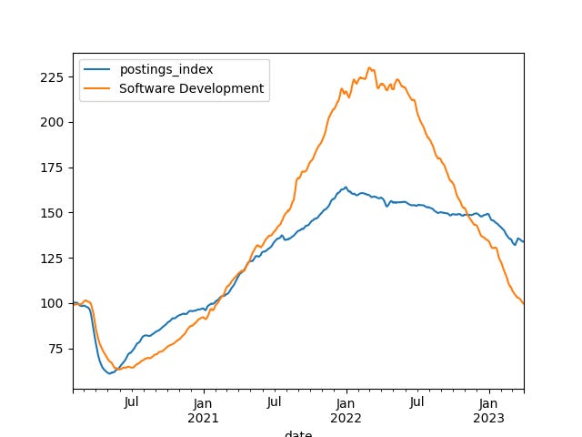
We can see that, compared with average job postings in the market, software jobs went down more than average in 2020, but then came roaring back up in 2022. Wow, there were lots of software positions open in 2022! We’re now down below the average in the market. We’re seeing the market cooling down, right in this plot. If people are having a tougher time finding software jobs… well, it’s reflected in the data.
Create a line plot, showing software job openings in the US vs. those in Australia, Canada, Germany, France, and Great Britain.
Finally, I want to create a data frame containing information from all six countries for which we have software-development data. This means creating a data frame much like aggregate_df for each country, then plotting the lines against one another.
I did that by creating a dictionary, in which the keys were country abbreviations, and the values were series.
Each data frame that I created was read from a file, and after creating the pivot table, I then assigned its “Software developer” column to our dict.
But I then assigned to the “name” attribute on each series. This name is usually pretty useless when you’re working with a series, but when you join several series together into a data frame, the name then becomes the column name. That said, I made sure that the names were unique, including the country names, to avoid namespace collisions.
Here’s the code that I wrote:
software_jobs = {}
for one_country in 'AU CA DE FR GB US'.split():
    print(one_country)
    filename = f'{one_country}/job_postings_by_sector_{one_country}.csv'

    sector_df = pd.read_csv(filename,
                     usecols=[0, 2, 4],
                     parse_dates=['date'],
                     names=['date', 'postings_index', 'display_name'],
                     header=1,
                     index_col=['date'])

    software_jobs[one_country] = sector_df.pivot_table(index='date', columns='display_name', values='postings_index')['Software Development']
    software_jobs[one_country].name = f'software_jobs_{one_country}'
With this dict of series in place, I could then turn them into a single data frame:
pd.concat(software_jobs.values(), axis='columns')I called software_jobs.values() to get the values from our dictionary, and then used “pd.concat” to concatenate them together. Usually, that will stack the data frames (or series) vertically — but if you use specify the axis to be “columns”, you’ll get a new data frame with the series as separate columns.
Then I can plot them against each other:
pd.concat(software_jobs.values(), axis='columns').plot.line(grid=True)The result looked like this:
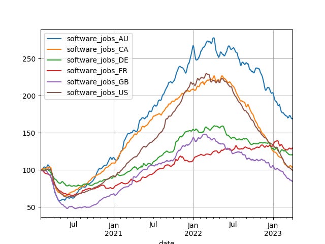
Note that by setting grid=True in my plot, it added grid lines. A nice touch, no?
We see that jobs in Australia went totally bananas, and haven’t come back down. (If you’re from Australia, let me know if this tracks with your experience!) If you’re from the UK, by contrast, things have been OK, but not amazing, peaking in January of last year — but even then wasn’t much better than before. And the US? It’s doing roughly as well as Canada, which probably reflects the closeness of the two economies as much as anything else.
And with that, our tour of employment stats concludes. Let me know what you think in the comments! And if you’re looking for a job… maybe you should think about moving to Australia?
Here’s my Jupyter notebook for this week: https://drive.google.com/file/d/1FSq6gGu5BAf7GX-DFO_D-PO_hlgZa9CS/view?usp=drive_link
I’ll be back next week with another question.
Reuven