


This week, we looked into recent trends in job postings, in an attempt to better understand how many companies are looking for new employees — as well as what sorts of jobs are being advertised, and if there are any differences across countries. We looked at data from the Indeed Hiring Lab, which reports on the state of hiring based on the number of job openings posted.
Data and five questions
The Indeed Hiring Lab publishes its data on GitHub (https://github.com/hiring-lab/job_postings_tracker) under a Creative Commons license. We'll be looking specifically at their "Jobs postings tracker" data, which includes daily updates on the number of total and new job postings. The report does not specify how many postings there are. Rather, it uses a number to show the relative number and growth in the job market.
The number of postings in February 2020 is taken as the baseline, and is labeled 100. A day with more job postings than were available in February 2020 has a number higher than 100, and one with fewer postings has a number lower than 100. So while we cannot use these numbers to know how many job postings there are, we can know whether things are trending up or down.
The GitHub repo includes a number of different related data sets. We'll explore several of them.
Paid subscribers, both to Bamboo Weekly and to my LernerPython+data membership program (https://LernerPython.com) get all of the questions and answers, as well as downloadable data files, downloadable versions of my notebooks, one-click access to my notebooks, and invitations to monthly office hours.
Learning goals for this week include working with multiple CSV files, dates and times, window functions, pivot tables, and plotting with Plotly.
Here are my five questions and tasks for this week, along with my solutions and explanations:
Read the US aggregate job postings into a Pandas data frame. Create a line plot showing the mean monthly values for both total and new job postings (seasonally adjusted). How is the recent job market compared with February 2020? Do things appear to be improving or declining?
I started off, as usual, by loading up Pandas and Plotly:
import pandas as pd
from plotly import express as px
I then defined filename to point to the CSV file containing aggregate job postings for the US, and used read_csv to load it into a data frame. I passed two keyword arguments, parse_dates and index_col, specifying the date column to each of them, so that date would be (a) treated as a datetime value and (b) would become our data frame's index:
filename = 'data/job_postings_tracker/US/aggregate_job_postings_US.csv'

df = pd.read_csv(filename,
                 parse_dates=['date'],
                 index_col='date')
The result? A data frame with 4,760 rows and 4 columns.
Having read this data into Pandas, I then wanted to create the line plot. My goal was to get a data frame with two columns, one for total job postings and one for new job postings. But I didn't want the daily reports; instead, I wanted the monthly mean.
I started by invoking drop to remove the jobcountry column.
I then used pivot_table to create the basic two-column data frame I needed in order to create the plot; by using the distinct values of variable for the columns, I was able to get those two columns almost immediately. The rows would remain the date column, and the values were indeed_job_postings_index_SA, the easy-to-remember column name for seasonally adjusted job postings:
(
    df
    .drop(columns='jobcountry')
    .pivot_table(index='date',
                columns='variable',
                values='indeed_job_postings_index_SA')
)
This gave me the daily value for total and new job postings. I wanted a monthly mean. This meant using resample along with mean to get the mean value for each month.
Finally, I used pipe along with px.line to create a line plot from the data frame. px.line will draw one line for each column in the data frame, meaning that we'll get one for new postings and another for total postings:
(
    df
    .drop(columns='jobcountry')
    .pivot_table(index='date',
                columns='variable',
                values='indeed_job_postings_index_SA')
    .resample('1ME').mean()
    .pipe(px.line)
)
Here is what I got:
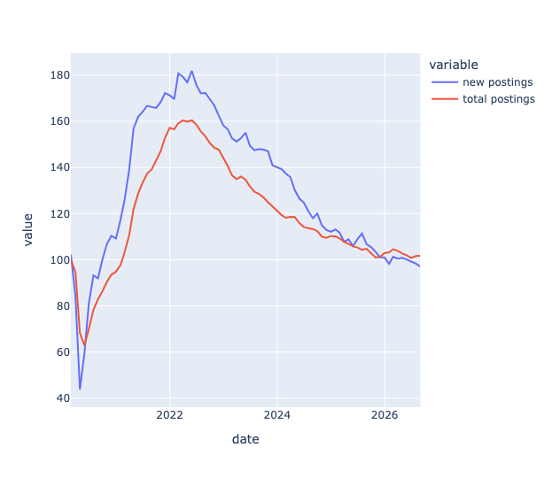
It's important to remember that the y axis doesn't represent the number of job postings. Rather, it's the number of job postings relative to February 2020. We can thus see that the number of job postings earlier this month were just about the same as in February 2020 — and come after a long, steady downturn from the peak of job offers in early 2022.
The lines show, visually, that the numbers are flattening out, meaning that they aren't getting worse, or at least not dramatically worse. But if you hear friends say that they feel like there are fewer jobs to apply for, these numbers would seem to bear them out.
The fact that the red (total postings) line is higher than the blue (new postings) line doesn't mean that there are more total postings than new ones! (Although we can certainly assume that's the case.) Rather, it means that total postings have declined less, relative to their February 2020 level, than new postings have relative to theirs. Each series has its own baseline, so you cannot directly compare the two numbers.
Look again at US aggregate job postings, at the mean monthly values for total (seasonally adjusted) job postings. Create a bar plot showing, per year, the number of months with positive changes, minus the number of months with negative changes (vs. the previous month).
In this problem, we only need total postings. After using drop to remove the jobcountry column, I then used loc and pd.col to keep only the rows where variable was 'total postings'. I actually used the two-argument version of loc, and in the second argument specified that I only wanted the indeed_job_postings_index_SA column to be returned:
(
    df
    .drop(columns='jobcountry')
    .loc[pd.col('variable') == 'total postings', 'indeed_job_postings_index_SA']
)
This gave me a series of job-posting numbers, with individual dates in the index. I again used resample to get the monthly mean:
(
    df
    .drop(columns='jobcountry')
    .loc[pd.col('variable') == 'total postings', 'indeed_job_postings_index_SA']
    .resample('1ME').mean()
)
However, I didn't want to know the mean for each month. Rather, I wanted to know if the mean had gone up or down since the previous month. Thus, after calculating the monthly mean, I then invoked diff (to get the comparison with the previous month).
But I didn't really care about the magnitude of the difference. Rather, I just wanted to know if it was positive or negative. I used a little trick to find out, invoking pipe and then using lambda to return the value of the series divided by its absolute value. This gave us either 1 or -1 for each month:
(
    df
    .drop(columns='jobcountry')
    .loc[pd.col('variable') == 'total postings', 'indeed_job_postings_index_SA']
    .resample('1ME').mean()
    .diff()
    .pipe(lambda s_: s_ / s_.abs())
)
But I wasn't interested in the month-by-month, either. Rather, I wanted to know the net number of gaining/losing months from each year.
I thus used resample again, this time with 1YE and sum, meaning that I wanted a sum per year. I then used pipe to invoke px.bar, giving a bar plot:
(
    df
    .drop(columns='jobcountry')
    .loc[pd.col('variable') == 'total postings', 'indeed_job_postings_index_SA']
    .resample('1ME').mean()
    .diff()
    .pipe(lambda s_: s_ / s_.abs())
    .resample('1YE').sum()
    .pipe(px.bar)
)
The result:
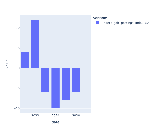
We can see that in each of the last few years, most months have had fewer job postings than the previous month. Which, again, confirms our anecdotal findings.