


[Administrative note: We'll have Pandas office hours later today! Office hours are for paid BW subscribers, but also for LernerPython+data subscribers, who can get the Zoom info on the (new!) personal calendar at https://lernerpython.com/my-account/my-calendar/. That personal calendar also has dozens of archived members-only lectures on a variety of topics.]
This week, I heard at least two podcasts that discussed the tight housing market in the United States, including Marketplace (https://www.marketplace.org/story/2026/07/28/as-mortgage-rates-stay-high-this-lender-is-seeing-buyers-accept-the-new-normal#as-mortgage-rates-stay-high-this-lender-is-seeing-buyers-accept-the-new-normal) and Slate Money (https://slate.com/podcasts/slate-money/2026/07/business-your-electricity-bill-is-growing-with-a-i). On both, I heard that there is just too little housing stock in the US. Reduced supply and increased demand will, pretty clearly, lead to higher prices.
I thought that it might be interesting to look at the American housing market. But then I remembered hearing that other countries were also faced with expensive housing, and thought that it might be interesting to compare the situation across the world, and see where housing prices have risen most dramatically, and where they haven't.
It's true that mortgage rates also influence the cost of housing – but because mortgages are so different in different countries, I decided to concentrate on the housing prices themselves, and see how much they have changed.
Data and six questions
This week, we'll look at historical housing-price data from the Bank for International Settlements (https://bis.org), an international organization that coordinates communication and policy among central banks. They collect and publish a wide variety of data from countries around the world, including residential property prices (https://data.bis.org/topics/RPP/data).
You can export the data from the BIS site, but we want more rows than it would actually allow us to export. For that reason, I suggest just retrieving the CSV file directly from the site:
https://stats.bis.org/api/v2/data/dataflow/BIS/WS_SPP/1.0/?format=csv&labels=both
Notice several parts of this request:
- I asked for
WS_SPP, the selected data, which is more than enough. Another option is to retrieveWS_DPP, with the detailed data. - I asked for the file in CSV format
- I asked for
labels=both, so that I would get both the shortened forms of some labels and columns, and also the long forms. This makes it far easier to understand some of the data. For example, it ensures that we'll get the name of each country, and not just the two-letter abbreviation.
The analysis comes in four different flavors, in two different axes:
UNIT_MEASUREcan be either 628 (relative to housing prices in 2010, which is defined to be 100) or 771 (percentage change from the same quarter in the previous year). If you're in 2011 and prices are twice what they were the year before, then it'll be a 628 measurement of 200, but a 771 measurement of 100 (percent). In general the 628 index is cumulative since 2010, while 771 covers only the most recent year — so outside of 2011 the two numbers won't correspond like this.VALUEdetermines whether inflation has been stripped out. N is "nominal", the raw price movement in local currency. R is "real", the same movement with consumer price inflation stripped out. If you're in 2011 and the 628 price is 200 for nominal, then that means what used to cost 100 now costs 200. But if there was 100 percent inflation (!), then the real price would actually be the same, and it would show 100 for real.
Paid subscribers, both to Bamboo Weekly and to my LernerPython+data membership program (https://LernerPython.com) get all of the questions and answers, as well as downloadable data files, downloadable versions of my notebooks, one-click access to my notebooks, and invitations to monthly office hours.
Learning goals for this week include cleaning data, dates and times, grouping, plotting with Plotly, regular expressions, and built-in window functions.
Here are this week's six questions, as well as my solutions and explanations:
Download the data from BIS, and turn it into a Pandas data frame. Create a date column (with a datetime dtype) from the TIME_PERIOD column, choosing the first day of the first month in the specified quarter. (So Q1 will be January 1st, Q2 will be April 1st, etc.) This means that you'll have four distinct dates for each year, one per quarter.
I started off, as usual, by loading both Pandas and Plotly:
import pandas as pd
from plotly import express as px
I then defined the URL as a variable, and used read_csv to read it directly from that URL into Pandas. I used the usecols keyword argument to indicate which of the file's columns I was actually interested in using:
url = "https://stats.bis.org/api/v2/data/dataflow/BIS/WS_SPP/1.0/?format=csv&labels=both"

df = (
    pd
    .read_csv(url,
             usecols=['VALUE', 'UNIT_MEASURE', 'TIME_PERIOD', 'OBS_VALUE',
                      'REF_AREA', 'Reference area']
             )
)
Why specify usecols? Often, we say that it's a good idea to indicate which columns we want because it'll reduce the amount of memory used by the data frame. And that is true, but it won't reduce the loading time; the entire CSV file needs to be downloaded and loaded into memory before Pandas can do anything with it. Mostly, I decided to pass usecols just to make the data frame easier to read and work with for me, the human writing these queries. I made sure to keep Reference area, the full-name version of each country and international aggregation, so that I could more easily understand and work with them.
This left the question of how to get datetime values from the TIME_PERIOD column in the original CSV file, which came in the format of YYYY-QN, with a four-digit year and a one-digit quarter. I wanted to use pd.to_datetime, a function that creates datetime values from strings, but it doesn't (so far as I know) support quarter numbers.
I decided to create two columns, year and quarter, with the individual parts of this column. Then I can create a month column, translating the quarter numbers into month names. Then I can create a date column with pd.to_datetime , using the year and month names.
I did all of this with the assign method, which returns a new data frame identical to the one on which it was invoked, but with one or more new columns added. assign uses keyword arguments, with the keyword used as the name of the new column and its value as the value – unless it's a callable, in which case the result of the callable is used as the value.
In modern Python, dictionaries are kept in chronological order, and that applies to keyword arguments, too. For that reason, later keywords in assign can refer to earlier ones, saving us from needing multiple assignments. Here is what I did to get the year, quarter, and month columns:
- For
year, I took advantage of the fact thatTIME_PERIODis a string, and that the year is always in the first four characters of that string. I thus usedstr.slice, the method equivalent of Python's built-inslicefunction that we normally ignore in favor of[start:end]syntax. I retrieved the first four characters fromTIME_PERIODand assigned them toyear. Normally, I would then turn the values into an integer – but I'll soon be using them withpd.to_datetime, which expects a string, so that's not needed. - For
quarter, I did roughly the same thing, usingstr.getwith an argument of -1, to get the final character. - For
month, I used themapfunction, using a dictionary as a translation table. Each of the four quarter numbers (really strings) was set to be a key in an inline dict, with the full month names as the values.
With these in place, I was able to invoke pd.to_datetime on the combination of year and month, passing the format string '%Y-%B', which means, "four-digit year, a hyphen, and the full name of the month."
df = (
    pd
    .read_csv(url,
             usecols=['VALUE', 'UNIT_MEASURE', 'TIME_PERIOD', 'OBS_VALUE',
                      'REF_AREA', 'Reference area']
             )
    .assign(year = pd.col('TIME_PERIOD').str.slice(0, 4),
            quarter = pd.col('TIME_PERIOD').str.get(-1),
            month = pd.col('quarter').map({'1':'January', '2':'April',
                                           '3':'July', '4':'September'}),
            date = lambda df_: pd.to_datetime(
                            df_['year'] + '-' + df_['month'],
                            format='%Y-%B'))
)
I then finished this off by invoking drop to remove the columns that will no longer come in handy:
df = (
    pd
    .read_csv(url,
             usecols=['VALUE', 'UNIT_MEASURE', 'TIME_PERIOD', 'OBS_VALUE',
                      'REF_AREA', 'Reference area']
             )
    .assign(year = pd.col('TIME_PERIOD').str.slice(0, 4),
            quarter = pd.col('TIME_PERIOD').str.get(-1),
            month = pd.col('quarter').map({'1':'January', '2':'April',
                                           '3':'July', '4':'September'}),
            date = lambda df_: pd.to_datetime(
                            df_['year'] + '-' + df_['month'],
                            format='%Y-%B'))
    .drop(columns=['year', 'quarter', 'month', 'TIME_PERIOD'])
)
The resulting data frame contains 35,520 rows and 6 columns.
But wait: There's an easier way to turn quarters into timestamps. We can just use PeriodIndex and then to_timestamp, as indicated here:
(
    pd
    .read_csv(url,
             usecols=['VALUE', 'UNIT_MEASURE', 'TIME_PERIOD', 'OBS_VALUE',
                      'REF_AREA', 'Reference area']
             )
    .assign(date = lambda df_: pd.PeriodIndex(df_['TIME_PERIOD'], freq='Q').to_timestamp())
)
Same results, with much less fuss!
Create a line plot showing, over time, the percentage change in nominal housing costs in emerging economies vs. advanced economies. Do we see prices changing more dramatically in one rather than the other? Repeat this for real values; do things change? (Note that aggregates start from about 2008, as opposed to countries, which start earlier.)
To answer this question, we want to see whether prices change more in emerging economies or advanced economies. These are the two aggregated groups for which we have data, and it'll be interesting to see where (and when) their housing prices went up.
In order to perform this analysis, we first need to filter the rows, to keep only the ones that are of interest:
- We only want rows where
REF_AREAis an aggregation (rather than a country). Fortunately, it's easy to do that; aggregations start with digits, rather than letters. We can use thestr.getmethod to grab the first character, and then can invokestr.isdigitto check if it's a digit. Truth be told, I originally planned to usefilterand a regular expression, but decided that this was a bit faster and easier – especially sincefilteronly works on the index. Notice that I usedpd.colhere, rather than the old-stylelambdathat we used before Pandas 3. - We only want the percentage changes, meaning that each data point will show how different housing prices were vs. the same quarter the previous year. That's just a matter of keeping
UNIT_MEASUREof 771. - We want nominal values, so we search for
VALUEofN.
For all of these, I used loc, which allows us to filter rows (and columns, albeit not here) by any criteria we want.
With these in place, we then want to have two columns, one for each reference area (emerging and advanced), with rows for the dates. That'll allow us to easily plot the two values against one another. For that, we can use pivot_table, which organizes it nicely for us.
Finally, we can use pipe along with px.line to get a nice line plot using Plotly:
(
    df
    .loc[pd.col('REF_AREA').str.get(0).str.isdigit()]
    .loc[pd.col("UNIT_MEASURE") == 771]
    .loc[pd.col('VALUE') == 'N']
    .pivot_table(columns='Reference area',
                index='date',
                values='OBS_VALUE')
    .pipe(px.line)

)
Here's the resulting plot:
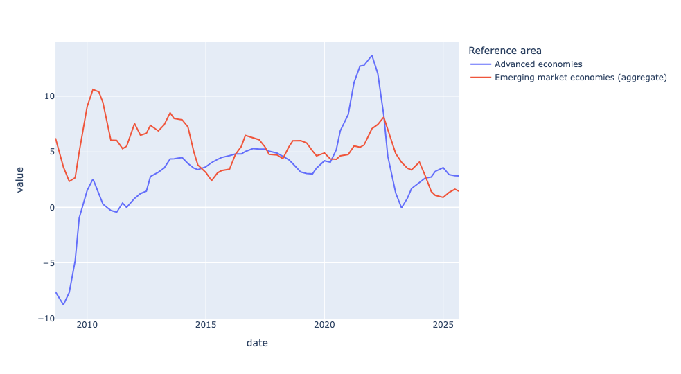
We can even see some times when housing prices dropped, especially just before 2010. Which corresponds to the Great Recession, when housing prices in the United States – and to some degree, elsewhere in the world – dropped like a stone, in part because so many people lost their homes.
What if we look at real prices (i.e., including inflation) rather than nominal ones? Here's the query:
(
    df
    .loc[pd.col('REF_AREA').str.get(0).str.isdigit()]
    .loc[pd.col("UNIT_MEASURE") == 771]
    .loc[pd.col('VALUE') == 'R']
    .pivot_table(columns='Reference area',
                index='date',
                values='OBS_VALUE')
    .pipe(px.line)

)
As you can see, it's identical to the previous one, except that we look for R, rather than N. But the plot looks exactly the same:
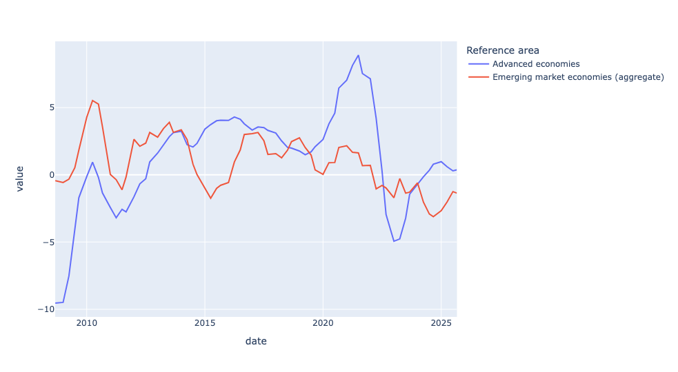
The plots look the same, but look carefully at the y axis: With nominal prices, the top number is about 12, showing a 12 percent increase in prices. But with real prices, the top number is about 8.
In other words: In 2023, nominal house prices in advanced economies were roughly flat while real prices fell about 5 percent – because inflation was running at 5-9 percent. Housing didn't stop getting more expensive in currency terms; it got materially cheaper relative to everything else people buy.