


[Administrative note: I'm very excited to share my new LernerPython practice system, which lets you solve Python, Pandas, and Git exercises in your browser — no installation necessary! All exercises at LernerPython.com now use this, and I'll be using it in my corporate training, as well. My BFF Claude and I have been spending lots of time on this in the last week; you can get a preview, with six free exercises, at https://practice.lernerpython.com/. Tell me what you think, and where/how it can improve!]
Everyone is talking about inflation. And central bankers are paying attention; the European Central Bank just raised interest rates (https://apnews.com/article/ecb-european-central-bank-interest-rates-fed-eurozone-2a2c26c580961a979372393706a7f93c), and incoming Federal Reserve chair Kevin Warsh is expected to keep rates high, or even raise them, in the coming months (https://www.msn.com/en-us/money/markets/new-fed-chair-kevin-warsh-is-squarely-focused-on-inflation-get-set-for-interest-rates-to-stay-high/ar-AA25XxUT).
This week, given all of the inflation talk (and worry), we looked at historical inflation data from the Organization for Economic Cooperation and Development (OECD). They collect, analyze, and distribute information from their member nations, allowing us to follow, understand, and even predict a variety of trends. We looked at where inflation is rising, and what sectors of the economy are most affected by it.
Data and six questions
To retrieve the data, go to the OECD data explorer (https://data-explorer.oecd.org/), and choose the consumer price indices. From there, select:
- national methodology
- consumer price index
- percent per annum
- all top-level expenditures, including total
- 240 most recent months (i.e., 20 years)
Download that as a filtered CSV file; the URL to get all of these at once is here:
Paid subscribers, both to Bamboo Weekly and to my LernerPython+data membership program (https://LernerPython.com) get all of the questions and answers, as well as downloadable data files, downloadable versions of my notebooks, one-click access to my notebooks, and invitations to monthly office hours.
Learning goals for this week include working with CSV files, dates and times, grouping, joins, pivot tables, correlations, and plotting with Plotly.
Here are my six questions for this week, along with my solutions and explanations:
Load the OECD data into a Pandas data frame. From the TIME_PERIOD column, create a datetime column for when the measurement was taken. Remove the European Union and euro area measurements. For the most recent month with data, what five countries had the highest total inflation rate? Which five had the lowest? Ignore countries for which we have no data.
I started off, as usual, by loading up Pandas and Plotly:
import pandas as pd
from plotly import express as px
I then loaded the file, using read_csv. I used the pyarrow engine, mostly because I worked with a number of different OECD data files before setting on this one, and wanted to make sure it loaded in a reasonable amount of time.
I passed the usecols keyword argument, significantly reducing the number of columns loaded into memory – which has a big effect on the size of the data frame, and then how quickly we can execute queries.
The one column that wasn't quite right for my purposes was TIME_PERIOD, a string in the format of YYYY-MM. An invocation of assign, together with pd.to_datetime and the format keyword argument, allowed me to read that column into the new datetime column. I then invoked drop to remove the unneeded column.
I also wanted to remove the non-state groups tracked by the OECD, namely the euro area, European Union, and the OECD. In the first case, I used a combination of pd.col along with str.lower and str.startswith. But that got me rows that did fit these criteria. I flipped the logic on that with the ~ operator. Removing the OECD-related rows was similar, but easier, just using a != comparison:
filename = 'data/bw-175-oecd.csv'

df = (
    pd
    .read_csv(filename, engine='pyarrow',
             usecols=['Reference area', 'Expenditure', 'OBS_VALUE', 'TIME_PERIOD'])
    .assign(datetime = lambda df_: pd.to_datetime(df_['TIME_PERIOD'], format='%Y-%m'))
    .drop(columns=['TIME_PERIOD'])
    .loc[ ~pd.col('Reference area').str.lower().str.startswith('euro')]
    .loc[ pd.col('Reference area') != 'OECD']
)
The result, after all this, was a data frame with 35,255 rows and 4 columns.
I was curious to know the inflation rate for the most recent month for which we have data on the total inflation, and wanted to retrieve it, comparing the various countries.
I started by using loc to filter the rows, saying that I only wanted those whereExpenditure was 'Total':
(
    df
    .loc[pd.col('Expenditure') == 'Total']
)
I then wanted to reshape the data, getting a new data frame back in which the columns were country names (Reference area) and the index was the dates on which the data was collected. For that, I used pivot_table:
(
    df
    .loc[pd.col('Expenditure') == 'Total']
    .pivot_table(columns='Reference area',
                index='datetime',
                values='OBS_VALUE')
)
I wanted the most recent data, which I knew – thanks to the fact that pivot_table, by default, sorts the index – would be in the final row. I used iloc[-1] to get that final row, giving me a series of the most recent month's data. This returned a series of floats, with an index of country names. I then invoked nlargest(5) to get the five elements with the highest inflation rates; the country names were right there, in the index:
(
    df
    .loc[pd.col('Expenditure') == 'Total']
    .pivot_table(columns='Reference area',
                index='datetime',
                values='OBS_VALUE')
    .iloc[-1]
    .nlargest(5)
)
The results:
Reference area	2026-05-01 00:00:00
Bulgaria	6.851792
Lithuania	5.530373
Greece	5.222641
Iceland	5.1
Belgium	4.080906
All of these inflation numbers are high – certainly, higher than the 2 percent that central banks generally aim to achieve – but they aren't the sort of outrageous inflation rates that we saw a few years ago, to say nothing of the 1970s.
What about the lowest rates? I ran the same query, but using nsmallest in the end:
(
    df
    .loc[pd.col('Expenditure') == 'Total']
    .pivot_table(columns='Reference area',
                index='datetime',
                values='OBS_VALUE')
    .iloc[-1]
    .nsmallest(5)
)
The results:
Reference area	2026-05-01 00:00:00
Costa Rica	-0.9737132
Switzerland	0.6158652
Sweden	0.7815018
Saudi Arabia	1.754077
Hungary	1.805675
Costa Rica has negative inflation? If so, that sounds great... until you learn that deflation, when prices go down, is worse than inflation. Everyone waits to buy things, because they know that prices will be going down, and then the economy has a lot of trouble. This central banking thing isn't for the weak of heart!
I decided to turn this data into a bar plot. I grabbed the final row from the pivot table, removed NaN values, sorted them (to make things prettier), and then used pipe to invoke the px.bar function on our data:
(
    df
    .loc[pd.col('Expenditure') == 'Total']
    .pivot_table(columns='Reference area',
                index='datetime',
                values='OBS_VALUE')
    .iloc[-1]
    .dropna()
    .sort_values()
    .pipe(px.bar)
)
The result:
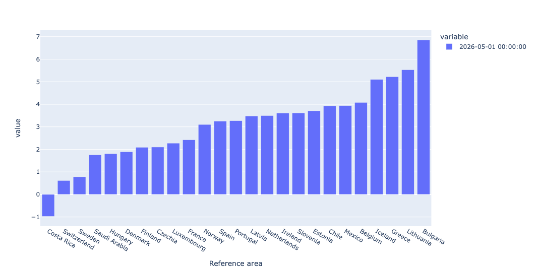
This shows, in graphical form, how widely spread inflation numbers are. That makes life for the European Central Bank a bit trickier, since they have to balance many different EU members. (And no, I'm not sure why US data wasn't provided.)
In data from the latest month, which top-line category of prices was, on average, the highest? (You should ignore "Total.") Display the values in a bar plot. Now display those same top-level values in a bar plot from 1 year ago, side-by-side with this year's. What has changed, if anything?
I started this query by keeping only data from the most recent report (May 1, 2026) and removing rows measuring the 'Total' inflation rate. That gave all of the inflation rates, for all countries, in all categories:
(
    df
    .loc[pd.col('datetime') == '2026-05-01']
    .loc[pd.col('Expenditure') != 'Total']
)
To get the mean value for each inflation category, I used groupby, invoking mean on each distinct value of Expenditure. I then invoked sort_values to get a clear picture of which values were higher and lower, and then invoked round just to make the numbers easier to read:
(
    df
    .loc[pd.col('datetime') == '2026-05-01']
    .loc[pd.col('Expenditure') != 'Total']
    .groupby('Expenditure')['OBS_VALUE'].mean()
    .sort_values()
    .round(2)
)
The results:
Expenditure	OBS_VALUE
Housing	0.35
Goods	2.21
All items non-food non-energy	2.9
Services less housing (Housing excluding imputed rentals for housing)	2.93
Services	3.77
Housing excluding imputed rentals for housing	4.07
Energy	9.14
In other words, housing (excluding rentals) went up just a little, at a mean annualized rate of 0.35 percent. But energy? It's at 9.14 percent.
Here's how we can get a plot of these results:
(
    df
    .loc[pd.col('datetime') == '2026-05-01']
    .loc[pd.col('Expenditure') != 'Total']
    .groupby('Expenditure')['OBS_VALUE'].mean()
    .sort_values()
    .round(2)
    .pipe(px.bar)
)
The plot:
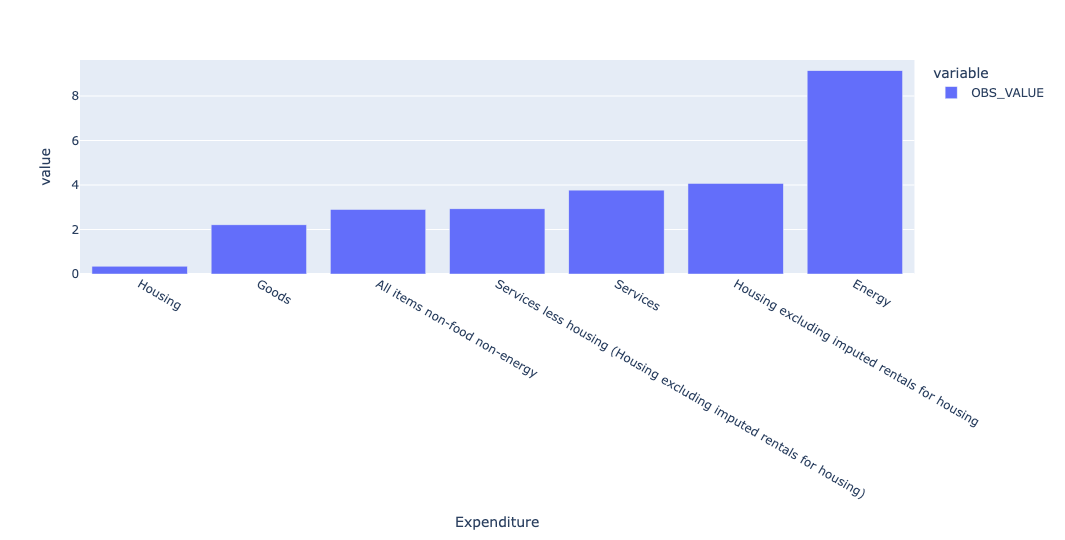
Energy is clearly far higher than any other, likely a result of the war in Iran, which has raised energy prices worldwide. We can find out by querying not only last month, but also a year before that, and comparing the inflation rates. This time, instead of retrieving one row and invoking groupby, I first invoked pivot_table, and then grabbed the rows that were of interest, using iloc:
(
    df
    .loc[pd.col('Expenditure') != 'Total']
    .pivot_table(index='datetime',
                columns='Expenditure',
                values='OBS_VALUE')
    .iloc[[-11, -1]]
)
I then used T to transpose the resulting pivot table, and used pipe to invoke px.bar. By default, Plotly likes to do stacked bar plots, so I specified barmode='group' to avoid that:
(
    df
    .loc[pd.col('Expenditure') != 'Total']
    .pivot_table(index='datetime',
                columns='Expenditure',
                values='OBS_VALUE')
    .iloc[[-11, -1]]
    .T
    .pipe(px.bar, barmode='group')
)
The result:
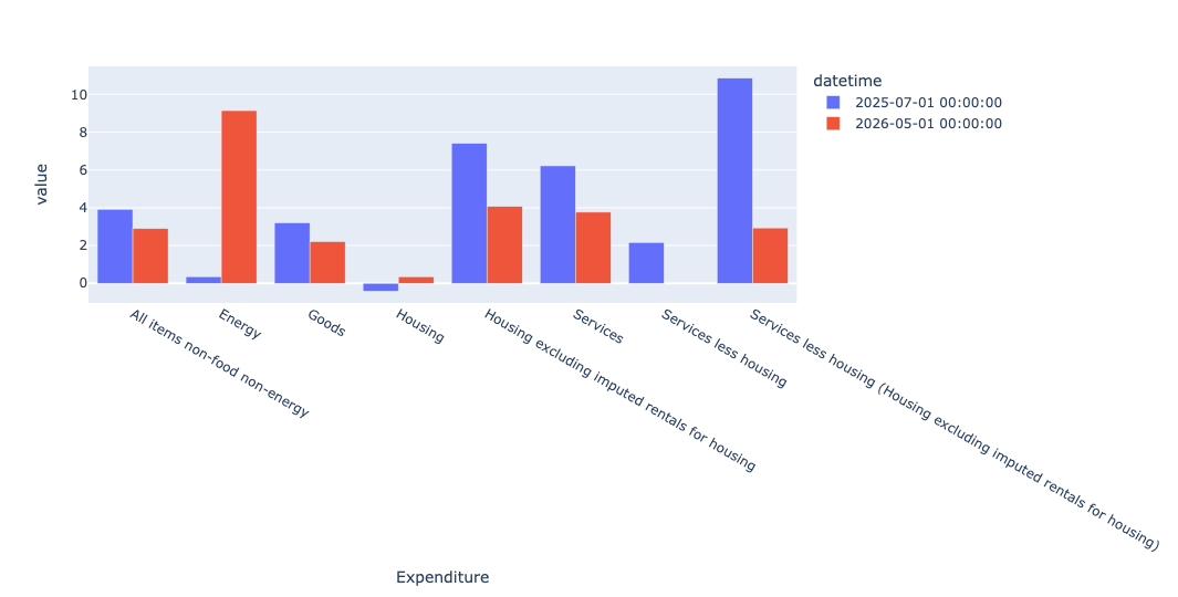
In this bar plot, the red bars represent this year (2026), and the blue bars represent last year (2025), almost certainly reflecting the war with Iran.
You can see the stark contrast between energy inflation last year and this year. Housing inflation, at least where they exclude imputed rental prices, has gone down.