


Inflation in the United States has been going down steadily over the last year. But that’s an overall measure; different parts of the economy will naturally rise and fall at different rates. A Washington Post article from earlier this week pointed to confusion regarding rental housing, and whether those prices are rising or declining — and at what rate that change is happening. (You can read the article at https://wapo.st/3SXVXEM .)
The confusion arises, in part, because landlords and tenants don’t have to submit prices to any central database. As a result, the government and researchers ask for individuals to cooperate, sharing rental prices with them on a regular basis. With a good sample and regular reporting, it should be possible to estimate the cost of rent. But it’ll just be a sample and an estimate — and different surveys, using different methods to sample the population, will almost certainly get different results.
I actually know a little bit about this from personal experience: When I was in graduate school just outside of Chicago, I was selected by the Bureau of Labor Statistics (BLS) to be one of their data points. Every few months, a researcher would call to ask how much we were paying in rent, and whether that had changed recently. The researcher was excited (as only a researcher can be) when my rent went up, and was disappointed when I told her that we were returning to Israel, and that I would no longer be able to provide her with data.
Data and six questions
This week, we looked at data from Apartment List, an online real-estate agency for rentals. Apartment List was cited in the Washington Post article as a data set showing different numbers than those used by the Bureau of Labor Statistics, and their data set is freely downloadable. I thought that it could provide us with some insights into rental costs — and also let us explore some Pandas features.
The data itself is downloadable as a CSV file from
https://www.apartmentlist.com/research/category/data-rent-estimates
Scroll to the bottom of the screen, and you'll be able to choose a research report to download. We'll use the "historic rent estimates, January 2017 - present.
There isn’t a data dictionary for this data set, but it does seem to be largely self documenting. The data provides information at several different levels of granularity, from national (i.e., the entire United States) to individual metropolitan areas. It also breaks the data down by the number of bedrooms in the rental unit, specifying 1, 2, or “overall.” (I’m not sure if the “overall” column includes the other two.)
Rental prices for each year-month combination is in a column whose name is in the format YYYY_MM, with a four-digit year and a two-digit month.
I gave you six tasks and questions this week. As always, a link to the Jupyter notebook I used to answer these questions is at the bottom of this newsletter.
Here are my solutions
Read the rent estimates into a data frame. Create a line plot showing the estimated rent in each month at the national level, with a separate line for each number of bedrooms (1, 2, and any).
The first thing to do, as usual, is load up Pandas:
import pandas as pdNext, we need to load the CSV file into a data frame using “read_csv”:
filename = 'Apartment_List_Rent_Estimates_2024_02.csv'
df = pd.read_csv(filename)
In theory, I could have used the PyArrow engine to load the CSV file. But the file is so small that I decided it wouldn’t really make any difference.
The resulting data frame has 3405 rows and 94 columns. That’s a rather large number of columns, but it reflects the fact that we have many months’ worth of data, each of which is in a separate column.
Next, we have to trim down our data frame, keeping only those rows with national-level data. We can do that by filtering (using “loc”) the rows based on the “location_type” value:
(
    df
    .loc[df['location_type'] == 'National']
)
This dramatically reduces the size of our data frame, returning only three rows — one for 1-bedroom apartments, another for 2-bedroom apartments, a third for “overall” number of bedrooms.
To get our data, I’ll need the “bed_size” (i.e., number of bedrooms) column and the data columns themselves, and nothing else. I’ll use the “filter” method to keep only those columns that match a particular pattern. In this case, the pattern will be a regular expression, saying that:
We want to start the match at the start of the string (^)
We want to look for either of these two patterns:
the string “bed_size”
four digits, _, and another two digits
The end of the pattern needs to match the end of the string ($)
(Confused by regular expressions? Check out my completely free e-mail course, “Regexp Crash Course,” at https://RegexpCrashCourse.com/ .)
This returns a new data frame, containing only the date columns and “bed_size”:
(
    df
    .loc[df['location_type'] == 'National']
    .filter(regex=r'^bed_size|\d\d\d\d_\d\d$')
)
I want to create a line plot in which the dates provide the X axis and the different bedroom counts are the Y axis. I’ll thus move the “bed_size” column into the index using “set_index”:
(
    df
    .loc[df['location_type'] == 'National']
    .filter(regex=r'^bed_size|\d\d\d\d_\d\d$')
    .set_index('bed_size')
)
I’ll then transpose the data frame, turning the rows into columns and the columns into rows, using the “T” alias for the “transpose” method:
(
    df
    .loc[df['location_type'] == 'National']
    .filter(regex=r'^bed_size|\d\d\d\d_\d\d$')
    .set_index('bed_size')
    .T
)
Finally, I’ll invoke “plot.line”, which will use the index for the X axis and the columns for the Y axis. I asked Pandas to add grid lines to the plot, which makes it a bit easier to read:
(
    df
    .loc[df['location_type'] == 'National']
    .filter(regex=r'^bed_size|\d\d\d\d_\d\d$')
    .set_index('bed_size')
    .T
    .plot.line(grid=True)
)
Here’s what I got:
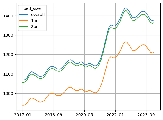
We can see that the rents really skyrocketed in 2021, and that they’ve bounced up and down a bit over the year and a half or so. And obviously, rents for 1-bedroom apartments are going to be lower than those for 2-bedroom apartments, but we do see very similarly shaped curves.
We can also see why people might feel like inflation is still rather high; since 2017, average rents have gone up by quite a lot. Most people aren’t going to look at the last part of the graph and say, “I see that rents are now staying stable, or even declining a bit.” Rather, they’ll compare their current rent with what they paid in 2017, and see a massive uptick.
Calculate, at a national level, the percentage change in rent from month to month. Create a line plot showing that percentage change.
The previous graph showed changes in the rents themselves. I now wanted you to calculate the percentage by which rents changed each month, and then plot that change.
The key to answering this question is the “pct_change” method, which returns a new data frame with an identical index and columns — but showing the percentage change that each value has from the value in the above row. (As a result, the first row has a NaN value.) By running this on the data frame after transposing it, we can graph the percentage change from month to month:
(
    df
    .loc[df['location_type'] == 'National']
    .filter(regex=r'^bed_size|\d\d\d\d_\d\d$')
    .set_index('bed_size')
    .T
    .pct_change()
    .plot.line(grid=True)
)
Here’s the resulting graph:
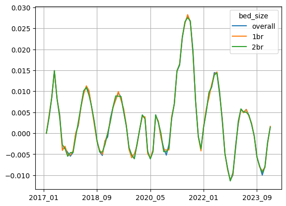
Wherever this graph has a value below 0, it means that the average national rent went down, relative to the previous month’s value. And wherever it’s above 0, it means that the average national rent increased from the previous month. The greater the value above 0, the greater the degree of increase.
We can see that in the last year, the average rent declined (i.e., was below 0) quite a bit of the time. But in the last few months, the graph has been ticking upward, becoming positive in just the last month or two — meaning that they’re now rising slowly, as opposed to falling slowly. By definition, this means that they are contributing to inflation. That doesn’t seem to contradict the story that we’re getting from the Fed and BLS, but it might be a more moderate view of that data. (Quite frankly, I’m still kicking myself a bit for not having downloaded and analyzed that data side-by-side with these values, seeing just how different they were from one another.)
Let's now see if rents are higher in counties with large populations than with small ones. To do this, we'll define a small county as one with a population < the 25th quantile, a large county as one with a population > the 75th quantile, and all others as medium counties. Create a line plot showing the mean estimated rent. Dates should be along the x axis. The plot should have three lines, one for each of small, medium, and large counties (by population). Do we see any difference?
To answer this question, we’ll still need all of the rental data from the YYYY_MM columns. But we’ll be looking at rows with a location_type of “County”. Let’s thus start off by keeping only those rows:
(
    df
    .loc[lambda df_: df_['location_type'] == 'County']

)
In order to produce this graph, we’ll need to create a new column (“category”) that’ll be based on the population. There are a variety of ways that I could do this, but my favorite is “pd.cut”, which gives us a categorical column based on a numeric one.
We tell “pd.cut” what the numeric boundaries should be in the “bins” keyword argument, and then what the labels should be in the “labels” keyword argument. (Don’t forget that for us to have three labels, we need four bins!) It’s nice to pass “include_lowest=True” as well, so that the left edge of each category is included without subtracting 1 or the like.
Combined with “assign”, which takes a lambda expression, we can create our “category” column as follows:
(
    df
    .loc[lambda df_: df_['location_type'] == 'County']
    .assign(category=lambda df_: pd.cut(
        df_['population'],
        bins=[df_['population'].min(),
              df_['population'].quantile(0.25),
              df_['population'].quantile(0.75),
              df_['population'].max()],
        labels=['small', 'medium', 'large'],
        include_lowest=True
    ))
)
Notice that I set the bins not with specified numbers, but rather by performing a calculation on our “population” column. I make sure to retrieve df_[‘population’], using the parameter to our lambda expression, in order to only use the values from the county-related rows. If I had asked about df[‘population’], I would have gotten all of the rows, which undoubtedly would have thrown off the min, max, and “quantile” calculations.
With this in place, we can now tell Pandas to keep only the “category” column, along with those with YYYY_MM names using “filter”:
(
    df
    .loc[lambda df_: df_['location_type'] == 'County']
    .assign(category=lambda df_: pd.cut(
        df_['population'],
        bins=[df_['population'].min(),
              df_['population'].quantile(0.25),
              df_['population'].quantile(0.75),
              df_['population'].max()],
        labels=['small', 'medium', 'large'],
        include_lowest=True
    ))
    .filter(regex=r'\d\d\d\d_\d\d|category')
)
We’re interested in calculating the mean for each category of county. This means running “groupby” on our “category” column, and telling Pandas to calculate the mean value per category. We don’t have to specify on which column(s) we want to use, because we want to use all of them.
Note that I passed observed=True as a keyword argument to “groupby”, telling it to ignore any categories for which we lack values. If we don’t pass this keyword argument, we (currently) get a warning from Pandas, telling us that the default will be changing in the future:
(
    df
    .loc[lambda df_: df_['location_type'] == 'County']
    .assign(category=lambda df_: pd.cut(
        df_['population'],
        bins=[df_['population'].min(),
              df_['population'].quantile(0.25),
              df_['population'].quantile(0.75),
              df_['population'].max()],
        labels=['small', 'medium', 'large'],
        include_lowest=True
    ))
    .filter(regex=r'\d\d\d\d_\d\d|category')
    .groupby('category', observed=True).mean()
)
Finally, we invoke “T” and “plot.line” again, to plot the mean rent, over time, for each size of county in the United States:
(
    df
    .loc[lambda df_: df_['location_type'] == 'County']
    .assign(category=lambda df_: pd.cut(
        df_['population'],
        bins=[df_['population'].min(),
              df_['population'].quantile(0.25),
              df_['population'].quantile(0.75),
              df_['population'].max()],
        labels=['small', 'medium', 'large'],
        include_lowest=True
    ))
    .filter(regex=r'\d\d\d\d_\d\d|category')
    .groupby('category', observed=True).mean()
    .T
    .plot.line()
)
Here’s the result of the above query:
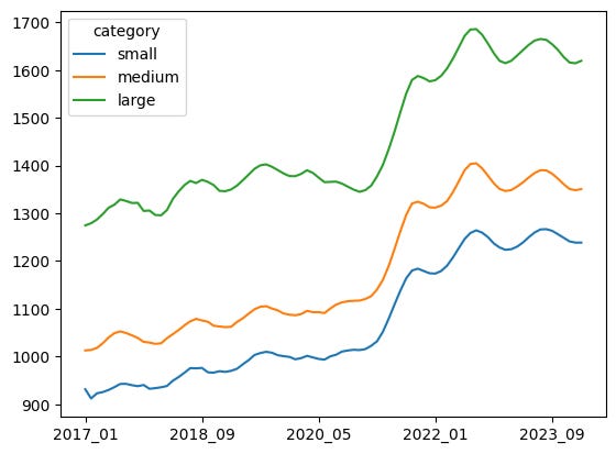
I’m not surprised to find that the size of the county is clearly correlated with the rent; more populated areas, such as cities, are almost always going to be more expensive than more rural areas.
I was, however, a bit surprised to see just how closely these different categories of rents moved up and down in lockstep. I think that I expected more differences between them, although I didn’t have a strong sense of just how they would be different.
What five states have the highest mean rent in the most recent (February 2024) report?
We’ve looked at rents at the national and county level. Now I’m curious to know which states have the most expensive rental prices. How can we do that?
First, we’ll use “loc” to keep only those rows in which “location_type” is “State”. While we’re at it, since I know precisely which two columns I want, I can use the two-argument form of “loc” (i.e., row-selector, column-selector) to get the “location_name” and “2024_02” columns, which we’ll need:
(
    df
    .loc[lambda df_: df_['location_type'] == 'State',
        ['location_name', '2024_02']]
)
We can now use “groupby” to calculate the mean rent value in February 2024 per state:
(
    df
    .loc[lambda df_: df_['location_type'] == 'State',
        ['location_name', '2024_02']]
    .groupby('location_name').mean()
)
We get back a one-column data frame, which is a tiny bit annoying. I’ll thus select this column, to get a series:
(
    df
    .loc[lambda df_: df_['location_type'] == 'State',
        ['location_name', '2024_02']]
    .groupby('location_name').mean()
    ['2024_02']
)
Finally, I’ll invoke “nlargest” to get the five states with the highest rent in February 2024:
(
    df
    .loc[lambda df_: df_['location_type'] == 'State',
        ['location_name', '2024_02']]
    .groupby('location_name').mean()
    ['2024_02']
    .nlargest(5)
)
The results:
location_name
District of Columbia    2115.666667
Hawaii                  2077.000000
California              2037.000000
Massachusetts           1816.333333
New Jersey              1816.000000
Name: 2024_02, dtype: float64
I must admit that I expected New York to be in this list. However, we have to remember that New York City is very expensive, but that it’s not the entirety of New York State, and this query has to do with the states. In that way, it’s not surprising that Washington, DC is at the top of the list; it’s only a city, and thus has no suburbs or rural areas to balance out its rental costs.
Create a table in which the index contains state names, the columns are the number of bedrooms, and the values are the mean rents starting in January 2023.
Next, I asked you to create a data frame based on “df”, in which:
- The index contains the different state names
- The columns contain the different number of bedrooms
- The values are mean rents, starting in January 2023.
This is a pivot table, a two-dimensional “groupby” operation that shows us all of the combinations of groupings we can get with two categorical columns and one numeric column.
First, let’s keep only the rows and columns that we want via a combination of “loc” and “filter”:
(
    df
    .loc[lambda df_: df_['location_type'] == 'State']
    .filter(regex=r'location_name|bed|202[34]_\d\d')
)
Now that we’ve pared down our data frame, we will run “pivot_table”, specifying:
- The index will contain unique values from the “location_name” column
- The columns will contain unique values from the “columns” column
- The values will come from “2023_01”
The query looks like this:
(
    df
    .loc[lambda df_: df_['location_type'] == 'State']
    .filter(regex=r'location_name|bed|202[34]_\d\d')
    .pivot_table(index='location_name', columns='bed_size', values='2023_01')
)
I should note that by default, “pivot_table” uses “mean” on the values.
Finally, I thought it would be nice to get commas every three digits, given that we’re dealing with lots of numbers. I did this with “map”, applying an anonymous function that puts the value inside of an f-string, giving us the opportunity to apply the format code “:,0f”. That means:
- Use commas every 3 digits
- Treat it as a float, and display 0 (yes, zero!) digits after the decimal point
Here’s the complete query:
(
    df
    .loc[lambda df_: df_['location_type'] == 'State']
    .filter(regex=r'location_name|bed|202[34]_\d\d')
    .pivot_table(index='location_name', columns='bed_size', values='2023_01')
    .map(lambda x: f'{x:,.0f}')
)
Here is the result I got:
bed_size                1br    2br overall
location_name
Alabama                 817    956   1,002
Alaska                1,062  1,427   1,416
Arizona               1,192  1,402   1,424
Arkansas                696    858     893
California            1,853  2,188   2,134
Colorado              1,438  1,669   1,654
Connecticut           1,264  1,601   1,527
Delaware              1,182  1,394   1,401
District of Columbia  2,072  2,127   2,096
Florida               1,343  1,588   1,591
Georgia               1,285  1,294   1,369
Hawaii                1,701  2,259   2,226
Idaho                   839  1,047   1,117
Illinois              1,144  1,312   1,310
Indiana                 875  1,064   1,055
Iowa                    759    991     966
Kansas                  809    977     998
Kentucky                788    963     969
Louisiana               877  1,032   1,034
Maryland              1,446  1,765   1,723
Massachusetts         1,460  1,963   1,846
Michigan                863  1,108   1,075
Minnesota             1,117  1,338   1,265
Mississippi             801    942     985
Missouri                893  1,065   1,072
Montana                 811  1,039   1,033
Nebraska                929  1,093   1,085
Nevada                1,166  1,384   1,454
New Hampshire         1,113  1,554   1,426
New Jersey            1,555  1,931   1,822
New Mexico              869  1,029   1,051
New York              1,683  1,780   1,769
North Carolina        1,150  1,176   1,252
North Dakota            815    969     973
Ohio                    823  1,059   1,039
Oklahoma                784    950     965
Oregon                1,267  1,475   1,492
Pennsylvania          1,033  1,261   1,227
Rhode Island          1,007  1,367   1,302
South Carolina        1,119  1,178   1,230
South Dakota            716    920     886
Tennessee             1,035  1,127   1,183
Texas                 1,166  1,306   1,314
Utah                  1,137  1,320   1,395
Virginia              1,487  1,488   1,599
Washington            1,486  1,666   1,695
West Virginia           623    841     827
Wisconsin               920  1,134   1,110
Wyoming                 754    969   1,000
In what 5 metro areas did mean rents rise at the slowest rate in the most recent (February 2024) report?
Finally, we’ll look at things from the perspective of cities, or “Metro” areas, as they’re known in this data frame. In which cities did we have the slowest rise in rents from the previous month (i.e., January 2024)?
To calculate this, we’ll first need to keep only the metro-area rows:
(
    df
    .loc[df['location_type'] == 'Metro']
)
Once I did that, I then set the data frame’s index to be the “metro” column, containing the various city names:
(
    df
    .loc[df['location_type'] == 'Metro']
    .set_index('metro')
)
Next, I kept only the columns in YYYY_MM format. This time, I decided to use a slightly different regular expression:
- \d{4} means “four digits, 0-9)
- _ is a literal “_” character
- \d{2} means “two digits, 0-9”
We can use “filter” to keep only those columns:
(
    df
    .loc[df['location_type'] == 'Metro']
    .set_index('metro')
    .filter(regex=r'\d{4}_\d{2}')
)
Next, I called “pct_change” to calculate the change. I told it to set axis=“columns”, since “pct_change” (like most aggregation methods) normally works on rows. And I added fill_method=None, because there are some NaN values in there, and “pct_change” told me that I need to specify a fill method for those values:
(
    df
    .loc[df['location_type'] == 'Metro']
    .set_index('metro')
    .filter(regex=r'\d{4}_\d{2}')
    .pct_change(axis='columns', fill_method=None)
)
Next, I grabbed only the column for February 2024:
(
    df
    .loc[df['location_type'] == 'Metro']
    .set_index('metro')
    .filter(regex=r'\d{4}_\d{2}')
    .pct_change(axis='columns', fill_method=None)
    ['2024_02']
)
As of now, our data frame contains not rent amounts, but the percentage change of each month’s rent from the previous month.
Next, I grouped by the “metro” column, getting the mean increase in rent for each metro region.
(
    df
    .loc[df['location_type'] == 'Metro']
    .set_index('metro')
    .filter(regex=r'\d{4}_\d{2}')
    .pct_change(axis='columns', fill_method=None)
    ['2024_02']
    .groupby('metro').mean()
)
Finally, I asked for the 5 smallest values. Because the index contains the metro-area names, we’ll get those along with their percentage changes:
(
    df
    .loc[df['location_type'] == 'Metro']
    .set_index('metro')
    .filter(regex=r'\d{4}_\d{2}')
    .pct_change(axis='columns', fill_method=None)
    ['2024_02']
    .groupby('metro').mean()
    .nsmallest(5)
)
Here’s what I got:
metro
Rock Springs, WY                        -0.025569
Bremerton-Silverdale-Port Orchard, WA   -0.019303
Mobile, AL                              -0.015929
San Angelo, TX                          -0.015633
Santa Maria-Santa Barbara, CA           -0.015622
Name: 2024_02, dtype: float64
Note that even if Rock Springs, WY had the greatest decrease in rent from January 2024, that doesn’t mean it is a place with low rent. It could be a big increase or big decrease and still be more expensive, or less expensive, than elsewhere. (Although I’d bet that Wyoming is cheaper than many other places.)
And that’s it! My Jupyter notebook is here: https://drive.google.com/file/d/1SZnT-TLpcWZcjQAhmaGjncT7M0YJrlhi/view?usp=sharing
Let me know what you think! And of course, I’ll be back next week with more Pandas problems based on current events.
Reuven