


[Sorry for the delay in sending these solutions, but I managed to lose my phone on the train earlier today. Fortunately, someone found it, and I got it after teaching this morning’s class, but it definitely ate into my schedule…]
Back in the mid 1990s, when I worked at Time Warner’s “Pathfinder” Web site, I was asked to review some icons for weather reports that we were putting out. I saw an icon for snow, another for rain, another for fog, and another for … dust? I hadn’t ever seen a forecast of “dust” before. People from other areas of the US told me that yes, sometimes you get dust storms, and they turn the sky a weird color.
Sure enough, after moving to Israel, I experienced such dust storms. And they are weird, let me tell you. They really stick in your mind.
So when I started to see lots of orange-tinted pictures on social media from friends in New York, I wondered whether dust storms had somehow made it to Manhattan. But no, it was much worse: Large wildfires in Canada were producing such huge quantities of smoke that oodles of people across the northern United States were being told that the air outside was unsafe, and that they should wear masks if they’re outdoors.
Only in China had I previously seen people wearing masks outdoors. On one trip, when the pollution was particularly bad, I decided that I didn’t need a mask, since I would be there for a very short time. That was dumb; I returned home with a cough that lasted for several weeks.
I thus thought that it would be interesting to look at the air quality in three northern states over the last few months, and see if we could spot any obvious trends.
Data and questions
As I wrote yesterday, this week's data comes from the US Environmental Protection Agency. I downloaded it from this page:
https://www.epa.gov/outdoor-air-quality-data/download-daily-dataWe’ll be looking at PM2.5 pollution in New York, Pennsylvania, and Ohio, at all sites in all of 2023. You’ll need to download all three CSV files; I’m going to assume that you’ll name them XX_data.csv, where XX is the two-letter state name for the state data you want.
I gave you 11 tasks and questions this week. Here are my answers, along with a link to the Jupyter notebook containing my solutions:
Create a single Pandas data frame from the three downloaded files. We'll only need a few of the columns: Date, PM2.5 concentration, site name, state, longitude, and latitude. Make the index a combination of the date and state name. Rename the columns to be all lowercase and shorter, to make it easier to work with.
Given the three downloaded CSV files, how can we create a single data frame? My favorite technique continues to be a list comprehension, combined with the “glob” module in the standard library and our favorite read_csv function:
import pandas as pd
import glob

all_dfs = [pd.read_csv(one_filename,
                       usecols=['Date',
                                'Daily Mean PM2.5 Concentration',
                                'Site Name',
                                'STATE',
                                'SITE_LONGITUDE',
                                'SITE_LATITUDE'],
                      parse_dates=['Date'])
           for one_filename in glob.glob('??_data.csv')]
I started off by importing the Pandas library (using the standard “pd” alias), and then glob, as well.
I then went through each of the files with two characters, followed by “_data.csv” in the current directory. Given a filename, I then invoked pd.read_csv on it, indicating which subset of columns I wanted to import, and also that the “Date” column should be interpreted as a datetime.
The result of a list comprehension is always a list. In this case, it’s a list of data frames. That’s not normally something we think about, but here it’ll be perfect, because we can then invoke “concat” on the list of data frames, returning a single data frame:
df = pd.concat(all_dfs)

df = df.rename(columns={
    'Daily Mean PM2.5 Concentration':'pm25',
    'SITE_LATITUDE':'latitude',
    'SITE_LONGITUDE': 'longitude',
    'Site Name': 'site',
    'STATE':'state',
    'Date':'date'})
I then invoked “rename” to rename our columns; the keyword argument “columns” let me pass a dict of the original column names and the new names. Note that if you get the original column name wrong, you won’t raise a warning or exception; your renaming will be silently ignored.
Finally, I want to set the index on this data frame to be based on the “date” and “state” columns — a two-part multi-index. We can do that with:
df = df.set_index(['date', 'state'])Our data frame is now in place, ready for us to perform some analysis.
What were the minimum, median, and maximum PM2.5 particle counts measured in these three states?
Let’s start with something simple, namely getting some basic descriptive statistics on PM2.5 counts in each of the three states.
We want to call three aggregation methods on each state. This sounds like a “groupby” problem, and indeed that’s where I went with it:
df.groupby('state')['pm25'].agg(['min', 'median', 'max'])The above code asks Pandas to calculate the min, median, and max aggregation functions for each of the states in our data frame.
There are two particular things to notice here:
First, because I want to run several aggregation methods, and not just one, I have to use the “agg” method. I then pass a list of what I want to run, either as strings or as functions.
Second, notice that we’re grouping on the “state” column… which isn’t really a normal column any more, but which is part of our index. We can’t retrieve values from the column directly any more, but we can use “groupby” on it, which is great. This is what I get:
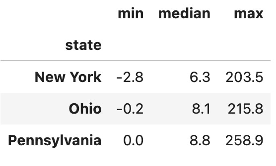
As you can see, the PM2.5 particle counts are normally quite low. (How they’re negative is beyond me, I’ll admit!) But you can see that the max values are way, way higher than what we would normally expect to see, at about 30x the median level. Something was clearly weird during this time.
Create a line plot showing the median PM2.5 particle count for each state, per day.
How unusually high was the particle count? And how much more was it from normal levels? I asked you to create a line plot showing, day by day, the median PM2.5 particle count for each state. The data only comes in once per day for each monitoring station, but each state has numerous stations.
I chose to look at the median, rather than the mean, because the median is less subject to being pulled higher or lower based on big outliers. If we see that the median on a given day has gone up a lot, that means that all of the readings for that day increased, not just one or two.
To create such a plot in Pandas, we need to have a data frame in which the columns are the states and the rows are the median readings on each date.
There are two equivalent ways to get to this kind of data frame. In the first, we can perform a normal “groupby” operation, grouping first by state and then by date. We’ll group on the “pm25” column, and we’ll invoke the “median” method:
df.groupby(['state', 'date'])['pm25'].median()However, that isn’t enough, because now we have both states and dates in the rows. We need to move the state to the columns. We can do that with “unstack”:
df.groupby(['state', 'date'])['pm25'].median().unstack(level=0)Now we have a data frame in which the dates are the index and the states are the columns. With that in place, we can finally create our line plot:
df.groupby(['state', 'date'])['pm25'].median().unstack(level=0).plot.line()And we get:
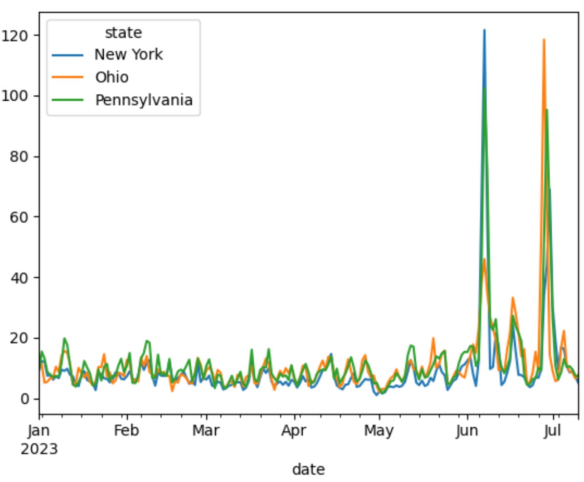
Yes, I think we can see the days on which the smoke was causing a lot of pollution!
Another way to get to this same result is by creating a pivot table, using the “pivot_table” method. We just need to specify which column will be used for rows (“date”), which column will be used for columns (“state”), which column will be used for the values (“pm25”), and what measure we want to use (“median”):
df.pivot_table(index='date', columns='state', values='pm25', aggfunc='median').plot.line()We get precisely the same plot, because we’ve created exactly the same data frame.
On which date was the highest reading taken for each state?
If we want to find the maximum reading of PM2.5 in the entire data set, we can run the “max” method on the “pm25” column.
If we want to find the maximum reading of PM2.5 for each of the states, we’ll need to run a “groupby” operation:
df.groupby('state')['pm25']
But what aggregation method do we want to run? It would be nice to run “max”, in order to get the maximum value for each state. But we want the maximum value and the date on which that max value took place.
For that, we can use “agg”, which as we saw above lets us specify more than one aggregation method. Here, we’ll use not only “max” but also “idxmax”, which returns the index of the element with the maximum value:
df.groupby('state')['pm25'].agg(['idxmax', 'max'])It’s a little annoying to read the result, because we’re getting both parts of the index that matched, but it seems to have worked pretty well. New York and Pennsylvania had their worst days (across all of their stations) on June 7th, while Ohio had its worst day on June 28th.
What was the PM2.5 value on June 30th for the northernmost collection point? The southernmost collection point?
Canada is to the north of the United States, and I was thus wondering if we would see any big difference between the readings at the northernmost and southernmost tracking stations. We can find those stations by sorting our data frame by latitude; the lower the number, the further south the location is.
I chose June 30th as a day to check, although we really could have chosen any day during that very smoky season.
I first used “loc” to grab only those measurements from June 30th. I then sorted the resulting data frame by the values in the “latitude” column, in descending order, using “sort_values”. Then, knowing that the highest lattitude is the northernmost station, I grabbed that row from the data frame, using iloc:
df.loc['2023-06-30'].sort_values('latitude', ascending=False).iloc(0)The result:
pm25                91.4
site         ROCHESTER 2
latitude        43.14618
longitude      -77.54817
Name: New York, dtype: object
I then reversed the sort direction, but otherwise kept the code the same:
df.loc['2023-06-30'].sort_values('latitude', ascending=True).iloc[0]The result:
pm25                 13.8
site         ODOT Ironton
latitude        38.508075
longitude      -82.659241
Name: Ohio, dtype: object
We can see that on that day, the reading in our northermost (Canada-adjacent) location was 91.4, whereas in our southernmost location, it was only 13.8 — still higher than usual, but not nearly as high.
Download and install GeoPandas. Create a GeoDataFrame that contains all of the information from our existing data frame, adding the geometry based on the "longitude" and "latitude" columns.
I’ve been experimenting with GeoPandas over the last week, and I’m totally in love with this package. (Which means that you can expect Bamboo Weekly to use a lot more GeoPandas in the future!)
The easiest way to think of GeoPandas is as adding two new types of functionality to Pandas:
- There’s a new “geometry” dtype, describing shapes (e.g., points and polygons), with methods that know how to work with that dtype, and
- There’s a new “GeoDataFrame” data structure, which is really just a data frame with a column named “geometry” and with a “geometry” dtype, containing shapes. That data structure handles all of the normal data frame functionality, but adds to it a bunch of methods that know how to work with the “geometry” column.
Note that a data frame containing longitude and latitude information isn’t a GeoDataFrame! However, it has the raw ingredients we’ll need in order to create a GeoDataFrame.
The first thing we have to do is bring in the “geopandas” library:
import geopandas as gpdWe then need to create a new GeoDataFrame. This is done by invoking “gpd.GeoDataFrame” , giving it two arguments: An existing Pandas data frame, and a value for its “geometry” column.
The first one is easy enough (since we have “df”), but how do we create appropriate geometry values?
The answer is to invoke the special “gpd.points_from_xy” method, which then takes three arguments: The longitude column, the latitude column, and the “crs”, or “coordinate reference system.” This last value is crucial in the mapping world, because we can “project” a shape onto a variety of types of coordinates. We’re going to use the “4326” coordinate system, which seems to be a common standard and choice, and also matches all of the data we’ll be dealing with today.
The bottom line is that I then create my GeoDataFrame as follows:
gdf = gpd.GeoDataFrame(df,
                 geometry=gpd.points_from_xy(df['longitude'],
                                             df['latitude'],
                                             crs='4326'))
With this in place, we can now start to do some geographical analysis.
Plot the GeoDataFrame's PM2.5 values on January 1st. Use the "Spectral_r" colormap, and show the legend.
One of the most important parts of GeoPandas is its ability to plot our data using the “geography” column. If I run the “plot” method on a particular column, I’ll get that column on a scatter plot.
For example, I can call:
gdf.loc['2023-01-01'].plot(column='pm25')that’ll give me all of the values for column “pm25” on January 1st, 2023:
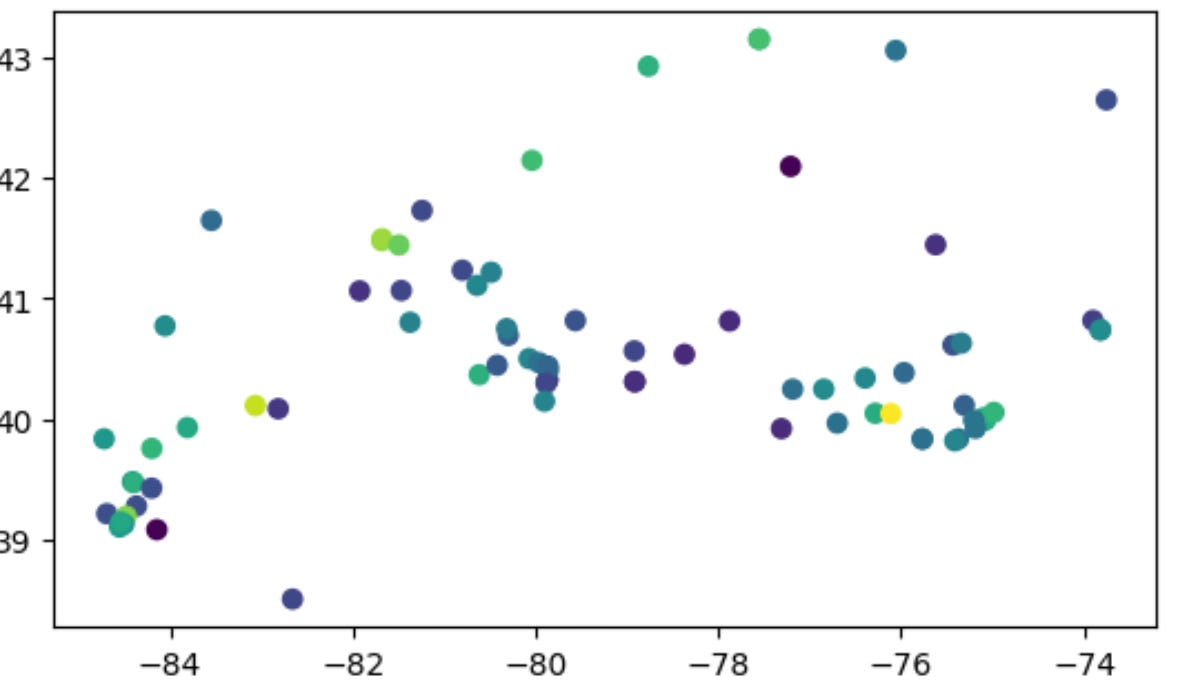
I can add a legend and change the colormap, too:
gdf.loc['2023-01-01'].plot(column='pm25', cmap='Spectral_r', legend=True)I think that this comes up much nicer and easier to read:
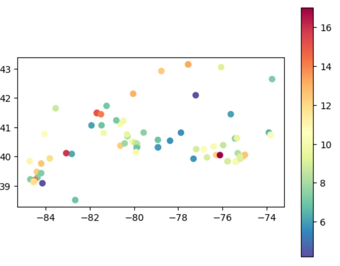
The legend tells us that the values on January 1st ranged from about 6 to 16, where 6 was blueish green and 16 is orange-red. Not too bad!
Now plot the GeoDataFrame's PM2.5 values on July 1st. Use the "Spectral_r" colormap, and show the legend.
July 1st, of course, was deep into the smoke arriving. Here’s the (almost identical) code:
gdf.loc['2023-07-01'].plot(column='pm25', cmap='Spectral_r', legend=True)And here’s what the plot looks like:
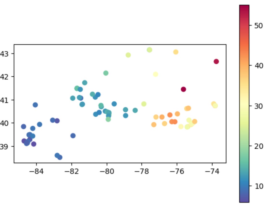
In our second plot, we can see that the red zone is 50, more than 4x the previous top (red) value. And we can see that the smoke is worst over New York (in the lower right corner), whereas locations to the west are bluer (and thus have better air quality).
But you know, while this is geographical, it’s also a bit abstract. Maybe we can get a map of the US, and then superimpose our data on that?
Read US states into a GeoDataFrame.
The first step is to download a “shapefile” into GeoPandas as a GeoDataFrame. I found such a file at the US Census, in a zipfile. And I used the “gpd.read_file” function to read it in:
us_states = gpd.read_file('/Users/reuven/Downloads/cb_2018_us_state_500k/cb_2018_us_state_500k.shp')That gives me a second GeoDataFrame, one containing the entire US map.
Clip the US map to have a bottom left corner of (-86, 38.5) and a top right corner of (-72, 45.5). Display the result.
The “us_states” GeoDataFrame is great, but we don’t really need to see the entire US. We just need the region for which we have data.
Fortunately, we can use the “clip” method to reduce the size of our GeoDataFrame, specifying the bottom left and top right corners:
us_states = us_states.clip([-86, 38.5, -72, 45.5])
us_states.plot()
Plotting the result gives us a map, the base on which we want to put our data:
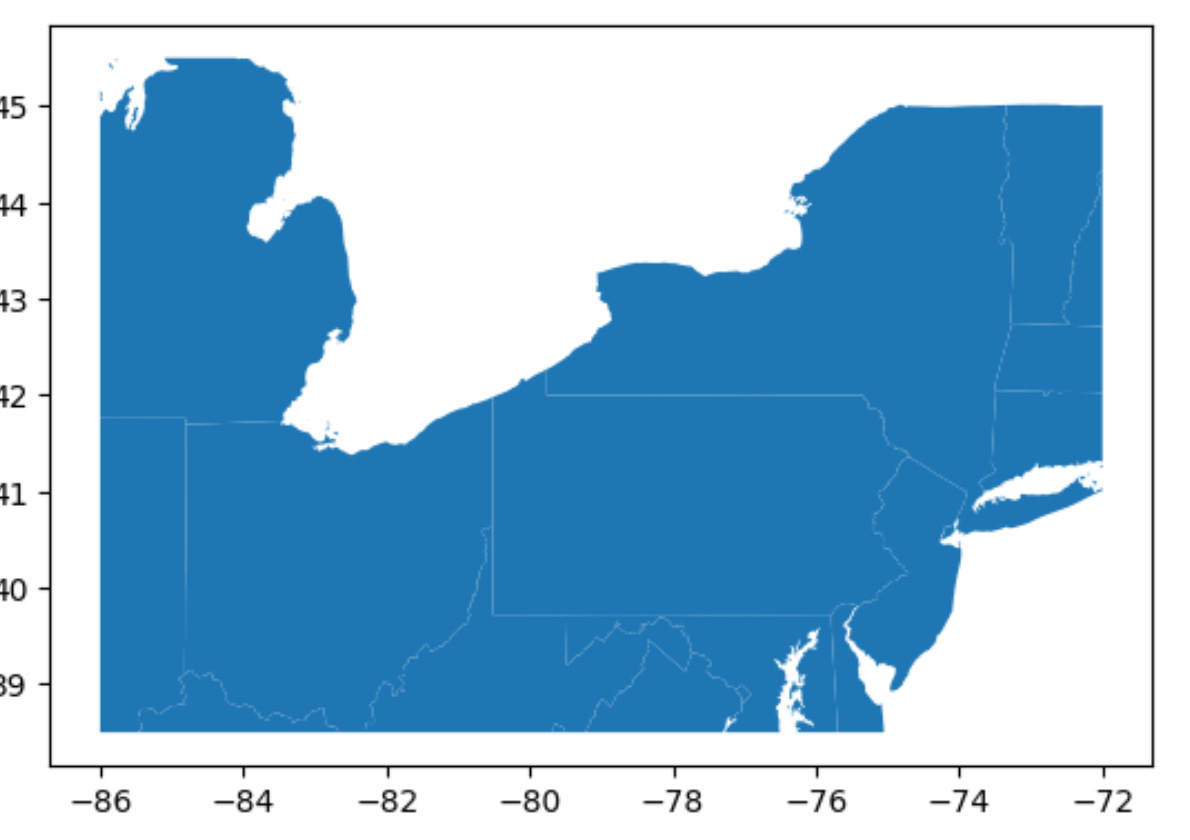
Not too shabby!
Using Matplotlib, plot the PM2.5 values on July 1st on top of the US map.
I’m not a big fan of using raw Matplotlib; I know that it’s a very useful and powerful library, but I find it to be hard to use. However, I don’t see a real alternative when working with GeoPandas.
Right now, my plan is:
- Create a “subplots” object in Matplotlib, and grab the “axes” object that it returns
- Rerun my plot of the US states, specifying the axes we got back.
- Rerun my plot of the data for July 1st, specifying the same axes as we got back before.
In this way, we can have a multi-layered map, based on multiple pieces of data:
fig, ax = plt.subplots()
us_states.plot(ax=ax)
gdf.loc['2023-07-01'].plot(ax=ax,
    column='pm25',
    cmap='Spectral_r',
    legend=True,
    markersize=10)
The only change that I made from before is that I made the dots size 10, which seemed a bit smaller than the usual, but still readable.
The result:
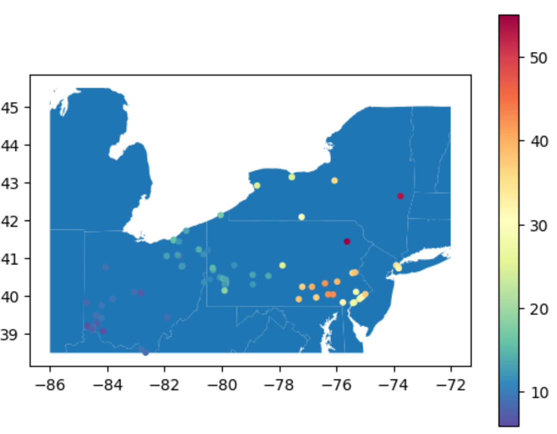
And just like that, we’ve managed to plot the data on a map of the US.
Try modifying this query, looking at days just before and just after this one, and you’ll see the red dots moving to the east, day by day, with the wind.
I don’t know about you, but I find this to be pretty amazing, fun, and even fairly straightforward. What did you think?
Here’s a link to my Jupyter notebook: https://drive.google.com/file/d/1h1iZsYQBuli89FMic2fU9PaugYTakJqC/view?usp=sharing
Please share your thoughts and comments! What do you think of GeoPandas?
Until next week,
Reuven