Want to improve your Python, Git, and Pandas skills in a small group that I personally mentor — with a clear syllabus and tons of practice? Cohort 8 of my Python Data Analysis Bootcamp (PythonDAB) will start on December 4th. Watch the recorded info session at https://www.youtube.com/watch?v=pTDP9rSv75Y, or sign up for an interview at https://savvycal.com/reuven/pythondab . Full bootcamp info is at https://PythonDAB.com .
This week, we looked at the US economy from a number of different perspectives, comparing and examining a number of economic indicators. Specifically, we looked at:
- The S&P500 index, measuring the stock prices of 500 different public companies (SP500)
- The yield of 10-year Treasury notes, aka US government bonds (IRLTLT01USM156N)
- The "Fed funds" interest rates, set by the Federal Reserve to achieve its dual mandate, maximizing employment and minimizing inflation (FEDFUNDS)
- Inflation, measured as PCE, aka "personal consumption expenditures," excluding food and energy (DPCCRV1Q225SBEA)
- Oil prices, using the West Texas Intermediate price (DCOILWTICO)
- University of Michigan's consumer sentiment measure (UMCSENT)
- The price of gold, measured via the import price of nonmonetary gold (IR14270)
- The price of bitcoin, as measured by Coinbase (CBBTCUSD)
This week's exercises used Marimo and Plotly to create a data dashboard showing these eight indicators, allowing us to choose which of them we want to see, and even create a scatterplot whose axes are dynamically chosen by the user via Marimo widgets.
Data and five questions
This week's data all comes from Fred, the amazing data portal from the St. Louis Federal Reserve Bank, at https://fred.stlouisfed.org/ . Each data source on Fred has a unique name. You'll use the fredapi Python package to retrieve eight data sources, and then present them in a variety of ways. Note that to use the fredapi package, you will need a Fred API key, which you can get for free from https://fred.stlouisfed.org/docs/api/api_key.html .
Learning goals this week include working with APIs, handling multiple data inputs, interpolation, Marimo, and Plotly.
Paid subscribers – including members of my LernerPython+data membership program at https://LernerPython.com – get access to all questions and answers, downloadable notebooks, and a one-click access to my notebook at Marimo's Molab. You also get invited to monthly office hours, like the ones we had earlier this week.
Here are this week's five questions and tasks, along with my solutions:
Define a Python dict whose keys are the Fred indicators in parentheses, and whose values are English-language descriptions of those indicators. Use that dict and the fredapi Python package to create a data frame with one column per dict key-value pair; the key will indicate the source of the data from Fred, and the value will be the column name. Resample to get the mean value per month for each indicator, then interpolate to remove NaN values.
First and foremost, I loaded Pandas, the fredapi module, and Plotly. I also retrieved my API key for Fred, and used it to connect to the Fred server:
import marimo as mo
import pandas as pd
from fredapi import Fred
from plotly import express as px

fred_api_key = open('/Users/reuven/.fred_api_key').read().strip()
fred = Fred(api_key=fred_api_key)
Above, I listed the eight indicators whose values I wanted to download and use. I created a Python dict as described:
data_sources = {'SP500': 's_and_p500',
                'IRLTLT01USM156N': '10_year_tnote',
                'FEDFUNDS': 'interest_rates',
                'DPCCRV1Q225SBEA': 'pce_inflation',
                'DCOILWTICO' : 'wti_oil',
                'UMCSENT': 'umich_sentiment',
                'IR14270': 'gold',
                'CBBTCUSD': 'bitcoin'}
The Fred API includes a get_series method that takes a data-source key (e.g., 'SP500'), retrieves the appropriate data from Fred, and returns a Pandas data frame. I used a list comprehension to invoke get_series once on each of the keys in this dict:
all_dfs = [fred.get_series(key)
          for key in data_sources]
I've often used pd.concat to combine data frames together. But by default, they are joined vertically, on the assumption that they share column names. Here, though, we want to join them horizontally, on the assumption that they share indexes (i.e., dates). I did this, and got one data frame back:
df = (
        pd
        .concat(all_dfs, axis='columns')
)
However, there was still a bit of housekeeping to do. First, I wanted to set the names of the columns to something a bit more normal – in this case, the values from the data_sources dictionary. I set them using the set_axis method:
df = (
        pd
        .concat(all_dfs, axis='columns')
        .set_axis(data_sources.values(), axis='columns')
)
Next, because the index contains datetime values, I was able to invoke resample, a special kind of groupby that works on a specified granularity of time. Here, for example, I used 1ME, meaning in one-month chunks, with the date given as the end of the month. I then used interpolate to replace any NaN values with the mean of values before and after the NaN:
df = (
        pd
        .concat(all_dfs, axis='columns')
        .set_axis(data_sources.values(), axis='columns')
        .resample('1ME').mean()
        .interpolate()
)
The result was a data frame with 877 rows and 8 columns. The columns, of course, contain values from each of the data sources I retrieved from Fred.
I should add that the system I created here makes it easy to add additional metrics to the data dashboard: Just add a new key-value pair to the data_sources dict, and you'll be able to include that data in your comparisons. With a big enough dictionary, you'll be on your way to building your own Bloomberg terminal.
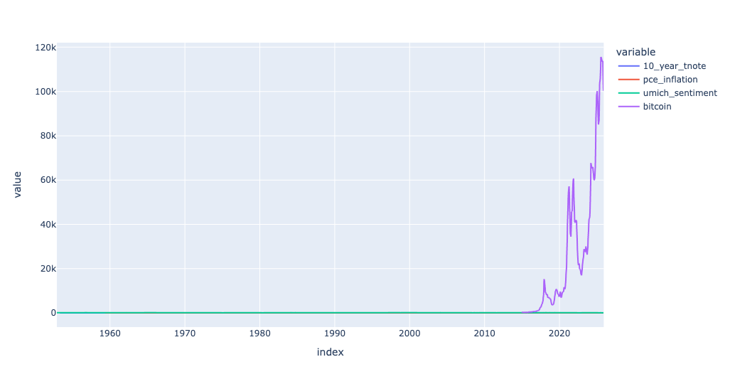
Display a line plot showing all of the columns, each in a different color. Use Marimo's UI elements (checkboxes and a UI dictionary) to let the user choose which columns of the data frame should (and shouldn't) be displayed.
Creating a line plot from our data frame isn't that hard:
(
    df
    .pipe(px.line)
)
But this displays a line for all of the columns in the data frame. I wanted to use Marimo's UI elements to create checkboxes allowing me to turn each of the lines on and off. How could I do that?
Creating a checkbox in Marimo isn't hard; you can say
mo.ui.checkbox(label=name, value=True)If you assign that checkbox to a variable, and then display the variable, the checkbox widget shows up in the notebook. Clicking on it sets the checkbox's value to True, and leaving it unchecked sets it to False. So all we have to do is create eight of these, one for each data source, and we're set, right?
Well, not quite, for two reasons: First, it would be nice to have them gathered together under a single widget, to make it easier to read and work with. But more importantly, as I discovered the hard way, individual checkboxes work independently, and don't update other cells in the way that I was expecting.
The solution to both of these problems was to gather the checkboxes up into a Marimo UI dictionary, a container widget. You create a Marimo dictionary with a Python dictionary; the displayed labels are the dict keys, and the checkbox widgets are the dict labels. I used a dict comprehension to create that dict, and passed it to mo.ui.dictionary:
column_checkboxes = mo.ui.dictionary({
    name: mo.ui.checkbox(label=name, value=True)
    for name in data_sources.values()
})
column_checkboxes
This displayed a set of checkboxes in my Marimo notebook:
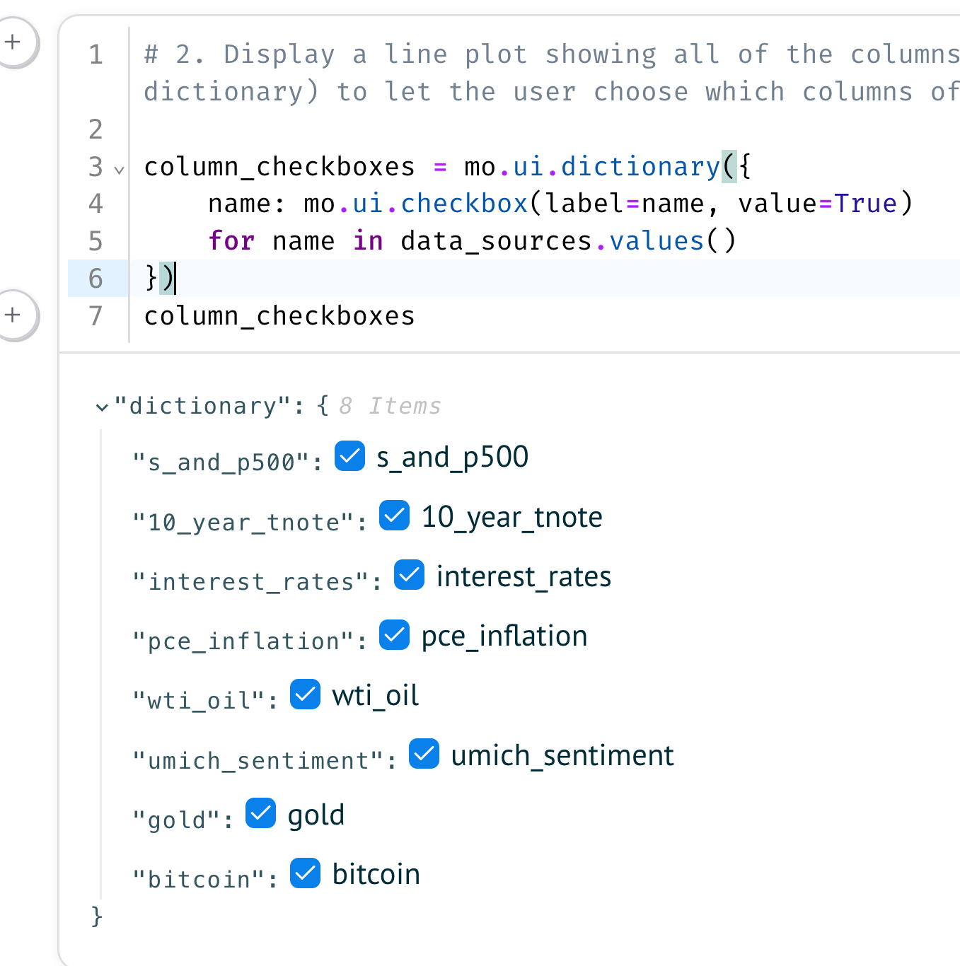
Marimo UI elements all have a value attribute that returns their value. In the case of the Marimo UI dict, though, it's a ... dict of string keys and checkbox values. If the value is True, then the checkbox is checked. Which, in our case, means that we want to see that line in the plot.
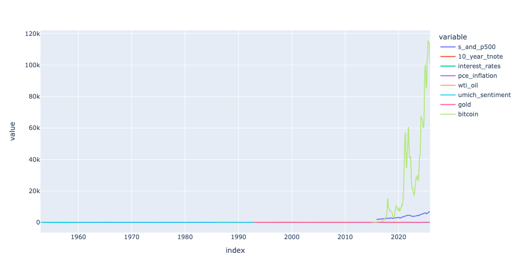
To get a list of the names of columns whose boxes have been checked, we can use a list comprehension:
[name
 for name, checkbox in column_checkboxes.items()
 if checkbox.value]
If we put that expression inside of [] and hand it to df, we'll get a subset of columns from df, based on the user's checkboxes. We can then hand the (probably) smaller data frame to pipe(px.line), in order to invoke a non-method in a method chain.
(
    df
    [[name
      for name, checkbox in column_checkboxes.items()
      if checkbox.value]]
    .pipe(px.line)
)
With all checkboxes active, I got the following plot:
I then unchecked a number of checkboxes, and found that the plot had changed dramatically, with fewer lines: