


[Administrative note: If you learned Python years ago, then you might not even know how much Python has changed, and what techniques you're missing out on. My upcoming 8-hour "python --update" course will help you understand everything from structured pattern matching to asyncio. It is free to LernerPython members. For more info, go to https://LernerPython.com/python-update.
Meanwhile, my LernerPython practice system continues to improve — now with support for Pandas, Polars, and SQL problems, along with Python and Git. An AI tutor pushes you toward a solution without revealing it, and can evaluate how well you solved the problem. Oh, and it now supports real-time pair programming! Also: Translation of the problem into your native language. Give it a shot at https://practice.lernerpython.com/, where you can play with a demo of what all LernerPython courses now include.]
This week, we're looking at algae – the annual growth of water-based cyanobacteria, which grows in Lake Erie and produces what's known as "harmful algal bloom." I first heard about this on Marketplace earlier this week (https://www.marketplace.org/story/2026/07/06/how-algae-can-crater-lake-eries-economy).
The issue is that the cyanobacteria produce microcystin, a liver toxin – which is not something you want in the drinking-water supply for cities like Toledo. When the bloom dies, its decomposition by other bacteria consumes the water's oxygen, creating low-oxygen dead zones that can suffocate fish.
This week, we'll look at data from the Maumee River, which is checked three times each day (!) for phosphorus and other substances that contribute to the harmful algal bloom. We'll also look at measurements of the harmful algal bloom from Lake Erie itself.
Data and five questions
This week, we have two pieces of complementary data:
First, we have the many measurements taken on the Maumee River, provided by the National Center for Water Quality research (https://ncwqr-data.org/HTLP/Portal.) From their site, you can select the Maumee station, and click on "download."
Then we'll look at data about Lake Erie itself, with algal bloom measurements taken by the National Oceanic and Atmospheric Administration. You can download that from
Paid subscribers, both to Bamboo Weekly and to my LernerPython+data membership program (https://LernerPython.com) get all of the questions and answers, as well as downloadable data files, downloadable versions of my notebooks, one-click access to my notebooks, and invitations to monthly office hours.
Learning goals for this week include Dates and times and joins.
Here are this week's five questions, along with my solutions and explanations:
Read the Maumee River data into a Pandas data frame. Keep only the "Value" columns, and rename the columns to use the text in square brackets. So "Value [FLOW] Flow (cfs)" would become just FLOW. How many samples were there, on average, per year? Has that frequency changed over time?
I started off by loading up Pandas and Plotly, as well as re for regular expressions:
import pandas as pd
from plotly import express as px

import re
I then loaded the Excel file into Pandas with read_excel. The actual data was on a sheet named "Maumee_samples", which means that we had to specify the sheet with the sheet_name keyword argument. I also used set_index to move the DateTime column (already with a dtype of datetime64 into the index, so that my filtering of the remaining columns won't affect it:
maumee_filename = 'data/bw-178-maumee-measurements.xlsx'
maumee_df = (
            pd
            .read_excel(maumee_filename, sheet_name='Maumee_samples')
            .set_index('DateTime')
)
That got the data into a data frame. But I still wanted to keep only those columns with "Value" in the name. I did that with filter, a great method for keeping columns whose names match a specific text pattern.
I then used rename to rename the remaining columns; I wanted to extract the [TEXT] from each column and rename the column with just that text. A regular expression was precisely what I needed:
- I searched for
\[, a literal opening square bracket - I then searched for
\w+, for one or more alphanumeric characters, - I put the
\w+inside of(), capturing it for later use, - and then a literal closing square bracket,
\].
I then retrieved the first captured group, and replaced the original column name with it — in other words, what it found between the square brackets:
maumee_filename = 'data/bw-178-maumee-measurements.xlsx'
maumee_df = (
            pd
            .read_excel(maumee_filename, sheet_name='Maumee_samples')
            .set_index('DateTime')
            .filter(like='Value')
            .rename(columns=lambda c_: re.search(r'\[(\w+)\]', c_).group(1))
)
The resulting data frame has 22,753 rows and 10 columns. To find the number of measurements taken per year, I first kept just a single column with []. Then I invoked resample, asking to count how many records there were within every one-year period ('1YE'). I then invoked describe, to get not only the mean, but also see how much it varied:
(
    maumee_df
    ['FLOW']
    .resample('1YE').count()
    .describe()
)
The mean was about 438 – a bit more than one measurement per day, with a minimum of 0 and a maximum of 602.
I was curious what we would see if we resampled per day:
(
    maumee_df
    ['FLOW']
    .resample('1D').count()
    .describe()
)
The result showed a mean of 1.2 measurements per day, with a minimum of 0 and a maximum of 7.
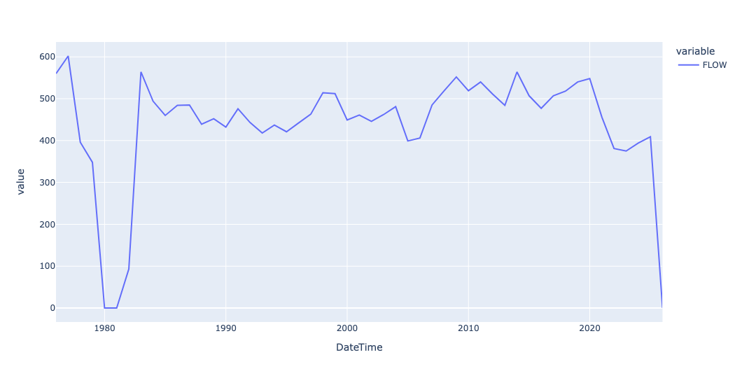
I created a line plot, just to see how many counts there were per year over time, and to see if the number was rising or falling:
(
    maumee_df
    ['FLOW']
    .resample('1YE').count()
    .pipe(px.line)
)
We can see that the number of annual measurements has fallen over the last few years, starting in 2020. The data only goes through 2025, and it might not even be complete for that year, which would account for the dramatic drop at the end of the plot:
The dissolved-phosphorus column (SRP) has many negative values, plus rows flagged "below detection". What do you think could and should be done with those values?
What does it mean to have negative values for dissolved phosphorus? That's a bit weird, no?
Maybe we should see those values as illegal, or outliers, and get rid of them? I mean, shouldn't we clean the data, so that we have the best possible analysis?
It turns out that the main NCWQR site addresses this, talking about it in their FAQ: https://ncwqr.org/monitoring/htlp-faqs/ And according to their FAQ, the negative values make no physical sense – but they were detected, and if we were to remove those negative values, then we would bias the numbers upward, which would make them less reliable. So as they write, "Negative concentrations make no physical sense, but they make analytical and statistical sense," and they say that it's OK to just include them in the analysis.
I'll add that the NCWQR FAQ addresses a second issue, one that we did not see in the Excel files that we're using, because they were pre-cleaned: Instead of NaN values, NCWQR uses -1 and -9 to represent missing data. If we had received those specific values, then we would have needed to weed them out, replacing them with NaN. However, that was done for us, when creating the Excel file – which means that the negative values that were reported in the spreadsheet should remain, and can be included in our analysis.