


Elon Musk's SpaceX will be going public in the next few days, at a valuation of $1.77 trillion (https://www.nytimes.com/2026/06/03/technology/spacex-ipo-pricing.html?unlocked_article_code=1.nlA.EsCT.9-Rnx3KSrE-6&smid=url-share), putting it on track to be the largest-ever initial public offering (IPO).
Meanwhile, AI companies Anthropic (makers of Claude) and OpenAI have also started to circulate documents for them to go public (https://www.nytimes.com/2026/06/01/technology/anthropic-ipo.html?unlocked_article_code=1.nVA.WSFn.kGiNEelq45nz&smid=url-share), also at very high valuations.
This week, we looked at data about IPOs over the last few years. How does SpaceX's proposed price compare with those? And of recent IPOs, how many companies are worth more today than when they went public?
Paid subscribers, both to Bamboo Weekly and to my LernerPython+data membership program (https://LernerPython.com) get all of the questions and answers, as well as downloadable data files, downloadable versions of my notebooks, one-click access to my notebooks, and invitations to monthly office hours.
Learning goals for this week include using APIs, cleaning data, joins, grouping, pivot tables, and working with dates and times.
Data and five questions
This week's data, comes in part from FinnHub.com, which has a list of IPOs available for download with a free API key. It's a bit tricky to get that data, but my new BFF Claude and I were able to get it. I've enclosed a program you can run to retrieve it into a data frame, although you will need to sign up and get a key from FinnHub.com.
Some other data comes from Yahoo Finance, from which you can retrieve things using the yfinance package on PyPI.
Here's the download program (which works, but could probably use some sprucing up):
Here are my five questions from yesterday, along with my solutions and explanations:
Register for a free API key from Finnhub. Put the key in a .env file (ideally in your home directory), with a name FINNHUB_KEY. Use the enclosed Python program to retrieve the data into a data frame. How many IPOs were there in each year in the data set? Create a stacked bar plot, showing the number of IPOs that took place each year in each exchange.
I started off with a lot of import statements:
import pandas as pd
import numpy as np
import os
import time
import requests
from dotenv import load_dotenv
from pathlib import Path
import re
from plotly import express as px
import yfinance as yf
Why do I need all of these? Because the download program (which we'll review in a moment) uses a fair number of Python modules. Here's the rundown:
- I needed Pandas, for obvious reasons.
- I imported NumPy, because I used
np.nan. - I used
osforos.getenv, to read the API key from the environment (os.getenv) - I used
timefortime.sleep, to pause the program from retrieving from the API, so as not to hammer it too hard (and maybe get banned) - I used
requeststo retrieve from the API - I used
dotenvto load the API key from the.envfile in my home directory. You definitely don't want to hard-code the key in your code! - I used
pathlib, an object-oriented API for working with files and directories in Python's standard library, to get the current directory. - I used
re, the regular expressions module from Python's standard library, to handle some of the trickier aspects of parsing and reformatting the prices - I used Plotly, as I often do, to create beautiful, interactive plots
- Finally, I used
yfinanceto retrieve historical financial information about various stocks.
I'll reiterate that this program was written in collaboration with Claude Code; I would normally have wanted to polish it a bit more, but it did the job, which was good enough for our purposes. I think it's a useful indication of what you sometimes need to do in order to retrieve data.
It started with some basic setup:
load_dotenv(Path.home() / ".env")
FINNHUB_KEY = os.getenv("FINNHUB_KEY")
assert FINNHUB_KEY, "FINNHUB_KEY still not loaded"

BASE = "https://finnhub.io/api/v1/calendar/ipo"
Normally, load_dotenv looks for a .env file in the current directory or any parent directory. But it seems that Marimo runs cells in /tmp, so it didn't see my .env. Invoking load_dotenv, which puts key-value pairs from .env into environment variables, wasn't enough; I needed to pass the file from which it should read. Doing that with pathlib.Path was fairly straightforward. Notice the use of / as an operator on paths, which is one of my favorite parts of pathlib.
I'm not a big fan of using assert in live code, since it's basically an "if or die" kind of statement – but decided that this was probably a reasonable way to say, "If you don't have FINNHUB_KEY defined, then stop now."
Next, I defined _quarters, a function that took a date range and returned all of the quarters (i.e., 3-month periods) between them. The style of the code is a mix between Claude's and mine; I would have written it a bit differently, but again, was happy enough with the results for the purpose of the newsletter that I kept it:
def _quarters(start="2021-01-01", end=None):
    end = pd.Timestamp(end or pd.Timestamp.today())
    for a in pd.date_range(start, end, freq="QS"):          # quarter starts
        b = min(a + pd.offsets.QuarterEnd(), end)
        print(f'\t\t_quarters, {a=}, {b=}')
        yield a.date().isoformat(), b.date().isoformat()
The function takes two string arguments, indicating the starting and (optional) ending dates for the quarter. If the start argument isn't provided, then it has a default of January 1st, 2021. If the end argument isn't provided, then it gets a default of None – which, in the function, is then replaced with pd.TimeStamp.today, the current datetime.
It then iterates, using pd.date_range, from the starting date to the ending date. But notice the freq keyword argument, which here has a value of 'QS', for "quarter start." This is identical to the frequency you can use in resample.
Notice that _quarters doesn't return a value, but rather uses yield to return it. That makes this not just a function, but a generator function, suitable for use in a for loop. Generator functions produce return one value at a time, rather than everything at once. Even if you were to provide an absurdly large date range, the generator would still return one quarter at a time – rather than a very long list that could potentially consume lots of memory.
Actually, _quarters yields a tuple of two dates, both in ISO format. There's a call to print here, so that you can see it as it runs.
Who calls the _quarters function?
This next function, fetch_ipos, which also took a starting date (with a default) and an ending date (with a None default).
This function gets a date range, iterates over each quarter in that date range (thanks to _quarters), retrieves information from FinnHub, and puts the retrieved data into a Python list. The list is then put into a Pandas data frame, which is returned:
def fetch_ipos(start="2021-01-01", end=None):
    rows = []
    for frm, to in _quarters(start, end):
        print(f'\tfetch_ipos, {frm=}, {to=}')
        r = requests.get(BASE, params={"from": frm, "to": to,
                                       "token": FINNHUB_KEY}, timeout=30)
        r.raise_for_status()
        rows.extend(r.json().get("ipoCalendar", []))
        time.sleep(1)                                       # well under 60/min
    return pd.DataFrame(rows)
So, the plan is: Invoke fetch_ipos, which will iterate over _quarters, grab the IPOs in each quarter, and then return a data frame with everything collected.
However, our data frame could use a bit of cleaning and help. For example, we'll want to turn the date column into a datetime dtype, rather than keep it as text. We'll want to turn the shares and proceeds columns into numeric values, rather than keep them as text. And we'll also want to make offer_price numeric.
That last point, making offer_price numeric, turned out to be a tough one. That's because FinnHub returned the values as text (which is fine), but it was in many inconsistent different formats. Fortunately, that's what regular expressions are for! Looking for digits, a decimal point, and more digits (i.e., r"\d+.?\d*") inside of the offer_price column, along with some strategic replacement of whitespace and dollar signs, made it possible to write a function, _parse_price, which did the right thing. Heck, we also had to deal with some occasions when we got more than one value!
Note that we didn't always have price information; in such cases, we returned np.nan:
def _parse_price(p):
    if not p:
        return np.nan
    nums = [float(n) for n in re.findall(r"\d+\.?\d*", str(p).replace(" ", ""))]
    return sum(nums) / len(nums) if nums else np.nan   # midpoint if a range
Finally, we modified the data frame that fetch_ipos had returned:
df = (
    fetch_ipos()
    .assign(
        date = lambda df_: pd.to_datetime(df_["date"]),
        offer_price = pd.col('price').map(_parse_price),
        shares = lambda df_: pd.to_numeric(df_["numberOfShares"], errors="coerce"),
        proceeds = lambda df_: pd.to_numeric(df_["totalSharesValue"], errors="coerce"),
    )
    .loc[pd.col('status') == 'priced']
    .assign(proceeds = lambda df_: df_["proceeds"].fillna(df_["shares"] * df_["offer_price"]))
    [['date', 'symbol', 'name', 'exchange',
      'offer_price', 'shares', 'proceeds', 'status']]
    .sort_values("date", ignore_index=True)
)
First, I used assign to change a few columns:
datewas passed as text, which we then usedpd.to_datetimeto convertpricewas passed as text, but we usedmapto invoke_parse_priceon each element, gettingoffer_pricenumberOfSharesandtotalSharesValuewere both text, but we invokedpd.to_numericon both of these. Whypd.to_numeric, and notastype(float)? Because this gave us a chance to pass theerrorskeyword argument – which meant that if there's an error in converting a value to a float, the request won't die, but will give usNaNinstead.
We then kept only rows with a status of priced , ignoring IPOs that were cancelled, and the like.
I then used assign again on the proceeds column, which should already have been filled. But FinnHub didn't fill them all, giving us NaN values in some places. Here, I calculated the product of proceeds and shares, and passed that to fillna. The non-null values remained the same, and the null values were replaced by those we calculated manually.
I then used [[ ]] to retrieve only a handful of the columns, and finally used sort_values to sort them by the date column.
The result? A data frame with 1,800 rows and 8 columns. (Yes, the same eight columns that we requested with [[ ]].)
How many IPOs were there in each year? I created a year column with assign, retrieving dt.year from the date column. I then used groupby, applying count, so that I would get the number of IPOs per year. I then passed that through pipe, invoking px.bar on the resulting series:
(
    df
    .assign(year = pd.col('date').dt.year)
    .groupby('year')['date'].count()
    .pipe(px.bar)
)
The result:
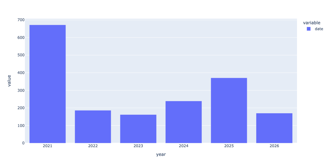
As you can see, 2021 had a very large number of IPOs. We'll see why in a question 3.
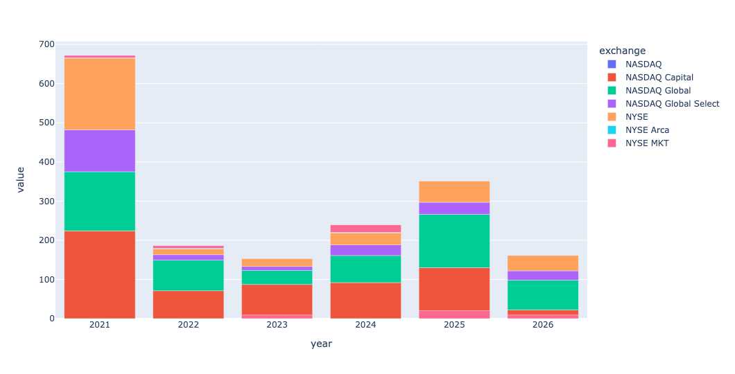
I then wanted to take this same bar plot, but divide it up by exchange. To get a stacked bar plot in Plotly, we need a data frame in which each row represents the count in one year (like we just got) – but we also have one exchange per column. We can do that with a pivot table, invoking pivot_table as follows:
(
    df
    .assign(year = pd.col('date').dt.year)
    .pivot_table(index='year',
                 columns='exchange',
                 values='symbol',
                 aggfunc='count')
    .pipe(px.bar)
)
If you're thinking that this looks roughly the same as what we just did, except that we added a second dimension, you're spot on. Pivot tables are just 2D groupby queries. Here's what we get:
Which 10 companies had the largest IPOs by proceeds (shares offered × offer price) in the data set? Use the yfinance package from PyPI to retrieve each one's current market cap (the marketCap field on Yahoo Finance). What are they worth today, and how many are even worth more than SpaceX's planned first-day valuation of $1.75 trillion?
The data we retrieved didn't have the IPO-day valuation of a company, meaning the offer price * the total number of outstanding shares. Instead, we had the proceeds, meaning the offer price * the number of shares sold on that day. I wanted to see which 10 companies brought in the largest amount of money.
To do that, I ran the below query: I first used set_index to make the stock symbol into the index. I then kept only proceeds, name, and shares. (We didn't need name, but it makes things look nicer). Then I ran nlargest, to get the 10 companies with the highest proceeds, and assigned it to greatest_proceeds:
greatest_proceeds = (
    df
    .set_index('symbol')
    [['proceeds', 'name', 'shares', 'offer_price']]
    .nlargest(columns='proceeds', n=10)
)
Now, for each of these 10 symbols, I wanted to get the latest share price and total market cap for each company. The easiest way to do this with Yahoo Finance is to invoke yf.Ticker(s).info, where s is the stock ticker symbol. That gets a full set of info back. We can then retrieve the marketCap and the previousClose items from that info.
I ended up storing the info object in the data frame in the _info column, then used map to grab the marketCap info for each symbol, and then used a second invocation of map to grab the previousClose value. I also got the number of shares the company has issued. Then I dropped _info, since I no longer needed it:
greatest_proceeds = (
    df
    .set_index('symbol')
    [['proceeds', 'name', 'shares', 'offer_price']]
    .nlargest(columns='proceeds', n=10)
    .assign(_info = lambda df_: [yf.Ticker(s).info for s in df_.index],
            marketcap = lambda df_: df_['_info'].map(lambda i: i.get('marketCap')),
            close = lambda df_: df_['_info'].map(lambda i: i.get('previousClose')),
            outstanding_shares=lambda df_: df_['_info'].map(lambda i: i.get('sharesOutstanding')))
    .drop(columns='_info')
)
I now have a data frame, greatest_proceeds, with full info about the 10 IPOs in the data set with the highest proceeds.
So, what are these companies worth today? We can just grab the marketcap column and spruce it up with:
(
    greatest_proceeds
    ['marketcap']
    .apply('${:,}'.format)
)
The result:
symbol	marketcap
COIN	$43,241,816,064.0
RIVN	$24,332,740,608.0
RBLX	$31,037,677,568.0
MDLN	$45,256,560,640.0
CBRS	$47,304,069,120.0
ARM	$420,224,925,696.0
CPNG	$29,672,413,184.0
LINE	$10,832,307,200.0
DIDI	$nan
KVUE	$32,409,745,408.0
Notice that DIDI, a Chinese ride-sharing company, has nan for its market cap. DIDI moved its stocks from the American markets a number of years ago, for reasons for corporate governance and transparency.
You can see that the most expensive company, by far, is Arm, with a current market cap of $420 billion. Which is less than 1/3 the planned market cap for SpaceX.