


[Reminder: The 9th cohort of my Python Data Analysis Bootcamp, an 18-week small program in Python, Git, Pandas, and agentic coding, starts on June 4th. Learn more about it at https://LernerPython.com/bootcamp, or come to a free info session on Monday, June 1st: https://us02web.zoom.us/webinar/register/WN_JJ3GK2DCRFGVBzy9Vc41Tw.]
The 2026 FIFA World Cup (https://en.wikipedia.org/wiki/2026_FIFA_World_Cup) starts in about two weeks, with soccer ("football") matches all over North America – mainly in the United States, but also in Canada and Mexico. This week, in anticipation of the tournament, we looked at World Cup data from previous years.
The data, from a GitHub repo set up by Josh Fjelstul (https://github.com/jfjelstul/worldcup), offers a wealth of data about World Cup teams, games, and players. We'll try to understand which teams (men's and women's) have played and won the most, and just how old soccer players can be, while still participating in the World Cup.
Paid subscribers, both to Bamboo Weekly and to my LernerPython+data membership program (https://LernerPython.com) get all of the questions and answers, as well as downloadable data files, downloadable versions of my notebooks, one-click access to my notebooks, and invitations to monthly office hours.
Learning goals for this week include working with CSV files, pivot tables, plotting, filtering, and working with dates and times.
Data and five questions
This week's data, as I indicated, comes from Josh Fjelstul's GitHub repo, https://github.com/jfjelstul/worldcup . We'll use files in the data-csv directory, which were kindly denormalized – meaning that they allowed us to avoid performing extensive joins.
Here are my five tasks and problems, along with my solutions and explanations:
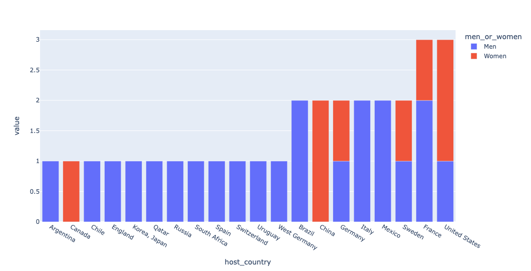
Read the tournament data into a data frame. Then create a stacked bar plot showing how many tournaments have been hosted by each country. Each bar should be divided, to show how many men's tournaments and how many women's tournaments have been hosted in each country.
Before doing anything else, I loaded a number of Python modules and packages that'll help:
import pandas as pd
import os.path
from plotly import express as px
I loaded Pandas and Plotly, as per usual around here. I also loaded os.path from Python's standard library, making it a little easier to manipulate the filenames I used.
I first defined a directory, data_dir, in which all of the data files sit. This, along with os.path.join, allowed me to reference the data files that I wanted to load. Note that os.path.join returns a string with the directory's pathname followed by the given filename.
Then, after defining data_dir, I invoked read_csv to load the CSV file into Pandas. The good news is that these CSV files are all straightforward, separated by commas, and have a single header row with the column names.
In any event, here's how I loaded the file into a data frame:
data_dir = 'data/bw-172-world-cup/'
tournaments_df = pd.read_csv(os.path.join(data_dir, 'tournaments.csv'))
I next wanted to have a bar graph showing how many times each country played in the World Cup finals. Normally, this would be a simple query with groupby. However, I wanted to distinguish between men's and women's tournaments. That would require not only a two-dimensional groupby (on men's/women's and also country), but also being able to know which were men's games and which were women's.
I decided to retrieve the column with pd.col, then applying a regular expression with str.extract, a Pandas string method that (as the name indicates) lets us retrieve text from each element in a string column. str.extract lets you apply a regular expression to a column. The regular expression should contain one or more parenthesized capture groups. str.extract returns a data frame with one column for each of the capture groups in the regular expression.
In this case, we only wanted one capture group. I defined the regular expression as r"^\d+ FIFA (\w+)'s World Cup$", meaning:
- Anchor to the front of the string with
^ - Look for 1 or more digits, followed by a space,
'FIFA', and another space - Our capture group, in parentheses, looked for one or more alphanumeric characters
- Following the capture group, we looked for static text
- I anchored the end of the regular expression to the end of the string with
$
The idea was to grab either "men" or "women" from each of the tournament names.
What would I do with those strings? Assign them to a new column with the assign method. However, that wasn't quite enough: Normally, str.extract returns a data frame. In this case, I only got a one-column data frame back – but really, I wanted a single series. I thus passed expand=False.
Th
(
    tournaments_df
    .assign(men_or_women = pd.col('tournament_name').str.extract(r"^\d+ FIFA (\w+)'s World Cup$", expand=False))
)
With the new men_or_women column in place, I then used pivot_table to summarize that information:
- For
columns, I passedmen_or_women, meaning that the pivot table will have one column for each unique value in themen_or_womencolumn. - For
index, I passedhost_country, so the pivot table will contain one row for each unique value inhost_country. - For
values, I choseyear, although we were just counting them - For
aggfunc, I chosecount, so that we would ... well, count how many values matched that type of tournament and that country - I also passed
margins=True, so that we would get a total count in each row and column.
Here's the query:
(
    tournaments_df
    .assign(men_or_women = pd.col('tournament_name').str.extract(r"^\d+ FIFA (\w+)'s World Cup$", expand=False))
    .pivot_table(columns='men_or_women',
                index='host_country',
                values='year',
                aggfunc='count',
                margins=True)
)
Why did I ask for margins=True? So that I could sort by the number of times each country had appeared in the World Cup finals. Remember that the result of pivot_table is a Pandas data frame – so I sort_values, sorting first by All (the summary) and then by host_country.
This meant that I primarily sorted on the total number of games in which countries had participated. In the case of a tie, I asked for the countries to be secondarily sorted by country name.
I also invoked drop, removing the All row and column:
(
    tournaments_df
    .assign(men_or_women = pd.col('tournament_name').str.extract(r"^\d+ FIFA (\w+)'s World Cup$", expand=False))
    .pivot_table(columns='men_or_women',
                index='host_country',
                values='year',
                aggfunc='count',
                margins=True)
    .sort_values(['All', 'host_country'])
    .drop(columns='All', index='All')
)
Finally, because px.bar is a Plotly Express method, and not a Pandas data-frame method, we can't include it directly in our method chain. Instead, we can use pipe, which then lets us pass any function we want. pipe passes the data frame as an argument to the function. In this case, the function is px.bar, which draws a bar plot – and because it's a data frame with multiple columns, we get a stacked bar plot:
(
    tournaments_df
    .assign(men_or_women = pd.col('tournament_name').str.extract(r"^\d+ FIFA (\w+)'s World Cup$", expand=False))
    .pivot_table(columns='men_or_women',
                index='host_country',
                values='year',
                aggfunc='count',
                margins=True)
    .sort_values(['All', 'host_country'])
    .drop(columns='All', index='All')
    .pipe(px.bar)
)
Here's the final plot:
Read the matches data into a data frame. Without using the "result" column, how often does the home team win vs. the away team (vs. tie games)? Do matches that take place in the morning (before 12 noon), afternoon (between 12 noon and 6 p.m.), or at night (after 6 p.m.) have the greatest mean number of goals? Do home or away teams win more often on weekends? Is there any correlation between the total number of goals and the hour at which the match started? Answer this last question both numerically and graphically.
Next, I wanted to work with the individual matches within the tournaments. I was particularly curious to know how well the home team does vs. the visiting team, and whether the day or time has any effect on the score.
To start off, I used read_csv to read matches.csv into a data frame. But I was going to need a datetime column, and all I had was a match_date column and a separate match_time column. I combined those two columns as strings (with +), and then used assign, along with lambda, to invoke pd.to_datetime on the resulting string:
matches_df = (
        pd
        .read_csv(os.path.join(data_dir, 'matches.csv'))
        .assign(datetime = lambda df_: pd.to_datetime(df_['match_date'] + ' ' + df_['match_time']))
)
The result was a data frame with 1,248 rows and 38 columns, including the new datetime column that assign created.
How often did the home team vs. the away team win? The result column provides that answer, but I asked you not to use it. (Besides, there could be tie games, right?) I started off by grabbing just the three relevant columns, home_team_win, away_team_win, and draw. This gave us a three-column data frame in which one (and only one) of the three columns contained a 1 value, with the other two containing 0 values.
You might recognize this as a form of "one-hot encoding," in which we take a series with three different values, and then turn each value into an integer column with either 1 or 0. In this case, we already have that form, and want to turn it back into a single column. To do that, we use melt, which returns a two-column data frame. One column, containing the different column names from before (home_team_win, away_team_win, and draw) , is called variable. The value column indicates where that column contained a 1 or a 0:
(
    matches_df
    [['home_team_win', 'away_team_win', 'draw']]
    .melt()
)
We were only interested in who won each game, so I used loc to pare down the data frame, keeping only where pd.col('value') == 1. And since I was only going to use the variable column afterwards, I used the two-argument version of loc, specifying the variable column selector:
(
    matches_df
    [['home_team_win', 'away_team_win', 'draw']]
    .melt()
    .loc[pd.col('value') == 1, 'variable']
)
Finally, I invoked value_counts on the resulting series, getting the number of games won by the home and away teams, as well as the number of draws:
(
    matches_df
    [['home_team_win', 'away_team_win', 'draw']]
    .melt()
    .loc[pd.col('value') == 1, 'variable']
    .value_counts()
)
The result:
variable	count
home_team_win	703
away_team_win	335
draw	210
In other words, the home team won more than twice as often as the away team. I always knew there was a "home-team advantage," but never expected it to be so big.
But wait a second: What does it even mean to have "home" and "away" teams in the World Cup? Does it mean the host country? Does it mean that a majority of spectators are fans for one particular country?
The answer? In the World Cup, that designation is meaningless. The home vs. away designation is there because we need to designate one team "home" and one team "away," but that's it. So it's interesting to see these numbers, and the calculations are accurate... but to interpret it in any serious way would be wrong. Which is, in and of itself, a useful thing to remember in data analysis, that the calculations aren't enough.
Next, I wanted to know how many goals were scored in morning, afternoon, and evening/nighttime games.
I started by using assign to calculate the total number of goals, adding the home_team_score and away_team_score columns. I also assigned hour the hour from datetime, using dt.hour to extract it.
But then I needed to split the day into morning, afternoon, and night, based on the hours of the day. In other words, I wanted to take my numeric column and turn it into a categorical column. That's what pd.cut is for, and that's what I used.
I invoked pd.cut on the hour column that I had just created. I passed the numeric edges (four of them, setting boundaries for three groups) and the three labels I wanted to give them. Note that I also passed include_lowest=True, so that the lowest boundary (0) would be included in the first bin. (Although I'm skeptical that any matches started at 12 midnight...) I also passed right=False so as not to include the rightmost edge for a bin:
(
    matches_df
    .assign(total_goals = pd.col('home_team_score') + pd.col('away_team_score'),
            hour = pd.col('datetime').dt.hour,
            period = lambda df_: pd.cut(df_['hour'],
                           [0, 12, 18, 24],
                           labels=['morning', 'afternoon', 'night'],
                           right=False,
                           include_lowest=True))
)
Next, I used groupby to find out how many goals were scored, on average, at games in each part of the day. Because mean returns a float, we got a lot of decimal points in the solution; I used round to cut those down:
(
    matches_df
    .assign(total_goals = pd.col('home_team_score') + pd.col('away_team_score'),
            hour = pd.col('datetime').dt.hour,
            period = lambda df_: pd.cut(df_['hour'],
                           [0, 12, 18, 24],
                           labels=['morning', 'afternoon', 'night'],
                           right=False,
                           include_lowest=True))
    .groupby('period')['total_goals'].mean()
    .round(2)
)
The results:
period	total_goals
morning	2.25
afternoon	2.89
night	2.94
So yes, there is a difference! Afternoon and nighttime games have higher scores than in the morning.
By the way, I didn't ask you to do this – but you can also check the mean number of goals per match-time start:
(
    matches_df
    .assign(total_goals = pd.col('home_team_score') + pd.col('away_team_score'),
            hour = pd.col('datetime').dt.hour)
    .groupby('hour')['total_goals'].mean()
    .round(2)
    .pipe(px.line)
)
The result:
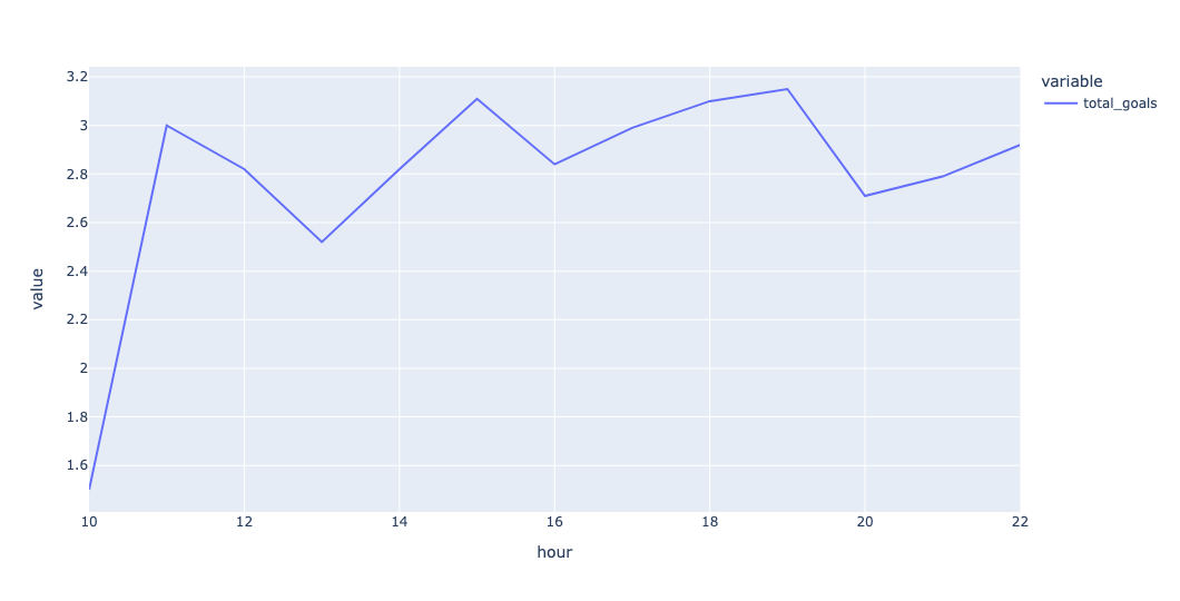
In other words: If you get World Cup tickets to a morning game, you're unlikely to see a high-scoring match.
Who wins most of the time on weekends (rather than weekdays)? We can check dt.dayofweek, and keep only those rows in which it's greater than 4. Having performed that filter, I repeated the use of melt and pd.col from before, finally invoking value_counts:
(
    matches_df
    .loc[pd.col('datetime').dt.dayofweek > 4]
    [['home_team_win', 'away_team_win', 'draw']]
    .melt()
    .loc[pd.col('value') == 1, 'variable']
    .value_counts()
)
The result:
variable	count
home_team_win	300
away_team_win	119
draw	60
We still see that home teams win more than away times – but this time, the difference is even more pronounced, at about 3 games to 1.
Of course, if you decided to use the result column, then you had a much easier solution at your fingertips:
(
    matches_df
    .loc[pd.col('datetime').dt.dayofweek > 4, 'result']
    .value_counts()
)
Finally (for this question), I was curious to know if there was any correlation between the hour at which the match started and the number of goals scored. I started by again calculating total_goals and extracting hour from datetime. I then grabbed just total_goals and hour, and ran corr, rounding it to 3 digits:
(
    matches_df
    .assign(total_goals = pd.col('home_team_score') + pd.col('away_team_score'),
            hour = pd.col('datetime').dt.hour)
    [['total_goals', 'hour']]
    .corr()
    .round(3)
)
The result:
	total_goals	hour
total_goals	1	0.013
hour	0.013	1
In other words, there is a positive correlation. But it's so incredibly tiny that it's not worth mentioning in a serious way. Bottom line, no, there isn't any such correlation.
This becomes especially obvious if we create a scatterplot:
(
    matches_df
    .assign(total_goals = pd.col('home_team_score') + pd.col('away_team_score'),
            hour = pd.col('datetime').dt.hour)
    [['total_goals', 'hour']]
    .pipe(px.scatter, x='hour', y='total_goals')
)
Remember that a scatterplot puts each point on an x,y axis, with one column providing the x, and the other providing the y. If there's a correlation, then we should see a cluster along a diagonal line. But here's what we get:
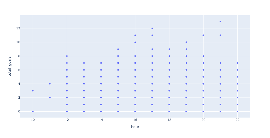
Do you see any clustering? Yeah, neither do I. If you add trendline='ols' to the query, you can get a trendline:
(
    matches_df
    .assign(total_goals = pd.col('home_team_score') + pd.col('away_team_score'),
            hour = pd.col('datetime').dt.hour)
    [['total_goals', 'hour']]
    .pipe(px.scatter, x='hour', y='total_goals', trendline='ols')
)
Here's the plot:
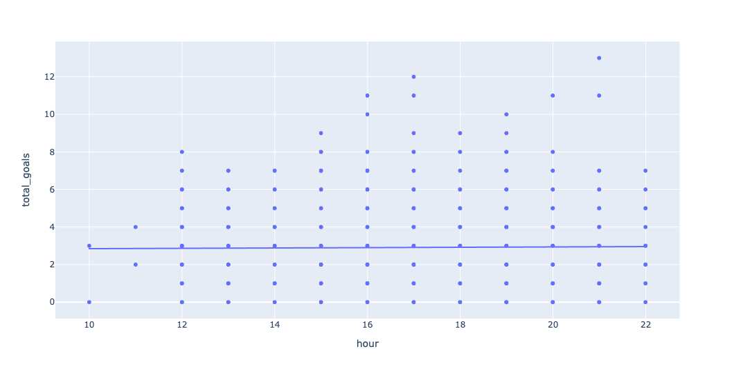
So yes, morning games have a very small number of goals. But you can go to an afternoon or evening game, and you'll basically see the same number of goals.