


Before we begin, several announcements:
- We'll hold office hours for paid subscribers on Sunday, January 25th. Come with any questions you have! A message with a Zoom link was sent out on Tuesday; let me know if you didn't get it.
- On February 1st, I'll start the 4th cohort of HOPPy, my Hands-on Projects in Python class. This time, every participant will create their own data dashboard, on a topic of their choosing, using Marimo. Not sure? Join the info session I'm running on Monday, January 26th: https://us02web.zoom.us/webinar/register/WN_YbmUmMSgT2yuOqfg8KXF5A
- My newest classes, AI-Powered Python Practice Workshop, and AI-Powered Pandas Practice Workshop, are happening on February 2nd and 9th, respectively. If you want to get better at programming and data analysis executed via Claude, then you don't want to miss these. More info: https://lerner.co.il/2026/01/22/learn-to-code-with-ai-not-just-write-prompts/
This week, we looked at university rankings as measured by the Centre for Science and Technology Studies at Leiden University in the Netherlands. Leiden has been ranking universities for more than 20 years — but these rankings have nothing to do with the number of students who enroll or graduate, the number of disciplines they teach, or even the tuition.
Rather, the Leiden ranking is all about the research. Specifically, it's about how many papers they publish, and how much they collaborate in their research with people at other universities.
If you're not in the academic world, then measuring the number of published articles might seem like a trivial thing. But it isn't; journals are the primary way in which researchers communicate their findings to colleagues. Getting a journal article published is a very big deal, and goes through more rigorous checking than a book or conference presentation.
The New York Times recently reported that while American universities had long been in the top ranks of the Leiden chart, they had recently lost ground. Moreover, they had lost ground to Chinese universities, which now dominate the top rung of academic research. The story is at: https://www.nytimes.com/2026/01/15/us/harvard-global-ranking-chinese-universities-trump-cuts.html?unlocked_article_code=1.GFA.qfme.XigRP5r4bz6d&smid=url-share).
This week, I thought it would be interesting to examine the Leiden data, and to see if we can find these trends ourselves.
But I've also been thinking a lot about the use of AI to write code on our behalf. I've spoken with too many people, and heard about too many companies, using these techniques with production code to dismiss them any more. Earlier this week, I wrote a blog post about where I see things (https://lerner.co.il/2026/01/21/were-all-vcs-now-the-skills-developers-need-in-the-ai-era/), and I've just announced two AI-first Python practice workshops (https://lerner.co.il/2026/01/22/learn-to-code-with-ai-not-just-write-prompts/).
In that spirit, I decided that this week's Bamboo Weekly would be about solving problems... with Claude Code! If you prefer a different system, such as Cursor, then that's totally fine. I believe that many of the techniques work similarly on other systems.
Data and six questions
This week's data comes from Leiden University, https://traditional.leidenranking.com/downloads. The original Excel data can be downloaded from: https://zenodo.org/records/17473109/files/CWTS%20Leiden%20Ranking%20Traditional%20Edition%202025.xlsx?download=1. The most recent information seems to be from the period 2020-2023.
A data dictionary is at https://traditional.leidenranking.com/information/indicators.
Paid subscribers, as usual, get all of the questions and answers, as well as downloadable data files, downloadable versions of my notebooks, one-click access to my notebooks, and invitations to monthly office hours.
Learning goals for this week include using AI to write queries, working with Excel files, grouping, pivot tables, and plotting.
Remember that I don't want you to write these queries yourself, but rather use Claude Code to do so on your behalf. What configuration will you need to give it? What works (and doesn't) in your prompt? How accurate are the results? And how good are the queries that it produces?
Here are this week's six tasks and questions, along with my solutions and explanations.
Download the data file and import it into a Pandas data frame. Keep only those lines for which the period is either 2006-2009 or 2020-2023. In each of those two periods, find the countries for which P_top_1 (greatest number of frequently cited publications) and PP_top_1 (greatest percentage of frequently cited publications) had the greatest mean value. Do we see any differences between these two lists?
Before starting, I installed Claude Code (https://claude.com/product/claude-code). This is a paid product, and I'm not usually a big fan of promoting such paid products in Bamboo Weekly. But I've been very impressed with Claude Code so far, and as I wrote above, if you prefer a different system, you can and should use it instead.
For me, the neat thing about Claude Code is that it runs on your computer, in your terminal window. (And yes, I'm old; I like to use the terminal window and command line.) So I can ask it to look at files, or to make Git commits, or to search the Web, or to produce files in my filesystem. I'm not using an application, or a Web version of Claude, from which I need to copy or download files.
Also: Claude Code keeps a separate history of each directory you run it in. Everything I did for this week's solutions were done in my /Users/reuven/BambooWeekly/notebooks directory, which is where (surprise, surprise) I write all of the notebooks for this newsletter. But anything I did, and any settings I made, were kept siloed within this directory.
If you think it's a bit crazy to let a GenAI system loose on your computer, making decisions about reading and writing files... you're not totally wrong! There is definitely an element of trust here. But Anthropic, the developers of Claude, have put in a lot of safeguards to make sure that it doesn't go crazy, or at least that it only does so when you give it permission.
Simply put: Any action that Claude Code wants to take on your computer, from executing a program (including ls), to downloading from a Web site, to reading from a file, to writing to a file, all must be OK'ed by you. Each time it wants to do a potentially problematic thing, Claude Code asks you whether it's OK once, whether it's OK always, or it's not OK.
You can turn off all checking, with the --allow-dangerously-skip-permissions switch, but I would be very, very nervous about doing that.
My notebooks directory is already a uv project and a Git repository. So I can just fire up Claude Code, feed it this week's questions, and move ahead, right?
Yes... but that would be a bad idea. You really need to treat Claude Code like an employee, one who needs clear direction and guidelines. And while you can do that in each of your prompts, it's easier to just give those instructions once, in a configuration file called CLAUDE.md. ("md" is short for "Markdown," and is commonly used to format text files. I use it to write this newsletter.)
Here's my CLAUDE.md file for this directory:
# Claude configuration for Bamboo Weekly

1. Output should be in the form of a Marimo notebook. This means that you cannot define the same variable (using assignment, import, or for) in more than one cell.
2. Each question should be in a Markdown cell, with all text and numbered.  The Python to solve that the problem should be in the cell following the documentation in Markdown.
3. Use Pandas unless stated explicitly in the question.
4. Use Plotly Express for plotting, unless that isn't possible, in which case you should use the Pandas API to Matplotlib. Avoid using Matplotlib directly unless there is no choice.
4. Use method chaining, not assignment, wherever possible. So use `assign`, `pipe`, and `loc` with `lambda` expressions rather than assign values using assignment.
5. Don't use the query method unless you can really justify it.
6. If the data source is at a URL, then the first time you retrieve it, you should put it into a file, ideally named starting with "bw-nnn", where nnn is the issue of Bamboo Weekly you're working on that week. Then you can just load from that file in subsequent cells and queries, saving a lot of time. Put that data file into the "data" subdirectory, *unless* the file is > 100 MB in size, in which case you should store it in `/tmp`, to avoid going over GitHub's file size limits.
7. Define the data frame variable, `df`, a single time, at the top of the notebook. Then just use method chaining on it to retrieve results. No need to reload the data multiple times, or to define multiple variables.
8. Bamboo Weekly's "notebooks" directory is a uv project. Use "uv run" to run Python, and you should already have access to NumPy, Pandas, Plotly, and other packages. Use "uv add" to add any additional packages you need.
9. When you're about to start, and also when you're done, do a "git commit" so that we can roll back as needed.
You can see a headline, and then 9 bulleted points, telling Claude what to do. I wanted to make it clear just how to write the output, in the form of a Marimo notebook.
Point 4, about using method chaining, was important to me. But I discovered, in the first version of the output, that while it used method chaining, it did two dumb things: First, it downloaded the (very large) Excel file each time it had to do some analysis. (I fixed that with point 6.) I also found that it defined df each time it downloaded the notebook. That created an invalid Marimo notebook. (I fixed that with point 7.)
I normally like to have the downloaded file right under the notebooks directory, in notebooks/data. But I also use GitHub to store and back up my Bamboo Weekly directory, and GitHub won't store files larger than 100 MB. So I added to point 6, about where to store the file.
I found that Claude was running python3 on the command line, then discovering that Pandas wasn't installed, and then doing all sorts of weird things to get it. So I added point 8, telling it to use uv.
Finally, I asked it to commit to Git, so that I could roll back any changes that it made. This was, in some ways, both the most soothing and the most nerve-wracking instruction, since I'm still not used to Claude committing to Git on my behalf.
Speaking of which, look at what now appears at the top of the Git repo:
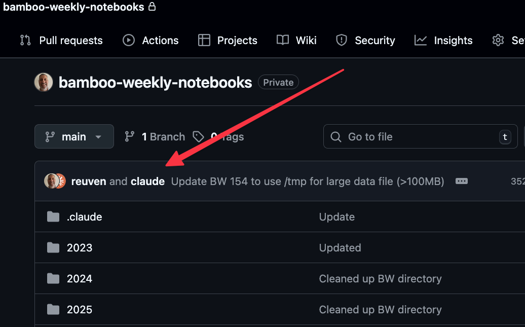
This happens because Claude inserts
Co-Authored-By: Claude Opus 4.5 <noreply@anthropic.com>
into any Git commits it makes. You can turn that off, but I'm not yet sure what I think. It's honest... but weird.
Anyway, I gave the first question to Claude Code. And it came up with the following:
import marimo as mo
import pandas as pd
import plotly.express as px

df = pd.read_excel('/tmp/bw-154-leiden-ranking-2025.xlsx', sheet_name='Results')
Claude correctly used read_excel to get the file into a data frame.
Notice that I hadn't said anything about which sheet in the Excel spreadsheet had the data we wanted; Claude figured that out, and specified which tab to use, using sheet_name.
It then started to solve the problem. I would have preferred a full method-chaining solution, without any interim assignments to other variables, but that's a matter of tweaking my CLAUDE.md file further. And indeed, just as a manager (or parent) needs to learn what to say, and how to say it, to give guidelines without smothering someone's creativity, learning what to say to AI takes some time and practice – and I'm certainly still learning.
It first filtered the rows:
df_periods = (
    df
    .loc[lambda d: d['Period'].isin(['2006–2009', '2020–2023'])]
)
print(f"Rows after filtering: {len(df_periods)}")
df_periods
As you can see, it used loc and lambda, as I requested. It used isin, which makes sense, given that I was looking for just two specific time periods. It nicely reported back on how many rows it found, although that seems unnecessary, given that Marimo already tells us that when displaying a data frame. (Another instruction to add!)
It then filtered further:
p_top_1_by_country = (
    df_periods
    .groupby(['Period', 'Country'])['P_top_1']
    .mean()
    .reset_index()
    .sort_values(['Period', 'P_top_1'], ascending=[True, False])
    .groupby('Period')
    .head(10)
)
print("Top 10 Countries by Mean P_top_1 (raw count of frequently cited publications):")
p_top_1_by_country
You can see that it did a two-dimensional groupby , something that I do much more rarely now, since I would prefer to use pivot_table instead. It then used reset_index to move Period from the index into the main data frame, then sorted by Period and P_top_1, then ran another groupby, and then grabbed the top 10 values with head(10).
The results look fine to me, but I think that a hand-crafted query would have worked better here. After all, why sort the values if you're going to then run a groupby? I don't see the point in that.
I also think that the results are presented in a somewhat weird way, namely that we still have the Period column, and are sorting by that. So we get the top 10 for the first Period value, and then the top 10 for the second Period value.
The results:
	Period	Country	P_top_1
66	2006–2009	Switzerland	36.3716465284
46	2006–2009	Netherlands	35.9411873193
74	2006–2009	United States	35.0599837487
59	2006–2009	Singapore	34.9924901547
15	2006–2009	Denmark	28.4422089871
5	2006–2009	Belgium	26.590492259
73	2006–2009	United Kingdom	24.706448371
8	2006–2009	Canada	22.2242188287
20	2006–2009	France	20.6656110334
65	2006–2009	Sweden	20.3205031548
136	2020–2023	Singapore	123.9949836471
123	2020–2023	Netherlands	95.2078188649
143	2020–2023	Switzerland	94.2248202105
92	2020–2023	Denmark	88.7982345354
82	2020–2023	Belgium	66.0598360626
150	2020–2023	United Kingdom	64.1941311363
151	2020–2023	United States	61.6961398633
79	2020–2023	Australia	60.9922851037
85	2020–2023	Canada	53.5182557947
142	2020–2023	Sweden	51.5882779768
Claude used the identical code to get the countries with the greatest percentage of papers accepted, which levels the playing field across countries of different sizes:
# Find countries with greatest mean PP_top_1 for each period
pp_top_1_by_country = (
    df_periods
    .groupby(['Period', 'Country'])['PP_top_1']
    .mean()
    .reset_index()
    .sort_values(['Period', 'PP_top_1'], ascending=[True, False])
    .groupby('Period')
    .head(10)
)
print("Top 10 Countries by Mean PP_top_1 (percentage of frequently cited publications):")
pp_top_1_by_country
Again, basically the same query. And the results:
	Period	Country	PP_top_1
66	2006–2009	Switzerland	0.0168893753
25	2006–2009	Iceland	0.0165033596
46	2006–2009	Netherlands	0.015702924
74	2006–2009	United States	0.0146211032
73	2006–2009	United Kingdom	0.0144238607
5	2006–2009	Belgium	0.0130199101
15	2006–2009	Denmark	0.0127612574
21	2006–2009	Germany	0.0119876619
30	2006–2009	Ireland	0.0115705144
3	2006–2009	Austria	0.0115656672
136	2020–2023	Singapore	0.0207360071
131	2020–2023	Qatar	0.0205463948
143	2020–2023	Switzerland	0.0199531389
150	2020–2023	United Kingdom	0.0197036999
120	2020–2023	Malta	0.0190562473
79	2020–2023	Australia	0.0188370786
123	2020–2023	Netherlands	0.0186751399
149	2020–2023	United Arab Emirates	0.0182737093
118	2020–2023	Luxembourg	0.0175209474
107	2020–2023	Ireland	0.0174914053
I would bore you with my analysis, but why do that when Claude also summarized things?
Analysis: P_top_1 vs PP_top_1 Rankings
P_top_1 (raw count) favors countries with many large universities producing large quantities of research:

    2006-2009 top: Switzerland, Netherlands, United States, Singapore, Denmark
    2020-2023 top: Singapore, Netherlands, Switzerland, Denmark, Belgium

PP_top_1 (percentage) measures quality/impact regardless of university size:

    2006-2009 top: Switzerland, Iceland, Netherlands, United States, United Kingdom
    2020-2023 top: Singapore, Qatar, Switzerland, United Kingdom, Malta

The key difference is that P_top_1 (absolute count) favors large research-intensive nations like the USA, UK, and China, while PP_top_1 (proportion) can highlight smaller countries with high-impact research programs.
Not bad! And yet... neither China nor the United States is anywhere to be found. So what was the New York Times talking about? Ah, these were per-country metrics. The Times article was talking about individual universities. So... I asked the wrong question, which was my fault, not Claude's!
From the 2006-2009 period to the 2020-2023 period, which five countries rose the most in the pp_top_1 numbers? Which five countries dropped the most?
Here's the query that Claude used:
pp_top_1_change = (
    df_periods
    .groupby(['Country', 'Period'])['PP_top_1']
    .mean()
    .unstack(level='Period')
    .assign(change=lambda d: d['2020–2023'] - d['2006–2009'])
    .dropna()
    .sort_values('change', ascending=False)
)
So, it started with the cut-down, two-period data frame from before (df_periods). It then grouped by Country and Period, on PP_top_1, and got their mean – so it's finding, for each country in each period, the mean for PP_top_1. A two-dimensional groupby gives a two-part multi-index on the result; it used unstack to move Period into the columns. As I mentioned before, my preference would have been to use pivot_table here, which is basically equivalent, and I think a bit more elegant.
But with the two periods now side-by-side, it used assign to calculate the difference between 2020-2023 and 2006-2009, and put it into a new change column. It then removed all NaN values with dropna, and used sort_values to get them in descending order.
It then printed a number of reports:
print("Top 5 countries that ROSE the most in PP_top_1:")
print(pp_top_1_change.head(5)[['2006–2009', '2020–2023', 'change']])
print("\nTop 5 countries that DROPPED the most in PP_top_1:")
print(pp_top_1_change.tail(5)[['2006–2009', '2020–2023', 'change']])
pp_top_1_change
They said:
Top 5 countries that ROSE the most in PP_top_1:
Period                2006–2009  2020–2023    change
Country
Qatar                  0.000000   0.020546  0.020546
United Arab Emirates   0.004012   0.018274  0.014262
Viet Nam               0.000593   0.014270  0.013676
Bangladesh             0.003113   0.013971  0.010858
Singapore              0.009880   0.020736  0.010856

Top 5 countries that DROPPED the most in PP_top_1:
Period     2006–2009  2020–2023    change
Country
Mexico      0.005966   0.005494 -0.000471
Thailand    0.005121   0.004319 -0.000802
Lithuania   0.008584   0.007062 -0.001522
Ethiopia    0.011072   0.009375 -0.001697
Iceland     0.016503   0.013192 -0.003312
So on a per-country basis, we can see that there hasn't been that much change over the years. Countries moved a handful of percentage points up or down, but nothing overwhelming.