


This week, we looked at the price of gasoline in the United States – both because it has declined over the last year, and because it is often considered a major factor in presidential elections. The New York Times reported on the lower gas prices just yesterday (https://www.nytimes.com/2024/09/11/business/gas-prices.html?unlocked_article_code=1.J04.b2Z9.5bY7k7zsD7_f&smid=url-share), and we can expect that this topic will continue to command attention for the next two months.
This week, we'll take a look at some of the historical data regarding gasoline prices in the United States. We'll not only analyze the data using Pandas, but we'll produce some nice-looking output using Great Tables (https://pypi.org/project/great-tables/), whose project leads were recently interviewed on the Real Python podcast (https://realpython.com/podcasts/rpp/214/).
Great Tables assumes that you have already analyzed the data, and now want to present it on a Web site or in a publication. It makes it easy to spruce up your formatted output in a wide variety of ways, without changing the data itself. You can think of it as the tabular equivalent of Matplotlib or (even better) Seaborn. After using it to answer this week's questions, you'll have a good sense of how it works and how you can start to use it.
Data and six questions
Our data comes from the US Energy Information Administration (https://www.eia.gov/), which tracks (among other things) the price of gasoline of different types, and in different areas of the country. You can download the data from their main report page, which is updated weekly:
https://www.eia.gov/petroleum/gasdiesel/
The data itself is in an Excel spreadsheet you can download by clicking on the "full history XLS" link next to the "regular gasoline prices" table. Or you can download it directly from here:
https://www.eia.gov/petroleum/gasdiesel/xls/pswrgvwall.xls
This week, I gave you six tasks and questions. As usual, a link to the Jupyter notebook I used to solve these problems is at the bottom of the post.
Create a data frame from the "Data 1" tab in the Excel file. The index should be the "Date" column. Shorten the other column names by removing the text that's common to them.
Let's start by loading Pandas:
import pandas as pdWith that in place, we can load the data from the Excel file using read_excel, which returns a data frame:
https://pandas.pydata.org/pandas-docs/stable/reference/api/pandas.read_excel.html
In the simplest form, read_excel returns a single data frame from an Excel file. But in this case, the Excel file contains a number of tabs, each of which could be considered its own data structure. We only want one of these, the tab labeled "Data 1", with prices of regular gasoline. We can pass the sheet_name keyword argument with either a string value ("Data 1") or the integer index of the tab. I chose to use the index.
I also wanted the "Date" column to be turned into the data frame's index. In order to do that, we need to pass the index_col keyword argument, either naming or providing the numeric index of the column we want to use.
We can try this:
filename = 'pswrgvwall.xls'
df = pd.read_excel(filename,
                   sheet_name=1,
                  index_col='Date')
But if we do, the data will be all messed up. Or it won't work at all. That's because there are some explanatory notes and references in the first two rows of the file. We can tell Pandas to ignore those first two lines, and start parsing on the third line (i.e., index 2) by passing the header keyword argument, along with a value of 2:
df = pd.read_excel(filename,
                   sheet_name=1,
                  header=2,
                  index_col='Date')
The good news is that we now have a data frame whose columns all have a dtype of float64, containing the data from the Excel spreadsheet.
But wait a second: The index (Date) that we read into the file contains datetime values. Don't we normally need to use the parse_dates keyword argument in order to turn strings into datetime values? Yes, we do. But this column in Excel actually contained datetime values. When read_excel read the values into a data frame, it just used the data type that Excel gave to it, without the need to explicitly convert the values.
We end up with a data frame with 1,778 rows and 20 columns. Each row represents one week of gasoline pricing data, and each column represents a region of the United States (or an average of the entire country) from which the data was drawn.
This worked fine, but if I ask to see df.columns, I get the following:
Index(['Weekly U.S. Regular Conventional Retail Gasoline Prices  (Dollars per Gallon)',
       'Weekly East Coast Regular Conventional Retail Gasoline Prices  (Dollars per Gallon)',
       'Weekly New England (PADD 1A) Regular Conventional Retail Gasoline Prices  (Dollars per Gallon)',
       'Weekly Central Atlantic (PADD 1B) Regular Conventional Retail Gasoline Prices  (Dollars per Gallon)',
       'Weekly Lower Atlantic (PADD 1C) Regular Conventional Retail Gasoline Prices  (Dollars per Gallon)',
       'Weekly Midwest Regular Conventional Retail Gasoline Prices  (Dollars per Gallon)',
       'Weekly Gulf Coast Regular Conventional Retail Gasoline Prices  (Dollars per Gallon)',
       'Weekly Rocky Mountain Regular Conventional Retail Gasoline Prices  (Dollars per Gallon)',
       'Weekly West Coast Regular Conventional Retail Gasoline Prices  (Dollars per Gallon)',
       'Weekly Colorado Regular Conventional Retail Gasoline Prices  (Dollars per Gallon)',
       'Weekly Florida Regular Conventional Retail Gasoline Prices  (Dollars per Gallon)',
       'Weekly New York Regular Conventional Retail Gasoline Prices  (Dollars per Gallon)',
       'Weekly Minnesota Regular Conventional Retail Gasoline Prices  (Dollars per Gallon)',
       'Weekly Ohio Regular Conventional Retail Gasoline Prices  (Dollars per Gallon)',
       'Weekly Texas Regular Conventional Retail Gasoline Prices  (Dollars per Gallon)',
       'Weekly Washington Regular Conventional Retail Gasoline Prices  (Dollars per Gallon)',
       'Weekly Cleveland, OH Regular Conventional Retail Gasoline Prices  (Dollars per Gallon)',
       'Weekly Denver, CO Regular Conventional Retail Gasoline Prices  (Dollars per Gallon)',
       'Weekly Miami, FL Regular Conventional Retail Gasoline Prices  (Dollars per Gallon)',
       'Weekly Seattle, WA Regular Conventional Retail Gasoline Prices  (Dollars per Gallon)'],
      dtype='object')
While it's good to have column names that clearly indicate the data they'll contain, these seem a bit long, especially since their text repeats so much. I asked you to cut out the repetitive text. How can we do that?
Remember that we can retrieve the index from a data frame with the index property. And we can assign back to that property, giving it a list or other iterable, assuming that it's the right length. The same is true for the columns property, which (somewhat confusingly) is also an "index" object. I thus decided to use a list comprehension, iterating over the column names, invoking plain ol' Python string methods (str.removeprefix and str.removesuffix) on each of the column names:
df.columns = [(one_column
               .removesuffix('Regular Conventional Retail Gasoline Prices  (Dollars per Gallon)')
               .removeprefix('Weekly')
               .strip())
              for one_column in df.columns]
df.head()
And yes, the lines are a bit long and out of control... but so are the column names!
Also notice that I used str.strip after removing those prefixes and suffixes, to ensure that there isn't extra leading or trailing whitespace.
After performing this surgery on the column names, we have the following:
Index(['U.S.', 'East Coast', 'New England (PADD 1A)',
       'Central Atlantic (PADD 1B)', 'Lower Atlantic (PADD 1C)', 'Midwest',
       'Gulf Coast', 'Rocky Mountain', 'West Coast', 'Colorado', 'Florida',
       'New York', 'Minnesota', 'Ohio', 'Texas', 'Washington', 'Cleveland, OH',
       'Denver, CO', 'Miami, FL', 'Seattle, WA'],
      dtype='object')
I find this easier to deal with and understand. We could have removed the parenthesized PADD text in a few of the columns, but I think that we did enough to make the column names easy to read and understand for now.
In which region of the US have gas prices been, on average, the highest since 2000?
The United States is a big country, and it's well known that some areas are more expensive than the others. I asked you to take the average price of gas for each region since 2000, and show which areas are the most expensive.
First, let's choose only those rows from 2000 and onward. Because our data frame has a datetime index, we can use some tricks to select certain rows. For example, if we use .loc with a string to select from a datetime index, we can retrieve all of the rows matching that datetime.
But if our string contains only part of a date – the year, or the year and the month – then .loc will match any value on the smaller measures. So if you include the year and month, .loc will retrieve rows with that year and month, regardless of the day. And if you include only the year, .loc will retrieve rows with that year, regardless of the month and day.
Moreover, we can use an open-ended slice in .loc. So if I look for .loc['2000':], this will return all rows with a year of 2000 or later:
(
    df
    .loc['2000':]
)
We now have a shorter (but just-as-wide) data frame as before, limited to rows from 2000 and onward. We want to calculate the mean of each column; fortunately, invoking mean does this, returning a series of floats, one for each column. (The series index is the same as df.columns.)
(
    df
    .loc['2000':]
    .mean()
)
If we want to get the 10 most expensive locations, we have two basic options. One is to use sort_values to sort the series. If we pass the ascending=False keyword, then we can use head(10) to get the 10 most expensive locations:
(
    df
    .loc['2000':]
    .mean()
    .sort_values(ascending=False)
    .head(10)
)
There's nothing wrong with this, but I always wonder if it might be faster to run nlargest, which both sorts and returns a set number of records:
(
    df
    .loc['2000':]
    .mean()
    .nlargest(10)
)
The good news is that I got the same answer in both cases:
Seattle, WA                   3.206568
Washington                    3.151362
West Coast                    2.886687
Miami, FL                     2.866249
New York                      2.774159
Florida                       2.754303
Cleveland, OH                 2.747500
Ohio                          2.729495
Central Atlantic (PADD 1B)    2.719431
New England (PADD 1A)         2.666187
dtype: float64
However, the two approaches didn't take the same amount of time, when measuring with timeit. Using nlargest took 588 μs, whereas sort_values and head took only 371 μs, about 40 percent faster.
Regardless, we can see that Seattle has had, on average, much higher gas prices than other areas of the country.
Calculate the weekly percentage change in gas prices, for each region, starting in 2000. Calculate the mean percentage change for each year. Display this in a GreatTable, with the date (month, day, and year) on the left (as the "stub"),
and the data (formatted as percentages) on the right. Give it a nice title, too.
For the first part of this question, I asked you to calculate the weekly percentage change in gas prices starting in 2000. Since we already have the weekly prices, we can get the percentage change using pct_change. This will return a new data frame, one whose index and column names are the same as the input, but with floats (reflecting the change from the above row) as the values.
(
    df.loc['2000':]
    .pct_change(fill_method=None)
)
Notice that I passed the fill_method=None keyword argument to avoid getting a warning from Pandas, telling me that I needed to do that given that the input data contained NaN values.
Next, I asked you to calculate the mean percentage change for each year. In other words, we got the percentage change for each week. I asked you to calculate the mean change for each year in the system. To do this, we'll take advantage of the datetime values in our index, calling resample to perform a date-based grouping operation. In this case, we want to resample all of the columns, using mean on an annual basis. That means passing a resample code of 1YE, meaning "1 year end":
(
    df.loc['2000':]
    .pct_change(fill_method=None)
    .resample('1YE').mean()
)
The result is a 25-row, 20-column data frame with one row per year (labeled on December 31st of each year) and one column per tracked region.
Now that we have the data we want, it's time to break out Great Tables. But before we do that, it's important to remember that GT formats existing data, and that the data all needs to be the data frame itself, rather than in the index. I thus used reset_index to bring Date back into the data frame:
(
    df.loc['2000':]
    .pct_change(fill_method=None)
    .resample('1YE').mean()
    .reset_index()
)
To use Great Tables to format our data frame, we first need to call it (GT), passing our data frame as an argument. The problem? I want to keep using method chaining. But GT isn't a method, so it would seem like we have to break the chain.
Except that Pandas provides us with the pipe method, designed for precisely these cases: Instead of calling GT(df), we can call df.pipe(GT). The resulting GT object is returned to us, and then we can continue the chain, calling methods on GT rather than on df. Note that this abrupt change in the object on which we're invoking methods can be confusing for some, and is frowned upon in some programming circles:
(
    df.loc['2000':]
    .pct_change(fill_method=None)
    .resample('1YE').mean()
    .reset_index()
    .pipe(GT)
)
Now that we have the GT object, what can we do with it? We'll pass methods, each of which affects the look of the resulting table. That is, we aren't going to change the calculations that Pandas performed, but we will format the table so that it'll be attractive and inviting for others to see. Many of the methods start with tab_, to modify the table's output, and fmt_, to modify the formatting of one or more columns.
For example, we can give our table a nice display header with tab_header, passing a string to display. And we can indicate which column should be displayed as the left-hand labels by invoking tab_stub, passing rowname_col and the name of the column (Date) we want to show there:
(
    df.loc['2000':]
    .pct_change(fill_method=None)
    .resample('1YE').mean()
    .reset_index()
    .pipe(GT)
    .tab_header('Monthly change in gas prices')
    .tab_stub(rowname_col='Date')
)
We have now indicated, beyond the actual data columns, what we want to be displayed. And GT offers many, many more options for labeling, including lines for subtitles and references.
But a big part of displaying data nicely, and something that can frustrate me with Pandas, is displaying data in the right way. For example, we're talking about percentage changes, so it would make sense to show the values as percentages. And as for the dates, I'd like to show them with the month, day, and year.
Both of these are easy to accomplish with GT methods fmt_percent and fmt_date. In both cases, the first argument is either a single column name or a list of column names (strings). In the case of fmt_date, we can pass a second keyword argument, date_style, choosing from a variety of styles that GT offers to us.
In the end, the query looks like this:
(
    df.loc['2000':]
    .pct_change(fill_method=None)
    .resample('1YE').mean()
    .reset_index()
    .pipe(GT)
    .tab_header('Monthly change in gas prices')
    .tab_stub(rowname_col='Date')
    .fmt_percent(columns=['U.S.', 'East Coast', 'New England (PADD 1A)',
       'Central Atlantic (PADD 1B)', 'Lower Atlantic (PADD 1C)', 'Midwest',
       'Gulf Coast', 'Rocky Mountain', 'West Coast', 'Colorado', 'Florida',
       'New York', 'Minnesota', 'Ohio', 'Texas', 'Washington', 'Cleveland, OH',
       'Denver, CO', 'Miami, FL', 'Seattle, WA'])
    .fmt_date('Date', date_style='m_day_year')
)
And the result, displayed in my browser, looks like this:
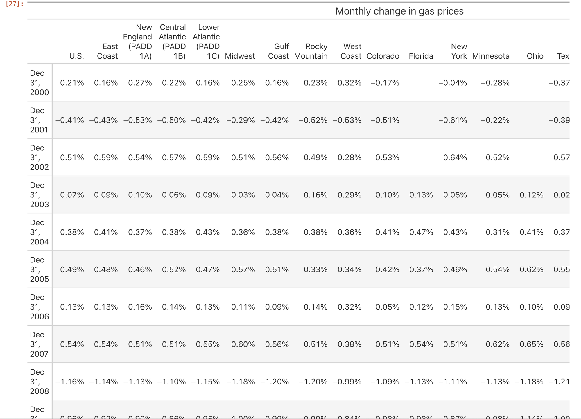
Note that this is a screenshot from part of the output, which is too long and too wide to capture with a single screen or screenshot.
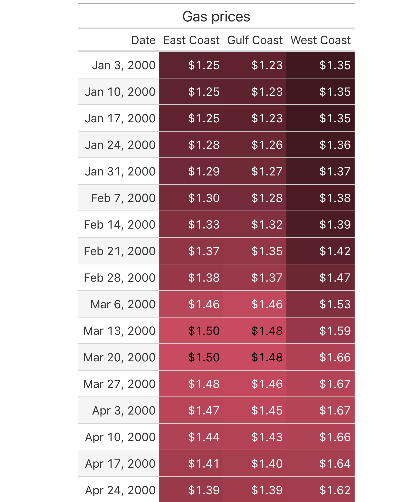
Use Great Tables to create a table showing the gas prices for any region with the word "coast" in it, starting in the year 2000. The table header should be "coastal gas prices," and the numbers should be formatted as currency (i.e., dollar signs at the front, and two digits after the decimal point).
Next, I asked you to use GT to show prices starting in the year 2000, but only for regions containing the word "Coast". I thus started by invoking loc again, and then using filter to keep only those columns containing Coast. Notice that I passed the like keyword argument, indicating that I wanted to keep any column whose name contains Coast in it.
I then invoked reset_index to (again) bring our Date column back into the world of Great Tables, where we can display it alongside the values:
(
    df
    .loc['2000':]
    .filter(like='Coast')
    .reset_index()
)
Now that our data is in place, I'll use Great Tables to format it. First, I'll again use pipe(GT) to keep the method chain going, even though we're now invoking methods on the GT object, rather than on df.
The first thing we'll do is again invoke fmt_header to give us a nice title. And then I'll again invoke fmt_date to show the dates in a nice way.
But then, since we're dealing with dollars (rather than percentages), I'll call fmt_currency, indicating that we want to display our three "coast" columns in dollars and cents.
And then, to give it a bit more flair, I invoked data_color to colorize each of the monetary values, showing with higher values showing in a darker color:
(
    df
    .loc['2000':]
    .filter(like='Coast')
    .reset_index()
    .pipe(GT)
    .tab_header('Gas prices')
    .fmt_date('Date', date_style='m_day_year')
    .fmt_currency(['East Coast', 'Gulf Coast', 'West Coast'])
    .data_color(['East Coast', 'Gulf Coast', 'West Coast'])
)
The result, at least in part, on my computer looks like this:
Create a line plot showing the overall US gasoline prices for each month in the data set. Are we currently at or near a high point with the prices?
Next, I was curious to know where US gas prices currently are, when compared with the historical data. I again used resample, this time looking at mean monthly prices (1ME, for "end of each one-month period"), and only on the U.S. column:
(
    df
    .resample('1ME')['U.S.'].mean()
)
We get a result that looks like this:
Date
1990-08-31    1.21800
1990-09-30    1.25800
1990-10-31    1.33540
1990-11-30    1.32400
1990-12-31    1.34100
               ...
2024-05-31    3.45875
2024-06-30    3.32625
2024-07-31    3.37760
2024-08-31    3.29525
2024-09-30    3.15550
Freq: ME, Name: U.S., Length: 410, dtype: float64
If we want to visualize this, we can use plot.line in Pandas, creating a line plot of the monthly mean gas prices:
(
    df
    .resample('1ME')['U.S.'].mean()
    .plot.line()
)
The result:
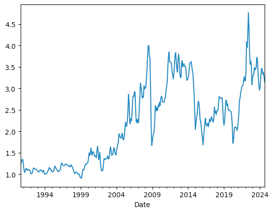
We can see that there has indeed been a huge spike in gas prices over the last few years. But we can also see that gas prices have come down from that high, and that while it isn't a single straight line, there is a general downward trend, at least for now. Of course, oil-producing countries are worried about low gasoline prices (which stem from low oil prices), and are hoping to reduce production in order to raise prices, but we'll see if and when that'll happen.
It's often said that gas prices rise in the summer. Let's see if that's true: For weeks starting in 2010 for the entire US, calculate the mean price per quarter, then the percentage change. Keep only those rows from Q2 (i.e., June 30th) and Q3 (i.e., September 30th). Do we see large gains? Drops? Format the results with Great Tables, showing the year and quarter for the Date column, and percentages for the U.S. column.
Next, I asked you to grab only data from 2010 and onward, and only from the U.S. column. We can do that with the two-argument version of loc, which takes a row selector (in this case, a slice) and a column selector (in this case, the name of a single column U.S.).
However, both resample and Great Tables require that we have a data frame, rather than a series. I thus put the U.S. column inside of a list (i.e., square brackets), creating a one-column data frame.
I then ran resample, giving it 1QE as the period, meaning "end of every one quarter". I invoked mean, to get the mean value of gas in the US at the end of every quarter starting in 2010:
(
    df
    .loc['2010':,
          ['U.S.']]
    .resample('1QE').mean()
)
Next, I ran pct_change on this result, and used filter and a regular expression to keep only those rows that are on June 30th (i.e., 06-30) or September 30th (i.e., 09-30). I also ran reset_index to get the Date column for formatting:
(
    df
    .loc['2010':,
          ['U.S.']]
    .resample('1QE').mean()
    .pct_change()
    .filter(regex='06-30|09-30', axis='rows')
    .reset_index()
)
We now have the calculations we want, which means that it's time to use GT to format our tables. I again use pipe(GT), followed by tab_sub (to display the date along the left side). I use fmt_date to format the date, this time telling it to show year_quarter. I must admit that I was surprised and impressed that this is one of their standard date-formatting displays! As is often the case in open source, the problems you're trying to solve aren't unique to you, and if someone else has solved it before you, all the better.
Finally, I invoke fmt_percent on our U.S. column:
(
    df
    .loc['2010':,
          ['U.S.']]
    .resample('1QE').mean()
    .pct_change()
    .filter(regex='06-30|09-30', axis='rows')
    .reset_index()
    .pipe(GT)
    .tab_stub('Date')
    .fmt_date('Date', date_style='year_quarter')
    .fmt_percent(columns=['U.S.'])
)
The result (albeit a bit large):
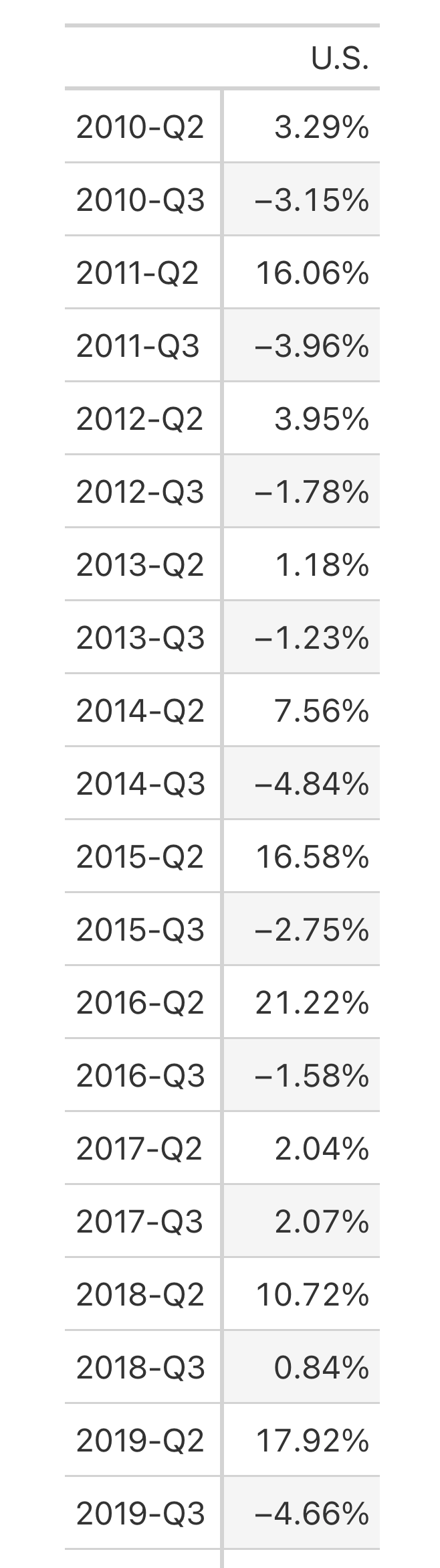
From eyeballing this data, it does indeed look like gas prices often shoot up in the second quarter by quite a bit, often followed by the third quarter. So the notion of summer gas prices would appear to be at least partly accurate.
That's it for this week!
Here's a link to my Jupyter notebook: https://drive.google.com/file/d/1c8cs6hqAsAlCzbx4EPIXGDdMKmqMHRLQ/view?usp=sharing
I'll be back next Wednesday with more Pandas and data-analysis puzzles based current events.
Reuven