


[Are you at PyCon US? Come to my talk on Friday, “Dates and times in Pandas,” and also to my booth, where I’ll be giving away T-shirts and stickers, and raffling off free copies of Pandas Workout. If you’re at the conference, please come and say “hi”!]
This week — indeed, today — is the start of PyCon US 2024. It’s taking place in Pittsburgh, so I decided to look into some Pittsburgh-related data for this week’s challenges.
The data set I found is a log of calls made to the 311 non-emergency municipal phone number. Except that nowadays, you don’t have to call 311 on your telephone. (Really, who uses their phone any more for making calls?) You can access it via a Web site, an app, and a variety of other possibilities.
So we’ll learn a bit about what the people of Pittsburgh complain about, at least to their city government. And along the way, we’ll practice some data-analysis techniques in Pandas.

Shirts, flyers, and book giveaways — I’m all set for my PyCon booth!
If you want a more traditional Pittsburgh-related data set, by the way, there’s a classic one describing the city’s many bridges:
https://archive.ics.uci.edu/dataset/18/pittsburgh+bridges
Data and six questions
This week's questions are based on the 311 data. The home page for this data set is at
https://data.wprdc.org/dataset/311-data
This page includes links to the data and a data dictionary. It also says that the feed for this data was last working in December of 2022, and that they're working to restore it. So our data will only exist through 2022.
You can download the data from here:
https://tools.wprdc.org/downstream/76fda9d0-69be-4dd5-8108-0de7907fc5a4
Here are the challenges that I posed in yesterday’s message. As always, a link to the Jupyter notebook I used to solve these problems is at the end of the message.
Here are the questions I asked you to answer:
Read the 311 data into a data frame. Ensure that the "CREATED_ON" column is a datetime value.
First, I loaded up Pandas:
import pandas as pdWith that in place, I was then able to load the file that I had downloaded:
filename = '76fda9d0-69be-4dd5-8108-0de7907fc5a4.csv'

df = pd.read_csv(filename)
The good news? This worked just fine, in the sense that the file uses commas (the default with “read_csv”), and the first line of the file contained column names.
However, by default, Pandas doesn’t look for or parse any date-related columns: It’ll identify integer and float columns, but anything other than that is treated as a string. One solution is to pass the “parse_dates” keyword argument to “read_csv”, telling it which column(s) to treat as datetime values:
df = pd.read_csv(filename,
                 parse_dates=['CREATED_ON']
)
A second option is to use the PyArrow engine for reading CSV files. PyArrow is a new, cross-platform, cross-language data structure that will eventually replace NumPy as the back-end storage for Pandas. We can use its CSV-parsing mechanism, though, even if we still store the data in NumPy, by setting the “engine” keyword argument:
df = pd.read_csv(filename,
                 engine='pyarrow')
This not only loads the CSV file faster than the default, but it has the advantage of identifying datetime columns and then setting their dtype appropriately. We can see this when we look at the “dtypes” attribute for our data frame:
_id                              int64
REQUEST_ID                     float64
CREATED_ON               datetime64[s]
REQUEST_TYPE                    object
REQUEST_ORIGIN                  object
STATUS                           int64
DEPARTMENT                      object
NEIGHBORHOOD                    object
COUNCIL_DISTRICT               float64
WARD                           float64
TRACT                          float64
PUBLIC_WORKS_DIVISION          float64
PLI_DIVISION                   float64
POLICE_ZONE                    float64
FIRE_ZONE                       object
X                              float64
Y                              float64
GEO_ACCURACY                    object
dtype: object
Sure enough, we see that the “CREATED_ON” column has a dtype of “datetime64[s]”. This is slightly different than what we would get with with “parse_dates”, which results in a dtype of “datetime64[ns]”, meaning with nanosecond granularity, but I think that we can do without such high accuracy in assessing when these calls arrive.
Create a stacked bar plot in which each bar represents the number of 311 requests in a given year. Each bar should show, via colorized sub-parts, the number of calls from each "REQUEST_ORIGIN". How do people submit most requests? Does this seems to be changing over time?
Normally, if we call “plot.bar” on a series, we get one bar for each element, labeled with the corresponding index. If we call “plot.bar” on a data frame, we get one cluster of bars for each index. Each cluster contains one bar for each column in the data frame. So in a 4-row, 3-column data frame, we would have 12 bars, clustered in to 4 groups of 3.
Let’s start with that as our goal. We’ll need a data frame in which the index contains the years in our data set, and the columns contain the unique values from REQUEST_ORIGIN. But we don’t want to get the mean or sum of these values; we just want to know how many times we saw each type of request per year.
The easiest way to create such a data frame is by running “pivot_table”:
- The index will be based on the years, which we can get with the “dt.year” on our datetime column, CREATED_ON
- The columns will be based on the values in REQUEST_ORIGIN
- The aggregation function wll be “count”
- It doesn’t matter much what column we use for values, so I’l just use REQUEST_ID.
We run the following code:
(
    df
    .pivot_table(index=df['CREATED_ON'].dt.year,
                 columns='REQUEST_ORIGIN',
                 aggfunc='count',
                values='REQUEST_ID')
)
This returns a data frame — a pivot table, no less — with 8 rows and 11 columns.
We can get a bar plot from this data by running “plot.bar”:
(
    df
    .pivot_table(index=df['CREATED_ON'].dt.year,
                 columns='REQUEST_ORIGIN',
                 aggfunc='count',
                values='REQUEST_ID')
    .plot.bar()
)
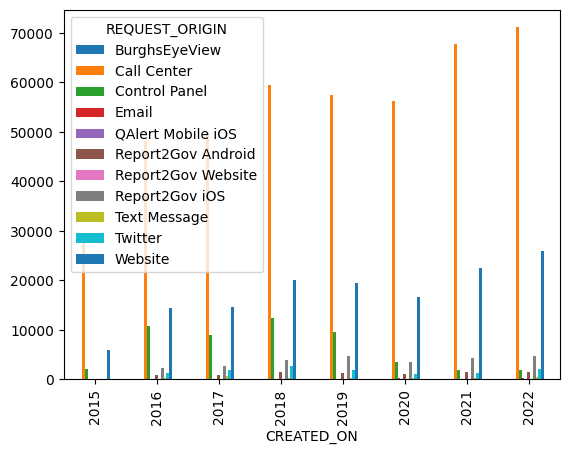
This works, giving us a bar plot with one cluster per year and 11 bars per cluster:
However, I asked you to create a stacked bar plot, one in which all of the bars for a given year are put on top of one another. With such a plot, we can compare total requests per year, and also the relative makeup of those requests:
(
    df
    .pivot_table(index=df['CREATED_ON'].dt.year,
                 columns='REQUEST_ORIGIN',
                 aggfunc='count',
                values='REQUEST_ID')
    .plot.bar(stacked=True, figsize=(10,10))
)
Note that I made the size of the plot 10x10, in order for it to be more readable.
The result of the above query is:
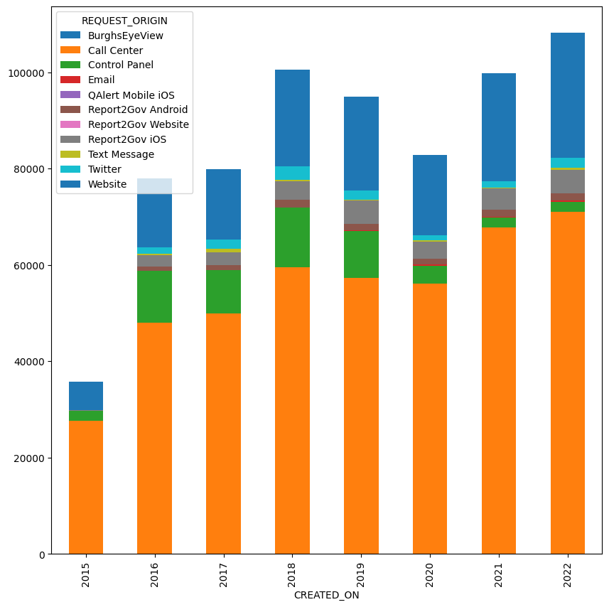
The chart shows that for all of the cynicism (including mine!) about how much people are using their phones to make actual calls, we can see here that the overwhelming majority of people contacting 311 are indeed calling that number.
Repeat the previous question, but combine all three "Report2Gov" values into a single value (and thus color in the bar plot)
In the previous plot (and in the pivot table itself), we see three columns having to do with the Report2Gov system — an iOS app, an Android app, and a Web site. I asked you to combine these three columns into a single one (“Report2Gov”), and then to recreate the bar plot.
There are a few ways in which we can do this. I decided to use the “replace” method, which allows us to replace any string in the data frame with any other string. By modifing the data frame before we create the pivot table, we automatically reduce the number of columns that the pivot table will contain. (Another option would be to sum all three of the “Report2Gov” columns into a single column, and drop the original ones, before creating the pivot table.)
How, though, can I replace a number of different strings, each starting with the term “Report2Gov”, into a single “Report2Gov” string?
The answer, as is so often the case with patterns of text, is to use a regular expression. We can tell the “replace” method that we are searching for a regular expression, and not a plain ol’ string, by passing a True value to the “regex” keyword argument.
Our regular expression will be:
- ^, to anchor our search to the start of the string
- Report2Gov, text that is taken literally
- .*, meaning 0 or more any characters after “Report2Gov”
Having run this replacement on the original data frame before we create the pivot table, the result happens almost automatically:
(
    df
    .replace(r'^Report2Gov.*', 'Report2Gov', regex=True)
    .pivot_table(index=df['CREATED_ON'].dt.year,
                 columns='REQUEST_ORIGIN',
                 aggfunc='count',
                values='REQUEST_ID')
    .plot.bar(stacked=True, figsize=(10, 10))
)
We now get the following bar plot:
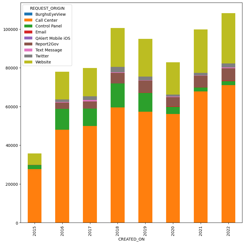
The three of “Report2Gov” columns have been combined. They are not an insiginificant part of the call history, but they are still far below phone calls (in orange) and even the standard Web site (in pea green).
Repeat the previous question, but instead of one bar per year, have one bar per quarter, from the start of the data set to the end.
So far, we’ve been looking at how many calls were created per year. But what if we want to look at things more finely, on a per-quarter basis? How could we get that information?
Your first instinct might be to say that just as datetime columns have a “dt.year” attribute, they have a “dt.quarter” attribute. So we could just substitute one for the other, and be done with it:
(
    df
    .replace(r'^Report2Gov.*', 'Report2Gov', regex=True)
    .pivot_table(index=df['CREATED_ON'].dt.quarter,
                 columns='REQUEST_ORIGIN',
                 aggfunc='count',
                values='REQUEST_ID')
    .plot.bar(stacked=True, figsize=(10, 10))
)
The problem is that this doesn’t really answer the question:
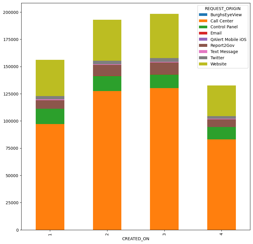
We can now see the seasonal fluctuations in the number of queries made to the 311 serivce. But this shows us all of the requests from the first quarter in any year, from the second quarter in any year, and so forth.
I was interested in breaking the data up into quarters — instead of seeing 8 rows, for the 8 years of information in the data set, we would see about 32 rows, one for each quarter in each year. (We wouldn’t have for the quarters preceding the initial data and after the final data.)
How can we do that? We can use “pd.Grouper”, a Pandas object designed to help us create complex “groupby” queries, especially when it comes to datetime information. Basically, Grouper returns an object that you can pass to “groupby”. For example, if we want to get data from the end of each quarter, taken from the CREATED_ON column, we can say:
pd.Grouper(key='CREATED_ON', freq='1QE')This returns an object that, when passed to “groupby”, will group by the end of each quarter — from the first quarter in the data set to the last.
Notice that we don’t call Grouper on a data frame. Rather, it’s a class defined at the top level of the “pd” namespace. We’re creating a new Grouper instance, once which “groupby” knows how to deal with.
This might seem familiar to you if you’ve used the “resample” method before on data frames whose index contains datetime values. And indeed, it’s a very similar idea, in that we’re not grouping on the integer values we would get from “dt.year” or “dt.quarter”. Rather, we’re grouping chronologically, from the first quarter of the data to the last one.
But wait: I’ve been writing about using Grouper with “groupby”. We’re not using “groupby” here; we’re using “pivot_table”. True! Remember, though, that a pivot table is basically a 2D “groupby” operation. Indeed, you can get the same results as a pivot table by passing two columns to “groupby” and then running “unstack” to make one of the multi-index dimensions into the columns.
Here, then, is the query I wrote to get results per quarter, rather than per year:
(
    df
    .replace(r'^Report2Gov.*', 'Report2Gov', regex=True)
    .pivot_table(index=pd.Grouper(key='CREATED_ON', freq='1QE'),
                 columns='REQUEST_ORIGIN',
                 aggfunc='count',
                values='REQUEST_ID')
    .plot.bar(stacked=True, figsize=(10, 10))
)
And here is the bar plot that I got:
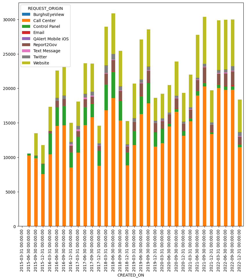
Look at the labels on the x axis: They show the end of each quarter as a date, the final date of each quarter of the year. And because they are datetime values, they also show the time, namely midnight. This isn’t bad or wrong, per se, but it shows the type of output we’ll get from Grouper.
Create a new column, "season", which should be "summer" during the months April-September and "winter" for all others. How many requests are there for 311 in the summer vs. winter?
Next, I asked you to divide the year into two seasons, “summer” and “winter”. (If you want to define all four seasons, then be my guest, but this struck me as far easier.)
We can always add a new column to a data frame by assigning to it. If we want each row to have a different value, we can assign a list or series. But if we want all of the rows to have the same value, then we can just assign a scalar value (int, float, or string), and it’ll be broadcast.
So I’ll start by creating the column, and assuming it’s always summer:
df['season'] = 'summer'Now I want to say: If the month of CREATED_ON is between 4 (April) and 9 (September), then keep the existing value of “summer”. Otherwise, use the value of “winter”.
I can do that with the “where” method, which lets me set a criterion, and returns a series. Wherever the condition is True, we get the original value from the series. But wherever the condition is False, we get another value, a default.
I want to say: If the month is between April and September, keep the “summer” value. Otherwise, use the value “winter”.
Here’s how I did that:
df['season'] = (
    df['season']
    .where(df['CREATED_ON'].dt.month
           .isin(range(4, 10)), 'winter')
)
Notice that I’m using the “isin” method to determine whether the “dt.month” value is in the range we want — and I’m using “range” to set up a the numbers that I’m looking for. I get back a new series, and assign it back to the “season” column.
I’m now able to ask how many queries there were in each season with “value_counts”:
df['season'].value_counts()The answer:
season
summer    391397
winter    288704
Name: count, dtype: int64
What are the 10 most common request types per season? Is there any overlap between them?
Finally, I asked you to find out which are the most common request types for each season. I ran the following query, creating a pivot table
summer_issues = (
    df
    .pivot_table(index='REQUEST_TYPE',
                 columns='season',
                 values='REQUEST_ID',
                 aggfunc='count')
    ['summer']
    .nlargest(10)
)
First, we create a pivot table in which we have the different request types in our index, and the seasons (winter vs. summer) in our columns. We’re just interested in seeing how many requests we have, so we (again) use “count” on the “REQUEST_ID” column. We then retrieve only the “summer” column, and use “nlargest” to grab the largest values.
I get:
REQUEST_TYPE
Weeds/Debris                            47213.0
Potholes                                38319.0
Referral                                15644.0
Building Maintenance                    13693.0
Abandoned Vehicle (parked on street)    10792.0
Refuse Violations                       10260.0
City Source (CDBG)                       8791.0
Overgrowth                               8684.0
Missed Refuse Pick Up                    7894.0
Illegal Parking                          7546.0
Name: summer, dtype: float64
So we see that major issues in the summer are weeds/debris, potholes, and referrals (?).
What about in the winter? The query is almost identical:
winter_issues = (
    df
    .pivot_table(index='REQUEST_TYPE',
                 columns='season',
                 values='REQUEST_ID',
                 aggfunc='count')
    ['winter']
    .nlargest(10)
)
I get:
REQUEST_TYPE
Snow/Ice removal                        31676.0
Potholes                                28238.0
Referral                                13941.0
Weeds/Debris                            13671.0
Building Maintenance                    11578.0
Abandoned Vehicle (parked on street)     8865.0
Refuse Violations                        7850.0
Missed Refuse Pick Up                    7805.0
Illegal Parking                          6941.0
Street Light - Repair                    6355.0
Name: winter, dtype: float64
Not surprisingly, snow/ice removal is very high in winter, and not in the summer. But we still have potholes and referrals.
Now we get to my final question: Which of these issues are common to both summer and winter? To answer this, it’s helpful to remember that in Pandas, indexes are not just simple lists. They’re sophisticated objects with their own methods. One such method is “intersection”, which lets us find where two index objects overlap:
summer_issues.index.intersection(winter_issues.index)Note that we’re not running “intersection” on the series, but rather on their indexes! The result:
Index(['Weeds/Debris', 'Potholes', 'Referral', 'Building Maintenance',
       'Abandoned Vehicle (parked on street)', 'Refuse Violations',
       'Missed Refuse Pick Up', 'Illegal Parking'],
      dtype='object', name='REQUEST_TYPE')
In other words, a lot of issues are true throughout the year. (You might do better checking per quarter or “real” season, rather than the arbitrary way I chopped things up here.)
That’s it for this week. I hope to see many of you in Pittsburgh. Come and introduce yourselves!
My Jupyter notebook is here: https://drive.google.com/file/d/1vn4e_dd0JsHshMnss5rqAPihRyVbj8Ls/view?usp=sharing
Reuven