


Administrative notes:
- Don’t forget the webinar with Philip Guo on Sunday, about the Python Tutor and Pandas Tutor. It’s free for anyone and everyone to join.
- Paid subscribers are also invited to office hours on Sunday; I’ll send info and link about it on Friday.
This week, we looked at data from the solar eclipse that was visible in North America on Monday. The pictures that I’ve seen from the eclipse are truly amazing, I can understand why someone would travel to see it — particularly the moments of totality, when the moon fully covers the sun.
There were obviously lots of jokes, online and off, about the eclipse. Perhaps my favorite online joke was when NASA’s moon account blocked NASA’s sun account.
Data and seven questions
In addition to providing excellent online jokes, NASA also collects and makes available large amounts of astronomical data. I was particularly happy to find their page of eclipse-related data:
https://svs.gsfc.nasa.gov/5073
This page included a number of different files, including shapefiles that can be used to create maps. I decided, however, to concentrate on the JSON file containing information about 32,000 US locations, and when they can expect to see the eclipse:
https://svs.gsfc.nasa.gov/vis/a000000/a005000/a005073/cities-eclipse-2024.json
As I wrote yesterday, NASA’s page has a short explanation that serves as a data dictionary. However, as we’ll see in question 2, their explanations weren’t quite accurate. That said, even without complete documentation, I believe that I figured out how to interpret their data.
Below are the seven questions and tasks that I gave you for this week. As usual, a link to the Jupyter notebook that I used to solve these problems is at the bottom of this week’s edition.
Load the cities data into a data frame. Replace the ECLIPSE column, which contains a list of times, with six datetime values. The date for all should be April 8th, 2024.
Before doing anything else, let’s start by loading Pandas:
import pandas as pdNext, we can use “read_json” to load a JSON file into a data frame:
filename = 'cities-eclipse-2024.json'

df = pd.read_json(filename)
The good news is that this worked just fine; we got a data frame from reading the JSON file, and it accurately reflects the JSON file. However, the “ECLIPSE” column in the data frame contains a list of strings representing times. I asked you to turn that list-containing column into separate columns.
To do this, I first used the “to_list” method on the “ECLIPSE” column, getting back a list of lists:
df['ECLIPSE'].to_list()What can I do with that list of lists? I can create a data frame:
pd.DataFrame(df['ECLIPSE'].to_list())However, I want this new data frame, containing six columns, to share an index with df. That’s probably already the case, given that we’re using the default, zero-based index, but just in case, we can specify it to our call to DataFrame:
pd.DataFrame(df['ECLIPSE'].to_list(),
                            index=df.index)
I can now combine the original data frame with these new columns using “pd.concat”:
df = (pd
      .concat([df,
               pd.DataFrame(df['ECLIPSE'].to_list(),
                            index=df.index)],
               axis='columns')
     )
Normally, “pd.concat” combines data frames top-to-bottom. We override that here, asking for them to be combined left-to-right, by specifying that they should be combined along the columns.
Our data frame “df” now contains the data we read from JSON in its original form, as well as the six columns we got from breaking up the “ECLIPSE” column. We don’t really need the original “ECLIPSE” column any more, so we can remove it with the “drop” method, again specifying that we’re talking about a column:
df = (pd
      .concat([df,
               pd.DataFrame(df['ECLIPSE'].to_list(),
                            index=df.index)],
               axis='columns')
      .drop('ECLIPSE', axis='columns')
     )
With that in place, we now have the data we want — except that the six columns we just added are all in string form, where we really want them to be “datetime” values. We could convert them to “datetime” applying “pd.to_datetime” to each of these columns, and that’ll mostly work — except that the columns all contain times, without any dates. From my experiments, doing so would force “to_datetime” to use the date on which we invoke the function.
To avoid this, we can take advantage of broadcasting in Pandas, adding the value “2024-Apr-08” to each time string before we then invoke “pd.to_datetime” on the column:
pd.to_datetime('2024-Apr-08 ' + df[column_number]To which of the six columns do I apply “pd.to_datetime”? Each of them in turn, using a “for” loop. And yes, it’s normally considered a bad idea to use a “for” loop in Pandas — but in this case, we’re not doing an action that could be vectorized, as far as I can tell. We really do need to go through each of the columns, add the date string, and convert to datetime values:
for column_number in range(6):
    df[column_number] = pd.to_datetime('2024-Apr-08 ' + df[column_number])
When the above actions are done, our data frame has the following dtypes:
STATE            object
NAME             object
LAT             float64
LON             float64
0        datetime64[ns]
1        datetime64[ns]
2        datetime64[ns]
3        datetime64[ns]
4        datetime64[ns]
5        datetime64[ns]
dtype: object
This is exactly what we want! I toyed with the idea of changing the column names to something other than numbers 0-5, but decided to keep things the way they are. As we’ll see in the next two questions, I feel good about having done that, given the way that we need to interpret the data.
According to the NASA documentation, the ECLIPSE column contains an array of five values, and says that they represent the start of the eclipse, 50% coverage, 100% coverage, 50% coverage, and the end of the eclipse. (Note that "100% coverage" doesn't mean totality; rather, it means the maximum coverage for a given location.) However, this column sometimes contains five values, and sometimes contains six. Without peeking at the next questions, what is your best guess/interpretation regarding these values? What do you think about the structure of this data?
The data frame contains 32,174 rows, each for a different location in the United States. The locations are marked by state and name (i.e., city or two), as well as longitude and latitude.
But things get more complicated with the data that we broke out of the “ECLIPSE” column in the previous question.
On its eclipse page, NASA describes the JSON data that as having five times (all in UTC), indicating five stages of the eclipse:
- When it starts (0.01% coverage)
- Halfway (50% coverage)
- 100% coverage — which doesn’t necessarily mean totality, but is the maximum coverage for that location
- Halfway (50% coverage)
- When the eclipse ends (0.01% coverage)
This is great, except that there are actually six columns. Some of the time, that sixth column contains a time. But some of the time, it contains nothing at all. In a usual Pandas data frame, no information would be turned into a NaN or NA value. When we have dates and times, though, we get a NaT (“not a time”) value, which we can think of in the same way.
So, what is it, NASA? Five or six columns? And what’s the mystery sixth column?
I looked all over for clues, and couldn’t find any. I asked myself if there was any pattern to those rows in which we did have a sixth column, versus those that only had five. After quite a lot of examining, playing, and thinking, I finally understood that there were six columns wherever there was a total eclipse (i.e., the moon completely covered the sun), and there were five columns wherever it was less than total.
But that still didn’t exactly explain what to do with the sixth column.
Finally, after some more thought and comparing notes on eclipse-related sites, I understood:
- In places without a total eclipse, NASA’s official description of five columns was correct.
- In places with a total eclipse, though, the columns marked 0.01%, 50%, start of totality, end of totality, 50%, and 0.01%.
In other words, wherever there was a total eclipse, we’ll have six columns. And columns 2 and 3 will tell us when the totality started and ended.
This means that column 3 might indicate the end of totality. And it might indicate the time at which we reach 50% as the eclipse ends.
In other words, we can’t even label these columns, because they mean different things in different rows. Which … isn’t really a great way to structure the data, in my opinion.
To be honest, it’s possible that my interpretation here is wrong — although based on everything else I’ve seen and researched, and particularly the plots that I did in questions 6 and 7, I’m convinced that I’m right.
A misleading data dictionary, and poorly structured data, can combine to create quite a bit of frustration.
Let's assume that the six columns represent: The start of the eclipse, 50% coverage, the start of totality, the end of totality, 50% coverage, and the end of the eclipse. If so, then which US states managed to see totality? How many cities in each state saw it?
Which states were able to see a total eclipse? And how many locations in each state saw it?
We can answer this by first removing all of the rows in which column 5 (i.e., the end of the eclipse for places with totality) lacks data. We can do this by using “dropna” — but usually, that will drop any row with any NA value. We only want to look at column 5, so we specify that with the “subset” keyword argument:
(
    df
    .dropna(subset=5)
)
Now we want to grab only the “STATE” column. We can do that with square brackets:
(
    df
    .dropna(subset=5)
    ['STATE']
)
Finally, we can use “value_counts” to show how often each state appears in the data:
(
    df
    .dropna(subset=5)
    ['STATE']
    .value_counts()
)
Here are the results:
STATE
OH    693
TX    591
IN    586
NY    403
AR    365
IL    252
MO    168
VT     87
PA     71
OK     41
KY     38
ME     28
NH      4
MI      3
Name: count, dtype: int64
The result from “value_counts” is always sorted in descending order according to value. We can see that Ohio has the most locations from which you can see totality, followed by Texas, Indiana. New York, and Arkansas.
Just because a state is mentioned doesn’t mean that all parts of that state will see totality, of course. For example, there were many places in Texas and New York that saw the totality, but there were quite a few that didn’t see it at all.
Did totality last the same amount of time in all places that had it? If not, then where was the longest totality, and where was the shortest? Which states had, on average, the longest and shortest totalities?
Since we have now sorted out the interpretation of our data regarding totality, I thought it might be interesting to find out how long the totality lasted, at a minimum and a maximum.
To do this, we first have to remove all of the columns that lack totality information — that is, where column 5 has a NaN value:
(
    df
    .dropna(subset=5)
)
Next, we can get rid of all columns except for “STATE”, “NAME”, 2, and 3:
(
    df
    .dropna(subset=5)
    [['STATE', 'NAME', 2, 3]]
)
We have the starting and ending times of the totality (i.e., columns 2 and 3). How can we use that to calculate the total time of the totality?
Remember that columns 2 and 3 are both of type “datetime”. When you subtract one datetime from another datetime, you get a value known as a “timedelta”, meaning the difference between two fixed points in time. Here, we can use “assign” to create a new column (“totality_length”) with that calculation for each row:
(
    df
    .dropna(subset=5)
    [['STATE', 'NAME', 2, 3]]
    .assign(totality_length = lambda df_: df[3] - df[2])
)
We now have a “totality_length” column with the difference between columns 2 and 3. We retrieve just that column, and then invoke “describe” on it, to get a full summary of our data:
(
    df
    .dropna(subset=5)
    [['STATE', 'NAME', 2, 3]]
    .assign(totality_length = lambda df_: df[3] - df[2])
    ['totality_length']
    .describe()
)
Here’s what we get:
count                         3330
mean     0 days 00:03:05.044144144
std      0 days 00:01:02.676558692
min                0 days 00:00:02
25%                0 days 00:02:34
50%                0 days 00:03:24
75%                0 days 00:03:52
max                0 days 00:04:29
Name: totality_length, dtype: object
We thus see that there were 3,330 locations for which NASA provided totality information. The shortest totality was 2 seconds (!), whereas the longest was nearly 4 and a half minutes. (Wow!) So no, the totality doesn’t last the same amount of time depending on where you are. It can make quite a big difference.
That led me to ask: So where were these longest and shortest totalities? To get that, after creating the “totality_length” column, I set the index to be a combination of STATE and NAME:
(
    df
    .dropna(subset=5)
    [['STATE', 'NAME', 2, 3]]
    .assign(totality_length = lambda df_: df[3] - df[2])
    .set_index(['STATE', 'NAME'])
)
Then I once again retrieved the “totality_length” column as a series:
(
    df
    .dropna(subset=5)
    [['STATE', 'NAME', 2, 3]]
    .assign(totality_length = lambda df_: df[3] - df[2])
    .set_index(['STATE', 'NAME'])
    ['totality_length']
)
Then I called “sort_values” to sort from lowest to highest:
(
    df
    .dropna(subset=5)
    [['STATE', 'NAME', 2, 3]]
    .assign(totality_length = lambda df_: df[3] - df[2])
    .set_index(['STATE', 'NAME'])
    ['totality_length']
    .sort_values()
)
Finally, I used “iloc” to retrieve values by location in the series, passing a list of two integers, 0 and -1. This retrieves the first (index 0) and last (index -1) from the series:
(
    df
    .dropna(subset=5)
    [['STATE', 'NAME', 2, 3]]
    .assign(totality_length = lambda df_: df[3] - df[2])
    .set_index(['STATE', 'NAME'])
    ['totality_length']
    .sort_values()
    .iloc[[0, -1]]
)
The results:
STATE  NAME
OH     Pleasant Run Farm   0 days 00:00:02
TX     Radar Base          0 days 00:04:29
Name: totality_length, dtype: timedelta64[ns]
So for the shortest totality, you could go to Pleasant Run Farm in Ohio. And for the longest? Go to Radar Base in Texas.
Which states had, on average, the shortest and longest mean totality? To do this, I’ll again create our “totality_length” column. But then I’ll use “groupby” to calculate the mean value of “totality_length” for each state:
(
    df
    .dropna(subset=5)
    [['STATE', 'NAME', 2, 3]]
    .assign(totality_length = lambda df_: df[3] - df[2])
    .groupby('STATE')['totality_length'].mean()
)
By the way, you might be surprised that you can calculate the mean of a timedelta. But remember that a timedelta is just a measurement of time, such as the length of a movie, a meeting, or a lifetime. You can calculate the average movie or lifetime, so it makes sense that you can do that with any timedelta value. (The average length of a meeting cannot be calculated, alas, because it’s infinitely long. Or at least, it usually feels that way.)
With this calculation in mind, we can again sort our values and pluck out the maximum and minimum with “iloc”. And because we’re grabbing values in this way, we get the indexes for these values, which happen to correspond to the states:
(
    df
    .dropna(subset=5)
    [['STATE', 'NAME', 2, 3]]
    .assign(totality_length = lambda df_: df[3] - df[2])
    .groupby('STATE')['totality_length'].mean()
    .sort_values()
    .iloc[[0, -1]]
)
The result is:
STATE
MI   0 days 00:00:39.333333333
IL   0 days 00:03:16.301587301
Name: totality_length, dtype: timedelta64[ns]
So Michigan had the shortest mean totality, at 39 seconds. And Illinois had the longest average totality, at 3 minutes and 16 seconds.
Add a new `totality_seconds` column to the data frame, containing the number of seconds of totality that were seen.
In the final two questions, we’ll plot where the totality took place, and how long it took. But in order to do that, we’ll need to turn our timedelta values into integers. In theory, we can use the “dt.total_seconds” attribute on a timedelta to get its value in seconds.
That sounds great, but there’s a bit of a problem with this plan: I want to have data for every location in the data frame, not just those where the totality was visible. In other words, I want “totality_seconds” to contain an integer for each row; if the totality wasn’t visible, then that value should be 0.
There are a few ways to do this, but I decided to use a new feature in Pandas, the “case_when” method. To use “case_when”, you pass a list of two-element tuples:
- The first element of each tuple is a condition
- The second element of each tuple is a value to return if that condition is True
If a condition is False, then the next conditions are checked, in order. The first condition to evaluate to True determines the value that is returned.
I basically wanted to say:
- If df[5] is NA, then return 0
- Otherwise, subtract df[3] - df[2], and calculate the number of seconds we get
This is great, except for one thing: How can we say “otherwise” in “case_when” statements? If you try to use True as a condition, you’ll get an error message, because True isn’t iterable. You really need to provide a series of boolean values.
Here, we can use a sneaky trick, comparing the series df[3] with itself, which returns a series of True values.
Here’s the code I used:
df['totality_seconds'] = df[3].case_when(
    [
     (df[5].isna(), 0),
     (df[3] == df[3], (df[3] - df[2]).dt.total_seconds())
    ]
).astype(int)
Note that “case_when” is a series method, so we need to invoke it on df[3]. We can then assign its return value to df[‘totality_seconds’].
But before we do that, I run astype(int), just to make sure we have integer values. I’m OK with truncating any fractional value we have; it won’t make a huge difference to our calculations.
Create a scatterplot of the cities, using their longitude and latitude. Color them by the number of seconds of totality they saw. Keep only those rows with a longitude < 0 and > -140, and latitude < 55.
Now that we have “totality_seconds” in place, we can produce a scatterplot. Based on what? We have the longitude and latitude of each location, and those are numbers — so we can easily plot them on x and y axes. There are also enough data points (more than 32,000) that the plot will fill up an approximate map of the United States.
Let’s start by trimming our map according to the parameters I set out. This will keep things within the Western Hemisphere. I used a combination of “loc” and “lambda” to restrict the longitude and latitude:
(
    df
    .loc[lambda df_: df_['LON'] < 0]
    .loc[lambda df_: df_['LON'] > -140]
    .loc[lambda df_: df_['LAT'] < 55]
)
With that in place, I can now use “plot.scatter” to create a scatterplot. I’ll choose the “LON” column for the x axis, and the “LAT” column for the y axis:
(
    df
    .loc[lambda df_: df_['LON'] < 0]
    .loc[lambda df_: df_['LON'] > -140]
    .loc[lambda df_: df_['LAT'] < 55]
    .plot.scatter(x='LON', y='LAT')
)
That gives me this plot:
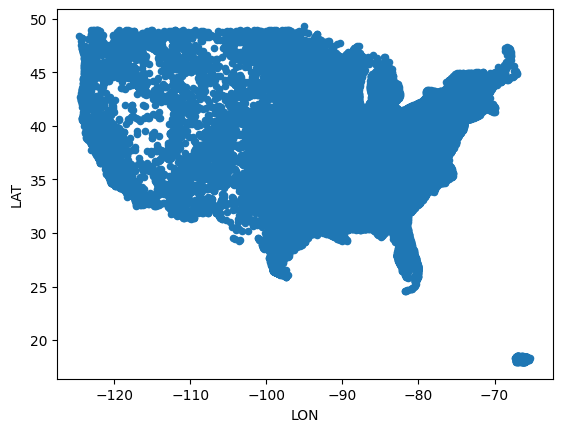
The good news is that we see (more or less) the US, including Puerto Rico. The bad news is that everything is the same color. I asked to colorize the map, giving each dot a color based on the number of seconds of totality we got. We can plot that by passing the “totality_seconds” column as a value to the “c” keyword argument:
(
    df
    .loc[lambda df_: df_['LON'] < 0]
    .loc[lambda df_: df_['LON'] > -140]
    .loc[lambda df_: df_['LAT'] < 55]
    .plot.scatter(x='LON', y='LAT', c='totality_seconds')
)
Here’s what we got:
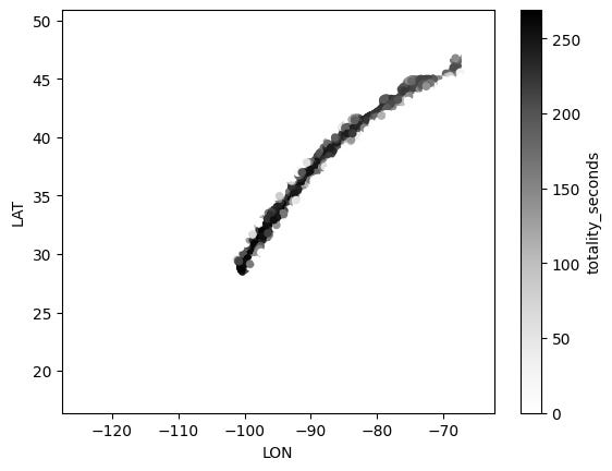
Ummm… huh?
The problem is that by default, Pandas assigns (as you can see from the scale on the right) values of 0 to white and the max value to black. Anything in the middle is scaled. Because the majority of locations in the US didn’t have a totality, they’re all white. Our plot thus looks quite weird.
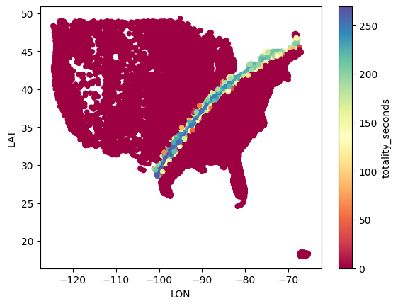
However, we can tell Pandas to use a different colormap, rather than its default white-to-black colormap. I happen to like “Spectral”, which puts the lowest number in blue:
(
    df
    .loc[lambda df_: df_['LON'] < 0]
    .loc[lambda df_: df_['LON'] > -140]
    .loc[lambda df_: df_['LAT'] < 55]
    .plot.scatter(x='LON', y='LAT', c='totality_seconds', colormap='Spectral')
)
Sure enough, that gives us a much nicer plot:
Choose a location in the United States, and get its longitude and latitude. Now create the scatter plot again, only showing locations within 5 degrees long/lat in any direction.
What if we just want to see a subset of the US? We can choose any longitude and latitude we want, and then plot only those rows that are nearby. For example, I chose Philadelphia:
philly_lon = -75
philly_lat = 39
I then restricted my search 5 degrees in any direction from Philadelphia with “loc” and “lambda”, as before. And then I took the resulting data frame and again created a scatterplot:
(
    df
    .loc[lambda df_: df_['LON'] < philly_lon + 5]
    .loc[lambda df_: df_['LON'] > philly_lon - 5]
    .loc[lambda df_: df_['LAT'] < philly_lat + 5]
    .loc[lambda df_: df_['LAT'] > philly_lat - 5]
    .plot.scatter(x='LON', y='LAT', c='totality_seconds', colormap='Spectral')
)
The result was the following image:
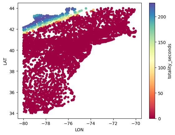
Philadelphia itself is at the center of this plot. So we can see (since it’s in red) that it wasn’t too far from the totality, but wasn’t quite there, either.
That’s it for this week! Here’s a link to my Jupyter notebook: https://drive.google.com/file/d/1LOSsLRBPX85CBN8oAazWAV85fTvxg9jI/view?usp=sharing
I’ll be back next week with more puzzles about data analytics and the news.
Reuven