


This week, we looked at NATO, the North Atlantic Treaty Alliance (https://nato.int). NATO has been in the news lately both because Sweden joined and because Donald Trump (again) threatened not to defend fellow NATO members if he’s re-elected.
Given the degree to which NATO has been in the news, I thought it would be appropriate to look at its membership and spending, and see what data we can analyze about it.
Data and eight questions
This week's data largely comes from the World Population Review (https://worldpopulationreview.com). The data itself is a bit annoying to download. First, go to the "NATO spending" page:
https://worldpopulationreview.com/country-rankings/nato-spending-by-country
We're interested in downloading the CSV version of the table of data, displayed right above the FAQs toward the lower part of the page. Click on the word "CSV" at the top of the page. You can then enter your e-mail address and get the data e-mailed to you… or you can go to the following link, where I made the file available to you:
https://drive.google.com/file/d/1x9iWLTfCpxqrDWrc_CwCvL529dCOg0pT/view?usp=sharing
We’ll also be looking at a second data set, this one taken from the Wikipedia page about NATO’s member states:
https://en.wikipedia.org/wiki/Member_states_of_NATO
Here are the eight tasks and questions I asked you to answer. As always, a link to the Jupyter notebook I used to solve these problems is at the bottom of this message:
Turn the CSV file from the World Population Report into a data frame. Use the country names as the data frame's index. Remove the "total" row.
Before doing anything else, I loaded up Pandas:
import pandas as pdNext, I downloaded the CSV file, and used “read_csv” to get a Pandas data frame from it:
filename = 'nato-spending-by-country-2024.csv'

df = pd.read_csv(filename)
However, I asked you to do two additional things with this file, beyond just reading it. First, I asked you to use the “country” column as an the data frame’s index. We can do that by passing the “index_col” keyword argument to “read_csv”:
df = pd.read_csv(filename,
                index_col='country')
I also asked you to remove the final row, the one marked “Total”. Given that “Total” appears in the “country” column, we can use “drop” to remove that row by specifying the index:
df = pd.read_csv(filename,
                index_col='country').drop('Total')
We now have a data frame with 30 rows (one for each NATO country in the data set) and 7 columns.
Which five countries, in 2023, spent the most on NATO (i.e., their militaries) as a percentage of GDP? Which five countries spent the most in absolute dollars? And which five spent the most per capita?
These three questions measured different things, but our way to solve them with Pandas was the same: Take one of the columns, and find the five largest numbers.
But wait a second — what is the best way to do that?
For years, my favorite technique was to take the column, sort it in descending order with “sort_values”, and then grab the first five rows with “head”:
(
    df['natoSpendingByCountry_percGdp2023']
    .sort_values(ascending=False)
    .head()
)
But there are a few other ways to do the same thing. I decided to compare techniques and time them with Jupyter’s “%%timeit” magic command. The double % means that it runs an entire cell multiple times, and then reports the mean time and its standard deviation.
On average, the above code took 87.8 µs. What if, instead of using “head”, I were to use “iloc”? Let’s see:
%%timeit

(
    df['natoSpendingByCountry_percGdp2023']
    .sort_values(ascending=False)
    .iloc[:5]
)
The answer? Almost identical, with 87.7 µs per run.
I’ve recently started to use “nlargest” more and more. Is that any different?
%%timeit

(
    df['natoSpendingByCountry_percGdp2023']
    .nlargest(5)
)
Wow, it’s different — and not in a good way! Running “nlargest” took an average of 392 µs per run, or 4x longer than the other techniques!
Of course, the speed might depend on the dtype or number of values. So there’s more to learn here. But I think that my infatuation with “nlargest” is coming to an end, at least for now.
Of course, all of the above queries gave me the same answer:
country
Poland           3.90
United States    3.49
Greece           3.01
Estonia          2.73
Lithuania        2.54
Name: natoSpendingByCountry_percGdp2023, dtype: float64
I’m not sure what surprises me more: That Poland and Greece are spending so much on defense relative to their GDP, or that the much-larger US is doing so. Actually, I have to assume that Poland — and likely Estonia and Lithuania, as well — is spendign on defense partly because of to Russia’s invasion of Ukraine.
What about the other comparisons? Let’s check in raw numbers, millions of US dollars:
(
    df['natoSpendingByCountry_defense2023_inMillionsUSD']
    .sort_values(ascending=False)
    .head()
)
Here’s the result:
country
United States     860000
Germany            68080
United Kingdom     65763
France             56649
Italy              31585
Name: natoSpendingByCountry_defense2023_inMillionsUSD, dtype: int64
In terms of raw numbers, the US spends far, far more than any other NATO ally on defense. I do find it interesting that Germany, which is constitutionally forbidden from having an army, has the second-highest defense spending in NATO.
Finally, I asked for the top-spending countries per capita:
(
    df['perCapita2023']
    .sort_values(ascending=False)
    .head()
)
The results:
country
United States     2515.985136
Norway            1598.338337
Finland           1319.846930
Denmark           1140.630958
United Kingdom     967.651671
Name: perCapita2023, dtype: float64
Again, it’s pretty amazing that the US spends so much on defense per capita, and is also a very large country. Again, I’m not sure why I’m surprised to find that Norway, Finland, and Denmark spend so much on defense, given that they’re right next to Russia, but I am.
The US is thus at or near the top of the pack on all of these measures. But that is unusual; no other country is near or at the top in more than two of them, and even that is rare.
Which countries increased their military spending, as a percentage of GDP, the most from 2022 to 2023? Did any countries decrease their spending?
Now that we’ve figured out how much countries are spending on defense, let’s find out how much they’re spending compared with how much they used to spend.
The data we got already has information about 2022 and 2023 in two different columns. So let’s start by just grabbing those columns. I could do that by naming them, but these columns have very long and annoying names. So I’ll instead use the “filter” method, which lets me choose rows or columns by applying a simple pattern:
(
    df
    [df.filter(like='percGdp', axis='columns')]
)
The above returns the two columns that contain the text “percGdp”, which is a good start. I would love to run “pct_change” on them, but they’re in the wrong order! Fortunately, I can swap the order by grabbing the columns’ names and applying the Python [::-1] slice, which returns the input iterable in reverse order. (The slice means: From the end, to the beginning, with a step size of -1.) We can thus say:
(
    df
    [df.filter(like='percGdp', axis='columns').columns[::-1]]
    .pct_change(axis='columns')
)
Notice how “pct_change” normally compares each row with its predecessor. Here, I tell it to compare each column with the one to its left. Since we started with two columns, we are left with a single column containing only NaN, and another column containing the differences. We want the second one, so let’s retrieve it:
(
    df
    [df.filter(like='percGdp', axis='columns').columns[::-1]]
    .pct_change(axis='columns')
    ['natoSpendingByCountry_percGdp2023']
)
Finally, we can sort the values in ascending order:
(
    df
    [df.filter(like='percGdp', axis='columns').columns[::-1]]
    .pct_change(axis='columns')
    ['natoSpendingByCountry_percGdp2023']
    .sort_values(ascending=True)
)
Here’s what I got back:
country
Greece            -0.220207
Belgium           -0.050420
United Kingdom    -0.041667
Turkey            -0.036765
Italy             -0.033113
Croatia           -0.016484
France             0.010638
United States      0.011594
Lithuania          0.028340
Portugal           0.042254
Netherlands        0.042945
Germany            0.053691
Slovenia           0.080000
Latvia             0.091346
Norway             0.105960
Czech Republic     0.119403
Slovakia           0.121547
Canada             0.131148
Bulgaria           0.135802
North Macedonia    0.154321
Luxembourg         0.161290
Spain              0.177570
Denmark            0.195652
Estonia            0.263889
Montenegro         0.326241
Hungary            0.335165
Romania            0.418605
Albania            0.454545
Finland            0.458333
Poland             0.625000
Name: natoSpendingByCountry_percGdp2023, dtype: float64
We can see that Poland, as I surmised earlier, isn’t just spending a lot on the military. It has dramatically increased its military spending from 2022 to 2023.
Did anyone reduce their military spending? Yes! Greece, Belgium, and the United Kingdom all reduced their military spending, with Greece reducing it by 22 percent. Given that they were already in third place when measured by percent of GDP, they still seem to be spending a lot — just not as much as before.
Create a bar graph of percentage-of-GDP NATO spending. For each country, show two bars — one for 2022, and one for 2023. Sort the countries by their 2023 percentage, in increasing order.
Next, I asked you to create a bar graph showing, for each country, their 2022 and 2023 spending as as percentage of GDP. I wanted to see the graph in increasing order, sorted by 2023 percentages.
We’ll first grab the two GDP-related columns, using the same trick as we did above:
(
    df
    [df.filter(like='percGdp', axis='columns').columns[::-1]]
)
With those columns in place, I can sort the data frame according to the values in the 2023 column:
(
    df
    [df.filter(like='percGdp', axis='columns').columns[::-1]]
    .sort_values('natoSpendingByCountry_percGdp2023', ascending=True)
)
Finally, I can invoke “plot.bar”, which creates a bar plot. If we have a single column (or a series), then Pandas creates one bar for each row. But with two columns, we get two bars for each row, next to one another so that we can easily compare them:
(
    df
    [df.filter(like='percGdp', axis='columns').columns[::-1]]
    .sort_values('natoSpendingByCountry_percGdp2023', ascending=True)
    .plot.bar()
)
Here is the image I got:
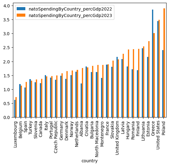
Once again, we can see that as a percentage of GDP, Poland, the US, and Greece are the leaders. By contrast. Luxembourg, Belgium, Spain, and Turkey are at the bottom. By plotting the two years next to one another, we can see who spent more in 2023 than in 2022, and it would certainly seem to be a large number of NATO members. Again, that’s almost certainly the direct result of Putin’s decision to invade Ukraine; instead of weakening NATO, he has strengthened it.
Turn the "list of member states" data from Wikipedia's "Member states of NATO" page into a data frame. We only need two columns — the country name, and the date of accession. Rename the columns to be more normal. Remove extraneous characters from country names. Clean the "Date of Accession" column and turn it into a datetime. (If a country has more than one date, take the first one.)
Next, we create a second data frame, this time taken from Wikipedia’s list of NATO member states. I asked you to create a data frame from the “list of member states” table on that page.
Web scraping doesn’t always work, but when it does, I feel like it’s almost like magic. Pandas provides the “read_html” method that takes a URL as an argument. It returns a list of data frames, one for each HTML table it found at that URL.
I thus started by invoking “read_html” on the Wikipedia page, and then asking for index 0, the first HTML table on the page:
wp_df = (
    pd
    .read_html('https://en.wikipedia.org/wiki/Member_states_of_NATO')[0]
)
I asked you to rename the columns to be more normal; we can do that by assigning to the “columns” attribute:
wp_df.columns = ['name', 'capital', 'date', 'population', 'area', 'pct_gdp', '2020_gdp']Then I asked you to do a bunch of other things: Drop all columns except for the two we care about. And then do some surgery on the name and date columns, removing symbols from footnotes. Finally, I wanted you to turn the “date” column into an actual “datetime” dtype.
Where do we start? First, we can use “drop” to remove the columns, passing the axis=”columns” keyword argument:
wp_df = (
    wp_df
    .drop(['capital', 'population', 'area',
           'pct_gdp', '2020_gdp'], axis='columns')

)
Next, I wanted to remove the footnote symbols from the country names. I could have done this in a number of different ways, but “str.replace” using a regular expression struck me as the easiest. Here, I took advantage of regexp functionality known as “capturing,” where we put the part we’re interested in within round parentheses. We can then refer to that captured text with the special \1 syntax. (It’s \1, because we’re referring to the first set of capturing parentheses. What happens when you need more than \9 in a regular expression? Therapy.)
My regexp is thus:
- Match the start of the string (^)
- Look for one or more alphanumeric (\w) or whitespace (\s) characters in a row.
We capture the above, and store it in \1. This allows us to drop anything that comes afterward.
Note, by the way, the leading “r” before the string for the regular expressions. This indicates that we’re using “raw” strings in Python, meaning that the backslashes are automatically doubled. This allows any backslashed character to pass through Python’s parser unscathed, in case that backslashed character is needed by the regexp engine.
By using “assign” on our data frame along with a lambda expression, we’re able to trim the “name” column of these footnotes, and keep just the country names:
wp_df = (
    wp_df
    .drop(['capital', 'population', 'area',
           'pct_gdp', '2020_gdp'], axis='columns')
    .assign(name=lambda df_:
                df_['name'].str.replace(r'^([\w\s]+).*$',
                                        r'\1', regex=True))
)
Now that we have fixed the “name” column, we come to the “date” column. This one is much harder to deal with, because I want to both modify the text and apply the “pd.to_datetime” function. This means that my lambda expression will invoke “pd.to_datetime”. On what? On the result of modifying the string in the “date” column.
The problem with the “date” column, much like the “name” column before, is that there is extraneous text — either footnote markers or (in the case of Germany) multiple dates for when it entered the NATO alliance. I wanted to keep things as simple as possible, so I just used a regexp that kept the date it found at the start of the string:
- ^ anchors the regexp to the start of the string
- \d+ means one or more digits
- \s+ means one or more whitespace characters
- \w+ means one or more alphanumeric characters
- \s+ means (again) one or more whitespace characters
- \d{4} means four digits
Bottom line, this means that we’re looking for things like “14 July 1970”. If we find that, then we get rid of anything that came after it, and then hand this string to “pd.to_datetime”. We then assign that all back to the “date” column:
wp_df = (
    wp_df
    .drop(['capital', 'population', 'area',
           'pct_gdp', '2020_gdp'], axis='columns')
    .assign(name=lambda df_:
                df_['name'].str.replace(r'^([\w\s]+).*$',
                                        r'\1', regex=True),
            date=lambda df_:
                pd.to_datetime(
                    df_['date'].str.replace(r'^(\d+\s+\w+\s+\d{4}).*$',
                                            r'\1', regex=True)))
)
We now have a data frame with two columns, “name” (a country name, in a string) and “date” (a datetime object). The data frame has 32 rows, one for each member of NATO.
Create a line graph showing how many countries joined NATO in each decade. What explains the graph's shape?
To create such a plot, we’ll need a series (or maybe a one-column data frame) in which the decades are the index and the number of NATO members is the value.
We can get there by turning the “date” column into the temporary index:
(
    wp_df
    .set_index('date')
)
With that in place, we then use the amazing “resample” method, which does a kind of time-based “groupby” operation. We can indicate the level of granularity we want to choose; in this case, I’ll say “10YE” which means “the end of every 10-year period.” We then invoke the “count” method:
(
    wp_df
    .set_index('date')
    .resample('10YE').count()
)
This gives us a series with decades as an index and the number of countries joining NATO that decade as the values. We can then invoke “plot.line”:
(
    wp_df
    .set_index('date')
    .resample('10YE').count()
    .plot.line()
)
The result:
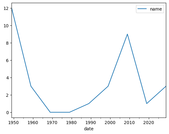
We see that NATO started with a bang (no pun intended!) at its outside, but the number of new members quickly declined. It only went up again around 2010, when a large number of new countries joined. And then the next spike up is now, in the wake of the war in Ukraine.
Which countries appear in the Wikipedia data, but not in the World Population Review data? What accounts for these differences?
To do this, I’ll want to compare the “name” column of wp_df with the index of df. There are ways to do this, but in this case, I find it easier to just set “name” to be the (temporary) index of wp_df. We can then invoke an the “Index.intersection” method, invoked on one index to which we pass another index as an argument:
wp_df.set_index('name').index.difference(df.index)The result of calling this method is a new Index object containing the names that existed in the Wikipedia article but not in the Wikipedia article:
Index(['Iceland', 'Sweden'], dtype='object')What accounts for these differences? Here are my guesses:
- Iceland doesn’t have an army. So it isn’t on the list military contributions to NATO.
- Sweden just joined, and we don’t have any historical data about them just yet.
Is there any correlation (negative or positive) between the year in which a country joined NATO and the percentage of its GDP it spent on the military in 2023?
Could it be that the longer a country has been in NATO, the more of its GDP it spends on defense? Let’s find out:
First, we take our Wikipedia data frame, and set the index to be “name”, as before. Then, with this new data frame in place, we “join” it with our original data frame. This gives us a data frame with all of the columns of wp_df, and also all of the columns of df. The number of rows is dictated by wp_df, because it’s the data frame on which we invoked the join:
(
    wp_df
    .set_index('name')
    .join(df)
)
Next, we use “assign” to set a “year” column, use the “dt.year” attribute and thus the year in which the country joined NATO. We don’t need it in a separate column, but it makes things a lot nicer looking:
(
    wp_df
    .set_index('name')
    .join(df)
    .assign(year=lambda df_:df_['date'].dt.year)
)
Finally, we retrieve the two columns that are of interest, and calculate the correlation:
(
    wp_df
    .set_index('name')
    .join(df)
    .assign(year=lambda df_:df_['date'].dt.year)
    [['year', 'natoSpendingByCountry_percGdp2023']]
    .corr()
)
Remember that correlation numbers are never “yes” or “no,” but rather much more nuanced, with -1 meaning “100% negative correlation”, with 1 meaning “100% positive correlation,” and 0 meaning “no correlation at all.)
So, how well (if at all) do these correlate? A little bit, 0.279, but not overwhelming at all. So yeah, earlier members give a bit more than modern members, but not a lot more.
Here’s my Jupyter notebook: https://drive.google.com/file/d/1br47vFTHcd2d9MGXERMeMN4oaO3YmEzd/view?usp=sharing
Reuven