


WeWork just filed for bankruptcy, and given the huge amount of press and attention that they got over the years — including numerous books (https://www.amazon.com/Cult-We-Neumann-Startup-Delusion-ebook/dp/B08FHC77MT), podcasts (https://wondery.com/shows/we-crashed/), and articles — I thought that it would be worth looking at them, and some data related to them.
I was interested in finding data about commercial real estate and office space, but wasn’t able to find any that was freely available and downloadable. However, I did find some data sources about WeWork’s stock price, as well as the S&P 500 stock index, the state of the office-construction market, and the office-rental market. Let’s see what we can find and understand about WeWork and associcated data. And along the way, we’ll have fun with Pandas!
Data and seven questions
This week, we looked at four different data sources:
- WeWork stock information, which I downloaded from Yahoo Finance: I went to https://finance.yahoo.com/quote/WE/history, asked for the "max" time period, and then clicked on "download," which put downloaded a CSV file (WE.csv) to my computer.
- The S&P 500 index -- or actually, a proxy for it, since I cannot seem to download the S&P 500 directly from Yahoo. I went to https://finance.yahoo.com/quote/SPY/history, chose the "5 year" time period, clicked on "apply," and then downloaded the CSV file (SPY.csv) to my computer.
- From FRED, the amazing data portal at the St. Louis Fed, I downloaded data about spending on office construction in the US. The page is at https://fred.stlouisfed.org/series/TLOFCONS, and I retrieved the CSV file by clicking on "download" and choosing CSV. You could also decide to download the data directly via the URL.
- Also from FRED, I downloaded data about office rents in the US. The page for that data is at https://fred.stlouisfed.org/series/WPU43110101, and I (again) retrieved the CSV file by clicking on "download" and chosing CSV. You could, as before, also decide to download the data directly via the URL.
Given this data, I gave you seven different tasks and questions. A link to the Jupyter notebook I used to solve these problems follows the questions and solutions.
Create a data frame for each of the four CSV files, parsing the date columns and using them as indexes.
Before doing anything else, I made sure to import the Pandas library:
import pandas as pdWith that in place, I was able to create four data frames, one from each of the CSV files that I had downloaded. I started with the WeWork data, and ran “read_csv” on it:
we_df = pd.read_csv('WE.csv')This worked, but wasn’t quite what I wanted. I did ask, after all, to ensure that the date would be the data frame’s index, and that it would have datetime information, rather than be text strings. The dates are in a format that is easy to parse, but we still need to specify that Pandas should do so (“parse_dates”) and that the column should be the index (“index_col”):
we_df = pd.read_csv('WE.csv',
                   index_col='Date',
                   parse_dates=['Date'])
With this in place, my data frame had a datetime index, plus six columns: The opening and closing prices for each day, the high and low prices for each day, the adjusted closing price, and the volume.
What about the S&P 500 data? I used almost precisely the same code:
spy_df = pd.read_csv('SPY.csv',
                   index_col='Date',
                   parse_dates=['Date'])
It shouldn’t be a huge surprise that these two data sets could be treated similarly, because they both come from Yahoo Finance.
What about the data about office-construction spending? Here, I decided to do a few things differently than with the Yahoo-based files:
- First, I decided to give the URL to “read_csv”, downloading the file directly from the source, rather than saving it to disk and then loading it. Yahoo Finance didn’t allow me to do this, but FRED does, so I’ll enjoy taking advantage of it.
- Second, I decided to give more reasonable names to the columns than FRED did. This meant using the “names” keyword argument to give names, but that also meant telling “read_csv” to ignore the existing header row. It also meant indicating which column was a date, and which should be used as the index, by specifying the column number — because until we actually create the data frame, the column names won’t exist.
The query ends up looking like this:
construction_spending_df = pd.read_csv('https://fred.stlouisfed.org/graph/fredgraph.csv?bgcolor=%23e1e9f0&chart_type=line&drp=0&fo=open%20sans&graph_bgcolor=%23ffffff&height=450&mode=fred&recession_bars=on&txtcolor=%23444444&ts=12&tts=12&width=1318&nt=0&thu=0&trc=0&show_legend=yes&show_axis_titles=yes&show_tooltip=yes&id=TLOFCONS&scale=left&cosd=2002-01-01&coed=2023-09-01&line_color=%234572a7&link_values=false&line_style=solid&mark_type=none&mw=3&lw=2&ost=-99999&oet=99999&mma=0&fml=a&fq=Monthly&fam=avg&fgst=lin&fgsnd=2020-02-01&line_index=1&transformation=lin&vintage_date=2023-11-08&revision_date=2023-11-08&nd=2002-01-01',
                                      parse_dates=[0],
                                      index_col=0,
                                      header=0,
                                      names=['Date', 'spending'])
Yeah, that URL is pretty ridiculous and long; I copied it from the “CSV download” option in the “download” menu on FRED. But it worked, giving me a data frame with a datetime index and a single column of data.
Finally, I downloaded the FRED data for office rents in the US, passing the same options as before:
gross_rents_df = pd.read_csv('https://fred.stlouisfed.org/graph/fredgraph.csv?bgcolor=%23e1e9f0&chart_type=line&drp=0&fo=open%20sans&graph_bgcolor=%23ffffff&height=450&mode=fred&recession_bars=on&txtcolor=%23444444&ts=12&tts=12&width=1318&nt=0&thu=0&trc=0&show_legend=yes&show_axis_titles=yes&show_tooltip=yes&id=WPU43110101&scale=left&cosd=2008-12-01&coed=2023-09-01&line_color=%234572a7&link_values=false&line_style=solid&mark_type=none&mw=3&lw=2&ost=-99999&oet=99999&mma=0&fml=a&fq=Monthly&fam=avg&fgst=lin&fgsnd=2020-02-01&line_index=1&transformation=lin&vintage_date=2023-11-08&revision_date=2023-11-08&nd=2008-12-01',
                                      parse_dates=[0],
                                      index_col=0,
                             header=0,
                            names=['Date', 'rents'])
We now have four data frames, all with datetime values in their indexes, and with 1-6 rows of data that we can use in our analysis.
Get a new version of the WeWork data, in which each row represents the mean values from that month.
My plan is to join these data frames together, in order to compare them on particular dates, However, the WeWork stock price is reported daily, whereas the FRED data is reported monthly. We somehow need to get things to match up.
The way that I want to do that is by having a single row for each month during which WeWork was a public company. Instead of having the stock price for each individual day, we’ll have one stock price for July, another for August, another for September, and so forth. The values for each month should be the mean for all values from that month.
It turns out that this is an easy thing to do in Pandas, especially if we have a data frame whose index contains datetime values. The “resample” method, when applied to our data frame, returns a new data frame whose index is based on the original, but with a different level of time granularity. For example, we currently have per-day data. We can resample for every 2 days, every week, every month, every quarter, or every year. The index of the returned data frame will reflect the level of granularity we described in our call to “resample”, and the values will be the result of invoking an aggregate method on all those in each group.
You can think of resampling as a form of “groupby” that only works on data frames with datetime data in the index.
How do we specify the granularity? With a “date offset,” specified with one or more letters and optional numbers. So “1W” would mean “1 week,” while “3D” means “3 days.” Here, we want the granularity to be per month, so we could say “1M”:
we_df = we_df.resample('1M')As with grouping, we then have to apply an aggregate method to our method call:
we_df = we_df.resample('1M').mean()However, the index returned by “resample” always contains the final values for each time chunk. If you resample by year, then every row will be from December 31st (of a different year). If you resample by week, then every row will be from Saturday. And if you resample by month, then every row will be from the final day of each month.
In theory, there’s nothing wrong with that. But we’ll want to join our data frame with others, and they all use the first day of the month in their indexes. If we try to join them, we’ll get all sorts of weird results and errors. However, then, can we resample for the month’s start, rather than the months’s end?
Simple: Use a date offset of “1MS”, and we’ll get the start of each month:
we_df = we_df.resample('1MS').mean()And this is what we get:
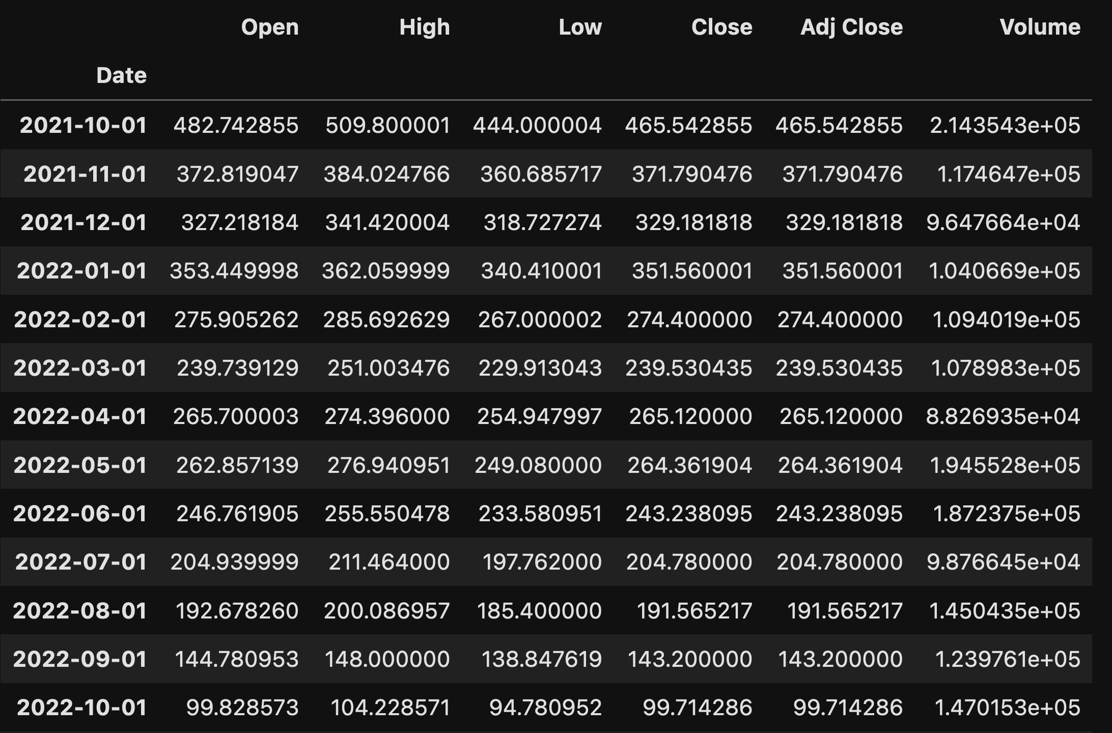
Our data frame has one row for each month during which WeWork was a public company, 26 months in all. That’s admittedly longer than any company I’ve run has been public, but for the low, low price of several billion dollars, I’ll be happy to make some changes in my corporate structure.
Create a line plot showing WeWork's closing stock price during each month over its two years as a public company, compared with the S&P 500 for that time period.
WeWork declared bankruptcy — but beyond that, its stock price hasn’t been doing so great. But “great” compared with what? A standard benchmark for market performance is the S&P 500, 500 companies from many different domains, thus (the theory goes) measuring the health of the overall economy. So if WeWork did so-so, but the S&P 500 also did so-so, then that wouldn’t be too bad, right?
I asked you to plot these two against one another. Creating a line plot in Pandas is pretty straightforward: We run “plot.line” on a data frame; the data frame’s index is used for values on the x axis, and each column is plotted in a different color.
But here, we have two different data frames. Plus, they have different indexes. And we have far more than just the closing price in each data frame.
If I have two data frames, then I can combine them into a single one with the “join” method:
left_df.join(right_df)The result of the above code is a new data frame. The assumption in the above call is that left_df and right_df share an index, or at least largely share an index. For each row in left_df, Pandas finds the row with the same index in right_df, and joins them together. So if left_df has three columns and right_df has four columns, the result of joining them will contain seven columns.
Things can get much more complex than that, but let’s keep things relatively simple for now.
I want to plot the WeWork stock price against the SPY (S&P 500 exchange-traded fund) price. I only want to see it during the period that WeWork was traded; if we invoke “join” on we_df, and use the default (“left inner”) join, then its index will be dominant, and any rows from spy_df that don’t match that index will be ignored.
But wait a second: we_df’s index is the result of our resampling! Which means that the index will often not match up. Thus, we’ll want to join we_df with the result of resampling by “1MS” on spy_df:
we_df.join(spy_df.resample('1MS').mean())This is great, except that it won’t work. That’s because the index in a Pandas data frame can repeat itself, but the column names must be unique. Because both we_df and spy_df came from Yahoo Finance, they share column names. We can solve this by telling join to add a suffix to the left and right data frames:
we_df.join(spy_df.resample('1MS').mean(),
           lsuffix='_we',
           rsuffix='_spy')
We now have a wide (12-column) data frame, the result of combining we_df and spy_df. But we are only interested in two columns, the closing values for each. Let’s thus retrieve those, and then plot them:
we_df.join(spy_df.resample('1MS').mean(),
           lsuffix='_we',
           rsuffix='_spy')[['Close_we', 'Close_spy']].plot.line()
The result of this query is a line plot, comparing the prices over WeWork’s time as a public company:
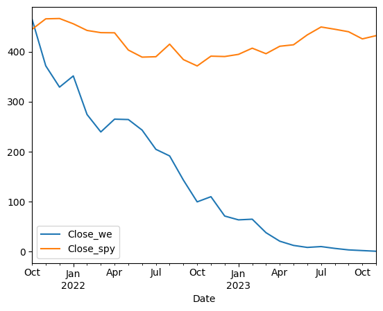
Maybe this goes without saying, but WeWork’s stock price has a pretty clear trajectory, and it’s not one that most investors want to see.
Now create a line plot showing the volume of trades of WeWork's stock relative to its highest-ever volume, vs. the volume of trades of SPY relative to its highest-ever volume. Did it look like WeWork investors were getting nervous in the last few months?
I next asked you to create a similar plot to the previous one — but this time, instead of looking at the closing price for WeWork and SPY, I wanted to see the trading volume, meaning how many shares were bought and sold on each day.
The thing is, if you just compare the volume of shares, then it won’t seem that interesting:

The problem, of course, is that the volume of trades of all companies in the S&P 500 is going to be far, far higher than in a single stock. (You could argue that the volume metric is only for this one SPY fund, and not actually for the S&P 500, and that’s probably true. But I still think that the result is interesting.)
I asked you to show both graphs as a percentage of their maximum-ever values. That is, the day on which WeWork traded its most shares should be the top of the y axis, marked 100%. And we should do that for SPY, as well. What will we see?
I decided that the query was getting a little long and messy, and thus added the resampled SPY data as a variable:
resampled_spy_df = spy_df.resample('1MS').mean()With that in place, I then divided each of the data frames (we_df and resampled_spy_df) by their max values, and then re-did the join from before:
(    (we_df / we_df.max())
    .join((resampled_spy_df / resampled_spy_df.max()), lsuffix='_we', rsuffix='_spy')
    [['Volume_we', 'Volume_spy']]
    .plot.line()
)
The result:

Wow! We see that in the last few months, people have been buying at selling WeWork at totally crazy levels. There wasn’t a similar spike in SPY, meaning that people weren’t trading SPY and super high volumes in the last quarter. Maybe people figured out that WeWork wasn’t a good investment. Or maybe they saw the financial results, and decided to get out before the getting was, well, worse than before. Whatever the reason, the jump is pretty dramatic.
Create a new data frame that combined the WeWork data with the construction and rent data. Keep all data starting in 2010, when WeWork started, even if you don't have data for all of those years.
In the questions I asked yesterday, I referred to “the three data frames.” But of course, there were four! Here, I meant that you should combine the WeWork data with the gross rent and the investment in construction.
This, of course, is another join operation. It’s made easier by the fact that all three have the same index, thanks to the resampling we did earlier. We will first join we_df to construction_spending_df, and then join the result to rent_df. Because we want to join rows that come before we_df’s first date, we will specify an “outer” join, meaning that it’s OK if only one of the two data frames has a particular index value. The missing values will be filled with NaN.
Here’s how we can do this:
df = we_df.join(construction_spending_df,
                how='outer').join(gross_rents_df,
                                  how='outer')
This works, except that it turns out that we can simplify things. A good rule of thumb is that anywhere you can pass a single value in Pandas, you can pass a list of values. That’s true for “join” as well, to which we can pass a list of data frames with which we want to join:
df = we_df.join([construction_spending_df, gross_rents_df], how='outer')However, df now contains data from all dates. How can we restrict it to be only starting in 2010? Well, we have a datetime index. So we can just state, using loc, that we only want rows starting on January 1st, 2010:
df = we_df.join([construction_spending_df, gross_rents_df], how='outer').loc['2010-01-01':]Here’s the resulting data frame:
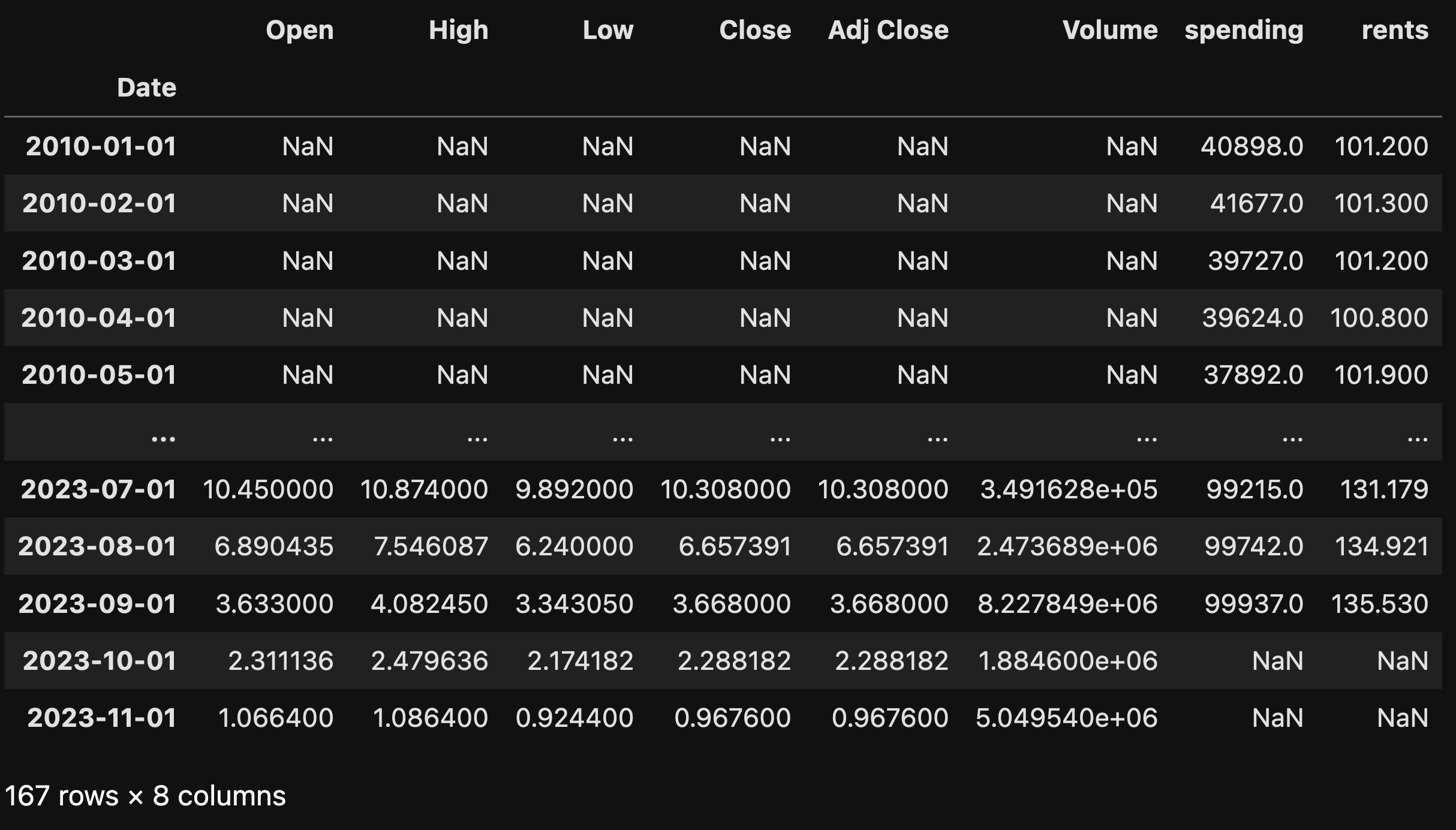
Notice that because there is no information about WeWork until it went public, we have NaN values for the initial rows of columns from that data frame. Similarly, because we don’t yet have spending or rent data from October and November, we have NaN values in those two columns for the two last rows.
What correlation do you see between the WeWork closing price, the gross rent, and the construction investment?
I thought that it might be interesting to see if there’s any correlation between these three values — the WeWork stock closing price, the gross rent, and the construction investment.
If two values are positively correlated, then when one goes up, the other does, too. For example, if the price of oil goes up, then the price of gasoline will likely go up, too. If they go up in lockstep, then that correlation would be called 1.0. A lower, positive number would mean that they’re still correlated, but not as strongly. Zero correlation means that if one goes up, the other might (or might not) go up, too. And of course, there can be negative correlation, meaning that when one thing goes up, the other goes down — for example, as the temperature goes up, sales of winter coats go down.
I was curious to know if investment in office-building construction would be correlated at all with office rents. And I wanted to know if either or both of those would be correlated with WeWork’s stock.
My guess was that especially in the last few years, construction of offices had declined (since people are working from home, and companies need less space), rents had thus declined, and WeWork stock had declined as well — because if people don’t need offices, then they won’t use WeWork, and their stock price will plummet. So I figured that all three would be positively correlated.
I used the “corr” method to calculate the correlations:
df[['Close', 'spending', 'rents']].corr()Here’s what I got:
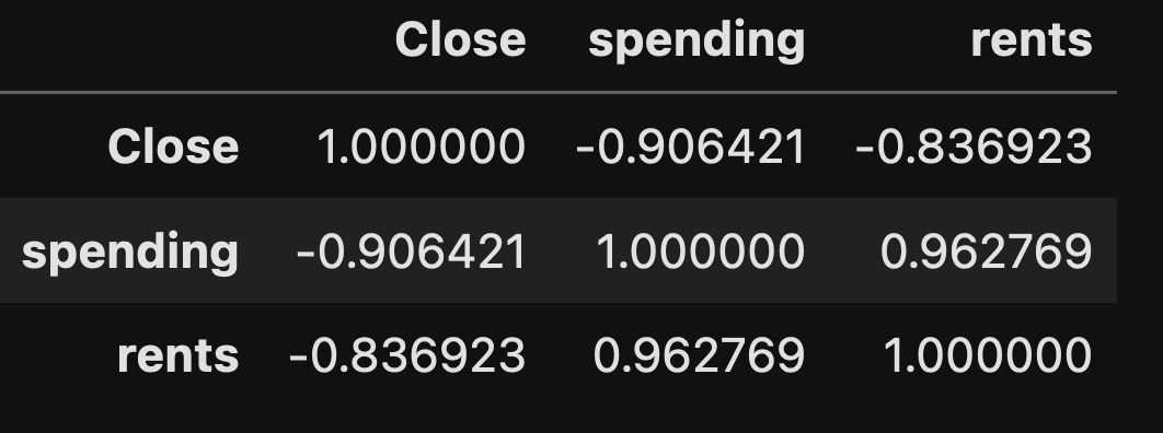
Each of the three columns I asked to use are displayed twice, once as rows and once as columns. The diagonal, where each column name meets itself, is obviously correlated at 1.0.
We can see that the spending on office construction and rents are very highly correlated — meaning, when office rents are high, people spend more to create new offices. And when office rents are low, people spend less to create new offices. That actually makes a fair amount of sense, I’d say; if I saw that office rents were high, then I might think to build a new office building, so that I could reap some of those profits. But if no one is going to the office, and rents are low? Then why would I waste my time?
We also see that there is a strong negative correlation between both of these and the WeWork stock closing price. Meaning that as rents and construction increase, WeWork’s stock decreased. I have to assume that this is because WeWork benefits from having a limited stock of offices around. Higher demand and limited supply make it easier to charge higher prices.
Whether this is true, and was reflected in the WeWork stock, is a bit hard to know. That’s because WeWork was doing terribly at a time when rents weren’t really changing all that much, as we can see in this plot:
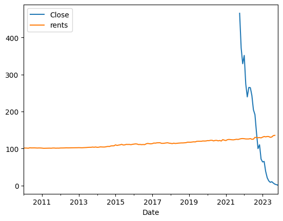
As this graph shows, WeWork’s stock would be pretty negatively correlated with just about anything other than the altitude of a falling rock.
Let's assume that you invested $1 in WeWork on the first day it went public, at its closing price. How much would you have on the final day? On what day would you have been wisest to sell?
Finally, let’s consider how much money you would have lost if you had invested in WeWork on the first day. I decided to use “pct_change” to compare the price on the final day with the price on the first day. Normally, pct_change compares each row with its predecessor. But here, I wanted to compare the last row with the first one.
I thus recreated the data frame, only reading the “Close” column along with the date:
we_df = pd.read_csv('WE.csv',
                    usecols=['Date', 'Close'],
                   index_col='Date',
                   parse_dates=['Date'])
I then grabbed only the first and last rows with “iloc”:
we_df.iloc[[0, -1]]Finally, I ran pct_change on this tiny (two-row) data frame:
we_df.iloc[[0, -1]].pct_change()I got the following:
Date
2021-10-21         NaN
2023-11-07   -0.998226
Name: Close, dtype: float64
Meaning, you would have lost 99.8 percent of your money if you had invested in WeWork on the first day it went public.
But perhaps you could have done well selling… on which day was the stock at its highest price? Here, I used “idxmax”, which returns the index associated with the max value:
we_df['Close'].idxmax()The result?
Timestamp('2021-10-25 00:00:00')In other words, October 25, 2021 was the highest that the stock ever got. And yes, that was just four days after it went public. (I mean, the SPAC was already public, but that’s a different story…) Yikes!
I hope that you enjoyed this. The Jupyter notebook I used to analyze this data is at https://drive.google.com/file/d/1A8HuehZWZvb1nAQCN6GLaxas_YZPEf3m/view?usp=sharing.
I’ll be back next Wednesday with more Pandas problems based on current events.
Reuven