


This week, we’re looking at data about labor unions in the United States. Specifically, we’re looking at data that was originally collected by the Bureau of Labor Statistics, then assembled at UnionStats.com, a site set up by three labor economists (Barry T. Hirsch, David A. Macpherson, and William E. Even).

Data and 10 questions
The Unionstats site offers data in a few different formats, the most of useful of which (to us, at least) is Excel. I presented ten questions and tasks having to do with union membership and earnings, and asked you to answer them using the files on Unionstats.com:
First, let's look at union membership per industry. Read in the data for union membership across industries in 2022 from from http://unionstats.com/ind/xls/ind_2022.xlsx, on the page http://unionstats.com/ind/ind_index.html.
I started off, as usual, by importing the Pandas library:
import pandas as pdWith that in place, I can now download the Excel file using read_excel. When you first start to use Pandas, it might seem like you need to manually download a file and then import it from the local filesystem. But if the file isn’t too big, then you can just give read_excel a URL:
url = 'http://unionstats.com/ind/xls/ind_2022.xlsx'
df = pd.read_excel(url)
That does work, in the sense that it creates a data frame. But it doesn’t really work in a useful way. That’s because the Excel file, as constructed, has a descriptive line at the top (above the column names). It also has copyright and attribution information at the bottom, in line 287 of the spreadsheet.
Since the headers are on line 3 of the Excel file, we’ll tell Pandas to read them using the “header” keyword argument to read_excel. But remember that while Excel starts numbering with 1, Pandas starts with 0. Thus, we’ll tell it that the headers are on line 2:
url = 'http://unionstats.com/ind/xls/ind_2022.xlsx'
df = (
    pd.read_excel(url, header=2)
)
Finally, we’ll remove line 283 of the data frame, which contains the copyright information. Having it there will interfere with things:
url = 'http://unionstats.com/ind/xls/ind_2022.xlsx'
df = (
    pd.read_excel(url, header=2)
    .drop(283)
)
We end up with a data frame whose rows describe the different types of jobs that people had in 2022 — both overall categories (in ALL CAPS) and more specific sub-categories. For each of these, we get the number of observations (i.e., people who were interviewed), the number of people employed in this area, the number of union members, the number of people who are covered by a union contract even if they aren’t themselves union members, the percentage of people who are members, and the percentage of covered non-members.
With our data frame in place, we can now start to perform some calculations with our data.
Looking only at the rows containing top-level job categories (where all of the words are capitalized): Which five categories have the highest union membership? The lowest?
If we want to find the five job types with the highest percentage of union membership, we could just run sort_values on our data frame, and take the top five. But that’s not quite what I asked for: I wanted to know what the top five were among the top-level categories.
Fortunately, we know that top-level categories are in ALL CAPS. Thus, I just need to retrieve the rows from the data frame whose words are in ALL CAPS. An easy way to do this is to turn each element of the “Industry” column into all caps; if that is equal to the original value, then it was in all caps to begin with, and we’ll keep it.
The Python string class has an “upper” method, which can be applied to a single string. We can apply that same method to every element of our series via the “str” accessor. In other words, if we invoke “str.upper()” on a column, we’ll get back a new series containing the same values, but in all caps.
df['Industry'].str.upper()Now we can run a comparison between the original values and the all-caps values:
df['Industry'] == df['Industry'].str.upper()This returns a boolean series (i.e., one containing True/False values), of the same length and with the same index as our data frame, df. We can then apply this boolean series as a mask index on df, using df.loc:
df.loc[df['Industry'] == df['Industry'].str.upper()]This will return only those rows of df that are high-level categories. How can we then sort these lines by the percentage of union members? Now we can use sort_values, telling it ascending=False (i.e., we want in descending order), then using “head” to get only the first five values:
df.loc[df['Industry'] == df['Industry'].str.upper()].sort_values('% Mem', ascending=False).head(5)But wait: If we only are about the industry and percentage of membership, let’s pass a second argument to “loc” indicating that we only want those two columns:
df.loc[df['Industry'] == df['Industry'].str.upper(),
  ['Industry', '% Mem']
].sort_values('% Mem', ascending=False).head(5)
The result is a five-element, two-column data frame:
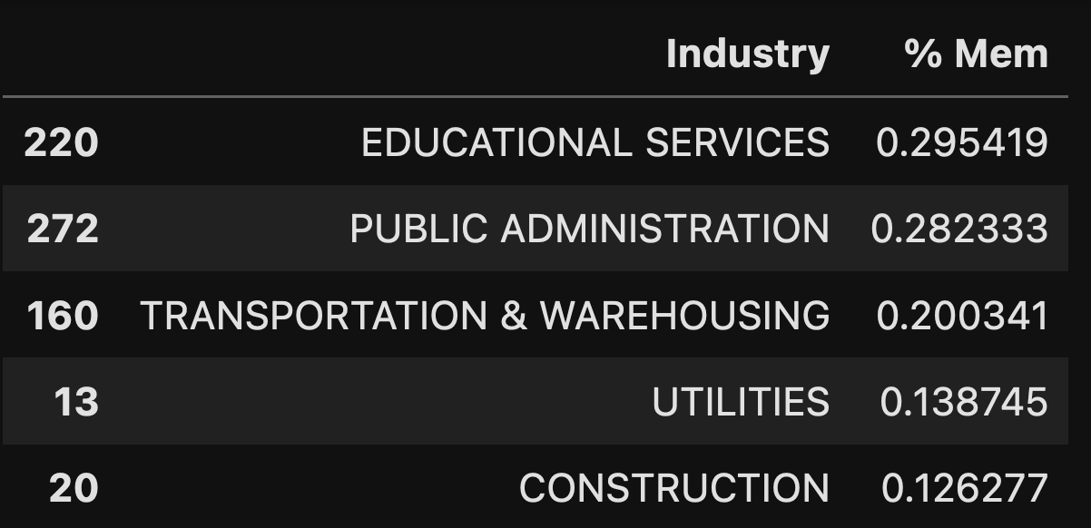
In 2022, we can see that nearly 30 percent of people in education and public administration are unionized — not surprising, given the prevalence of teacher and public-sector unions in the United States. Further down are transportation and warehousing, which makes me think of UPS, but I’m sure that there are many more types of businesses here. Finally, we have utilities and construction.
How can we find the industries with the lowest percentage of union membership in 2022? Just reverse the sort that we did:
df.loc[df['Industry'] == df['Industry'].str.upper(),
  ['Industry', '% Mem']
].sort_values('% Mem', ascending=True).head(5)
And the results:
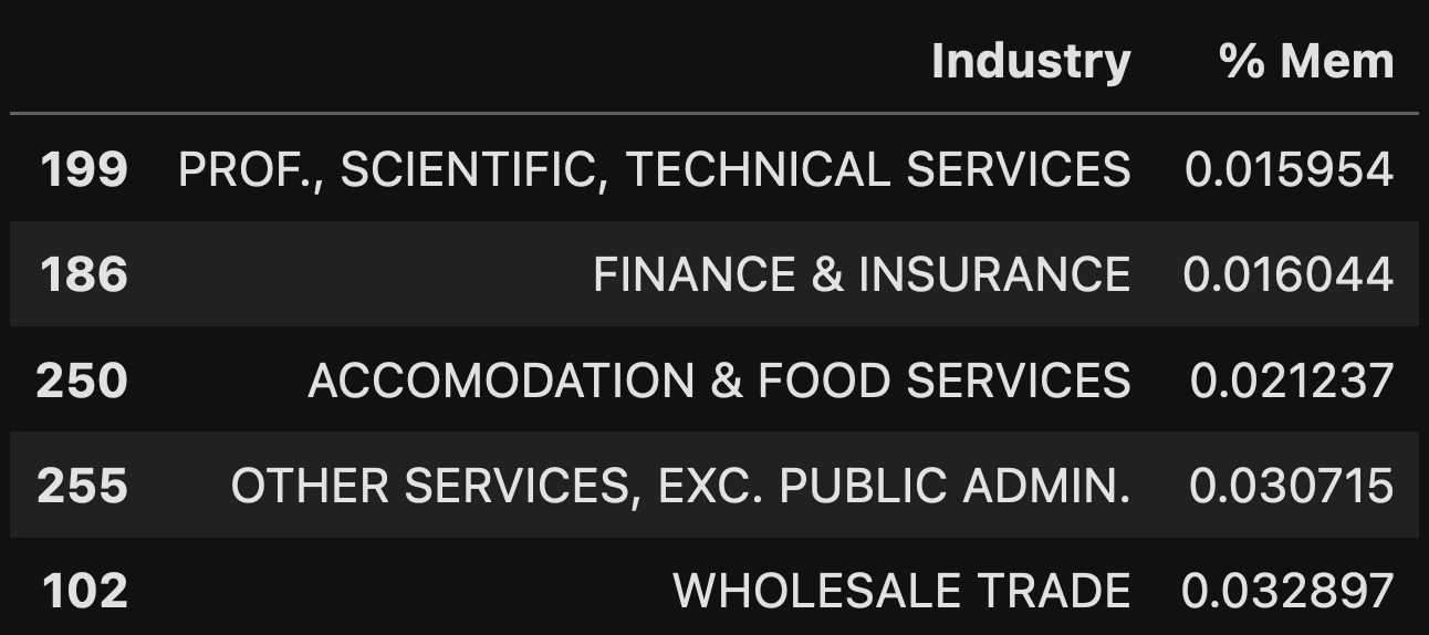
The least likely industry to be unionized? People in scientific and technical fields, which makes a lot of sense given the very small number of unionized workers in tech companies.
Looking only at the rows containing specific job categories (where the words are a mix of capital and lowercase letters): Which five job categories have the highest union membership? The lowest?
To answer this question, we’ll need to do the opposite of what we did above, finding all of the lines that are not the same when they are capitalized.
How can we do that? The easiest way, I think, is to use != (for “not equal”) instead of == (for “equal”):
df.loc[df['Industry'] != df['Industry'].str.upper(),
  ['Industry', '% Mem']
].sort_values('% Mem', ascending=False).head(5)
In theory, we could have used ==, put that entire row selector in parentheses, and put ~ (tilde) before the parenthesized expression. In Pandas, ~ is the “not” operator, turning True into False and False into True. That would have given us the same results. However, I think it’s more intuitive just to use != here.
The result:

Not surprisingly, more than 60 percent of people working for labor unions are members of a labor union. (Why isn’t it higher?) That’s also true for postal workers, rail workers (as we know from some narrowly avoided strikes earlier this year), and the like.
What about specific jobs that are not likely to be unionized? We’ll just flip the sort order:
df.loc[df['Industry'] != df['Industry'].str.upper(),
  ['Industry', '% Mem']
].sort_values('% Mem', ascending=True).head(5)
And the result:

I can’t say that I’m hugely surprised, although I don’t know if I would have guessed any of these specific jobs off the top of my head.
Retrieve the Excel files from 1983, 1993, 2003, 2013, and 2022. Create a data frame in which the rows are the years, and the columns are the top-level (all-caps) categories, showing the percentage of union membership.
In the previous two questions, we downloaded a single Excel file (for 2022) and looked at which jobs had the largest and smallest union representation. In the end, we were only interested in two of the columns from that spreadsheet, “Industry” and “% Mem”.
We could have taken that two-column data frame and turned it into a series, with “Industry” serving as the index and “% Mem” containing the values. We wouldn’t have lost any information that way, and it might even have been easier to work with the values in the end.
In this question, I asked you to create a data frame out of multiple Excel files. From each Excel file, we’re only going to be interested in the ALL CAPS rows (as in question 2). The final data frame will have an index consisting of the “Industry” values, and the columns will each contain values from a single year.
Here’s how I thought about solving this:
- Download each Excel file
- From each file, create a series in which the index is the “Industry” column and the value is the “% Mem” column.
- Combine these series into a Python list
- Use “pd.concat” to turn this list of series into a data frame
I looked at the URLs for the Excel files, and found that they all had the same pattern, which I can express as follows in Python:
f'http://unionstats.com/ind/xls/ind_{one_year}.xlsxThe above f-string will work, assuming that “one_year” is defined as the four-digit year whose data we want to retrieve, and that such a file exists on the server.
I defined two Python lists, one containing the years that I want to download, and a second (empty) list into which I’ll put the series that I create:
all_years = [1983, 1993, 2003, 2013, 2022]
all_series = []
I’ll then want to go through each year, use it to create a URL, and run read_excel on that URL. I’ll once again want to set headers=2 to avoid the initial junk, and only keep the “Industry” and “% Mem” columns. In other words, I can run a “for” loop:
for one_year in all_years:
    print(f'Downloading {one_year}...')

    one_year_df = pd.read_excel(f'http://unionstats.com/ind/xls/ind_{one_year}.xlsx',
               header=2,
             usecols=['Industry', '% Mem']).dropna()
Notice that I use “print” to display the current year; I often do that when running something that’ll take a long time, and where I want to know where things went awry if there was a bug.
Also notice that I run “dropna”, which returns the data frame without any rows that contain NaN values. I’ve got enough data to work with that I’m willing to get rid of any such rows.
But wait: The resulting data frame contains all of the rows from “Industry”, not just those with names in ALL CAPS. I’ll again apply our string comparison:
for one_year in all_years:
    print(f'Downloading {one_year}...')

    one_year_df = pd.read_excel(f'http://unionstats.com/ind/xls/ind_{one_year}.xlsx',
               header=2,
             usecols=['Industry', '% Mem']).dropna()

    one_year_df = one_year_df.loc[
        one_year_df['Industry'] == one_year_df['Industry'].str.upper()
]
Now that the downloaded data frame contains what I want, with only two columns, I’ll turn the “Industry” column into the index, using set_index. Remember that set_index returns a new data frame, rather than modifying the original data frame’s value, so we need to assign it back to the variable. (Yes, you could use inplace=True, but the core Pandas developers have long said that this is a bad idea, and will eventually go away.)
for one_year in all_years:
    print(f'Downloading {one_year}...')

    one_year_df = pd.read_excel(f'http://unionstats.com/ind/xls/ind_{one_year}.xlsx',
               header=2,
             usecols=['Industry', '% Mem']).dropna()

    one_year_df = one_year_df.loc[
        one_year_df['Industry'] == one_year_df['Industry'].str.upper()
]

    one_year_df = one_year_df.set_index('Industry')
Finally, I take the new data frame that we created, and grab the ‘% Mem” column. The column is a series, which we can then append to all_series, our Python list. The final code is:
for one_year in all_years:
    print(f'Downloading {one_year}...')

    one_year_df = pd.read_excel(f'http://unionstats.com/ind/xls/ind_{one_year}.xlsx',
               header=2,
             usecols=['Industry', '% Mem']).dropna()

    one_year_df = one_year_df.loc[
        one_year_df['Industry'] == one_year_df['Industry'].str.upper()
]

    one_year_df = one_year_df.set_index('Industry')
    all_series.append(one_year_df['% Mem'])
We now have a list of series in all_series, each with an index reflecting the major industries from the downloaded Excel file. We can turn those into a data frame with pd.concat. That function expects to get a list of series or data frames, and returns a new data frame based on their combination. By default, though, it assumes that you want to join its arguments by stacking them vertically. Since we want to join them horizontally (i.e., treating each element of the list as a column in the resulting data frame), we have to specify axis="columns":
df = pd.concat(all_series, axis='columns')This is great, except for one thing — the columns aren’t named for the years. We can remedy this by setting the “columns” attribute to our list of years:
df.columns = all_yearsWe now have a data frame whose index reflects the union (combination) of all indexes from all Excel files, and whose columns reflect the percentage of union members for that industry in a particular year.
If you look at the data, you’ll see that only some of the rows have data all the way through. Many industries only exist in the earlier years. Some only exist in the later years. This means that we’ve ended up with a data frame with lots of holes in it. Welcome to the world of realistic data!
Create a line plot with the above data.
To create a line plot from a data frame, it’s usually enough to run “plot.line”:
df.plot.line()But here, we can’t do that. For starters, we want the years to be on the x axis, and the industries to be on the y axis. But as things now stand, the years are the columns and the industries are the index.
Fortunately, we can use the “transpose” method in Pandas, or its alias, a capital T (on which we don’t use parentheses). In other words:
df.T.plot.line()The good news? It works, and creates a plot. The bad news? It’s completely unreadable. There are just too many rows and columns. Moreover, we have (as I mentioned above) some industries with NaN values for 1983 and 1993, and others with NaN values in 2003 and onward.
There’s no one right answer here, but I decided to simplify things by looking at industries for which we had data all the way through. In other words, I’ll remove all of the rows with NaN values in them:
df.dropna().T.plot.line()This is a lot easier to read and understand, and produces the following plot:

For the five industries that have always been polled, we can see that education and public administration have tapered off a bit, but are still relatively high. Mining has dropped rather dramatically, with a slight uptick in the last 10-15 years. And trade (both wholesale and retail) are trending negative, not that they had so many union members to begin with.
Now let's find out how much more union members are paid: Create a data frame from http://unionstats.com/wages/xls/wages_all.xlsx .
Next, I asked you to turn to a different Excel file from the same site, which tracks wages for all types of workers. How much more, on average, are union members paid than their counterparts?
Once again, we’ll use read_excel to retrieve the file from a URL. Once again, we’ll say “header=2”, so that it picks up the column names from the right row.
We also call dropna again, removing any rows that contain any NaN values. Here’s how I did it:
df = (
    pd.read_excel('http://unionstats.com/wages/xls/wages_all.xlsx',
                  header=2)
    .dropna(thresh=3)
)
Notice that I passed “thresh=3” to dropna. This means that we’ll keep any row that contains at least 3 non-NaN values.
The result of this query is a data frame containing lots of information about union wages over the years. Each row is for a different year, and each column is a different measurement during that year.
Why don't you need to remove the copyright notice (on line 54 of the Excel file) from your data frame?
In previous Excel files, we found and removed the “Copyright” line, either implicitly or explicitly. That’s because the copyright line, while important for attribution, would cause us some trouble. Why didn’t we have to do it here, then? Because it was an image in the Excel file, which is then ignored by the Pandas import process.
Create a line plot showing the adjusted union wage premium, with the years as the x axis. What can you say about the salary benefits of belonging to a union over the last few decades?
I want to have the years on the x axis and the adjusted union wages on the y access. I’ll thus set the “year” column to be the index, and retrieve only the wage info column:
df.set_index('Year')['Adjusted Union Wage Prem.']Then I’ll again run “plot.line”:
df.set_index('Year')['Adjusted Union Wage Prem.'].plot.line()The result:

In other words: Over the years, we’ve seen a major drop in the salary boost that people get as a result of belonging to a union. However, those numbers have gone up a bit in recent years — likely the result of a stronger market for employees, giving them negotiating leverage. However, even this recent uptick can’t mask the fact that the union-member bonus is about half (on average) what it was in the past.
Now create a new data frame, based on Excel files for specific demographic groups at http://unionstats.com/wages/wages_index.html : White male/female, Black male/female, and Hispanic male/female. The data frame's index should contain years, and the six columns should contain the adjusted union wage premium for each of these groups in each of these years.
[I have updated this answer to reflect the actual URLs and columns I wanted. Thanks to readers for pointing out my errors in the original answer!]
The above data led me to ask: The BLS survey distinguishes between and women, as well as different ethnic groups (white/Black/Hispanic). Might we see a difference there? The overall trend for all of these groups will likely be negative, but perhaps some groups still make significantly more when they join a union.
Once again, I needed to download multiple files and turn them into a single data frame. First, I created an empty list into which my series would all go. I also defined an empty list into which we can put the strings describing each column:
all_series = []
names = []
I have to download six files, but each file’s URL is standardized, varying only for gender and ethnicity. I decided to use a nested loop, and define the URL based on the iteration variables:
for one_gender in ['male', 'fem']:
    for one_ethnicity in ['wh', 'bl', 'hisp']:
        url = f'http://unionstats.com/wages/xls/wages_{one_ethnicity}_{one_gender}.xlsx'
I then printed the current URL (for easier tracking and debugging), and then ran our favorite “read_excel” method again:
for one_gender in ['male', 'fem']:
    for one_ethnicity in ['wh', 'bl', 'hisp']:
        url = f'http://unionstats.com/wages/xls/wages_{one_ethnicity}_{one_gender}.xlsx'
        names.append(f'{one_ethnicity}_{one_gender}')
        print(url)

        s = pd.read_excel(url, header=2,
                      usecols=['Year', 'Adjusted Union Wage Prem.']).dropna().set_index('Year')
Finally, after creating the data frame, I ran “dropna” on it, set the index to be “Year”, and retrieved the adjusted union premium, in order to have a series.
Finally, I took that series and appended it to “all_series”:
for one_gender in ['male', 'fem']:
    for one_ethnicity in ['wh', 'bl', 'hisp']:
        url = f'http://unionstats.com/wages/xls/wages_{one_ethnicity}_{one_gender}.xlsx'
        names.append(f'{one_ethnicity}_{one_gender}')
        print(url)

        s = pd.read_excel(url, header=2,
                      usecols=['Year', 'Adjusted Union Wage Prem.']).dropna().set_index('Year')['Adjusted Union Wage Prem.']

        all_dfs.append(s)
With the list of series in place, and a list of column names in place, I used pd.concat to create a new data frame, again using “pd.concat” with the axis=”columns” keyword argument:
df = pd.concat(all_series, axis='columns')Oh, and let’s set the column names while we’re at it:
df.columns = namesHere’s a screenshot from the top of the resulting data frame:

Create a line plot showing the adjusted union wage premium for these groups. Which groups seem to enjoy a larger premium from belonging to a union, and which have a smaller one?
With this data in place, we can now create a line plot:
df.plot.line()And the result:

We can see that Hispanic and Black men are still doing pretty well if they are members of a union, compared with their non-unionized counterparts. But this is less true for women, especially for Black women, who have seen that premium decline over the years.
What do you think? What insights did you find from this data? Do share!
Meanwhile, my (updated as of Friday the 22nd) Jupyter notebook is here: https://drive.google.com/file/d/1gPhUevRMnVZWa--17cRVZnV13ss_R3Pt/view?usp=sharing
I’ll be back next Wednesday with a new set of questions. (And of course, if you have suggestions for current-events topics, Pandas functionality, and/or data sets to examine, please let me know.)
Reuven