


This week, the United Nations General Assembly (UNGA) is taking place, with many national leaders coming to give speeches, and hobnob with their counterparts from around the world. There are also countless out-of-sight opportunities for these leaders to chat with one another. While all of these meetings and speeches add up to a spectacle of international diplomacy, the UNGA does offer an opportunity for news to be made, The New York Times has been following and documenting news from the UNGA here: https://www.nytimes.com/live/2025/09/24/world/un-general-assembly-ukraine?unlocked_article_code=1.oU8.RH_g.XK6CXzTtCBbV&smid=url-share .
Most major UN decisions aren't made by the entire General Assembly, but rather by the 15-member Security Council, with five permanent members (China, France, Russia, the United Kingdom, and the United States) and 10 rotating ones. Each permanent member has a veto, meaning that for any Security Council resolution to pass, none of the permanent members can vote "no."
As the news continues to report on speeches, decisions, and diplomacy at the UNGA, I thought it would be interesting to look at various votes that have taken place over the history of the Security Council, examining votes, dates, topics, and even which countries vote most similarly to one another.
Data and five questions
This week's data comes from the UN's Security Council voting data page, at https://digitallibrary.un.org/record/4055387 . As of today, this data set includes all votes on all resolutions in the Security Council's history through July 2025. A Markdown file with a data dictionary, describing the columns and the possible values, can be downloaded from the same page.
This week's learning goals include working with dates and times, working with text, grouping, pivot tables, and plotting.
Paid subscribers, including members of my LernerPython+data subscription program (https://LernerPython.com), can download the file directly from a link at the bottom of this message. Paid subscribers also participate in monthly office hours, can download my notebook files from a link below, and also get a one-click link letting them explore the data without having to install or download anything.
Here are my five tasks and questions for this week:
Read the UN vote data into a Pandas data frame. Make sure that the date column is treated as a datetime value. Create a bar plot indicating how many UN Security Council resolutions were brought to a vote in each year. Is there some point in time that indicates a big change in the number of resolutions per year?
Before doing anything else, I loaded up Pandas — and also Plotly, which I will be using in some plotting.
import pandas as pd
from plotly import express as px
Next, I set a variable (filename) to contain the file, and used read_csv to read it into a Pandas data frame. To speed things up a bit, I set engine='pyarrow', meaning that I want to use the PyArrow CSV-loading system to get the data frame. The backend data will still be stored in NumPy, though; to use PyArrow for data storage, I would need to use the experimental dtype_backend='pyarrow', which I didn't do here:
filename = '/Users/reuven/Downloads/2025_7_21_sc_voting.csv'

(
    pd
    .read_csv(filename, engine='pyarrow')
)
This works, but two things bother me here. First, I want the date column to have a datetime dtype, and it's currently seen as object, which basically means strings. That's because PyArrow is usually pretty astute about identifying datetime columns and setting that dtype, but needs a bit of a kick if the format is even slightly off. We can do that by passing parse_dates=['date'] to read_csv.
Beyond that, I'm only going to need two columns, date and resolution. I decided to keep only those columns, reducing the data frame's memory footprint, by passing usecols:
(
    pd
    .read_csv(filename, engine='pyarrow',
              usecols=['date', 'resolution'],
              parse_dates=['date'])
)
To get a bar plot showing the number of resolutions per year, I'll need to extract the year part of the date column. That's not too hard to do, using the dt accessor; I can say df['date'].dt.year, and get a series of years back.
However, the data frame doesn't contain one line per resolution. Rather, it contains one line per vote. Which means that if we count the number of times each year appears, we'll be massively overcounting – probably, but not definitely, by a factor of 15, since there are 15 members of the Security Council.
I thus decided to invoke drop_duplicates, a method which returns a new data frame based on an existing one, but (somewhat obviously) without any duplicate rows:
(
    pd
    .read_csv(filename, engine='pyarrow',
              usecols=['date', 'resolution'],
              parse_dates=['date'])
    .drop_duplicates()
)
Then what? There are numerous ways to get the right solution here. But just last week, during office hours with my Python Data Analytics Bootcamp, I learned a neat trick from one of my students: If you pass a function (including a lambda) to groupby, then the function is invoked on each element in the data frame's index. If the index contains datetime values, then we can say df_.year, which will retrieve the year component from each datetime value in the index.
I thus decided to invoke set_index to make date the index, and then to perform a simple groupby on the index, invoking count. Not only did this count the number of times each year appeared, but because groupby orders the resulting series by the index, we also got the years in ascending order:
(
    pd
    .read_csv(filename, engine='pyarrow',
              usecols=['date', 'resolution'],
              parse_dates=['date'])
    .drop_duplicates()
    .set_index('date')
    .groupby(lambda df_: df_.year).count()
)
Next, I used Plotly (as I've been doing lately) to create a bar plot. Because px.bar is a Plotly function, rather than a method we can invoke on a data frame, I called the pipe method, which lets us feed our own function. In this case, that function was a lambda expression, allowing me to invoke px.bar(s_)on the series we got from the groupby:
(
    pd
    .read_csv(filename, engine='pyarrow',
              usecols=['date', 'resolution'],
              parse_dates=['date'])
    .drop_duplicates()
    .set_index('date')
    .groupby(lambda df_: df_.year).count()
    .pipe(lambda s_: px.bar(s_))
)
Here's the plot I got:
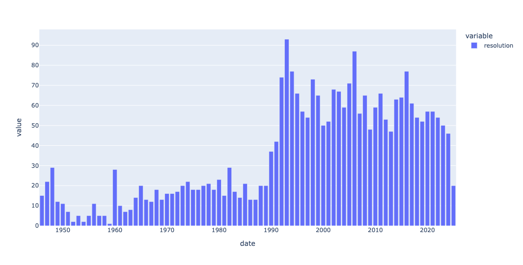
We can see that the number of Security Council resolutions increased pretty dramatically starting in 1990. I'm not enough of a scholar of the United Nations to know why, but I have a few guesses: First, a number of international crises (e.g., the second Iraq War, the breakup of Yugoslavia, and issues with Afghanistan) all started around then and drew international attention. Maybe the Security Council saw it fit to deal with such topics more than in the past.
A second possible factor was the breakup of the Soviet Union. The United States and Russia (not to mention China) aren't on the best of terms, but those years might have set the stage for better international cooperation.
But of course, there might be many other possibilities, including a more general interest or belief in using international institutions for world stability. Or even something as mundane as procedural rules making it easier to introduce new resolutions.
Whatever the reason, we see the increase pretty starkly in the plot.
Look at the five permanent Security Council members. Which are most highly correlated in their voting patterns? With which countries' votes does the US most highly correlate?
The whole point of having five different countries on the Security Council is to represent divergent viewpoints. But even so, we can guess that some countries vote with one another (e..g, the United Kingdom and United States) more often than with, say, China.
I asked you to find the correlation between these countries. Using standard correlation measures (e.g., those returned by the corr method), a score of 1 means that two columns are perfectly positively correlated, a score of -1 means that they are perfectly negatively correlated, and a score of 0 means that they aren't correlated at all.
But before we can do that, we need to get the values into a different configuration. I read the CSV file into a data frame, keeping five columns and (again) asking for date to be considered a datetime column:
(
    pd
    .read_csv(filename, engine='pyarrow',
             usecols=['ms_name', 'date', 'ms_vote', 'resolution', 'permanent_member'],
             parse_dates=['date'])
)
I then used loc and lambda to keep only those rows where the country in question was a permanent member of the Security Council. That seems like a straightforward thing to do:
(
    pd
    .read_csv(filename, engine='pyarrow',
             usecols=['ms_name', 'date', 'ms_vote', 'resolution', 'permanent_member'],
             parse_dates=['date'])
    .loc[lambda df_: df_['permanent_member'] == True]
)
However, I found that after performing this task, a number of other countries snuck into my results — Somalia, Ghana, and Switzerland. I have nothing against any of these countries, but they aren't permanent Security Council members. The data set is slightly wrong, and I added a second loc and lambda line, using a combination of ~ (to reverse a boolean series) and isin (to find membership) to remove those three countries:
(
    pd
    .read_csv(filename, engine='pyarrow',
             usecols=['ms_name', 'date', 'ms_vote', 'resolution', 'permanent_member'],
             parse_dates=['date'])
    .loc[lambda df_: df_['permanent_member'] == True]
    .loc[lambda df_: ~df_['ms_name'].isin(['SOMALIA', 'GHANA', 'SWITZERLAND'])]
)
With just the data we want (for permanent Security Council members) in place, I then used pivot_table to rejigger the data into a format that we could use:
- The rows (index) contained the unique resolution names
- The columns contained the unique Security Council country names
- The values were from
ms_vote - The aggregation function was
sum
Note that I didn't expect to see more than one value in any cell, because each country cast (in theory) only one value for each resolution. Sure enough, that worked fine:
(
    pd
    .read_csv(filename, engine='pyarrow',
             usecols=['ms_name', 'date', 'ms_vote', 'resolution', 'permanent_member'],
             parse_dates=['date'])
    .loc[lambda df_: df_['permanent_member'] == True]
    .loc[lambda df_: ~df_['ms_name'].isin(['SOMALIA', 'GHANA', 'SWITZERLAND'])]
    .pivot_table(columns='ms_name',
                index='resolution',
                values='ms_vote',
                aggfunc='sum')
)
However, correlations work on numbers, and the votes in ms_vote are recorded as Y, N, X, and A. I used replace to replace these letter values with integers, and then invoked astype(float) on the data frame to turn them into numbers. I'll admit off the bat that Pandas gives a warning when doing this, and it's likely not the best way to do things... but it's so convenient to pass a dict to df.replace and know it'll work:
(
    pd
    .read_csv(filename, engine='pyarrow',
             usecols=['ms_name', 'date', 'ms_vote', 'resolution', 'permanent_member'],
             parse_dates=['date'])
    .loc[lambda df_: df_['permanent_member'] == True]
    .loc[lambda df_: ~df_['ms_name'].isin(['SOMALIA', 'GHANA', 'SWITZERLAND'])]
    .pivot_table(columns='ms_name',
                index='resolution',
                values='ms_vote',
                aggfunc='sum')
    .replace({'Y':1, 'N':-1, 'X':0, 'A':0})
    .astype(float)
)
Finally, I invoked corr, then grabbed only those values from the United States` and sorted them to see who was most (and least) highly correlated:
(
    pd
    .read_csv(filename, engine='pyarrow',
             usecols=['ms_name', 'date', 'ms_vote', 'resolution', 'permanent_member'],
             parse_dates=['date'])
    .loc[lambda df_: df_['permanent_member'] == True]
    .loc[lambda df_: ~df_['ms_name'].isin(['SOMALIA', 'GHANA', 'SWITZERLAND'])]
    .pivot_table(columns='ms_name',
                index='resolution',
                values='ms_vote',
                aggfunc='sum')
    .replace({'Y':1, 'N':-1, 'X':0, 'A':0})
    .astype(float)
    .corr()
    ['UNITED STATES']
    .sort_values(ascending=False)
)
What did I find?
ms_name	UNITED STATES
UNITED STATES	1.0
UNITED KINGDOM	0.7260896030025624
FRANCE	0.6072468692212912
RUSSIAN FEDERATION	0.4455326688482324
CHINA	0.35339678898919363
USSR	0.0824828709373495
Obviously, the US is 100 percent positively correlated with itself. But then we see +72 and +60 for the UK and France, respectively.
Russia, which took over the USSR (Soviet Union) seat after the Communist government fell, has a +44 correlation with the US, a big difference from the +8 correlation that the USSR had. I might have expected a negative correlation between the US and USSR, but we'll discuss that more in question 3.) And China is only a +35 correlation — much smaller than the other Western powers, but still larger than I would have expected, and positive.