


I'm finally home from Bengaluru (Bangalore), where I had the most wonderful time at PyCon India 2025. (This, just after attending PyCon Taiwan 2025 in Taipei the previous week.) I attended interesting talks, spoke with smart people doing amazing things, met with companies interested in my Python/Pandas training services, and even got to tour the city a little. I had a marvelous time, and hope to return to India in the near future.
The traffic in Bangalore was something to behold: There were only a few traffic lights, and even fewer crosswalks with walk signals. This meant that in many places, people simply drove and walked when they felt it was safe to do that. After a full week of crossing streets, I started to get a good sense of when and how to do so safely. But even in the hip neighborhood where I was staying, the sidewalks were often blocked, forcing me (and others) to walk in the street, dodging cars, motorbikes, and tuk-tuks.
Here's a short video from an intersection near my hotel, just to give you a taste:
This was possible, in part, because traffic moved so slowly. Locals told me that Bangalore has grown so quickly in the last few years that the roads are unable to handle the influx of traffic. Even short distances become long journeys; someone I met with said that he lives 10 km from my hotel, but that it takes an hour to get there.
These experiences led me to wonder: How many vehicles are there in Bangalore? How does that rank among all Indian states? How fast have these numbers been climbing? And what kinds of vehicles are most popular?
This week, we'll thus look at Indian government data about new vehicle registrations. That's not a perfect metric of what I'm trying to understand, but it will give us some insights into what's happening on the roads.
Data and five questions
This week's data comes from the Indian government's "VAHAN registration by maker" data set, allowing us to see how many new vehicles of each type were registered each year. The main page is at https://ckandev.indiadataportal.com/dataset/vehicle-registrations , and it offers a number of different files, all taken from a larger data set. Of the five listed there, we'll just be looking at three – those for makers (i.e., which company manufactured the vehicle), class (i.e., what type of vehicle it is), and fuel type (to see how electric cars are doing).
I got each of these files in CSV format by clicking on the "explore" menu button next to the particular file I wanted, and then choosing "download."
The data starts in 2020 and ends halfway through last year (i.e., in 2024), so we aren't going to have a long historical perspective. But we will be able to compare numbers over time, compare states with one another, and even get a sense of how many cars vs. motorbikes are being registered. (I can already tell you, before doing the analysis, that motorbikes will overwhelm the number of four-wheeled vehicle purchases.)
Learning goals for this week: Grouping, window functions, pivot tables, and plotting with Plotly.
Paid members, including members of my LernerPython + data subscription program at https://LernerPython.com , can download all of the CSV files in a single zipfile from a link at the bottom of this message. Paid subscribers can also download my Marimo notebook, and execute it with a one-click link to Molab, the Marimo collaboration system.
Here are my solutions and explanations for this week's questions and tasks:
Load the "vehicle class" data into a Pandas data frame. Transform it into a data frame in which the rows represent years and the columns show the number of new vehicles of each class registered in that year. Using Plotly, create a stacked bar plot with one bar per year. Have overall vehicle registrations gone up each year? Do we see any trend?
First thing, I loaded Pandas:
import pandas as pdNext, I defined a variable for the vehicle-class CSV file that I downloaded, and then read it into Pandas using read_csv. I often like to use the PyArrow engine for loading CSV files, in part because it's faster than the builtin Pandas CSV-loading engine, and in part because it parses dates automatically, so I don't have to pass the parse_dates keyword argument.
Notice that the CSV file I passed to read_csv isn't really a CSV file, but rather a zipped CSV file with a .zip extension. That's fine, because both the native Pandas CSV reader and the PyArrow CSV reader will automatically unzip a compressed file and handle it appropriately.
Perhaps because the date column contained only a date value (e.g., 2020-04-01) rather than a full datetime, the PyArrow parser didn't parse it automatically. I added the parse_dates keyword argument, and it worked just fine:
vehicle_class_filename = 'data/bw-136-vahan-class.zip'

(
    pd
    .read_csv(vehicle_class_filename, engine='pyarrow', parse_dates=['date'])
)
The result was a data frame with 857,760 rows and 9 columns.
I wanted to use the year to create a pivot table. I could have done this directly from the date column, but I often like to use assign to grab the year and then access it directly. Moreover, while you can use integers as column names in Pandas, you get a warning when doing so. This particular pivot table won't give me trouble, because the years will be used for the rows – but since I'll be reusing this code later, I decided to grab the years from date (using dt.year) and turned them into strings with astype(str):
(
    pd
    .read_csv(vehicle_class_filename, engine='pyarrow', parse_dates=['date'])
    .assign(year = lambda df_: df_['date'].dt.year.astype(str))
)
Next, I created my pivot table:
- The index (rows) were the years
- The columns were the unique values from
class_type, indicating the type of vehicle - The values were
registrations, the number of registrations of each vehicle - The aggregation function was
sum, adding together all of the registrations for each class type per year
I also passed sort=False, so that we wouldn't get the values sorted in what could be a weird-looking way.
I invoked pivot_table with these arguments:
(
    pd
    .read_csv(vehicle_class_filename, engine='pyarrow', parse_dates=['date'])
    .assign(year = lambda df_: df_['date'].dt.year.astype(str))
    .pivot_table(index='year',
                 columns='class_type',
                 values='registrations',
                 aggfunc='sum',
                sort=False)
)
The resulting data frame had 74 columns, indicating a wide variety of vehicles registered in India in each year. I wanted to see this in a bar plot, stacking all of the vehicle registrations for a given year together. To do this using Plotly, I used pipe, allowing me to invoke px.bar, passing the data frame to it:
from plotly import express as px

(
    pd
    .read_csv(vehicle_class_filename, engine='pyarrow', parse_dates=['date'])
    .assign(year = lambda df_: df_['date'].dt.year.astype(str))
    .pivot_table(index='year',
                 columns='class_type',
                 values='registrations',
                 aggfunc='sum',
                sort=False)
    .pipe(lambda df_: px.bar(df_) )
)
Here's what I got from Plotly:
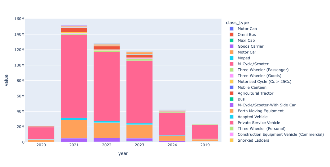
Much to my surprise, we see fewer total vehicle registrations each year. Whether that is because of better public transportation, a worse economy, government rules regarding registrations, or some combination of factors, I really don't know. But we do see a huge pink section in each of these years, dwarfing all other values. And the pink bars represent, as the legend indicates, motorcycles and scooters.
I should add that there are numerous variations on these including "motorcycle/scooter with side car," which weren't included in that pink section. So the numbers are off by a bit, but it's still easy to see that scooters and motorcycles are the vehicle purchase of choice for most Indians.
Now calculate the trend from year to year, for each vehicle class. In 2023, the last full year for which we have data, which five vehicle types increased their registration numbers, percentage-wise, the most? What if we limit our search to only the state of Karnataka?
This will require creating another pivot table — but this time, we'll flip the columns and rows, using year for the columns and class_type for the rows. We'll still use registrations for the values and sum for the aggregation function:
(
    pd
    .read_csv(vehicle_class_filename, engine='pyarrow', parse_dates=['date'])
    .assign(year = lambda df_: df_['date'].dt.year.astype(str))
    .pivot_table(index='class_type',
                 columns='year',
                 values='registrations',
                 aggfunc='sum')
)
I wanted to find out the percentage change in registration numbers for each vehicle type. To do that, I ran the pct_change method, a "window function" that allows us to calculate the difference from row to row or (in this case) from column to column. Here, I passed axis='columns' to indicate that we wanted to compare each column's values with the one to its left. I also passed fill_method=None, mostly to quiet a warning about future compatibility. Then, because I was only interested in differences between 2023 and the previous year (2022), I used [] to retrieve just that column:
(
    pd
    .read_csv(vehicle_class_filename, engine='pyarrow', parse_dates=['date'])
    .assign(year = lambda df_: df_['date'].dt.year.astype(str))
    .pivot_table(index='class_type',
                 columns='year',
                 values='registrations',
                 aggfunc='sum')
    .pct_change(axis='columns', fill_method=None)
    ['2023']
)
I wanted to see what 10 vehicle types had increased the most from 2022 to 2023. I already had the percentages, so I just needed to grab the largest ones. For that, I turned to nlargest:
(
    pd
    .read_csv(vehicle_class_filename, engine='pyarrow', parse_dates=['date'])
    .assign(year = lambda df_: df_['date'].dt.year.astype(str))
    .pivot_table(index='class_type',
                 columns='year',
                 values='registrations',
                 aggfunc='sum')
    .pct_change(axis='columns', fill_method=None)
    ['2023']
    .nlargest(10)
)
I got the following:
class_type	2023
Motor Cycle/Scooter-With Trailer	17.636363636363637
Snorked Ladders	7.833333333333334
Semi-Trailer (Commercial)	7.333333333333334
Mobile Clinic	3.740369799691834
Auxiliary Trailer	2.891891891891892
Private Service Vehicle (Individual Use)	1.298510935318753
Omni Bus	1.252419709634844
Quadricycle (Commercial)	0.899375
Breakdown Van	0.6777777777777778
Fire Tenders	0.581441263573544
This is fine, but a bit hard to read, thanks to the large numbers. I thus decided to invoke apply on these values, passing them the str.format method on a string that applied ,.2%, which:
- Puts commas before every group of three digits
- Shows the number as a percentage
- Show only two digits after the decimal point:
(
    pd
    .read_csv(vehicle_class_filename, engine='pyarrow', parse_dates=['date'])
    .assign(year = lambda df_: df_['date'].dt.year.astype(str))
    .pivot_table(index='class_type',
                 columns='year',
                 values='registrations',
                 aggfunc='sum')
    .pct_change(axis='columns', fill_method=None)
    ['2023']
    .sort_values()
    .nlargest(10)
    .apply('{:,.2%}'.format)
)
The result:
class_type	2023
Motor Cycle/Scooter-With Trailer	1,763.64%
Snorked Ladders	783.33%
Semi-Trailer (Commercial)	733.33%
Mobile Clinic	374.04%
Auxiliary Trailer	289.19%
Private Service Vehicle (Individual Use)	129.85%
Omni Bus	125.24%
Quadricycle (Commercial)	89.94%
Breakdown Van	67.78%
Fire Tenders	58.14%
In other words, motorcycle and scooter sales rose by 1,763 percent, year over year! That's a huge indication of growth.
But are these numbers representative of Bangalore's state? We can find out by filtering the results, keeping only registrations from Karnataka with a loc and lambda filter near the top of our query:
(
    pd
    .read_csv(vehicle_class_filename, engine='pyarrow', parse_dates=['date'])
    .loc[lambda df_: df_['state_name'] == 'Karnataka']
    .assign(year = lambda df_: df_['date'].dt.year.astype(str))
    .pivot_table(index='class_type',
                 columns='year',
                 values='registrations',
                 aggfunc='sum')
    .pct_change(axis='columns', fill_method=None)
    ['2023']
    .sort_values()
    .nlargest(10)
    .apply('{:,.2%}'.format)
)
The result:
class_type	2023
Vehicle Fitted With Compressor	300.00%
Private Service Vehicle (Individual Use)	295.60%
Tow Truck	200.00%
Quadricycle (Commercial)	182.93%
Maxi Cab	158.38%
Omni Bus (Private Use)	133.33%
Three Wheeler (Passenger)	118.96%
Tractor (Commercial)	111.50%
Motor Cab	105.46%
Construction Equipment Vehicle (Commercial)	100.00%
We still see many vehicle types whose registration has doubled or tripled in the last year. But they seem to mostly be commercial vehicles and taxis – which does make some sense, given the very large number of taxis I saw, and took, during my time there. Maybe the number of scooters hasn't grown massively in Kanataka as much as the rest of India, but I assure you there were many of them!