


I'm in Long Beach, California, where PyCon US, the annual conference of the Python community in the United States, just started yesterday. I've been overwhelmed with the conference (and massive jet lag), so this issue is going out a bit late, and will also be a bit shorter than usual.
This week, we're looking into the Port of Long Beach – how much cargo is imported and exported through here, and the main countries with which the US trades via Long Beach. We'll use data from the Port of Long Beach itself, along with additional information from the US Department of Transportation's Bureau of Transportation Statistics.
Paid subscribers, both to Bamboo Weekly and to my LernerPython+data membership program (https://LernerPython.com) get all of the questions and answers, as well as downloadable data files, downloadable versions of my notebooks, one-click access to my notebooks, and invitations to monthly office hours.
Learning goals for this week include working with CSV files, pivot tables, merging, plotting with Plotly, and working with dates and times.
Data and six questions
We used two different data sets this week:
First, the official monthly statistics from the Port of Long Beach's data portal. Go to the main page at https://polb.com/business/port-statistics, then click on the link to get monthly data from 1987. Download the data in CSV format.
Then we used BTS data from https://explore.dot.gov/#/site/BTS/views/ImportsbyCountryandPort/Home. I created a report with:
- HS port-level data
- Port of Long Beach, CA
- All commodities, including the total
- All countries
- All years through 2025
After marking each of these, I clicked on "create report," and asked for CSV files (comma separated) in sparse format. (I would have preferred to get per-month data, but that exceeded the maximum number of rows the site will export.) After several minutes, I got a CSV file downloaded onto my computer.
Here are my solutions and explanations for this week's six questions:
Read the Long Beach data into a Pandas data frame. Ensure the Date column has a datetime dtype. Remove any rows whose dates aren't in "MONTH YEAR" format. Make sure numeric columns have numeric dtypes. Create a line plot showing the total number of loaded TEUs (i.e., 20-foot cargo containers) inbound and outbound over the course of the data set's history, with separate lines for inbound and outbound.
I first loaded Pandas and Plotly:
import pandas as pd
from plotly import express as px
I then defined a variable with the filename, and then used read_csv to read it in. But then I discovered that all of the numeric (integer) columns were being treated as strings! That's because the numbers all included commas, which the Pandas parser saw were non-digits, and thus interpreted as strings.
However, I then passed the thousands=',' keyword argument, which told Pandas to treat it as a thousands separator. Immediately, the columns were seen as integers. No use of assign or astype as needed. Note that if you use the PyArrow engine for parsing CSV files, you cannot use the thousands keyword argument.
I also wanted to interpret the Date column as dates. I originally thought that I can get away without too much work – passing the parse_dates keyword argument, specifying that Date should be interpreted as a datetime, and then specifying the format with date_format. However, the earliest data isn't in a valid date format, and asking Pandas to interpret the values as datetime values in read_csv will silently leave the column as strings.
As a result, we needed to be a bit more sophisticated:
- I used
locandpd.colto find the date values containing a'-'character, and then (thanks to~) ignore those rows. - Then, once I eliminated those values, I used
assignalong withpd.to_datetimeto turn theDatecolumn intodatetimevalues. I had to specify the format, as well. - Then I used
set_indexto turnDateinto the index - Finally, I used
sort_indexto sort our new data frame in ascending order by the index, so that older values would come earlier, rather than later:
filename = 'data/bw-170-long-beach.csv'


df = (
    pd
    .read_csv(filename, thousands=',')
    .loc[~pd.col('Date').str.contains('-')]
    .assign(Date = lambda df_: pd.to_datetime(df_['Date'], format='%b %Y'))
    .set_index('Date')
    .sort_index()
)
The result? A data frame with 466 rows and 7 columns.
To plot imported vs. exported containers, I selected the two columns of interest, then passed them to px.line within a call to pipe:
(
    df
    [['Loaded Inbound', 'Loaded Outbound']]
    .pipe(px.line)
)
The result:
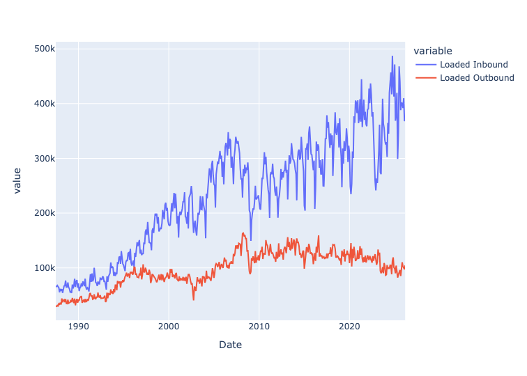
We can thus see that the number of loaded inbound containers has been rising steadily over the years, indicating more imports entering via the Port of Long Beach. However, the loaded outbound containers (i.e., exports) has been declining. This likely reflects, among other things, the fact that the US economy is centered around services, rather than goods.
The standard way to measure a port's size is to add up all TEUs (i.e., 20-foot cargo containers), whether loaded or empty, inbound or outbound. Create a line plot showing the total for each year in the data set, through 2025. Has the Port of Long Beach grown significantly over time? Also: Containers can be loaded or empty, inbound or outbound. Check that the Total column matches the total for loaded and empties. And check that Total also matches the total from loaded inbound and outbound, and also empty inbound and outbound. If these figures don't match, what might the issue (or issues) be? What effect does NaN have?
I first used loc with two arguments:
- a slice on dates, getting up to (and including) 2025 – our row selector
- a column name,
Total– our column selector
The index remained from before, and because it's a set of datetime values, we can use resample. I specified that I wanted the total for each year, specified as '1YE' (end of each 1-year period) and sum. I then passed that to pipe and px.line:
(
    df
    .loc[:'2025', 'Total']
    .resample('1YE').sum()
    .pipe(px.line)
)
The result:
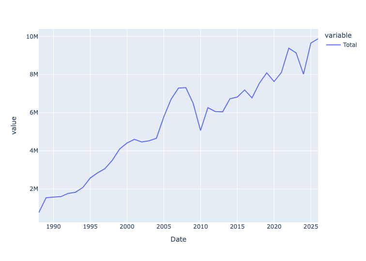
We can see that the total number of containers – empty and loaded, imported and exported – has been rising pretty steadily for many years.
I then used assign to total a number of different columns that should all give us the same numbers:
Total Loaded+Total Emptiesshould give us the sum total, reflected inTotalLoaded Inbound+Loaded Outbound+Empty Inbound+Empty Outboundshould also give us the same asTotal.
Are they the same, then? Here's the query:
(
    df
    .assign(total_from_summing_totals = pd.col('Total Loaded') + pd.col('Total Empties'),
           total_from_summing_all_loaded_and_empty = sum([pd.col('Loaded Inbound'),
                                                  pd.col('Loaded Outbound'),
                                                  pd.col('Empty Inbound'),
                                                  pd.col('Empty Outbound')]))
    [['Total', 'total_from_summing_totals', 'total_from_summing_all_loaded_and_empty']]
)
Are they the same? They are, for the most part – but there are some slight differences, here and there. For example, in March 2026, Total is 774,935, as is the sum of the two total columns. But the larger sum gives us 774,936. Not the end of the world, but a slight difference that reflects just how messy real-world data can be.
As for NaN, it indicates that there isn't any data for that time period. If we were to just add those with +, we would potentially get a NaN result. By using sum, we avoid that trouble. We could also have used df.fillna(0), but you do want to be careful before replacing NaN with 0, since they do have different meanings.