


Administrative note: I'll be teaching my Claude Code + Python workshops later this month. If you want to learn how to use AI to write code (and also how not to do so, and what pitfalls you might encounter), join me for these fun, hands-on workshops. You can get more information at https://lernerpython.com/code-with-claude/, or sign up for a free info session on Monday at https://us02web.zoom.us/webinar/register/WN_1m1K4KV0RpqiINfl49dOFw.
This week has been quite eventful for those of us living in Israel: On Saturday morning, our army joined the United States in attacking numerous government and military institutions in Iran.
Rather predictably, Iran has responded by launching numerous missiles and drones at Israeli cities — sending my family, and millions of other Israelis, to safe rooms (if we're fortunate enough to have one), public bomb shelters, subway stations, and underground parking garages. In Modi'in, we've had four or five alerts today (Thursday) alone.
(And yes, it's a bit bonkers that I cannot tell you with any precision how many times missiles have been aimed at my city in the last 24 hours. I'll again stress that we are safe, and quite fortunate to have a safe room in our home.)
Less predictably, Iran has also launched numerous missiles and drones at other countries: The United Arab Emirates, Saudi Arabia, Bahrain, Qatar, and even Turkey, Cyprus, and Azerbaijan. This seems to be part of their larger strategy of widening the war, making it economically and diplomatically unfeasible to continue fighting.
Iran increased the pressure further over the last few days, saying that they'll attack any ships that pass through the Strait of Hormuz (https://www.nytimes.com/interactive/2026/03/03/business/iran-war-oil-gas-strait-of-hormuz.html?unlocked_article_code=1.QlA.8gcD.xn74_tuE5sXN&smid=url-share). This narrow waterway is essential to world petroleum exports, with an estimated 20 percent of all oil products traveling through there.
I thought that this week would be a good opportunity to look at the Strait of Hormuz, and see just how much of the world's oil exports go through there. Truth be told, we won't really look at those precise numbers, but rather at the production and export numbers from countries in the Persian Gulf, and assume that the bulk of that oil is exported by ship, rather than by oil pipeline. But we'll still learn a bit about the petroleum industry, and how it works.
This week, we'll answer these questions using data, mostly from the EIA, the Energy Information Administration (https://eia.gov), part of the US government.
Paid subscribers, both to Bamboo Weekly and to my LernerPython+data membership program (https://LernerPython.com) get all of the questions and answers, as well as downloadable data files, downloadable versions of my notebooks, one-click access to my notebooks, and invitations to monthly office hours.
Learning goals for this week include working with JSON, cleaning data, multi-indexes, plotting with Plotly, and pivot tables.
Data and five questions
This week's data comes from the EIA. To get the data file you'll need, go to https://www.eia.gov/international/data/world/petroleum-and-other-liquids/annual-crude-and-lease-condensate-exports. Click on country/region. Click on "data options". On the right, choose "Crude oil including lease condensate" in the first group, under "production", to get production information along with the export data. Then click on "view data". Finally, download the JSON file.
Note that Persian Gulf countries are considered to be Saudi Arabia, Bahrain, Iraq, Iran, Qatar, Kuwait, and the United Arab Emirates (UAE). You'll need that to answer some of the questions.
Here are my five tasks and questions for the week; I'll be back tomorrow with my solutions and explanations:
Turn the JSON file from the EIA into a Pandas data frame. The data frame should have four columns from the JSON file – iso (the 3-letter country code), activityid (a string, with 'production' replacing 1 and 'export' replacing 4), year (an integer, a 4-digit year) and value (a float). The last two of these will be taken from the data column in the JSON file, expanded such that you'll have one row in the data frame for each date-value pair in a given row. Replace both '--' and NA with np.nan values. Set the two-level multi-index to be iso and year. Remove the 'WORL' values, representing the entire world.
Before doing anything else, I loaded up NumPy (for use of np.nan), Pandas, and Plotly:
import pandas as pd
import numpy as np
from plotly import express as px
I then put the downloaded JSON file into the data subdirectory under where I put my Marimo notebook, and then used read_json to load the file into a data frame:
filename = 'data/bw-160-eia-exports-and-production.json'

df = (
    pd
    .read_json(filename)
)
The good news? We got a data frame. But it wasn't quite what we wanted or needed. That's because JSON isn't a tabular format, like CSV. Rather, it can contain nested data structures. In Python, that translates into a list of lists, a list of dicts, or a dict of dicts. In this case, the data column is a list of dicts.
Now, Pandas doesn't really mind; it can contain arbitrary Python objects. But in order to perform any sort of serious analysis, we need to break this up. But how?
One way would be to get a new column from each list element. So if data contains a list of 10 dicts, we'll get 10 new columns. However, that's not really what we want: Since each element of data represents a different data point, each should probably be in a row of its own, not in a column of its own.
That's precisely what the explode method does in Pandas: It turns one row into a number of rows, putting each element of a list in a different row, and keeping all of the other values constant. We can thus say:
df = (
    pd
    .read_json(filename)
    .explode('data')
)
Sure enough, this results in a data frame with many more rows — but instead of data containing a list of dictionaries, it now contains one dictionary.
Is that helpful? Not immediately; we don't want a dict any more than we want a list of dicts. But we can then use assign to create new columns based on the values in the dict.
For starters, I created a new year column. This turned out to be tricky, because the timestamp in data was stored as a Unix time, meaning the number of seconds since January 1st, 1970. Or in this case, the number of milliseconds since then.
To turn that integer into a date value, and then to extract the year from the date value, I invoked pd.to_datetime on the data column. I then applied .str.get('date') on the resulting series, getting a new series back of datetime values. Finally, I used
.dt.year to get the year portion of that datetime value.
You might be wondering why I used a lambda expression here, since I'm using Pandas 3, and it supports the new pd.col syntax. Sadly, that syntax doesn't work in this sort of situation, at least so far as I can tell.
In the case of value, however, I was able to use pd.col to retrieve the datacolumn.
This gave me a tabular version of this hierarchical data set:
df = (
    pd
    .read_json(filename)
    .explode('data')
    .assign(
       year = lambda df_: pd.to_datetime(df_['data'].str.get('date'), unit='ms').dt.year,
       value=pd.col('data').str.get('value')
   )
)
However, there were still a few issues. Among them were the fact that two strings, '--' and 'NA', were used to represent missing data. Both of these are normally represented in Pandas with NaN, also known as np.nan. I used replace, passing it a dictionary with the "from" and "to" values I wanted.
However, there were two other transformations I wanted to do, turning 1 into 'production' and 4 into 'export'. My query thus became:
df = (
    pd
    .read_json(filename)
    .explode('data')
    .assign(
       year = lambda df_: pd.to_datetime(df_['data'].str.get('date'), unit='ms').dt.year,
       value=pd.col('data').str.get('value')
   )
    .replace({1:'production', 4:'export', '--':np.nan, 'NA':np.nan})
)
There were a few more things I wanted to do, in order to get this data set organized. For starters, the value column needs to contain numeric values – floats, because it contains some np.nan values, which are floats (and cannot be turned into integers). We couldn't turn them into floats before, because of the string values that were in there. So we now need to use assign a second time, to turn value into a float column.
df = (
    pd
    .read_json(filename)
    .explode('data')
    .assign(
       year = lambda df_: pd.to_datetime(df_['data'].str.get('date'), unit='ms').dt.year,
       value=pd.col('data').str.get('value')
   )
    .replace({1:'production', 4:'export', '--':np.nan, 'NA':np.nan})
    .assign(value=pd.col('value').astype(float))
)
Next, I used set_index with a list of strings, to turn two columns (iso and year) into a two-part multi-index. I then used [[ ]] to keep only the activityid and value columns, removing all of the rest:
df = (
    pd
    .read_json(filename)
    .explode('data')
    .assign(
       year = lambda df_: pd.to_datetime(df_['data'].str.get('date'), unit='ms').dt.year,
       value=pd.col('data').str.get('value')
   )
    .replace({1:'production', 4:'export', '--':np.nan, 'NA':np.nan})
    .assign(value=pd.col('value').astype(float))
    .set_index(['iso', 'year'])
    [['activityid', 'value']]
)
Finally: I found that a number of my calculations were coming up with very weird values. This turned out to be because the data set also includes a summary for the entire world, on the WORL row. To avoid such problems, I used drop to remove the WORL :
df = (
    pd
    .read_json(filename)
    .explode('data')
    .assign(
       year = lambda df_: pd.to_datetime(df_['data'].str.get('date'), unit='ms').dt.year,
       value=pd.col('data').str.get('value')
   )
    .replace({1:'production', 4:'export', '--':np.nan, 'NA':np.nan})
    .assign(value=pd.col('value').astype(float))
    .set_index(['iso', 'year'])
    [['activityid', 'value']]
    .drop('WORL', axis='rows')
)
The result? A data frame with 15,972 rows and 2 columns (activityid and value), and a two-part multi-index.
Create a line plot showing, for each year in the data set, the number of thousands of barrels of oil exported by each Persian Gulf country. The x axis should contain years, the y axis should show the value, and there should be a line for each of the seven countries. How much oil does Iran export, relative to the other countries?
Now that we have the data in place, we can start to understand it. My first request was just to plot the number of barrels exported from each Persian Gulf country.
To do that, we first need a data frame in which each country abbreviation is a column, each year is a row, and each value is the number of barrels (in thousands) exported in that year.
Let's start by keeping only the export rows, since those are the only ones of interest to us. We can do that with a combination of loc and pd.col:
(
    df
    .loc[pd.col('activityid') == 'export']
)
Next, I used pivot_table to create the data frame that I wanted:
- The columns contain the country abbreviations,
iso - The index (rows) are from the years
- The values are from
value aggfuncissum, to add the numbers together
This is the query so far:
(
    df
    .loc[pd.col('activityid') == 'export']
    .pivot_table(columns='iso',
                index='year',
                values='value',
                aggfunc='sum')
)
However, this will give us information about all of the countries. We only want the Persian Gulf states. I created a list of those strings:
persian_gulf_states = ['BHR', 'IRN', 'IRQ', 'KWT', 'QAT', 'SAU', 'ARE']
And then used [] to retrieve only those columns:
(
    df
    .loc[pd.col('activityid') == 'export']
    .pivot_table(columns='iso',
                index='year',
                values='value',
                aggfunc='sum')
    [persian_gulf_states]
)
Finally, I used pipe to invoke px.line (the method for Plotly Express line plots) as part of the method chain:
(
    df
    .loc[pd.col('activityid') == 'export']
    .pivot_table(columns='iso',
                index='year',
                values='value',
                aggfunc='sum')
    [persian_gulf_states]
    .pipe(px.line)
)
The result:
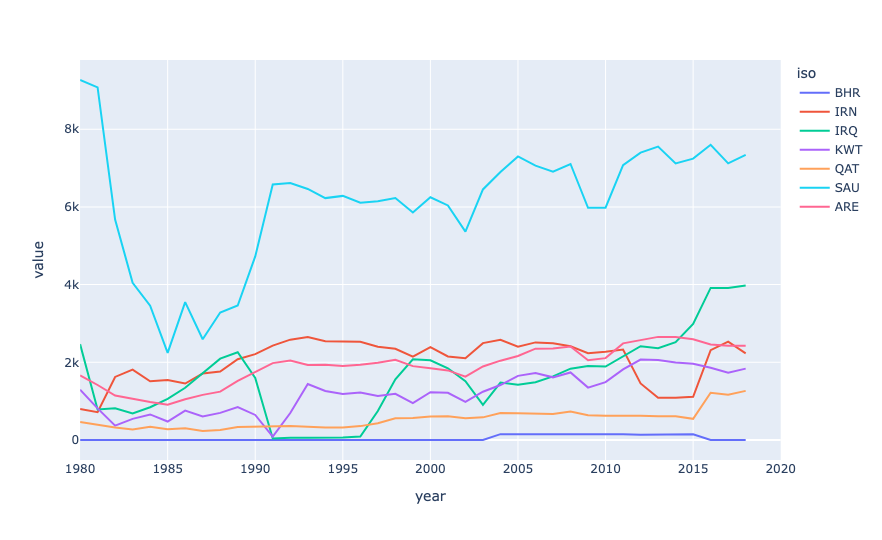
From this plot, we can see that Saudi Arabia exports far and above the most oil of all Persian Gulf states. Next is Iraq (which, to be honest, I never thought of as a major player, then the UAE, then Iran, then Kuwait, Qatar, and Bahrain.
Now, not all of this oil is exported via the Strait of Hormuz; some of it goes through oil pipelines to other countries. But it does show that these are indeed major oil exporters, and that their economies depend to a very large degree on getting that oil out.
The data set only has export information through 2018, but even that, measuring thousands of barrels per day, is a pretty astonishing number:
iso,2018
BHR,0.0
IRN,2230.938
IRQ,3975.824
KWT,1837.918
QAT,1264.4
SAU,7340.811
ARE,2427.162
OMN,778.989
In other words, we can multiply these numbers by 1,000 (for every thousand barrels) and then $80 (a reasonable price of oil) and then 365 (for every day of a year):
(
    df
    .loc[pd.col('activityid') == 'export']
    .pivot_table(columns='iso',
                index='year',
                values='value',
                aggfunc='sum')
    [persian_gulf_states]
    .iloc[-3]
    .mul(1000 * 80 * 365)
    .map('${:,}'.format)
)
The result:
iso 2018
BHR $0.0
IRN $65,143,389,600.0
IRQ $116,094,060,800.0
KWT $53,667,205,600.0
QAT $36,920,480,000.0
SAU $214,351,681,200.0
ARE $70,873,130,400.0
OMN $22,746,478,800.0
That's... a lot of money! Iran is bringing in $65 billion/year in exported oil, while Saudi Arabia is bringing in $214 billion/year. Wow.
You can see that we don't have data for Bahrain from 2018. However, it's unlikely to be a small amount, even if it's small compared to some of these countries.