


This week, we looked at the latest report from Transparency International (https://www.transparency.org/), a nonprofit organization that tracks corruption in governments around the world. We looked not only at this year's data, but also made some comparisons with previous years, produced some graphs, and generally tried to understand the state of corruption.
Paid subscribers, both to Bamboo Weekly and to my LernerPython+data membership program (https://LernerPython.com) get all of the questions and answers, as well as downloadable data files, downloadable versions of my notebooks, one-click access to my notebooks, and invitations to monthly office hours.
Learning goals for this week include working with Excel files, grouping, plotting, filtering, and categorizing.
Data and six questions
This week's data comes from the data file provided by Transparency International. You can download it as an Excel file from:
https://files.transparencycdn.org/images/CPI2025_Results.xlsx
Here are this week's six questions, along with my solutions and explanations.
Read the 2025 corruption data into a Pandas data frame, keeping only the first five columns. Using Plotly, create a Choropleth map of countries in which they are colored according to their corruption ranking in reverse (such that yellow represents non-corrupt countries and dark purple represents corrupt ones) and using a Robinson projection.
Before doing anything else, I loaded both Pandas and Plotly Express into Python:
import pandas as pd
from plotly import express as px
The data file is in Excel format. In theory, we should be able to use read_excel to load it in, specifying the sheet with this year's corruption information:
filename = 'data/bw-157-CPI2025_Results.xlsx'

df = pd.read_excel(filename, sheet_name='CPI2025')
I've done this hundreds of times before, and it has worked fine. But this time? I got a weird error message from Pandas about the file not being in the right format. I checked and double checked it, and found that yes, it was an Excel file.
I decided that the problem was likely with the engine being used to load it. Pandas doesn't know how to read Excel files directly; it outsources this to an external library. In the case of an xlsx file, read_excel will try to use the openpyxl library – and if it isn't installed, Pandas will tell you to use it.
The possible engines, as described in the read_excel documentation, are openpyxl, calamine, odf, pyxlsb, and xlrd. I tried each of these, one at a time, and discovered that none of them worked. Actually, that's not quite true: I tried them all except for calamine, which I hadn't ever heard of before, and none of them worked. I then, in something of a desperate move, tried calamine, which turns out to be a Rust-powered library for reading Excel files – and it worked! (More info on calamine is here: https://github.com/tafia/calamine)
Excel is a notoriously complex format, and it's no surprise that these open-source libraries aren't always able to handle it. I was happy to discover that calamine was up to the task, though.
However, I only needed the first five columns. I thus specified usecols, passing the column index numbers, rather than their names, mostly because the names were extremely long and complex. I also had to specify the header keyword argument, to indicate in which row the column names were stored. I ended up with:
df = pd.read_excel(filename, sheet_name='CPI2025',
                   engine='calamine',
                   header=3,
                  usecols=[0,1,2,3,4])
After all of that wrestling, I was happy to get a data frame with 182 rows and 5 columns.
I've always been amazed and impressed by choropleth maps (i.e., maps in which each geographic area is colored based on a value), and the ease with which certain libraries make it possible to create them. I was thus delighted to find that Plotly Express includes a simple method call that allows us to create such maps. This data set seems like a great place to try it.
I started off by using pipe to invoke px.choropleth. I didn't have to use pipe, but I suspected that I would need to use some method chaining beforehand, and thus decided to do it right away. But my call to px.choropleth needed a few keyword arguments:
- For
locations, I passed theCountry / Territorycolumn, which named each country locationmode, tellingpx.choroplethwhether the geographic breakdown was by country ('country names') or by US statescolorindicated the column that should be used to specify the colortitlespecified the title that should be displayedprojectionindicated which of Plotly's many map projections should be used to show the data
This resulted in the following query:
(
    df
    .pipe(px.choropleth,
          locations='Country / Territory',
          locationmode='country names',
          color='Rank',
          title='Corruption 2025',
         projection='robinson')
)
The good news? It worked:
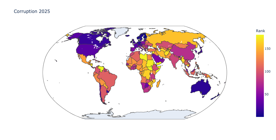
But I somehow felt that the ranking, which went from 1 (the most open, transparent democracy) to 181 (the most dictatorial and closed country), resulted in colors that were the reverse of what I really wanted. After all, shouldn't open and transparent countries have happier, brighter colors?
I thus asked you to reverse the ranks, so that the colors would also be reversed. Here, I used assign to create a new column, reverse_rank, which was set to be the difference between the maximum rank and the current rank, using the brand-new pd.col method. I then changed the color assignment to reverse_rank:
(
    df
    .assign(reverse_rank = pd.col('Rank').max() - pd.col('Rank'))
    .pipe(px.choropleth,
          locations='Country / Territory',
          locationmode='country names',
          color='reverse_rank',
          title='Corruption 2025',
         projection='robinson')
)
Sure enough, transparent countries were colored in bright yellow, closed dictatorships in dark purple, and everything else was in between.
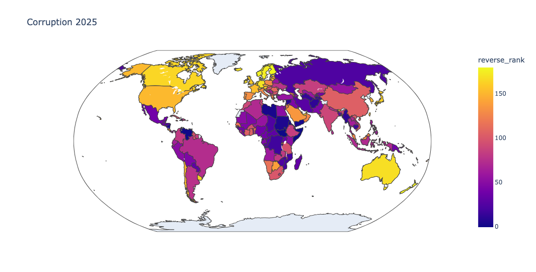
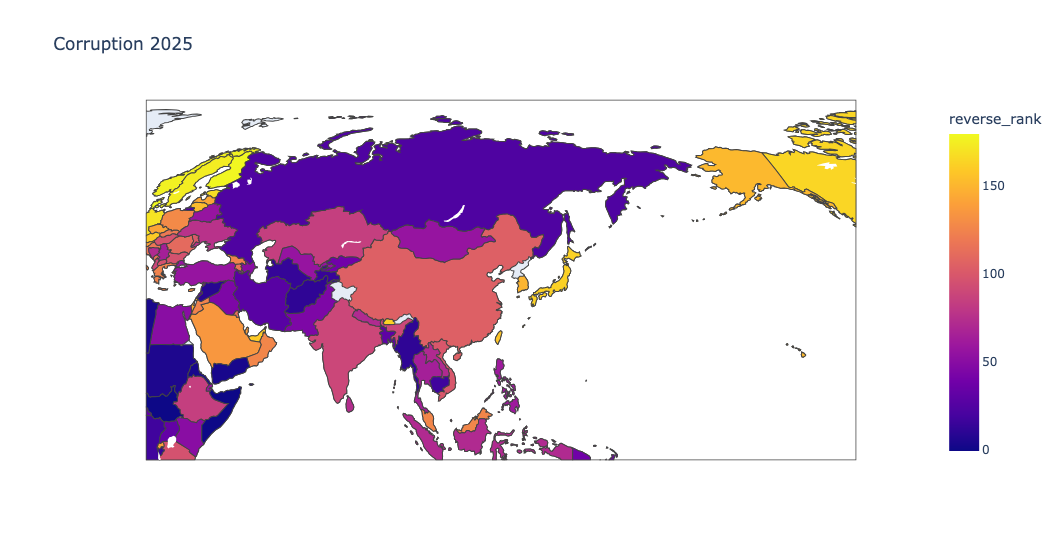
I also love the fact that the map is interactive; you can click on it with your mouse, and move around the world, or zoom into one region:
Show the names of the most and least corrupt countries in each region, using the CPI score. Show the highest and lowest CPI scores for these most/least corrupt countries, and the difference between them. How big is the most/least difference in each region?
This question was a bit tricky, because it involved (a) grouping by region, but showing the names of individual countries, as well as (b) displaying both the highest- and lowest-ranking countries.
Whenever you want to get the maximum (or minimum) value for a given column in a particular category, groupby is almost always going to be the answer. Here, we wanted to group by Region, the values on which we wanted to operate were in the 'CPI 2025 score' column, and we wanted to execute both min and max.
To have more than one aggregation method, Pandas provides agg. You invoke agg on the output from groupby, and then pass a list of strings, each representing a method that should be invoked:
(
    df
    .groupby(['Region'])['CPI 2025 score'].agg(['min', 'max'])
)
The above query worked... but it didn't do everything we wanted. In particular, it gave the min and max scores, but didn't say which countries were associated with them.
To get the country names, I added two more parts to the query: First, I used set_index to move the country names into the index. I then added idxmin and idxmax to the list of aggregation methods. While min tells you the minimum score, idxmin gives you the index for that minimum score. And if the index happens to be the country, then you can get the country name:
(
    df
    .set_index('Country / Territory')
    .groupby(['Region'])['CPI 2025 score'].agg(['min', 'max', 'idxmin', 'idxmax'])
)
This query gave me what I wanted:
Region	min	max	idxmin	idxmax
AME	10	75	Venezuela	Canada
AP	15	84	Korea, North	Singapore
ECA	17	50	Turkmenistan	Georgia
MENA	13	69	Libya	United Arab Emirates
SSA	9	68	Somalia	Seychelles
WE/EU	40	89	Bulgaria	Denmark
ddd
In other words:
- In the Americas, Venezuela is the worst (10), and Canada is the best (75).
- In Asia Pacific, North Korea is the worst (15), and Singapore is the best (84).
- In Eastern and Central Europe, Turkmenistan is the worst (17) and Georgia is the best (50).
- In the Middle East and North Africa, Libya is the worst (13) and the UAE is the best (69).
- In Sub-Saharan Africa, Somalia is the worst (9), and the Seychelles are the best (68).
- And in Western Europe and the European Union, Bulgaria is the worst (40) and Denmark is the best (89).
Now, this isn't quite true, as we'll see in the next question. That's because multiple countries can share a score, and thus be tied. But these do provide some fairly decent approximations for least and most transparent countries.