


Some reminders about upcoming courses:
- On February 1st, I'll start the 4th cohort of HOPPy, my Hands-on Projects in Python class. This time, every participant will create their own data dashboard, on a topic of their choosing, using Marimo. Learn more from an info session I ran earlier this week (https://www.youtube.com/watch?v=NgcE04UsJZM) or sign up at https://lernerpython.com/hoppy-4.
- My newest classes, AI-Powered Python Practice Workshop, and AI-Powered Pandas Practice Workshop, are happening on February 2nd and 9th, respectively. You can watch a video of an info session I ran earlier this week at https://youtu.be/dWq9x6Rz1T4?si=geWbiymst4OBf_qD. Or you can sign up at https://lernerpython.com/product/ai-python-workshop-1/ and https://lernerpython.com/product/ai-pandas-workshop-1/.
I hope to see you at these classes! Any questions? Just e-mail me at reuven@lernerpython.com.
Bamboo Weekly #155: Gold
The dollar has declined significantly against other currencies in the last year — and at the same time, the price of gold has shot up. I've read no small number of articles saying that this isn't a coincidence, that a weaker dollar has led many people to buy gold as an alternative investment (https://www.nytimes.com/2026/01/26/business/gold-prices.html?unlocked_article_code=1.H1A.7JgU.ewZSFX7-ceMe&smid=url-share).
Actually, it's not just people who are buying gold: Central banks hold onto foreign currency, and for many years the most popular currency for them to hold has been US dollars. But I recently read that central banks are buying more gold, so as not to hold onto less-valuable dollars.
This week, I thought it might be interesting to look at gold prices, central-bank holdings, and the relationships between these numbers.
Data and five questions
This week's data comes from four (!) different sources:
- The price of gold, it turns out, is a bit hard to find! However, I found a site, https://stooq.com/q/d/?s=xauusd, that does show the historical price of gold, with prices back to the late 1700s (!), denominated in dollars. Use the "download as CSV" link on that page to get the full historical price.
- The price of silver is similarly available at Stooq, at https://stooq.com/q/d/?s=xagusd. Again, use the "download as CSV" link on that page.
- We'll also look at the proportion of US dollars that central banks own. For that, we'll look at Currency Composition of Official Foreign Exchange Reserves (COFER), a data set from the International Monetary Fund (IMF), at https://data.imf.org/en/datasets/IMF.STA:COFER .
- Finally, we'll look at changes in the gold holdings at central banks. That can be downloaded from https://www.gold.org/goldhub/data/gold-reserves-by-country, an Excel file provided by the World Gold Council.
Paid subscribers, including LernerPython+data subscribers (https://LernerPython.com), get all of the questions and answers, as well as downloadable data files, downloadable versions of my notebooks, one-click access to my notebooks, and invitations to monthly office hours.
Learning goals for this week include Excel files, dates and times, regular expressions, filtering, joins, grouping, plotting with plotly, and correlations.
Here are this week's five questions, along with my solutions and explanations:
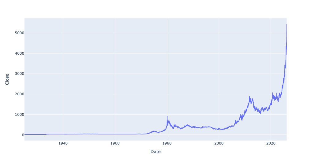
Read the historical gold prices into a data frame, treating the Date column as as datetime value, and making it the data frame's index. Create a line plot showing the price of gold throughout the data set. Create a second line plot showing only from 1925 through the present day. Then create a bar plot showing the percentage change in the mean price of gold for every 5-year period. How do the last 5 years compare with historical changes in gold's price? Use the Close column for these displays and calculations.
As usual, I started things off by loading the Python modules I need:
import pandas as pd
from plotly import express as px
I then defined the URL at which the CSV-downloadable gold data was available, and used pd.read_csv to retrieve and import it:
gold_history_url = 'https://stooq.com/q/d/l/?s=xauusd&i=d'

gold_history_df = pd.read_csv(gold_history_url,
                             parse_dates=['Date'],
                             index_col='Date')
It's important to remember that read_csv, along with other read_* methods in Pandas, can take a filename or an open file-like object as a first argument. But it can also take a string containing a URL. In such a case, the URL is retrieved, its contents read into memory, and returned as a data frame. Other than the time and network connection needed, this doesn't change the options you can use with read_csv.
For that reason, I thus added the parse_dates keyword argument, indicating that the Date column should be treated as as datetime value. I also passed the index_col keyword argument, indicating that Date should be set to be the index of the new data frame.
The result was a data frame with 15,170 rows and 4 columns.
I then asked you to create a bar plot showing gold prices over time. To use Plotly, I prefer to use a method chain, invoking pipe and then passing px.line as the first argument. In theory, I could have just invoked px.line here – but since the subsequent queries will be similar, I decided to stick with pipe.
Remember that when you invoke pipe, the first argument is the function you want to run on the data frame. Any additional positional and keyword arguments are passed along to that function. Passing y='Close' to pipe ensures that y='Close' is passed along to px.line, which means that only one column will be plotted:
(
    gold_history_df
    .pipe(px.line, y='Close')
)
Here's the plot that I got:
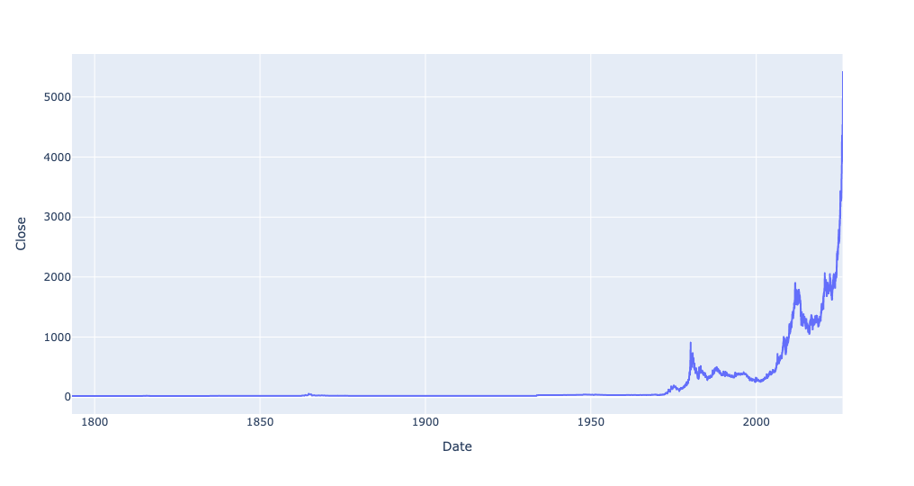
You can see that gold prices have gone up quite a bit from earlier levels. But when you start in the late 1700s, a lot of prices will seem to have gone up recently, I asked you to narrow the plot to just 1925 and onward.
Since the index contains datetime values, you can easily do that with .loc and a slice. (This assumes that the index is already sorted; if it isn't, you'll need to run sort_index first.) If you just put '1925' as the first part of the slice, and don't specify the second part, then it'll take any and all date values in 1925 (ignoring the months and days), through the present:
(
    gold_history_df
    ['1925':]
    .pipe(px.line, y='Close')
)
Now you can see how dramatic the rise was in just the last few years:
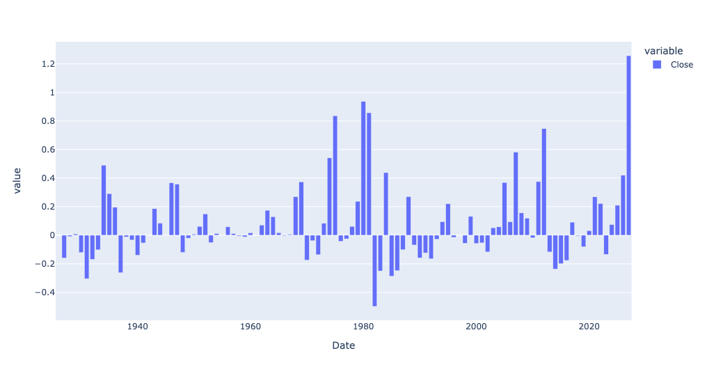
I was curious to know the percentage by which the price of gold had changed for every 5-year period in the data set. To do this, we first needed to calculate the mean Close price for every 5-year period – something that resample, along with the date code '5YE' (for 5-year end) will give:
(
    gold_history_df
    .resample('5YE')['Close'].mean()
)
To get the percentage change from one value to the next, invoke pct_change. This returns a data frame (or in this case, a series) with an index and column names identical to the original data frame, but with float values indicating by how much the values changed. I then fed that into px.bar via pipe:
(
    gold_history_df
    .resample('5YE')['Close'].mean()
    .pct_change()
    .pipe(px.bar)
)
The result:
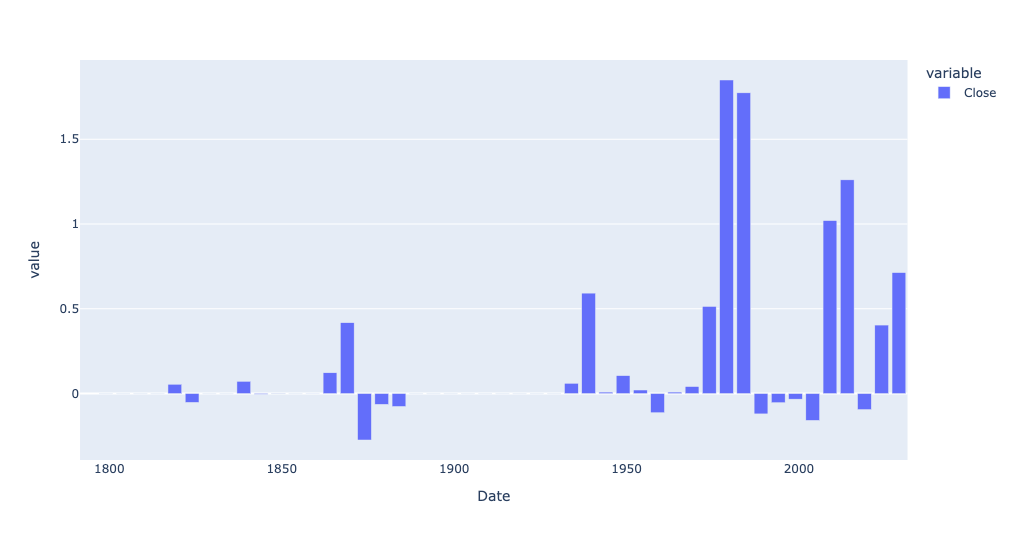
Every bar above the 0 line indicates that the price of gold in that 5-year period went up relative to the previous 5-year period. And if the bar goes below the 0 line, that indicates the average price of gold declined since the previous period.
So yes, the price of gold has definitely gone up, as a percentage, quite a bit more lately than a few years ago. But there were periods when gold's price went up by a far greater percentage.
But what if we don't check the percentage? What if we, instead, look at the change in dollar value? For that, we can use diff, rather than pct_change:
(
    gold_history_df
    .resample('5YE')['Close'].mean()
    .diff()
    .pipe(px.bar)
)
And look at this result:
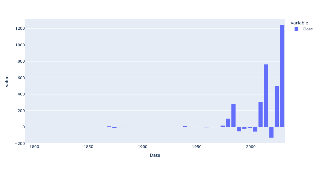
Wow! The price of gold, on an absolute price basis, has indeed gone up more in the last 5 years than before. And if we look just at 1925 and onward, and on an annual basis?
(
    gold_history_df
    .loc['1925':]
    .resample('1YE')['Close'].mean()
    .diff()
    .pipe(px.bar)
)
Here is that bar plot:
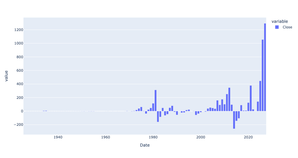
So yes, gold has definitely gone up quite a bit in just the last year – but even before that, it was rising much more on a year-to-year basis than before.
Read in silver prices. Create a scatterplot comparing gold and silver prices, including a trendline. Use the corr method to see how correlated they are. What does the scatterplot tell you about the current relationship between gold and silver vs. their historical correlation?
I read silver prices in, using almost identical code as I used for the gold prices:
silver_history_url = 'https://stooq.com/q/d/l/?s=xagusd&i=d'

silver_history_df = pd.read_csv(silver_history_url,
                             parse_dates=['Date'],
                             index_col='Date')
First, while I didn't ask you to do this, I was curious to know if silver prices had also gone up a lot in the last few years. I used the same bar plot showing the absolute difference in price, from year to year:
(
    silver_history_df
    .loc['1925':]
    .resample('1YE')['Close'].mean()
    .diff()
    .pipe(px.bar)
)
And the answer is yes, silver has also gone up a lot in the last few years — not as much as gold, but a pretty big year-to-year difference:
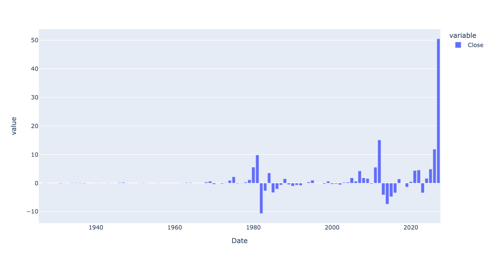
How about if we look at percentage change?
(
    silver_history_df
    .loc['1925':]
    .resample('1YE')['Close'].mean()
    .pct_change()
    .pipe(px.bar)
)
We get this:
So yes, while gold has risen more than ever in absolute terms, silver has actually risen more, year over year, in the last year than ever before, at least in percentage terms.
This made me wonder whether the two tend to march in lockstep. One way to find that out is with a scatterplot. A scatterplot takes two columns from a data frame, plotting one on the x axis and the other on the y axis.
The problem is that our gold prices are in one data frame, and our silver prices are in another. Fortunately, their indexes are roughly the same. We can thus use join to combine them into a new data frame, and then get a scatterplot.
You might think that we could invoke gold_history_df['Close'].join, then pass silver_history_df['Close'] as an argument. And you would be close! But join is a method for data frames, not for series. And when you request a single column from a data frame, you get a series back.
The trick is thus to put double [] around the column name. That allows you to request a list of column names, and get a data frame back. Even if you have only a single column name in the list, you'll still get a data frame.
However, there's still another problem: Columns in a data frame need to have unique names. Joining the Close column from gold_history_df with the Close column from silver_history_df will result in two Close columns, which is a no-no. We can thus pass lsuffix and rsuffix keyword arguments to join, indicating what suffixes should be added to each data frame's column names, avoiding the collision:
(
    gold_history_df[['Close']]
    .join(silver_history_df[['Close']],
         lsuffix='_gold', rsuffix='_silver')
)
Now we can use pipe to invoke px.scatter. You must indicate what column is the x axis and which is the y axis. And I asked for a trendline, which you can get with trendline='ols', providing the simple-but-usually-good-enough regression line using least squares:
(
    gold_history_df[['Close']]
    .join(silver_history_df[['Close']],
         lsuffix='_gold', rsuffix='_silver')
    .pipe(px.scatter, x='Close_gold', y='Close_silver', trendline='ols')
)
The result:
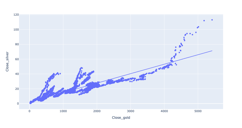
We can indeed see that as the price of gold goes up, the price of silver goes up, too. The prices are indeed pretty close to that trendline, showing a fairly linear relationship.
Well, until the price of gold gets above a certain amount. And then things go completely bananas. Gold goes up, but silver goes up even more. What's going on there?
The answer, I believe, is that the x and y axes are on very different scales, owing to the different prices. If silver goes from $60 to $80, that's a nearly vertical line, and an obvious one. But if gold goes from $4,000 to $4,020, that's barely even a blip on the screen.
One way to deal with such disparities is to use the log of each axis, rather than the actual number. You can do that in Plotly by passing log_x and log_y keyword arguments:
(
    gold_history_df[['Close']]
    .join(silver_history_df[['Close']],
         lsuffix='_gold', rsuffix='_silver')
    .pipe(px.scatter, x='Close_gold', y='Close_silver', trendline='ols', log_x=True, log_y=True)
)
And the plot:
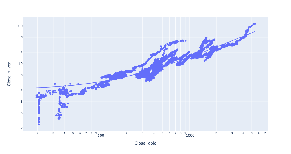
Except for some noise at the lower levels, this actually fits the trendline pretty closely.
Finally, we can check the correlation between the two, and see how closely they move in lockstep, with the corr method:
(
    gold_history_df[['Close']]
    .join(silver_history_df[['Close']],
         lsuffix='_gold', rsuffix='_silver')
    .corr()
)
The result? They correlate at 0.920. Given that -1 is a perfect negative correlation and +1 is a perfect positive correlation, it seems safe to say that these move very closely to one another.