


This week, we're looking at Venezuela – and specifically, information about the Venezuelan oil industry.
Venezuela, of course, has been in the news quite a bit lately, between Maria Corina Machado (https://en.wikipedia.org/wiki/María_Corina_Machado) winning the Nobel Peace Prize, the US attacking Venezuelan boats with some questionable ties to drug trafficking and in ways that raise serious ethical and legal questions, and the capture of Nicolas Maduro, the president of Venezuela, earlier this month.
But beyond the many political and legal issues, Venezuela is famous for its large oil reserves – the largest in the world, by some estimates. President Donald Trump is currently calling for US oil companies to extract, refine, and sell Venezuelan oil. He met with them earlier this week (https://www.nytimes.com/2026/01/09/world/americas/trump-oil-venezuela.html?unlocked_article_code=1.EVA.3bGX.SsIYhC5dWThz&smid=url-share), but they are reserving judgment — in part because the benefits to them are far from obvious.
Data and five questions
This week, we'll get some data from the US Energy Information Administration (EIA), which has information about Venezuela's monthly production of petroleum and other liquids, as well as the annual refined petroleum products consumption. You can download those in CSV format from: https://www.eia.gov/international/data/country/VEN.
Other data comes from FRED, at the St. Louis Federal Reserve (https://fred.stlouisfed.org/). We'll specifically look at the SAUNGDPMOMBD data set, for oil production in Saudi Arabia, and DCOILWTICO, with West Texas Intermediate oil prices.
Paid subscribers, as usual, get all of the questions and answers, as well as downloadable data files, downloadable versions of my notebooks, one-click access to my notebooks, and invitations to monthly office hours.
Learning goals for this week include CSV files, joins, cleaning data, working with dates and times, correlations, and window functions.
Here are this week's five tasks and questions, as well as my extended solutions:
Read the data about "petroleum and other liquids" into a Pandas data frame. In which month did they start to export a liquid other than petroleum? In which month did Venezuela export the most barrels of oil? Create a line plot showing, per year, the number of barrels exported.
Before doing anything else, I loaded both Pandas and Plotly Express, which I'll use for my plots:
import pandas as pd
from plotly import express as px
With that in place, I used read_csv to read the CSV file into Pandas, indicating that the second line (i.e., with an index of 1) was the location of the column headers:
liquid_export_filename = 'data/bw-135-petroleum.csv'

liquid_export_df = (
    pd
    .read_csv(liquid_export_filename, header=1)
)
Next, I got rid of the first two lines after the headers with .iloc[2:] , using a slice to indicate that I wanted every data row starting with the third:
liquid_export_df = (
    pd
    .read_csv(liquid_export_filename, header=1)
    .iloc[2:]
)
The first column, naming the measurement for that particular row, didn't have a name in the header row, so Pandas assigned it the name 'Unnamed: 1'. That's annoying but relatively standard – but I learned later on that the strings in that column had tons of whitespace around them, making it very hard to retrieve them.
I thus decided to use assign to create a new column, title, based on Unnamed: 1, and to invoke str.strip on every element there. That gave me the column I then set to be the index with set_index. I used drop to remove both the Unnamed: 1 column and the unused API column:
liquid_export_df = (
    pd
    .read_csv(liquid_export_filename, header=1)
    .iloc[2:]
    .assign(title = lambda df_: df_['Unnamed: 1'].str.strip())
    .set_index('title')
    .drop(columns=['Unnamed: 1', 'API'])
)
Finally, the remaining column titles were all dates in the format of MON YYYY, with three-letter month-name abbreviations. You can turn those column names (strings) into datetime values with pd.to_datetime, passing the format keyword argument that indicates just what formats the months and days are in.
But it's one thing to run pd.to_datetime on a single value, or even a series of values, and another to use it to change the dtype of the column names. To do that, we'll need to pass the output of pd.to_datetime to set_axis, a method that you can run on a data frame to set one of its axes (i.e., columns or rows).
But on what data frame do we want to run this? We don't have a variable that refers to our data frame. We can, however, use pipe, which takes a function (a lambda expression in our case) and passes it the data frame on which it was invoked. In this way, it turns a function into a method!
Our lambda has a parameter, df_, into which the data frame is passed. And then df_ can invoke set_axis, and pd.to_datetime can be invoked on df_.columns, and we're able to get datetime values on our column names:
liquid_export_df = (
    pd
    .read_csv(liquid_export_filename, header=1)
    .iloc[2:]
    .assign(title = lambda df_: df_['Unnamed: 1'].str.strip())
    .set_index('title')
    .drop(columns=['Unnamed: 1', 'API'])
    .pipe(lambda df_: df_.set_axis(pd.to_datetime(df_.columns, format='%b %Y'), axis='columns'))
)
The result is a data frame of 6 rows and 633 columns. That's a lot of columns, right? But that reflects the history of this data set regarding Venezuelan oil.
When did Venezuela start to export non-petroleum liquids? For this, I removed the row with the unwieldy title Total petroleum and other liquids (Mb/d) using drop , and then invoked dropna on the columns with a threshold of 1. In other words, I kept any column in which there was at least 1 non-NaN value. Since I had removed the petroleum-production row, a column in which we had at least one non-NaN value was the earliest. We can get the column title – and thus date – of when this happened with columns[0]:
(
    liquid_export_df
    .drop(['Total petroleum and other liquids (Mb/d)'])
    .dropna(thresh=1, axis='columns')
    .columns[0]
)
I got Timestamp('1973-01-01 00:00:00'), meaning January 1st, 1973.
When did Venezuela export the most oil? I was wondering about this, given its large reserves, and that I kept hearing that they had abandoned their petroleum industry over the last few decades. I thus grabbed the line for total petroleum, returning a series. I then invoked agg, asking for both max (the highest value) and idmax (the index for the highest value, meaning the date):
(
    liquid_export_df
    .loc['Total petroleum and other liquids (Mb/d)']
    .agg(['max', 'idxmax'])
)
I got 3655.79 Mb/d (i.e., thousands of barrels per day, or about 3.6 million barrels per day), back in March of 1998.
By the way, if you're thinking, "Shouldn't Mb/d" be "millions" and not "thousands," I'm with you! I had no idea that the oil industry measured things in this way. They apparently use "MMb/d" for millions. I'll keep that in mind the next time I'm on the market for a barrel of oil.
To plot the total amount of oil exported per year, I first used iloc to grab line index 2, since that's what interested me. I then used resample to get the sum per year, rather than the monthly amounts the data set contained. I used the '1YE' offset code to indicate that I wanted to aggregate based on the end of calendar years. Finally, I used pipe to invoke px.line:
(
    liquid_export_df
    .iloc[2]
    .resample('1YE').sum()
    .pipe(px.line)
)
The result:
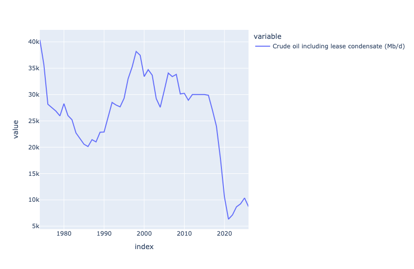
At first glance, you might think that the massive drop happened when the pandemic occurred, and all oil production went down. But if you look more closely, you'll see that Venezuela's oil production fell off a cliff, from 2015 to 2020. I have to assume that this had to do with the Venezuelan government's economic policy that caused such trouble.
Now download data from FRED describing annual oil production (in barrels/day) in Saudi Arabia. Plot this against the data from Venezuela. Over the last decade, in how many years has oil production risen vs. declined?
I thought it would be interesting to compare Venezuela's production with that of another major oil producer, namely Saudi Arabia. FRED is always great for this kind of data, so I downloaded it via the regular Web link (as opposed to the Fred API).
Notice that in calling read_csv, I provided a URL to a CSV file, rather than the filename itself; Pandas notices the https at the start of the string, and treats it as a URL. I passed the parse_dates and index_col keyword options to make observation_date into a datetime value and also make it the index:
saudi_oil_barrels_url = 'https://fred.stlouisfed.org/graph/fredgraph.csv?bgcolor=%23ebf3fb&chart_type=line&drp=0&fo=open%20sans&graph_bgcolor=%23ffffff&height=450&mode=fred&recession_bars=off&txtcolor=%23444444&ts=12&tts=12&width=1320&nt=0&thu=0&trc=0&show_legend=yes&show_axis_titles=yes&show_tooltip=yes&id=SAUNGDPMOMBD&scale=left&cosd=2000-01-01&coed=2025-01-01&line_color=%230073e6&link_values=false&line_style=solid&mark_type=none&mw=3&lw=3&ost=-99999&oet=99999&mma=0&fml=a&fq=Annual&fam=avg&fgst=lin&fgsnd=2020-02-01&line_index=1&transformation=lin&vintage_date=2026-01-14&revision_date=2026-01-14&nd=2000-01-01'

(
    pd
    .read_csv(saudi_oil_barrels_url,
             parse_dates=['observation_date'],
             index_col='observation_date')
)
To compare these values with Venezuela, I needed to combine them into a single data frame. To do that, we can use join, which combines two data frames wherever their indexes are the same.
In this case, invoking join on the Saudi data then means we should pass a data frame (or series) with datetime values on the index. Sure enough, retrieving the petroleum info from liquid_export_df does the trick!
There are, however, three issues:
- What if not all the dates match up? In this case, the Saudi data is annual, and the Venezuelan data is monthly. We could either use
resamplehere, or we can just accept that the Saudi dates will determine which rows are included in the join, and accept that as enough, since both are measured in barrels/day. - The Venezuelan data is measured in thousands of barrels per day! We can invoke
muland multiply those values by 1,000, to make them even up. - The Venezuelan data is a row, but we need a column or a data frame. We can use
transpose, akaT, to fix that. Remember thattransposeis a method, and needs(), whereasTdoes not.
The join looks like this:
saudi_oil_barrels_url = 'https://fred.stlouisfed.org/graph/fredgraph.csv?bgcolor=%23ebf3fb&chart_type=line&drp=0&fo=open%20sans&graph_bgcolor=%23ffffff&height=450&mode=fred&recession_bars=off&txtcolor=%23444444&ts=12&tts=12&width=1320&nt=0&thu=0&trc=0&show_legend=yes&show_axis_titles=yes&show_tooltip=yes&id=SAUNGDPMOMBD&scale=left&cosd=2000-01-01&coed=2025-01-01&line_color=%230073e6&link_values=false&line_style=solid&mark_type=none&mw=3&lw=3&ost=-99999&oet=99999&mma=0&fml=a&fq=Annual&fam=avg&fgst=lin&fgsnd=2020-02-01&line_index=1&transformation=lin&vintage_date=2026-01-14&revision_date=2026-01-14&nd=2000-01-01'

(
    pd
    .read_csv(saudi_oil_barrels_url,
             parse_dates=['observation_date'],
             index_col='observation_date')
    .join(liquid_export_df
          .loc['Total petroleum and other liquids (Mb/d)']
            .mul(1_000)
          .T)
    .pipe(px.line)
)
Finally, I used pipe to invoke px.line for a line plot. With two columns in the data frame, Plotly automatically shows each as a different-colored line on the shared x and y axes:
(
    pd
    .read_csv(saudi_oil_barrels_url,
             parse_dates=['observation_date'],
             index_col='observation_date')
    .join(liquid_export_df
          .loc['Total petroleum and other liquids (Mb/d)']
            .mul(1_000)
          .T)
    .pipe(px.line)
)
The plot:
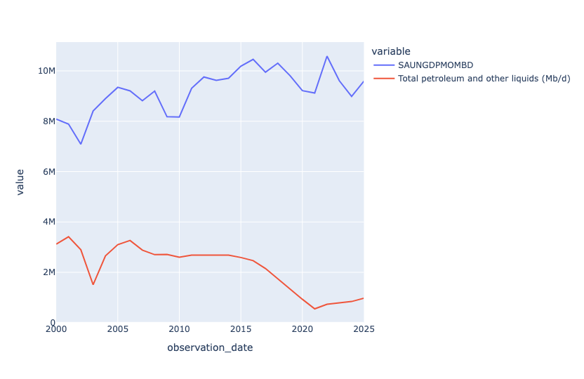
We see that Saudi Arabia exports a lot more oil than Venezuela, that's for sure! But we also see that Saudi exports were going up starting in 2010, whereas Venezuela's exports were going down. There was a slight post-pandemic uptick for Venezuela, but it never recovered to its glory days (in this plot) of the early 2000s.