


This week, we looked at congestion pricing in New York City, which went into effect just over one year ago. This was a politically contentious issue, with everyone from New York State Governor Kathy Hochul and President Donald Trump getting involved. But despite delays and arguments, the plan went into effect.
Has it succeeded? The Metropolitan Transport Authority (MTA), which runs public transportation in New York, released a report indicating that yes, it has succeeded (https://congestionreliefzone.mta.info), increasing vehicle speeds, reducing accidents, and increasing ridership of subways and buses. The New York Times published a story earlier this week summarizing and analyzing the report, giving a similarly positive review (https://www.nytimes.com/interactive/2026/01/05/upshot/congestion-pricing-one-year.html?unlocked_article_code=1.ClA.50uZ.ekmVzT3rbTo2&smid=url-share).
This week, we'll look at some of the data regarding congestion pricing in New York, and see if we can spot similarly positive trends.
Data and five questions
This week, we're looking at four different (but related) data sets, all published by New York City, that can help us to understand different facets of congestion pricing:
- Speeds of taxis and other for-hire cars (e.g., Uber) in the midtown area during the day: If we see that traffic speeds during business hours have improved in the last year, that might also indicate a success. This data comes from https://data.ny.gov/Transportation/MTA-Central-Business-District-Taxi-and-For-Hire-Ve/6p29-6xqn/about_data .
- Bus speeds in the central business district: Available from https://data.ny.gov/Transportation/MTA-Central-Business-District-Bus-Speeds-Beginning/r6db-kkzj/about_data .
- Ridership on public transportation, starting in 2019: If we see a jump in ridership in 2025, that might indicate that people are using public transportation rather than driving. This data comes from https://data.ny.gov/Transportation/MTA-Daily-Ridership-and-Traffic-Beginning-2020/sayj-mze2/about_data .
- How many vehicles entered the midtown Manhattan during business hours: This data comes from https://data.ny.gov/Transportation/MTA-Congestion-Relief-Zone-Vehicle-Entries-Beginni/t6yz-b64h/about_data .
With all four files, I was able to download the data by using Chrome (not Firefox, for some reason) to open each URL. I clicked on "export" in the top right, which opened a dialog box. I chose CSV as the download format, and clicked on "download." In the case of the vehicle-entry file, which was more than 600 MB in size, it took some time before the download even occured, so some patience will be useful.
Paid subscribers to Bamboo Weekly, or to my LernerPython membership program (at https://LernerPython.com), can download the data files from the end of this message. You also get access to all questions and answers, downloadable notebooks, and an invitation to monthly office hours.
Learning goals for this week include: CSV files, dates and times, grouping, pivot tables, data cleaning, and plotting with Plotly.
Here are this week's five questions, along with my solutions and explanations:
Read the taxi-speeds data into a data frame, treating the Month column as datetime values. Create a line plot showing the average vehicle speeds in the CBD during each month of 2024 vs. 2025. Calculate the mean change in speed for taxis from 2024 to 2025. Was there an improvement?
To start things off, I loaded up Pandas and Plotly (for plotting):
import pandas as pd
from plotly import express as px
I defined the filename in a variable, vehicle_speed_filename, and then loaded it with read_csv. Because I wanted the Month column to be treated as a datetime, I named it in the parse_dates keyword argument:
(
    pd
    .read_csv(vehicle_speed_filename,
              parse_dates=['Month'])
)
In order to compare each month in 2024 and 2025, we'll need to create a pivot table in which the rows are months and the columns are years. I used assign to create two new columns, month and year, so that I can pull them out later on:
(
    pd
    .read_csv(vehicle_speed_filename,
              parse_dates=['Month'])
    .assign(year = lambda df_: df_['Month'].dt.year,
            month=lambda df_: df_['Month'].dt.month)
)
Next, I used loc and lambda to keep only those rows where Zone is 'CBD', and where the year is at least 2024:
(
    pd
    .read_csv(vehicle_speed_filename,
              parse_dates=['Month'])
    .assign(year = lambda df_: df_['Month'].dt.year,
            month=lambda df_: df_['Month'].dt.month)
    .loc[lambda df_: df_['Zone'] == 'CBD']
    .loc[lambda df_: df_['year'] >= 2024]
)
I then invoked pivot_table, telling it that the index (row labels) should be from the unique values in month, the column names should be from the unique values in year, and the values should be from Zonal Speed:
(
    pd
    .read_csv(vehicle_speed_filename,
              parse_dates=['Month'])
    .assign(year = lambda df_: df_['Month'].dt.year,
            month=lambda df_: df_['Month'].dt.month)
    .loc[lambda df_: df_['Zone'] == 'CBD']
    .loc[lambda df_: df_['year'] >= 2024]
    .pivot_table(index='month',
                columns='year',
                values='Zonal Speed')
)
Finally, I wanted to create a line plot with this data. Because I wanted to use Plotly, I invoked pipe, allowing me to pretend that Plotly's px.line is really a method for data frames:
(
    pd
    .read_csv(vehicle_speed_filename,
              parse_dates=['Month'])
    .assign(year = lambda df_: df_['Month'].dt.year,
            month=lambda df_: df_['Month'].dt.month)
    .loc[lambda df_: df_['Zone'] == 'CBD']
    .loc[lambda df_: df_['year'] >= 2024]
    .pivot_table(index='month',
                columns='year',
                values='Zonal Speed')
    .pipe(px.line)
)
The result:
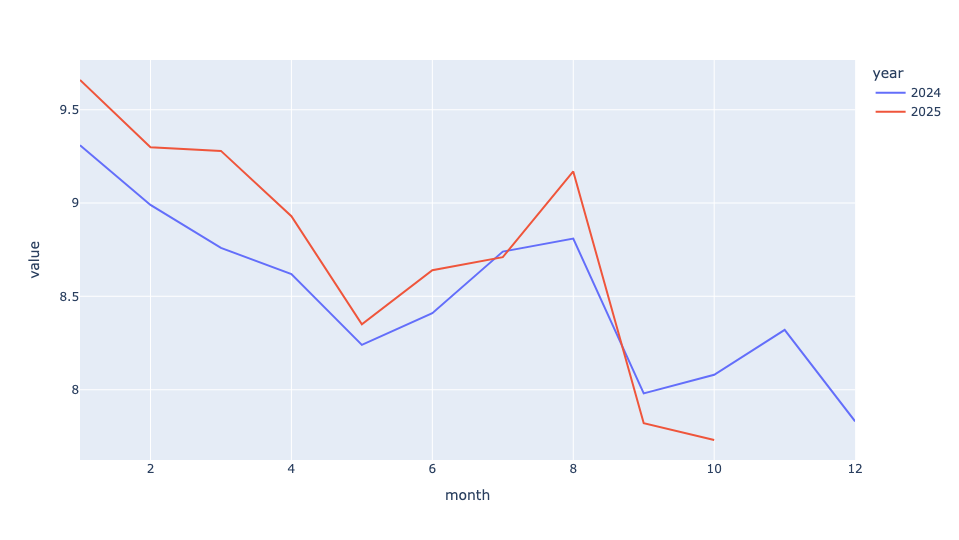
Truth be told, I was a bit surprised by the result! Yes, we see that for the better part of the year, speeds in 2025 were greater than those in the corresponding month in 2024. But it wasn't massively faster.
To calculate the mean improvement in speed for taxis from 2024 to 2025, I again loaded the file with read_csv, and used loc to keep only those rows having to do with the CBD:
(
    pd
    .read_csv(vehicle_speed_filename,
              parse_dates=['Month'])
    .loc[lambda df_: df_['Zone'] == 'CBD']
)
I then used set_index to move the Month column into the index. Because Month is a datetime value, this turned our data frame into a "time series," providing some extra functionality. Among other things, we're able to invoke resample, a kind of groupby for time. I specified 'YE', meaning that I wanted to group the results with a 1-year granularity, looking at the end of the year.
In other words, I asked Pandas to calculate the mean speed for taxis throughout each of the years in the data set:
(
    pd
    .read_csv(vehicle_speed_filename,
              parse_dates=['Month'])
    .loc[lambda df_: df_['Zone'] == 'CBD']
    .set_index('Month')
    .resample('1YE')['Zonal Speed'].mean()
)
Finally, to see the percentage improvement or decline each year, I then invoked pct_change, which calculates how much each cell differs from the one above it. Because pct_change returns a float, and I wanted to see a percentage difference, I invoked apply , then passed it str.format with a string to get the % sign and only two digits after the decimal point:
(
    pd
    .read_csv(vehicle_speed_filename,
              parse_dates=['Month'])
    .loc[lambda df_: df_['Zone'] == 'CBD']
    .set_index('Month')
    .resample('1YE')['Zonal Speed'].mean()
    .pct_change()
    .apply('{:.02%}'.format)
)
I got the following:
Month Zonal Speed
2019-12-31T00:00:00.000 nan%
2020-12-31T00:00:00.000 47.98%
2021-12-31T00:00:00.000 -12.94%
2022-12-31T00:00:00.000 -10.76%
2023-12-31T00:00:00.000 -4.93%
2024-12-31T00:00:00.000 -2.55%
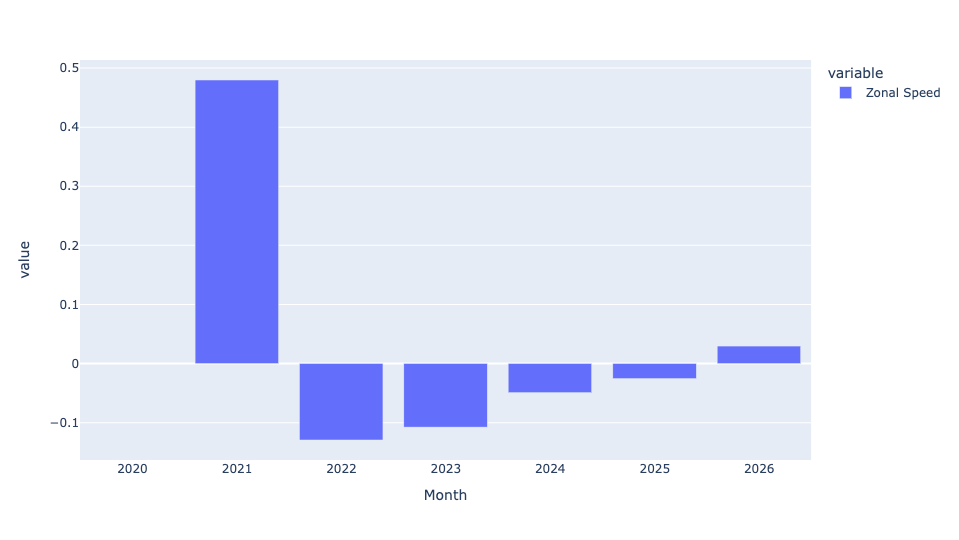
2025-12-31T00:00:00.000 2.96%So yes, there was a nearly 3 percent improvement in overall taxi speeds from 2024 to 2025. Not overwhelming, but not bad at all. It's particularly impressive when we see that every single previous year (since the pandemic) showed slowing traffic speeds. So yes, the congestion pricing rules seem to have reversed a years-long negative trend.
You can even put this in a bar plot:
(
    pd
    .read_csv(vehicle_speed_filename,
              parse_dates=['Month'])
    .loc[lambda df_: df_['Zone'] == 'CBD']
    .set_index('Month')
    .resample('1YE')['Zonal Speed'].mean()
    .pct_change()
    .pipe(px.bar)
)
Here's the result:
Repeat the first question with bus-speed data. Then calculate the mean Average Road Speed for each bus route for each year. Which 10 routes had the greatest (positive) percentage change, on average, from 2024 to 2025? Did any CBD routes get slower, on average?
Here was my query for the buses, identical except for (a) the filename, (b) the need to look at CBD Relation, and (c) the column containing the speed value, Average Road Speed:
(
    pd
    .read_csv(bus_speed_filename,
              parse_dates=['Month'],
             usecols=['Month', 'CBD Relation', 'Average Road Speed'])
    .loc[lambda df_: df_['CBD Relation'] == 'CBD']
    .assign(year = lambda df_: df_['Month'].dt.year,
            month=lambda df_: df_['Month'].dt.month)
    .loc[lambda df_: df_['year'] >= 2024]
    .pivot_table(index='month',
                columns='year',
                values='Average Road Speed')
    .pipe(px.line)
)
Here's the resulting line plot:
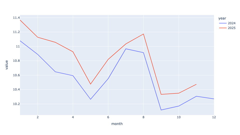
Here, we can see a clear speed improvement (albeit a relatively small one) for buses throughout 2025 vs. the corresponding month in 2024.
As for the year-over-year mean speed comparison:
(
    pd
    .read_csv(bus_speed_filename,
              parse_dates=['Month'],
             usecols=['Month', 'CBD Relation', 'Average Road Speed'])
    .loc[lambda df_: df_['CBD Relation'] == 'CBD']
    .set_index('Month')
    .resample('1YE')['Average Road Speed'].mean()
    .pct_change()
    .apply('{:.02%}'.format)
)
Here are the results:
Month	Average Road Speed
2023-12-31T00:00:00.000	nan%
2024-12-31T00:00:00.000	-1.29%
2025-12-31T00:00:00.000	2.54%
Notice that reporting started much later, so we can only compare 2024 and 2025. But once again, we can see that there was a decline in average bus speed from 2023 to 2024, and an improvement of 2.5 percent in bus speed from 2024 to 2025, roughly the same as seen by cars.
To get a bar plot, I said:
(
    pd
    .read_csv(bus_speed_filename,
              parse_dates=['Month'])
    .loc[lambda df_: df_['CBD Relation'] == 'CBD']
    .set_index('Month')
    .resample('1YE')['Average Road Speed'].mean()
    .pct_change()
    .pipe(px.bar)
)
Here's the (admittedly small) plot I got:

So at least from the perspective of faster traffic, two different measures show both improvement and a reversal of previous years' trends.
But these were average speed increases. I was curious to know which specific bus routes' speed improved by the most. I re-read the bus file, again keeping only bus routes that go through the CBD. But this time, I created a pivot table in which the dates (months) were the index, the route IDs were the column names, and the values were their average road speeds. This gave the average speed for each bus route during each month:
(
    pd
    .read_csv(bus_speed_filename,
              parse_dates=['Month'])
    .loc[lambda df_: df_['CBD Relation'] == 'CBD']
    .pivot_table(index='Month',
                columns='Route ID',
                values='Average Road Speed')
)
With Month (a datetime value) as the index, I again used resample to find, for each year, the mean speed. Then I invoked pct_change, to get the year-over-year speed change as a percentage:
(
    pd
    .read_csv(bus_speed_filename,
              parse_dates=['Month'])
    .loc[lambda df_: df_['CBD Relation'] == 'CBD']
    .pivot_table(index='Month',
                columns='Route ID',
                values='Average Road Speed')
    .resample('1YE').mean()
    .pct_change()
)
I was only interested in changes from 2024 to 2025, meaning the final row of the data frame returned by resample. I thus used iloc[-1] to retrieve that row by its positional index, and then invoked nlargest(10) to get the 10 routes whose speeds had improved the most. Finally, I again used apply and str.format to display a percentage:
(
    pd
    .read_csv(bus_speed_filename,
              parse_dates=['Month'])
    .loc[lambda df_: df_['CBD Relation'] == 'CBD']
    .pivot_table(index='Month',
                columns='Route ID',
                values='Average Road Speed')
    .resample('1YE').mean()
    .pct_change()
    .iloc[-1]
    .nlargest(10)
    .apply('{:.02%}'.format)
)
The result:
Route ID	2025-12-31 00:00:00
B39	21.33%
QM11	16.01%
QM36	15.92%
Q101	12.72%
Q60	12.23%
SIM35	11.58%
QM18	9.14%
SIM4X	8.76%
QM4	8.72%
QM40	8.69%
As we can see a number of buses were far faster in 2025 than in 2024. The B39, in particular, was more than 20 percent faster, and another few buses were more than 10 percent faster.
But were all bus routes faster? I repeated my query, but then used apply to ask whether the percentage was positive or negative. That gave me a boolean series with True and False values. I then invoked value_counts to count these values, passing normalize=True to get them as percentages. I then used apply and str.format again:
(
    pd
    .read_csv(bus_speed_filename,
              parse_dates=['Month'])
    .loc[lambda df_: df_['CBD Relation'] == 'CBD']
    .pivot_table(index='Month',
                columns='Route ID',
                values='Average Road Speed')
    .resample('1YE').mean()
    .pct_change()
    .iloc[-1]
    .apply(lambda s_ : s_ > 0)
    .value_counts(normalize=True)
    .apply('{:.02%}'.format)
)
The result:
2025-12-31T00:00:00.000	proportion
true	88.03%
false	11.97%
So yes, about 12 percent of bus lines were slower in 2025 than in 2024. But that means about 90 percent were faster, which is pretty impressive, I'd say.