


This week, we looked at some aspects of the recent economic problems in Argentina. The country has long had financial issues, including numerous defaults on its sovereign bonds (https://en.wikipedia.org/wiki/Economic_history_of_Argentina). In the two years since Javier Milei, a libertarian economist, was elected president, inflation has declined dramatically. But there are some serious stresses on the country, and particularly its central bank's foreign-currency reserves.
The Trump administration has decided to give Argentina $20 billion to beef up its foreign currency reserves (https://www.nytimes.com/2025/10/17/us/politics/trump-argentina-bailout-bessent.html?unlocked_article_code=1.vk8.I48D.CvMeP0z9z9tz&smid=url-share). That would give Milei more economic breathing room, which would, he and Trump both hope will give him a political advantage in mid-term elections on Sunday, October 26th.
Economist Paul Krugman is very skeptical that this bailout would work. He also wonders if this is an attempt to help American hedge funds that bet on Milei's economic success. Even if you don't buy his cynicism, his economic analysis is worth reading (https://paulkrugman.substack.com/p/bailing-out-bessents-buddies-bets). An article in the Economist from Tuesday also indicates that defending the peso as he has done so far is a losing game: https://www.economist.com/leaders/2025/10/21/javier-milei-faces-his-most-dangerous-moment-yet?giftId=304b3b1e-18b0-4de9-bd0f-fbdf130ac666&utm_campaign=gifted_article
This week, we'll look at a few Argentine economic measures, including inflation, the central bank's currency reserves, and the peso-to-dollar exchange rate. We'll also see just how big Trump's proposed bailout is relative to the central bank's reserves.
Data and five questions
This week's data comes from several sources:
- From Argentina's National Institute of Statistics and Censuses (INDEC), which publishes historical values for its consumer price index (CPI in English, and IPC in Spanish), a leading inflation measure, at https://www.indec.gob.ar/indec/web/Nivel4-Tema-3-5-31. I downloaded the first link, an Excel version whose name starts with "Índices y variaciones," from https://www.indec.gob.ar/ftp/cuadros/economia/sh_ipc_10_25.xls .
- From FRED, the St. Louis Federal Reserve Bank's online data-download and analysis system, I retrieved data about the non-gold holdings of Argentina's central bank. The page is at https://fred.stlouisfed.org/series/TRESEGARM052N?utm_source=chatgpt.com , and I downloaded the CSV version of this data.
- Also from FRED, I downloaded the historical peso-to-dollar exchange rate, from https://fred.stlouisfed.org/series/ARGCCUSMA02STM .
Learning goals this week Joining and merging, correlations, grouping, and plotting.
Paid members, including subscribers to my LernerPython membership program (https://LernerPython.com) can download the data files from the end of this message. You can also download my Marimo notebook, as well as get one-click access to it and my analysis via Molab. Paid members are also invited to monthly office hours.
Here are my solutions to the five tasks and questions I posed yesterday:
Read the national CPI data (the first section) into a data frame. Given the general inflation level ("Nivel general"), produce a line plot in Plotly showing monthly inflation numbers for the history of this data.
Before doing anything else, I loaded Pandas and Plotly Express:
import pandas as pd
from plotly import express as px
With that in place, I was ready to start working with the CPI data. Because I downloaded the data in Excel format, I used read_excel to import it into a data frame. The file contains several different tabs, but I was only interested in the first one, the monthly variation in national CPI. By default, read_excel returns the first sheet (i.e., index 0), so I didn't specify the sheet:
filename = 'data/bw-141-ipc.xls'

df = (
        pd
        .read_excel(filename)
)
However, the above query didn't work. It complained that there was a mismatch between the number of columns in the initial rows and the subsequent rows. That's because this spreadsheet includes not only the data, but also headers and basic background information.
I was only interested in the overall national measures, which start on row 6 and continue through row 31. Row 6 contains the column names, and I wanted the first column (the descriptions of what was being measured) to be the columns. I also only wanted 25 rows to be used for the data. I thus passed three keyword arguments, header, index_col, and nrows.
Note that Excel sees the headers as being on row 6, because it starts counting with 1. We in the world of Python and Pandas start counting with 0, so I passed header=5:
filename = 'data/bw-141-ipc.xls'

df = (
        pd
        .read_excel(filename,
                    header=5, index_col=0, nrows=25)
)
The above code created the data frame successfully, but there were a number of empty rows, or rows with headers and no values. I realized that I could remove all of those, and thus keep only the data, by invoking dropna:
df = (
        pd
        .read_excel(filename,
                    header=5, index_col=0, nrows=25)
        .dropna()
)
This created a data frame with 18 rows and 105 columns. Each row represents a different measure of inflation, with the values indicating the percentage change from the previous month. Each column represents a month in which inflation was calculated, starting with January 2017 and going through September 2025.
Excel is a binary format, meaning that Pandas doesn't need to guess what types of values it retrieves. This is different from CSV, a textual format. When I loaded this data, I was sure that the dates in row 6, which I asked Pandas to treat as column names, were datetime values. But it seems that they are actually strings.
I fixed this by using the set_axis method on our data frame, invoking pd.to_datetime on each of the column headers. However, I wanted to do this to the data frame after running dropna. This meant invoking pipe on the data frame we got back from dropna, and passing it a lambda expression in which I invoked pd.to_datetime on each column name:
df = (
        pd
        .read_excel(filename,
                    header=5, index_col=0, nrows=25)
        .dropna()
        .pipe(lambda df_: df_.set_axis(pd.to_datetime(df_.columns), axis='columns'))
)
The above code should have worked! But I encountered a weird bug in Marimo that didn't carry over the assignment to an index from one cell to another. I thus changed my code, writing:
df = (
        pd
        .read_excel(filename,
                    header=5, index_col=0, nrows=25)
        .dropna()
)
In a separate cell, I then wrote:
df.columns = pd.to_datetime(df.columns)That fixed the problem.
I next wanted to read the general inflation level, month to month, and plot it. I used loc to retrieve from one row of the data frame. But then I wanted to invoke px.line to get a line plot. px.line is a Plotly Express function, not a Pandas method, which means that I cannot include it in my method chain.
That's where I used pipe for a second time, this time without a lambda: I pass a function (in this case, px.line) to pipe. That function is then invoked, passing it the series or data frame that we got from the previous line:
(
    df.loc
    ['Nivel general']
    .pipe(px.line)
)
It produces the following plot:
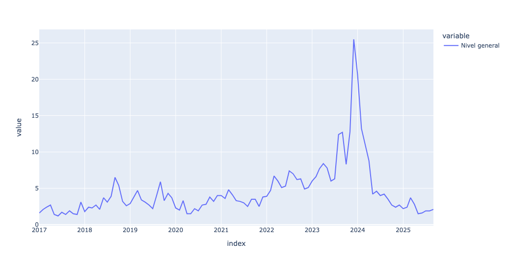
Now, this inflation score is a good way to keep track of it overall. But different sectors of the economy will do better and worse than this overall score.
For example, on lines 25, 26, and 27 we have "Estacional," "Núcleo," and "Regulados," which are measures of "seasonal," "core," and "regulated" inflation. Many governments (including the US) pay attention to "core" inflation, but "seasonal" refers to items that fluctuate over the year and "regulated" has to do with prices controlled or influenced by the government. We can plot these against each other:
(
    df
    .loc
    [['Estacional', 'Núcleo', 'Regulados']]
    .pipe(px.line)
)
Notice that in the above query, I used fancy indexing (i.e., a list of indexes) to retrieve three rows. However, when I tried to plot it, Plotly gave me weird-looking output:
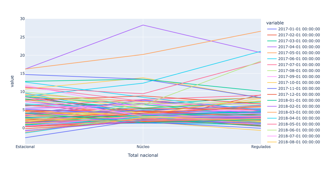
What happened? It used the months (i.e., the columns) for the lines, and the index (i.e., the three values we retrieved) on the x axis. That's not what we wanted! I thus used T, an alias for transpose, to turn the data frame around, and then plotted it:
(
    df
    .loc
    [['Estacional', 'Núcleo', 'Regulados']]
    .T
    .pipe(px.line)
)
The output then made much more sense:
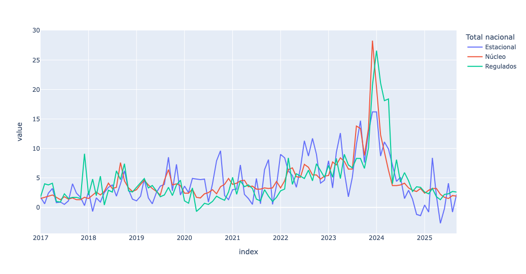
The blue (seasonal) line does indeed jump around more than the others, which makes sense. But we can see that from the time that Milei was inaugurated at the end of 2023, month-to-month inflation, and especially core inflation, has declined dramatically. This, of course, is what Milei and his supporters point to when challenged by their critics.
For each calendar year, calculate the annual inflation for the "Nivel general" values, and produce a line plot showing annual inflation in Argentina starting in 2017.
Western central banks generally aim to keep inflation at about 2 percent each year; if annual inflation goes above that, they'll tend to raise interest rates to slow the economy down, and if it goes below that, they'll lower interest rates to get things moving again.
I thus wondered what the annual inflation rate looked like in Argentina over the last few years. To find this, I took advantage of the fact that the data frame's columns are datetime values. I again grabbed the Nivel general row with loc:
(
    df
    .loc['Nivel general']
)
I then wanted to sum up each month's inflation in a given year. To do this, I used resample, passing it the string "1YE", meaning that I want to get the sum for each calendar year in the system. I passed sum as the aggregation method:
(
    df
    .loc['Nivel general']
    .resample('1YE').sum()
)
Next, I used px.line to create a line plot:
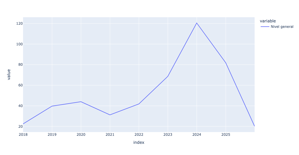
The plot gives a sense of why Milei might have been elected at the end of 2023; inflation had been skyrocketing over the previous few years, to about 120 percent. And it's even worse if you look at the numbers: Even during the "good" years, annual inflation in Argentina was about 30 percent per year. No wonder people were (and are) selling their pesos for dollars.
I thought about this plot a bit, and wondered if a bar plot might be more appropriate:
(
    df
    .loc['Nivel general']
    .resample('1YE').sum()
    .pipe(px.bar)
)
This actually did seem a bit better:
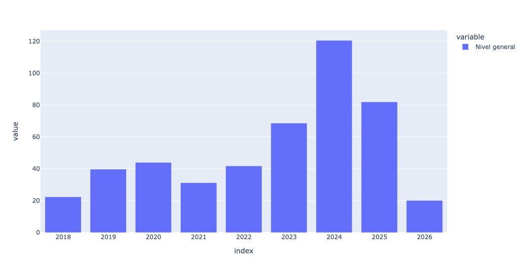
Then I thought: What if, instead of taking the overall inflation, I were to grab all of the subcategories from rows 11-22 of the Excel spreadsheet, meaning rows 1-13 of our data frame:
(
    df
    .iloc[1:13]
)
This returned a subset of our data frame df. As before, I wanted to run resample, but that was only possible with an index of datetime values. I thus again used T to transpose. Then I ran resample, and then I used px.bar:
(
    df
    .iloc[1:13]
    .T
    .resample('1YE').sum()
    .pipe(px.bar)
)
Here was the result:
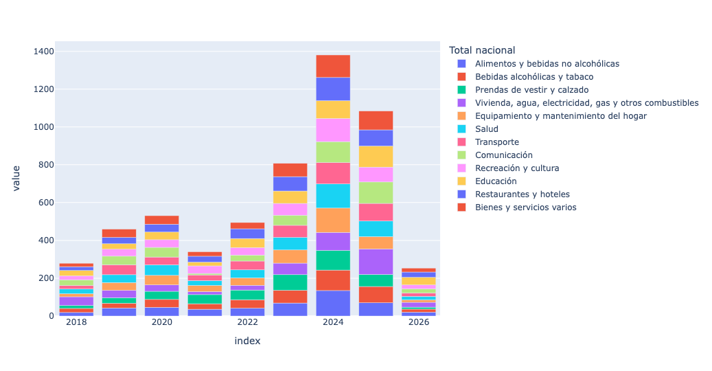
This is a stacked bar plot. showing the contribution of each sector of the economy to inflation in each year. The first item, in blue (at the bottom of each bar), is food and non-alcoholic beverages; you can see that those prices rose quite a bit over time.
I'll add that from my reading, using sum is not the best way to measure inflation in an economy where it is running so high. Instead, we want to use "compounded percentage," where we multiply each monthly inflation against the previous month, rather than adding it together. I can't totally vouch for this, but thought it would be interesting to try and compare. I thus grabbed the function I found:
def compounded_pct(s: pd.Series) -> float:
    return ((1 + s/100).prod() - 1) * 100
I then applied it, using agg, as part of my resample:
(
    df
    .iloc[1:13]
    .T
    .resample('1YE').agg(compounded_pct)
    .pipe(px.bar)
)
I got a plot that looks similar, but not identical:
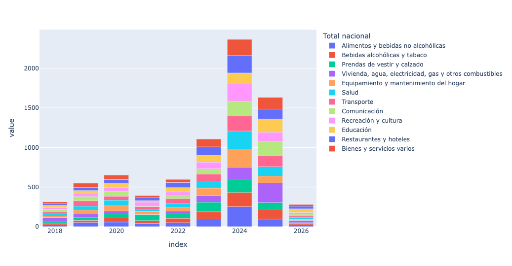
Regardless, we can see that inflation is down in a serious way in Argentina.
Argentina isn't the only country to have battled inflation and won. There's a great Planet Money story from NPR about how Brazil did it: https://www.npr.org/sections/money/2010/10/04/130329523/how-fake-money-saved-brazil