
BW #59: Long covid (solution)
Beyond the many obvious, short-term effects of covid-19, which the WHO declared a pandemic four years ago, is "long covid". This week, we look at the latest data about long covid.


This week marks four years since covid-19 was officially declared a pandemic by the World Health Organization (WHO). Of course, it had been spreading through China and other countries for the previous two months, and people had already been getting nervous about what the effects were going to be. The official declaration of a pandemic was a milestone in the madness that followed, and in the many societal changes that we continue to see to this day.
Covid-19 isn't gone, but it is far more treatable and under control than was the case four years ago. At the same time, we’re now more aware of “long covid,” a set of symptoms that affect people who were sick with covid-19 and have long-term medical issues as a result.

The Centers for Disease Control and Prevention (CDC) has been surveying people regularly about long covid, in an attempt to understand and treat it better. The CDC calls this a "pulse survey," because it's taking the pulse of an issue between official, formal Census Bureau surveys. It's described in full here:
https://www.cdc.gov/nchs/covid19/pulse/long-covid.htm
This week, we looked at data about long covid, including some of the CDC's survey results.
Data and five questions
This week, I gave you five tasks and questions. As usual, a link to the Jupyter notebook I used to solve these problems is at the bottom of this newsletter.
The questions are all be based on the data that you can download from the CDC, from this link:
https://data.cdc.gov/NCHS/Post-COVID-Conditions/gsea-w83j/about_data
Click on the "export" button at the top right of the page to get a CSV file with the latest pulse survey results. The above URL also serves as a data dictionary, albeit one with limited descriptions.
Import the CSV file into a data frame. Ensure that "Time Period Start Date" and "Time Period End Date" are both treated as datetime values. Also, the index should consist of the columns "Phase", "Group", and "Subgroup".
As usual, the first thing that I did was load Pandas:
import pandas as pdWith that in place, I wanted to load the downloaded CSV file into a data frame, using “read_csv”. And I could:
filename = 'Post-COVID_Conditions_20240320.csv'

df = pd.read_csv(filename)
However, I asked you to only include some of the columns from the CSV file. We can specify which ones we want with the “usecols” keyword argument:
df = pd.read_csv(filename,
                usecols=['Indicator', 'Group',
                         'State', 'Subgroup', 'Phase',
                         'Time Period Start Date',
                         'Time Period End Date',
                        'Value'])
I also asked you to ensure that the two “Time Period” columns are of “datetime” types. We can do that by passing their names as a list of strings to the “parse_dates” keyword argument:
df = pd.read_csv(filename,
                usecols=['Indicator', 'Group',
                         'State', 'Subgroup', 'Phase',
                         'Time Period Start Date',
                         'Time Period End Date',
                        'Value'],
                parse_dates=['Time Period Start Date',
                            'Time Period End Date'])
Finally, I asked you to have a three-level multi-index on the rows. We can always tell “read_csv” to choose a column as the index. If we want a multi-index, then we just have to pass a list of strings, indicating the columns we want to use:
df = pd.read_csv(filename,
                usecols=['Indicator', 'Group',
                         'State', 'Subgroup', 'Phase',
                         'Time Period Start Date',
                         'Time Period End Date',
                        'Value'],
                parse_dates=['Time Period Start Date',
                            'Time Period End Date'],
                index_col=['Phase', 'Group', 'Subgroup'])
With this in place, our data frame now has a three-way multi-index on the rows. The data frame has 13,023 rows and five columns that aren’t in the multi-index. While the data frame contains information from a single survey, it combines information from numerous, different cross sections, which makes it a bit difficult to understand and work with at first.
Create a line graph showing, at the national ("United States") level, the percentage of all adults who had each indicator. The x axis should reflect the phases of the study, and the y axis should reflect the percentage reporting each indicator. Each line should reflect a different indicator.
To answer this, we first need to retrieve only those rows where “United States” is in the “Subgroup” portion of the multi-index. We can do this with “xs”, an extremely powerful Pandas method that lets us retrieve based on values at different parts of a multi-index. Here, we say that the “Subgroup” level (and yes, you can use a name instead of a number) should equal “United States”:
(
    df
    .xs('United States', level='Subgroup')
)
Having selected those rows, I decided that the easiest way to create such a comparison data frame would be to create a pivot table. Pivot tables are basically 2D grouping operations, letting us have all unique values of one categorical column in the rows, all unique values of a second categorical column in the columns, and then the mean of the values.
Because my pivot table will include the “Phase” values, and because those are currently in the multi-index, I use “reset_index” to get the column back:
(
    df
    .xs('United States', level='Subgroup')
    .reset_index()
)
Now I can build my pivot table:
- The rows should be from each unique value of “Phase”
- The columns should be from each unique value of “Indicator”
- The values should come from the “Value” column
Here’s how we can do that, using “pivot_table”:
(
    df
    .xs('United States', level='Subgroup')
    .reset_index()
    .pivot_table(index='Phase', columns='Indicator', values='Value')
)
This is great, except that we now have all of the values for “Indicator”. We only want those columns that have the phrase “of all adults” in them. We can grab all of those columns with the “filter” method:
(
    df
    .xs('United States', level='Subgroup')
    .reset_index()
    .pivot_table(index='Phase', columns='Indicator', values='Value')
    .filter(like='of all adults', axis='columns')
)
Now that we only have those columns we want, we can create a line plot with “plot.line”:
(
    df
    .xs('United States', level='Subgroup')
    .reset_index()
    .pivot_table(index='Phase', columns='Indicator', values='Value')
    .filter(like='of all adults', axis='columns')
    .plot.line()
)
The good news? We get a plot! The bad news? The legend takes up nearly everything, because the “Indicator” columns’ values are too long. I decided to use the “rename” method to modify the column names, removing “long COVID, as a percentage of all adults” and also “from” before plotting:
(
    df
    .xs('United States', level='Subgroup')
    .reset_index()
    .pivot_table(index='Phase', columns='Indicator', values='Value')
    .filter(like='of all adults', axis='columns')
    .rename(mapper=lambda x: x.removesuffix('long COVID, as a percentage of all adults'), axis='columns')
    .rename(mapper=lambda x: x.removesuffix('from '), axis='columns')
    .plot.line()
)
Here’s the result:
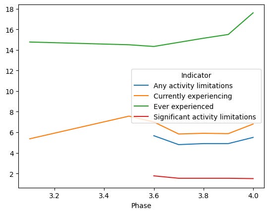
We can see that the percentage of people who say that they have ever experienced long covid has gone up over time. Perhaps that shouldn’t be a surprise, as more and more people are exposed to covid-19 multiple times, and each occurrence adds to their chances of having long covid.
The good news is that while the number of people who have ever had long covid continues to rise, the percentage that has significant activity limitations has gone down.

