


Remember, my book "Pandas Workout" is now available, in print, at https://PandasWorkout.com ! Use coupon code "pblerner2" through May 10th for a 45% discount.
I'll be giving away copies of my books — along with T-shirts and other swag — at PyCon US next week, so if you'll be in Pittsburgh, come and find me at my booth! I’ll be giving a tutorial about decorators on Thursday afternoon and a talk about dates and times in Pandas on Friday, as well. I hope to see you there.

Me, delighted to have received my author copies of Pandas Workout
This week, I decided to look into microplastics, after reading Eve Schaub’s opinion piece in the Washington Post, "Don’t waste your time recycling plastic" (https://wapo.st/3UxdJQj). Schaub is an avowed environmentalist, but found that recycling plastic is counterproductive — confirming, in some ways, what I had heard several years ago on NPR (https://www.npr.org/2020/09/11/912150085/waste-land). One of the problems with recycling plastic is that it encourages us to use plastic — and the world is increasingly full of “microplastics,” pieces smaller than 5 mm found in our oceans, in our soil, and even in our bodies.
This week, I decided to look into microplastics. I found that the US government’s National Oceanic and Atmospheric Administration (https://noaa.gov/), via its National Centers for Environmental Information (https://www.ncei.noaa.gov/) has an entire section related to marine microplastics -- that is, microplastics found in water — at https://www.ncei.noaa.gov/products/microplastics .
This week, we'll dig into NOAA's data about microplastics — and along the way, we'll (of course) explore lots of Pandas functionality, too.
Data and six questions
We’ll be looking at data from the Marine Microplastics project at NOAA's National Centers for Environmental Information:
https://www.ncei.noaa.gov/products/microplastics
To get the data set, click on the button labeled "Launch Microplastics Map." This will open a new window on this page:
https://experience.arcgis.com/experience/b296879cc1984fda833a8acc93e31476
Click on the "data table" button in the top left. Then click on the "actions" button (looks like four circles) in the top right corner. One available action will be "export," with a submenu. Choose "Export to CSV." That'll give you a file in CSV format.
Below are the six questions and tasks that I gave for this week. As always, a link to the Jupyter notebook I used to solve these problems is at the bottom of the newsletter. And of course, if you have feedback, questions, or thoughts, just leave them below!
Read the CSV file into a data frame, ensuring that the "Date" column is treated as a "datetime" dtype.
Before we can do anything else, let’s load up Pandas:
import pandas as pdThe file is in CSV format, so the natural thing to do is use “read_csv” to read it into a data frame:
filename = 'Marine_Microplastics_WGS84_2489995288044274451.csv'

df = (
    pd
    .read_csv(filename)
)
The good news is that this works, giving us a data frame with 18,991 rows and 22 columns. However, as we can see from checking the “dtypes” attribute on our data frame, the “Date” column was treated as a string, rather than as datetime data:
OBJECTID              int64
Oceans               object
Regions              object
SubRegions           object
Sampling Method      object
Measurement         float64
Unit                 object
Density Range        object
Density Class        object
Short Reference      object
Long Reference       object
DOI                  object
Organization         object
Keywords             object
Accession Number      int64
Accession Link       object
Latitude            float64
Longitude           float64
Date                 object
GlobalID             object
x                   float64
y                   float64
dtype: object
This is true, by the way, even if we specify the Pandas should use PyArrow to read the CSV file. We’ll need to tell Pandas that it should parse the “Date” column as datetime data, by passing the “parse_dates” keyword argument:
df = (
    pd
    .read_csv(filename,
              parse_dates=['Date'])
)
Despite this keyword argument, the “Date” column isn’t parsed as a date. Moreover, we get a warning from the system:
/var/folders/rr/0mnyyv811fs5vyp22gf4fxk00000gn/T/ipykernel_53054/2840507075.py:7: UserWarning: Could not infer format, so each element will be parsed individually, falling back to `dateutil`. To ensure parsing is consistent and as-expected, please specify a format.
  .read_csv(filename,
In other words: The datetime format in the “Date” column isn’t easily understandable by the parser — specifically, the “to_datetime” top-level function in Pandas. It tried to figure things out on its own, but because it couldn’t, we were left with strings rather than datetimes.
To solve this problem, we need to tell Pandas how to parse a datetime in this format:
12/18/2002 12:00:00 AMIn other words:
- Month, as a 2-digit number
- Day, as a 2-digit number
- Year, as a 4-digit number
- Time, in the format of two-digit hour, two-digit minute, two digit seconds and AM or PM
A bit of examination shows that all of the values in the “Date” column have a time of 12:00:00 AM, aka midnight. So one way to handle this format would be to read the values as strings, remove the “12:00:00 AM” from each of them, and then pass the result to “pd.to_datetime”.
Instead, I decided to pass the “date_format” keyword argument, whose value is a string in “strftime” format. The Python functions strftime (string-format-time) and strptime (string-parse-time) are used for output and input of dates, respectively. The format is taken literally except for characters following a %. You can learn more about these format codes from these two Web sites:
Here, then is what I came up with to parse the dates:
df = (
    pd
    .read_csv(filename,
              parse_dates=['Date'],
              date_format='%m/%d/%Y %I:%M:%S %p')
)
With this in place, we can read the CSV file into a data frame without any warnings. The “Date” column is indeed a datetime value, which will come in handy later on.
Create a line plot showing, in each year, how many measurements were performed. Now recreate the plot with a separate line for each ocean. What do you notice about the plot?
The data set contains measurements of microplastics taken all over the world, and in many different places. Each measurement indicates in which ocean it was taken, and in some places we see the region and subregion, as well.
I was curious to know how often measurements had been taken in each ocean, and in each year. Do we see more measurements over time? Do we see them evenly spread out across different oceans?
I decided to start by asking how many measurements were taken per year. That is: In this data set, how many rows are from each year? To create a line plot from such data, we’ll need a series in which the index contains years. The values should indicate how often each year was mentioned.
This is most easily done with the “value_counts” method. But on what can I run “value_counts” to get the number of measurements per year? I can’t use the “Date” column, because that’ll count the number of measurements per date. But I can retrieve the year from the “Date” column using the “dt” accessor. By asking for “dt.year” on the “Date” column, we get a new series back containing the year from each row:
(
    df['Date']
    .dt.year
)
We can then run “value_counts”, getting a series back in which the index contains years and the values are the counts of the times each year was mentioned:
(
    df['Date']
    .dt.year
    .value_counts()
)
Could we then run “plot.line”, and get a plot? Yes, but it won’t be in order, with earlier years on the left and later years on the right. That’s because “value_counts”, like many other grouping mechanisms in Pandas, sorts the results by default — in the case of “value_counts”, from most common to least common. Even if we were to turn off such sorting, we would still have to sort the rows from earliest year to latest one. We can do that with “sort_index”. The result is:
(
    df['Date']
    .dt.year
    .value_counts()
    .sort_index()
    .plot.line()
)
We get the following plot:
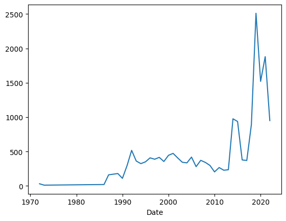
We can see that there were a small number of measurements for a long time, then more starting in the early 1990s, and then a huge spike in the early 2010s, followed by a drop. I would like to think that the drop happened around the time of covid-19, but it’s hard to know for sure.
What if I want to create a similar plot, but this time I want to have three lines, one for each ocean? That would require running “plot.line” not against a series, but rather against a data frame, one in which the index still contains years, but each column names a different ocean. The cells in that data frame indicate how many times each ocean was sampled each year.
To create such a data frame, I decided to use a two-dimensional “groupby”. Normally, we think of grouping as something we do on a single categorical column. However, I want to group primarily on the year, and then secondarily on the oceans. I can do that with this code:
(
    df
    .groupby([df['Date'].dt.year, 'Oceans'])['OBJECTID'].count()
)
Instead of passing a single column name to “groupby”, we pass a list of columns for the grouping. And “Oceans” is passed as a string, but the first (year) values are passed by naming the column, then using the “dt.year” accessor.
Grouping on more than one column means that we’ll have a two-part multi-indexed series as a result.
The aggregation method I use is “count”, which (as you can imagine) returns the number of rows for this combination of year and ocean name.
Why did I decide to count “OBJECTID”? Not because I care about it very much, but because it has a value for every row. And I can’t use one of the columns on which I grouped.
Next, I take our two-part multi-index and move the inner part (“Oceans”) to be columns. It takes a bit of thought and imagination, but once you can picture this in your mind, it becomes much clearer: A two-column multi-indexed series is exactly the same as a data frame. We can use “unstack” to perform this switcheroo:
(
    df
    .groupby([df['Date'].dt.year, 'Oceans'])['OBJECTID'].count()
    .unstack(level='Oceans')
)
Finally, we invoke “plot.line” to plot these changes:
(
    df
    .groupby([df['Date'].dt.year, 'Oceans'])['OBJECTID'].count()
    .unstack(level='Oceans')
    .plot.line()
)
We get:
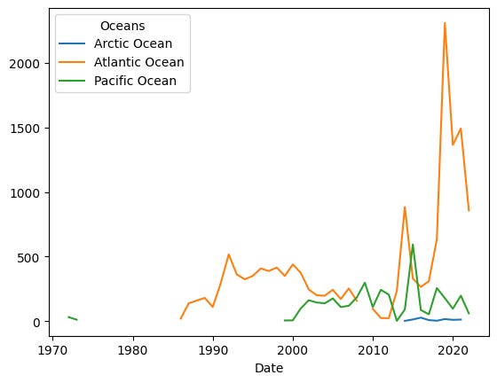
We can see that only a small number of samples have been done in the Arctic Ocean. That’s not hugely surprising, given how few people live near there.
We see, in the mid-2010s, a spike in sampling done in both the Atlantic and Pacific Oceans. But then we see an absolutely massive spike around 2020. Was this because of covid-19? Additional funding for environmental research? More environmental research outfits along the Atlantic Ocean? Or something else?
I’m not sure, but the difference is clear. We also see a decline in measurements in the last year or so. However, based on what I’ve seen with other data, the issue might just be delayed reporting, rather than a downturn.
What are the northernmost and southernmost samples that were taken? When were they taken?
How far north and south have people gone to look for microplastics?
To find out, I thought it would be interesting to ask for the lowest and highest values of “Latitude” were. We can, of course, invoke “min” and “max” on a Pandas series. But what I really want is to invoke them together. We could use “describe”, since that includes both “min” and “max”, but we can also use “agg”, a method that lets us invoke multiple aggregation methods:
(
    df
    ['Latitude']
    .agg(['min', 'max'])
)
The above returns the highest and lowest values for the “Latitude” column. But I thought it would be interesting to find out when these measurements were taken place.
In order to find that out, we’ll need to get the “Date” column’s value where we see the min and max values. My favorite way to do this is to set the “Date” column to be the index of the data frame, albeit temporarily, with “set_index”:
(
    df
    .set_index('Date')
    ['Latitude']
    .agg(['min', 'max'])
)
In other words: We first set the index of our data frame to be the “Date” column. Then we ask for only the “Latitude” column, which preserves the index. Then we invoke “agg” with “min” and “max”. Note that while we could pass functions or methods in the list of arguments to “agg”, it’s also find (and more typical, I’ve found) to pass strings:
(
    df
    .set_index('Date')
    ['Latitude']
    .agg(['min', 'max'])
)
This works, and gives us the following output:
min   -26.238
max    79.960
Name: Latitude, dtype: float64
However, I wanted to know not just what the most southern and northern locations were, but also when the measurements were taken from those places. To do that, we can use “idxmin” and “idxmax”, which return not the min/max values in a series, but rather the index at which the min/max values were found:
(
    df
    .set_index('Date')
    ['Latitude']
    .agg(['min', 'idxmin', 'max', 'idxmax'])
)
We get the following results:
min                   -26.238
idxmin    2011-04-17 00:00:00
max                     79.96
idxmax    2016-06-18 00:00:00
Name: Latitude, dtype: object
In other words, the southernmost location was sampled in 2011, and the northernmost in 2016.
Looking just at those rows where measurement was done in pieces/m3, find the percentage change in found microplastics, year after year. Does the number always increase? Do any years stick out?
To answer this question, we’ll first grab only those rows in which the measurement unit is pieces per cubic meter. We’ll look for where “Unit” is equal to “pieces/m3”, giving us a boolean series back. We can then apply that boolean series as part of a “lambda” that we hand to “.loc”:
(
    df
    .loc[lambda df_: df_['Unit'] == 'pieces/m3']
)
Now that we only have rows with pieces/m3, we want to get the mean measurement for each year. This is another classic use of “groupby”, since the year is a categorical value and we want to calculate the mean value of “Measurement” for each unique year in the system.
As before, we’ll run “groupby” on our “Date” column, using the “dt.year” accessor and the “mean” aggregation method:
(
    df
    .loc[lambda df_: df_['Unit'] == 'pieces/m3']
    .groupby(df['Date'].dt.year)['Measurement'].mean()
)
The above query returns a series in which the index contains years and the values are the mean “Measurement” for that year.
However, I didn’t just want the measurements. I wanted to know by what percentage they changed each year. For that, we invoke the “pct_change” method:
(
    df
    .loc[lambda df_: df_['Unit'] == 'pieces/m3']
    .groupby(df['Date'].dt.year)['Measurement'].mean()
    .pct_change()
)
The result from “pct_change” will always have NaN as its first value, because there’s nothing with which to compare. Following that, we see by what percentage things changed each year. We see that the numbers go up and down by a bit each year, but then there was a massive spike in 2016. Again, I’m not sure what happened then that would have led to such a massive increase in the number of pieces found in each cubic meter of water, but it was far greater than anything else we’ve seen
Which three regions have seen the highest measures of microplastics? What is strange about asking this kind of question? What measurements do and don't show up in such a query?
Next, I asked you to show, for each region and unit, the greatest measure we saw of each. This is another grouping operation, and we’ll again group by two categorical columns, “Regions” and “Unit”. To find the max value of “Measurement” for each region-unit combination, we’ll apply the “max” method:
(
    df
    .groupby(['Regions', 'Unit'])['Measurement'].max()
)
The result is a series with a (very wide!) two-part multi-index. There are, however a fair number of NaN values. We can get rid of those with “dropna”:
(
    df
    .groupby(['Regions', 'Unit'])['Measurement'].max()
    .dropna()
)
Finally, we can use “sort_values” to sort from lowest to highest:
(
    df
    .groupby(['Regions', 'Unit'])['Measurement'].max()
    .dropna()
    .sort_values()
)
We get results. And yet, as I indicated in my question, there are some weirdnesses here. For one, sorting by value when we have three completely different units doesn’t really make sense. We’re finding the biggest numbers for each category, but they aren’t exactly comparable to one another — it would be like measuring the weight and price of every item in a store, and then finding the five items with the biggest numbers. We can perform such a task, but it’s meaningless.
Also, we can find out which units are being measured:
df['Unit'].value_counts()The result:
Unit
pieces/m3           12916
pieces/10 mins       5800
pieces kg-1 d.w.      275
Name: count, dtype: int64
I didn’t see any results for “pieces/10 mins” in these results. The reason? Those weren’t measured in the “Measurement” column, which contained NaN for all of the “pieces/10 mins” samples. Instead, they put results in the “Density range” column, a totally different place.
I wouldn’t have put all of these samples together, given that they’re measuring totally different things. But this happens quite a bit, and we have to know how to deal with it.
The "Keywords" column attaches one or more keywords (often phrases) to each data point. What are the five most commonly used keywords?
Finally, I asked you to look at the “Keyword” column. Here are the first 10 rows from the data frame:
0                                                SEA
1                Great Pacific Garbage Patch/SEAPLEX
2                           Amazon Continental Shelf
3                Adventure Scientist/Citizen Science
4                                                SEA
5                                      Nurdle Patrol
6                           Rockall Trough, Scotland
7    MRV Scotia/MRV Alba na Mara /RV Sir John Murray
8                                                SEA
9              Oceaneye Association; Citizen Science
Name: Keywords, dtype: object
We can see that there are often multiple values. And I can tell you from experience that sometimes the multiple values are separated by slashes, whereas at other times they’re separated by semicolons.
The first task is to break them up. If we were in pure Python, we would be tempted to use “str.split”. But “str.split” cannot handle more than one type of delimiter. Fortunately, in Pandas, “str.split” is a bit smarter, and can even be given a regular expression, if we pass regex=True. We can say that we’re searching for either / or ; by using [] to create a character class, indicating that either of these characters would be an acceptable match:
(
    df['Keywords']
    .str.split('[/;]', regex=True)
)
The good news is that this gives us back a series of Python lists. The bad news is that we don’t want a series of lists; we want a series of strings. We can use “explode” to turn the series of lists into a series of strings:
(
    df['Keywords']
    .str.split('[/;]', regex=True)
    .explode()
)
Now that we have regular strings, we can count them, right? Not yet — there was whitespace around those delimiters, and we should remove those. We can do that with “str.strip”:
(
    df['Keywords']
    .str.split('[/;]', regex=True)
    .explode()
    .str.strip()
)
Finally, we’ll count them with “value_counts” and get the top 5 with “head:”:
(
    df['Keywords']
    .str.split('[/;]', regex=True)
    .explode()
    .str.strip()
    .value_counts()
    .head(5)
)
The results:
Keywords
SEA                             7891
Nurdle Patrol                   5800
Citizen Science                 1770
Adventure Scientist             1126
The Ocean Cleanup Foundation     722
Name: count, dtype: int64
In other words, the “Nurdle Patrol” that I discovered while researching this week’s challenges turns out to be a huge part of getting data!
My Jupyter notebook is here: https://drive.google.com/file/d/1jyiVyOMJrF_lzHWBJ7jwzu8R0gJiNRFn/view?usp=sharing
I’ll be back next week, from Pittsburgh.
Reuven