


This week, we looked at economic trends among members of the Organization for Economic Cooperation and Development (OECD), what the Economist likes to call "a club of mostly-rich countries." The idea was to explore three types of data, inflation (via the consumer price index), unemployment, and per-capita GDP.
When considering this sort of data, visualization can help us to better understand the correlations and trends. For that reason, I decided that many of this week’s analyses would be done via plots and charts. It has been several months since we last used the Seaborn package to create our plots, so I thought it would be appropriate to use it, as well.
Hopefully, this week’s questions and tasks gave you not just a better sense of how to use Pandas with real-world data, but also provided you with insights regarding the state of the world economy, of the US economy, and where things seem to be headed over the coming year.
Data and 7 questions
This week’s data came from three different CSV files, all from the OECD’s Web site:
- GDP data for OECD countries, described at https://data.oecd.org/gdp/gross-domestic-product-gdp.htm . The CSV file we'll use is at https://stats.oecd.org/sdmx-json/data/DP_LIVE/.GDP.../OECD?contentType=csv&detail=code&separator=comma&csv-lang=en .
- Unemployment data for OECD countries, described at https://data.oecd.org/unemp/unemployment-rate.htm . The CSV file we'll use is at https://stats.oecd.org/sdmx-json/data/DP_LIVE/.HUR.../OECD?contentType=csv&detail=code&separator=comma&csv-lang=en .
- The consumer price index (CPI) for OECD countries, described at https://data.oecd.org/price/inflation-cpi.htm . The CSV file we'll use is at https://stats.oecd.org/sdmx-json/data/DP_LIVE/.CPI.../OECD?contentType=csv&detail=code&separator=comma&csv-lang=en .
This week, I asked seven questions. While solving the problems, I hope that you gained some experience with Seaborn and the Pandas “pipe” method, along with such topics as pivot tables and joins.
A link to the Jupyter notebook that I used to solve these problems is at the bottom of this edition of the newsletter.
Here are this week’s questions, along with my solutions.
Create a data frame from each of the three CSV files.
Before doing anything else, I made sure that Pandas is available. Since I’m going to be using Seaborn, I also imported it. Note that both of these packages have fairly standard aliases; you don’t have to use them, but given that all of the documentation, examples, and Stack Overflow answers do, I’d strongly suggest it:
import pandas as pd
import seaborn as sns
I then created three data frames, all using “read_csv”. This method, like all of the “read_*” methods in Pandas, can take a filename or a URL. The data frames were all relatively small, and I wasn’t sure what columns I would need, so I just slurped all of the data up and created them:
gdp_df = pd.read_csv('https://stats.oecd.org/sdmx-json/data/DP_LIVE/.GDP.../OECD?contentType=csv&detail=code&separator=comma&csv-lang=en')

hur_df = pd.read_csv('https://stats.oecd.org/sdmx-json/data/DP_LIVE/.HUR.../OECD?contentType=csv&detail=code&separator=comma&csv-lang=en')

cpi_df = pd.read_csv('https://stats.oecd.org/sdmx-json/data/DP_LIVE/.CPI.../OECD?contentType=csv&detail=code&separator=comma&csv-lang=en')
These three data frames were for GDP, unemployment, and inflation, respectively. They all come in a format that’s common to OECD data sets, with the following columns:
- LOCATION, a three-character country code or a longer code representing a group of countries
- INDICATOR, what we’re measuring. For our three data frames, it’ll be GDP, HUR, and CPI, respectively.
- SUBJECT, the sub-indicators that we’re looking at. For example, CPI can measure total inflation (“TOT”), or it can measure food (“FOOD”), energy (“ENRG”), or total without food and energy (“TOT_FOODENRG”). We’ll only be looking at the total indicators in these problems, but it’s easy to see why you might want to look at sub-indicators for a more nuanced and sophisticated analysis.
- MEASURE, indicating what you’re measuring. For example, the GDP measures both per-capita GDP (“USD_CAP”) and the total GDP, in millions of US dollars (“MLN_USD”).
- FREQUENCY indicates whether we’re looking at annual (“A”), quarterly (“Q”), or monthly (“M”) measurements. These CSV files often include all three measurements, meaning that you need to select the frequency that’s of interest to you.
- TIME is the time for which the measurement was taken. It’s a function of the FREQUENCY column. For a row with “A” (annual) frequency, the TIME value will typically be a four-digit year. But for “Q” (quarterly) frequency, the TIME value will be a four-digit year, followed by “-Q1” for the first quarter, “-Q2” for the second quarter, and so forth. This can be an integer column, but is often an “object” column because it contains strings.
- Value (which is typically not all in ALL CAPS, for reasons I don’t understand) is the actual measurement value. It’s usually a float.
- Finally, the “Flag codes” column indicates whether data is partial, missing, or has other issues that we should know about. I feel comfortable ignoring these doing Bamboo Weekly.
And yes, the capitalization that the OECD uses in its data is inconsistent.
These data frames, as I indicated, aren’t that big:
- gdp_df is 5,288 rows
- hur_df is 70,746 rows
- cpi_df is 294,961 rows
While these might sound large, they really aren’t that big on a modern computer; even cpi_df consumes only 120 MB of memory. That sounded like a lot when I was growing up, but which is fairly small by modern standards.
Use Seaborn to plot total US unemployment over the years. The x axis should contain the final two digits of each year. The y axis should be the percentage of unemployment reported.
In order to create this line plot, I’ll need to have a data frame with at least two columns, for the year and the unemployment number in that year.
I’ll start off by keeping only those rows in which:
- SUBJECT is TOT (because I only want the total unemployment figure)
- LOCATION is USA (because I only want US unemployment)
- FREQUENCY is A (because I want to check annual numbers)
I can do that with “loc”. I perform comparisons, getting a boolean series back from each, and then whittle down the data frame:
(
    hur_df
    .loc[hur_df['SUBJECT'] == 'TOT']
    .loc[hur_df['LOCATION'] == 'USA']
    .loc[hur_df['FREQUENCY'] == 'A']
)
Note that I could have combined these into a single call to loc, using “&” to combine them. However, it doesn’t change the timing much with a data set this size, and the ease with which I can then eyeball, copy, paste, and modify these queries across the three data frames pushed me to write it this way.
This gives me a pared-down data frame. But it’s not quite enough for our purposes.
First of all, we only want to see the final two digits of each year. I already know that the TIME column will contain four-digit years, because we selected the rows with an annual frequency. I also know that the column’s dtype is “object”, because it contains non-numeric values. I can thus apply the “str.slice” Pandas method to the TIME column, getting new string values back with only the final two characters. (Invoking “str.slice(2)” is similar to saying “[2:]” in a traditional Python slice.
If I invoke str.slice on a column, I get back a new series, one which I can assign to another column. If I want to use method chaining, then I’ll want to use the “assign” method, passing it “TIME” as a keyword argument, so that I’ll replace the existing “TIME” column. In order to create the replacement column, I use an anonymous function via “lambda”, taking a data frame (df_) and applying “str.slice” to the “TIME” column on that data frame.
Why use a lambda here? Why not just invoke str.slice on our original data frame, hur_df? Because we’ve pared down that data frame, and assigning it back to the TIME column won’t work. There are too many rows in hur_df. The whole idea of method chaining is that we slowly but surely transform hur_df, removing and transforming rows and columns until we get what we want.
But wait: Before we can apply our lambda, we should first sort the data frame according to TIME. That’s because pre-lambda, TIME contains four-digit years. Sorting after we’re done will result in some very odd visualizations.
At this point, we now have the following:
(
    hur_df
    .loc[hur_df['SUBJECT'] == 'TOT']
    .loc[hur_df['LOCATION'] == 'USA']
    .loc[hur_df['FREQUENCY'] == 'A']
    .sort_values('TIME')
    .assign(TIME=lambda df_: df_['TIME'].str.slice(2))
)
The data frame is now ready for us to hand it to Seaborn and plot the unemployment data. But how can we fit this into our method-chaining paradigm? Normally, I would invoke Seaborn’s “lineplot” method as:
sns.lineplot(data=df, x='TIME', y='Value')But with method chaining, there isn’t any obvious way for me to take the current data frame and pass it as the “data” keyword argument’s value.
That’s where “pipe” comes in. The pipe method is meant for situations in which we want to use method chaining, but we want to use a function along the way. With pipe, we can effectively turn any function into a method. We pass a lambda to pipe, which will get a data frame as its argument. In our case, we’ll then use the data frame we got as an argument to sns.lineplot:
(
    hur_df
    .loc[hur_df['SUBJECT'] == 'TOT']
    .loc[hur_df['LOCATION'] == 'USA']
    .loc[hur_df['FREQUENCY'] == 'A']
    .sort_values('TIME')
    .assign(TIME=lambda df_: df_['TIME'].str.slice(2))
    .pipe(lambda df_: sns.lineplot(data=df_, x='TIME', y='Value'))
)
The result:
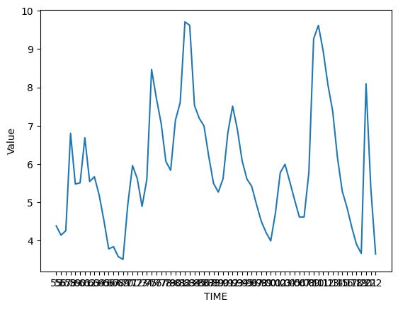
Hmm. That isn’t wrong, but the text is a bit hard to read. I decided to make the image a bit larger, and the font size a bit smaller. There are a few ways to do it, but the easiest is by invoking “sns.set_theme”, a catch-all function that lets us set a variety of display variables in Seaborn:
sns.set_theme(rc={"figure.figsize":(14, 6)})
sns.set_theme(font_scale=0.75)
With the above settings in place, my image looked a lot nicer:
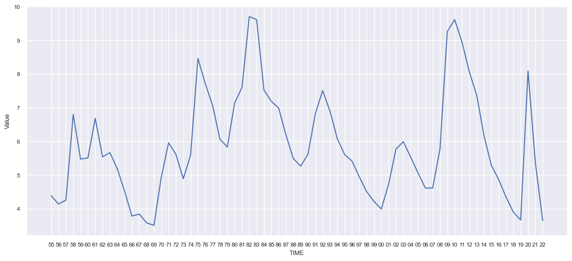
We can see that US unemployment is at a truly historic low point, nearly matched in the pre-pandemic boom, and bested more than 50 years ago.
No wonder economists have been saying that the US economy is doing quite well; if you want a job, you can probably find one, and you can ask for a good wage, given the tight labor market.
Recreate this same plot, but with lines for not just the US, but also for the UK, France, and Germany. (Use different-colored lines for each country.)
The previous chart looked at the US. Now let’s compare unemployment in the UK, France, and Germany along with the US. (We could look at all of the OECD countries, but that graph tends to be rather crowded.)
Our query will be similar to the previous one, with two changes:
- First, we won’t be finding rows in which LOCATION is “USA”. Fortunately, we can tell Pandas to return rows in which LOCATION’s value is one of several using “isin”, and passing a list of the locations of interest to us.
- Next, we have to tell Seaborn to draw each location in a different color. Otherwise, it’ll lump together all of the values for a given value of YEAR, giving us a big mess. We can do that by passing the “hue” keyword argument, naming the LOCATION column as the basis for setting the hue.
In the end, I went with this query:
(
    hur_df
    .loc[hur_df['SUBJECT'] == 'TOT']
    .loc[hur_df['LOCATION'].isin(['USA', 'FRA', 'DEU', 'GBR'])]
    .loc[hur_df['FREQUENCY'] == 'A']
    .sort_values('TIME')
    .assign(TIME=lambda df_: df_['TIME'].str.slice(2))
    .pipe(lambda df_: sns.lineplot(data=df_, x='TIME', y='Value', hue='LOCATION'))
)
The resulting plot looked like this:

We can see that while US unemployment spiked during the pandemic, it has come down a very long way, and is currently a bit lower than that of the UK. Germany’s unemployment rate has declined steadily for more than a decade, and is extremely low. France has higher unemployment than any of these other countries, but it has also seen steady declined in the last decade or so.
I decided to throw in the EU27_2020 detail, just to get a sense of how the EU is doing vs the US, and found that it has less unemployment than France, but much more than the US:

The US thus seems to be doing well by its own historical measures, and is doing pretty well when compared with other countries, too.
From the CPI data frame, create one in which the index contains years, the columns are from the US, UK, France, and Germany, and the values represent the percentage change in total annual CPI from the previous year.
Next, I asked you to take the data frame with a common measure of inflation (CPI), and to extract a new data frame from it in which the index contains years, the columns contains a few countries, and values show the year-to-year change in CPI.
For starters, I limited the rows of cpi_df to those with the “TOT” subject (for total CPI), a location in one of the four countries we’re examining, and annual frequency:
(
    cpi_df
    .loc[cpi_df['SUBJECT'] == 'TOT']
    .loc[cpi_df['LOCATION'].isin(['USA', 'FRA', 'DEU', 'GBR'])]
    .loc[cpi_df['FREQUENCY'] == 'A']
)
How can I turn this into the kind of data frame I need? A pivot table.
Remember that a pivot table requires three columns:
- One categorical column, whose unique values will be the rows of the resulting data frame. Here, we want the years to be the rows, so we’ll use the “TIME” column.
- Another categorical column, whose unique values will be the columns of the resulting data frame. Here, we want the locations to be the columns, so we’ll use LOCATION.
- The values will come, not surprisingly, from the “Value” column. A pivot table normally calculates the mean for all values at a given row-column intersection, unless we specify otherwise. Here, we know that there will be just one value, so it doesn’t really matter.
We can thus say:
(
    cpi_df
    .loc[cpi_df['SUBJECT'] == 'TOT']
    .loc[cpi_df['LOCATION'].isin(['USA', 'FRA', 'DEU', 'GBR'])]
    .loc[cpi_df['FREQUENCY'] == 'A']
    .pivot_table(index='TIME', columns='LOCATION', values='Value')
)
We think of inflation as a percentage, but it’s actually calculated relative to a baseline of 100 set a while ago. If prices have gone up since then, the CPI score will be above 100. If they went down since then (which isn’t the case), then the CPI score will be below 100. Each monthly or annual increase or decrease in prices modifies that score. But it’s not a percentage; to calculate that, we’ll compare each value with the previous one, and see by what percentage it changed.
Fortunately, Pandas has the “pct_change” method, which does just that:
(
    cpi_df
    .loc[cpi_df['SUBJECT'] == 'TOT']
    .loc[cpi_df['LOCATION'].isin(['USA', 'FRA', 'DEU', 'GBR'])]
    .loc[cpi_df['FREQUENCY'] == 'A']
    .pivot_table(index='TIME', columns='LOCATION', values='Value')
    .pct_change()
)
The result is a data frame showing the percentage of annual inflation in each of these four countries:

Notice that the first line (from 1955) contains NaN. The result of pct_change will always have NaN in the first row, because it’s the baseline against which all other rows are compared.
Take the data frame from the previous task, and use Seaborn to create a line plot showing inflation in each of the countries. Show only from 1995 onward.
I’ll need to modify the above query somewhat, but it did give me a good starting point to create the Seaborn plot.
First, I want to keep only years from 1995 and on. That sounds easy, except that the “TIME” column is a string. And yes, I could just compare with the string “1995”, but that feels a bit wrong to me. I thus added a call to “loc”, converting the “TIME” column to integers and comparing with 1995:
(
    cpi_df
    .loc[cpi_df['SUBJECT'] == 'TOT']
    .loc[cpi_df['LOCATION'].isin(['USA', 'FRA', 'DEU', 'GBR'])]
    .loc[cpi_df['FREQUENCY'] == 'A']
    .loc[lambda df_: df_['TIME'].astype(int) >= 1995]
)
Now that I’ve pared down the number of years, I can re-apply the same query as I used in the previous task to create a pivot table and compute the annual difference:
(
    cpi_df
    .loc[cpi_df['SUBJECT'] == 'TOT']
    .loc[cpi_df['LOCATION'].isin(['USA', 'FRA', 'DEU', 'GBR'])]
    .loc[cpi_df['FREQUENCY'] == 'A']
    .loc[lambda df_: df_['TIME'].astype(int) >= 1995]
    .pivot_table(index='TIME', columns='LOCATION', values='Value')
    .pct_change()
)
Finally, I again use “pipe” to create a Seaborn line plot, invoking sns.lineplot. I only have to pass a single argument, the data frame, because I want to get one line for each column:
(
    cpi_df
    .loc[cpi_df['SUBJECT'] == 'TOT']
    .loc[cpi_df['LOCATION'].isin(['USA', 'FRA', 'DEU', 'GBR'])]
    .loc[cpi_df['FREQUENCY'] == 'A']
    .loc[lambda df_: df_['TIME'].astype(int) >= 1995]
    .pivot_table(index='TIME', columns='LOCATION', values='Value')
    .pct_change()
    .pipe(lambda df_: sns.lineplot(data=df_))
)
The resulting graph shows just how dramatically, and universally, inflation climbed in the last few years:

Recreate the data frame from the previous task — except this time, get the quarterly CPI value, starting in 2010. Use Seaborn to create a line plot from that data. Given that the quarterly data includes 2023, what trends do we see in the countries we're examining?
Next, I asked you to do perform roughly the same query, but on a quarterly basis, allowing us to zoom in a bit. Plus, because it includes the first few quarters of 2023, we’ll be able to get a sense of whether inflation is leveling off.
First, we’ll filter cpi_df to include total inflation (“TOT”) from our four countries, looking at a frequency of “Q” (quarterly):
(
    cpi_df
    .loc[cpi_df['SUBJECT'] == 'TOT']
    .loc[cpi_df['LOCATION'].isin(['USA', 'FRA', 'DEU', 'GBR'])]
    .loc[cpi_df['FREQUENCY'] == 'Q']
)
We only want data starting in 2010. (I actually asked for data from 1995, but I’m changing it so that the plot won’t be too crowded.) Normally, I would filter on the year — but here, the “TIME” column contains the year, a dash, and then a two-character quarter indicator.
If I want to keep only those from 2010 and on, then I’ll need to grab the first four characters of the TIME column, turn them into an integer, and then compare with 2010. And indeed, using loc and lambda, I can do that:
(
    cpi_df
    .loc[cpi_df['SUBJECT'] == 'TOT']
    .loc[cpi_df['LOCATION'].isin(['USA', 'FRA', 'DEU', 'GBR'])]
    .loc[cpi_df['FREQUENCY'] == 'Q']
    .loc[lambda df_: df_['TIME'].str.slice(0, 4).astype(int) >= 2010]
)
Now that I have these, I’ll play with the TIME values, to make them a bit more readable when they become our index. I’ll change the “-Q” in the TIME column to be a newline followed by Q, using “str.replace”. Then I’ll use str.slice to grab the year and quarter starting with the last two digits of the year:
(
    cpi_df
    .loc[cpi_df['SUBJECT'] == 'TOT']
    .loc[cpi_df['LOCATION'].isin(['USA', 'FRA', 'DEU', 'GBR'])]
    .loc[cpi_df['FREQUENCY'] == 'Q']
    .loc[lambda df_: df_['TIME'].str.slice(0, 4).astype(int) >= 2010]
    .assign(TIME=cpi_df['TIME'].str.replace('-Q', '\nQ').str.slice(2))
)
With that in place, I can create my pivot table based on the TIME and LOCATION:
(
    cpi_df
    .loc[cpi_df['SUBJECT'] == 'TOT']
    .loc[cpi_df['LOCATION'].isin(['USA', 'FRA', 'DEU', 'GBR'])]
    .loc[cpi_df['FREQUENCY'] == 'Q']
    .loc[lambda df_: df_['TIME'].str.slice(0, 4).astype(int) >= 2010]
    .assign(TIME=cpi_df['TIME'].str.replace('-Q', '\nQ').str.slice(2))
    .pivot_table(index='TIME', columns='LOCATION', values='Value')
    .pipe(lambda df_: sns.lineplot(data=df_))
)
Note that if you kept the original year of 1995, then this will give you weird results. That’s because Pandas will sort the index, and sorting by the final two digits will give wacky results if you’re starting in 1995 (“95”) and ending in 2023 (“23”). It’s like having your own little Y2K problem on your desktop!
Finally, we use pipe to invoke sns.lineplot:
(
    cpi_df
    .loc[cpi_df['SUBJECT'] == 'TOT']
    .loc[cpi_df['LOCATION'].isin(['USA', 'FRA', 'DEU', 'GBR'])]
    .loc[cpi_df['FREQUENCY'] == 'Q']
    .loc[lambda df_: df_['TIME'].str.slice(0, 4).astype(int) >= 2010]
    .assign(TIME=cpi_df['TIME'].str.replace('-Q', '\nQ').str.slice(2))
    .pivot_table(index='TIME', columns='LOCATION', values='Value')
    .pipe(lambda df_: sns.lineplot(data=df_))
)
The resulting plot shows us how inflation is looking in our sample countries over the last few quarters:

We can see that inflation has been leveling off in all of these countries, but the UK seems to have gotten higher before that started to happen.
Get the per-capita GDP and unemployment rate for every country in 2022, and use Seaborn to create a scatter plot comparing them.
Finally, I asked you to create a scatter plot comparing unemployment per-capita GDP and total unemployment in every country in 2022.
To do this, we need to do some similar things to gdp_df and hur_df:
- Grab only those rows where “TIME” is 2022 (or “2022”, in the case of hur_df, since it uses strings rather than integers)
- Keep those rows where “TOT” is the subject
- Keep only those locations with three-letter names
- In gdp_df, we need to specify that MEASURE is GDP_CAP
- We need to set LOCATION to be the index in both
Here’s how that looks for gdp_df:
(
        gdp_df
        .loc[lambda df_: df_['TIME'] == 2022]
        .loc[lambda df_: df_['MEASURE'] == 'USD_CAP']
        .loc[lambda df_: df_['SUBJECT'] == 'TOT']
        .loc[lambda df_: df_['LOCATION'].str.len() == 3]
        .set_index('LOCATION')
    )
And here’s what we can do with hur_df:
(
        hur_df
        .loc[lambda df_: df_['TIME'] == '2022']
        .loc[lambda df_: df_['SUBJECT'] == 'TOT']
        .loc[lambda df_: df_['LOCATION'].str.len() == 3]
        .set_index('LOCATION')
)
However, we’re going to use “join” to combine these data frames into a single one:
  (
        gdp_df
        .loc[lambda df_: df_['TIME'] == 2022]
        .loc[lambda df_: df_['MEASURE'] == 'USD_CAP']
        .loc[lambda df_: df_['SUBJECT'] == 'TOT']
        .loc[lambda df_: df_['LOCATION'].str.len() == 3]
        .set_index('LOCATION')
    ).join(
        hur_df
        .loc[lambda df_: df_['TIME'] == '2022']
        .loc[lambda df_: df_['SUBJECT'] == 'TOT']
        .loc[lambda df_: df_['LOCATION'].str.len() == 3]
        .set_index('LOCATION')
    )
If we do this, we quickly discover that we have a problem: The names of the columns in gdp_df are clashing with those in hur_df. We can solve this by telling join to add a suffix to the left and right data frames’ column names:
  (
        gdp_df
        .loc[lambda df_: df_['TIME'] == 2022]
        .loc[lambda df_: df_['MEASURE'] == 'USD_CAP']
        .loc[lambda df_: df_['SUBJECT'] == 'TOT']
        .loc[lambda df_: df_['LOCATION'].str.len() == 3]
        .set_index('LOCATION')
    ).join(
        hur_df
        .loc[lambda df_: df_['TIME'] == '2022']
        .loc[lambda df_: df_['SUBJECT'] == 'TOT']
        .loc[lambda df_: df_['LOCATION'].str.len() == 3]
        .set_index('LOCATION'),
        lsuffix='_gdp', rsuffix='_hur'
    )
With this in place, we’ll use pipe to inovke “sns.scatterplot”:
# 7. Get the per-capita GDP and unemployment rate for every country in 2022, and use
# Seaborn to create a scatter plot comparing them.
(
    (
        gdp_df
        .loc[lambda df_: df_['TIME'] == 2022]
        .loc[lambda df_: df_['MEASURE'] == 'USD_CAP']
        .loc[lambda df_: df_['SUBJECT'] == 'TOT']
        .loc[lambda df_: df_['LOCATION'].str.len() == 3]
        .set_index('LOCATION')
    ).join(
        hur_df
        .loc[lambda df_: df_['TIME'] == '2022']
        .loc[lambda df_: df_['SUBJECT'] == 'TOT']
        .loc[lambda df_: df_['LOCATION'].str.len() == 3]
        .set_index('LOCATION'),

        lsuffix='_gdp', rsuffix='_hur'
    )
        .pipe(lambda df_: sns.scatterplot(data=df_,
               x='Value_gdp', y='Value_hur'))
)
The result looks like this:

Eyeballing it, I’d say that there’s a general negative correlation between unemployment and GDP. Which kind of makes sense: Countries with a high unemployment rate aren’t earning as much per person as those with a low unemployment rate, right?
Comments or suggestions? Let me know!
This week’s Jupyter notebook is available here: https://drive.google.com/file/d/1Y_udanfeF0AatjfMrcJQ98FMzncWo_dv/view?usp=sharing
I’ll be back next week with more Pandas puzzles based on current events. See you then!
Reuven