


Consumer finances
This week, we explored a small part of the data that the Federal Reserve used in its Survey of Consumer Finances, a study of that they conduct every three years about American households’ financial state.

The latest edition of the SCF was just released last week, with the report downloadable from /content/files/publications/files/scf23.pdf. Given that the report has nine (!) co-authors, it’s no surprise that there is a ton of data to review and analyze, and many questions that we could answer.
Data and seven questions
This is a weekly newsletter about Pandas, rather than a year-long, graduate-level seminar in economics — so I asked you to look at one Excel file that summarizes the data found in the research report. That file still contains many tabs, many of which describe a great deal of data, so we’re really looking at the tiniest tip of the iceberg here.
The Excel file we’re looking at is located at /content/files/econres/files/scf2022_tables_public_nominal_historical.xlsx. If you’re generally interested in the SCF, you can find out more at https://www.federalreserve.gov/econres/scfindex.htm.
This week, I gave you seven questions and tasks. The learning goals include working with Excel files (including rejiggering spreadsheets into useful data frames), multi-indexes, and plotting. A link to the Jupyter notebook that I used in solving these problems is below. Meanwhile, let’s look at how I solved things:
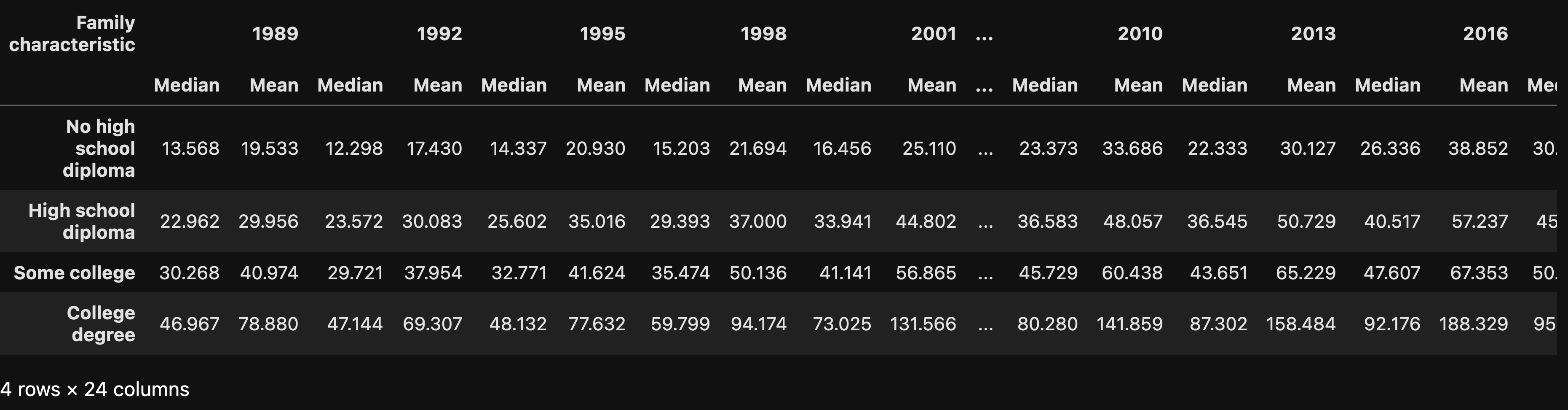
Create a data frame from the first two sheets (Table 1, 89-98 and Table 1, 01-22), where the index will be the descriptions (in column A) of rows 34-37, and the values will come from each year's values. The result will be a data frame with four rows and a multi-index columns, with the years on the outer level and "median" and "mean" in the inner level.
Before doing anything else, I loaded up Pandas — the library itself, and also aliases to Series and DataFrame, which often come in handy:
import pandas as pd
from pandas import Series, DataFrame
For this first task, I asked you to read data from the Excel file. That shouldn’t be too bad; Pandas has the “read_excel” method, and we can use it similarly to “read_csv” to get data from a file into a data frame.
However, this Excel file threw us a few curveballs. First, it has a bunch of sheets, each corresponding to a table of data in the research report. Second, data for Table 1 in the report is actually broken into two separate sheets that we have to join together. Third, these sheets have the equivalent of a multi-index (year → income → median/mean and year → percentage that saved). And finally, the sheets have many subsections, each of which describes a different breakdown of the data.
I was only interested in the subset that had to do with education, on rows 34-37. The goal is a data frame of four rows and with a multi-index on the columns, consisting of years (on the outer level) and median + mean (on the inner level).
How will we do all this? Slowly and carefully, for sure.
First, let’s talk strategy: I’m going to create a data frame from each of the first two sheets. I’ll create a Python list containing those two data frames, and then run “pd.concat” on them, to get a new, combined data frame back.
I love list comprehensions, and here I used one to create a 2-element list of data frames. (And yes, I could have theoretically asked for more than one sheet back from read_excel, but that didn’t seem to work for me, for reasons I didn’t have a chance to investigate.)
I thus created a list comprehension, iterating over the integers 0 and 1, corresponding to the indexes of the sheets I wanted to retrieve from the Excel file. For each of those sheets, I passed the following keyword arguments to read_excel:
- sheet_name — as I indicated above, I passed an integer indicating which sheet I wanted to retrieve. Especially when there are long, complex sheet names containing spaces, I somehow feel more comfortable using the numbers.
- header — normally, the “header” keyword argument lets us indicate from which row of a spreadsheet we can retrieve the column headers. Or we can pass None, which indicates that we shouldn’t take headers from the Excel file at all. In this case, though, I wanted to use three rows as a multi-index. No problem; I just passed a list of integers referring to the rows of the spreadsheet I wanted to use.
- index_col — I indicated that the first column (i.e., index 0) should be turned into our data frame’s index rather than be a separate, standard column.
Remember that while Excel numbers its rows starting with 1, Pandas indexes them starting with 0. It’s a great source for off-by-one errors.
Here’s how the code looks so far, given what I’ve described:
filename = 'scf2022_tables_public_nominal_historical.xlsx'

all_dfs = [pd.read_excel(filename,
                        sheet_name=sheet_number,
                        header=[2,3,4],
                       index_col=0)
            for sheet_number in [0, 1]
The above is a good start, but definitely not enough. Each data frame still contains all of the rows from its sheet. And the multi-index is a bit too “multi” for our taste. And of course.
Fortunately, the two sheets are formatted identically, meaning that will want the same rows — 27 through 30. We could use “loc” to retrieve rows via the index, but given that we know which row numbers we want, it’ll be easier to just use “iloc” with a range. Remember that ranges, like many things in Python, are specified with the starting number and one past the ending number. We’ll thus ask for “iloc[27:31]” from each of the data frames we get from read_excel.
But then things get more interesting: How can we take the multi-index as we got it from Excel and turn it into a simplified version, containing only the year and median/mean?
The answer is with “xs”, the amazing method that lets us retrieve from a multi-index using a variety of different forms. In this case, we ask for only those columns whre “Income” is in the middle level (i.e., level 1). That gets rid of the “Percentage” portion of each multi-index, as well as the “Income” part.
all_dfs = [(pd.read_excel(filename,
                        sheet_name=sheet_number,
                        header=[2,3,4],
                       index_col=0)
            .iloc[27:31]
            .xs('Income', level=1, axis='columns'))
           for sheet_number in [0, 1]]
The result is a 2-element list of data frames containing only the “Income” part of the multi-indexed columns, and the rows that are of interest to us from both sheets.
What’s left? We need to combine these two data frames together into a single one with pd.concat. (Remember that “concat” isn’t a method we run on a data frame, but rather a top-level Pandas function to which we pass a list of data frames.)
The only tricky thing here is that we want to join the data frames side-to-side, rather than top-to-bottom. We thus need to pass the “axis” keyword argument, with a value of “columns”:
df = pd.concat(all_dfs, axis='columns')After doing all this, I got a data frame with 4 rows and 24 columns — 2 columns (mean and median) for each year of the survey.
Create a line plot with a separate line for each educational level, the x axis representing years, and the y axis showing median income in 2022 dollars. Which level of educational achievement appears to be improving its mean income level the most over the years?
Matplotlib is the best-known plotting library for Python, but whenever I can get away with it, I prefer to use the builtin Pandas plotting methods. They tend to be more limited, but they’re also (for me, at least) easier to work with, remember, and understand. (When things get more complex, or if I want the plot to look nicer, I use Seaborn instead.)
I wanted to see a line plot showing the median income for each educational level, with the x axis showing the progression of years. The idea is that we would be able to see whether, over the years, median income had improved or declined for each educational level.
We can always create a line plot from a data frame using the “plot.line” method. This gives us a separate line for each column, and uses the index for the x axis. While we could do this, it’ll give us a very weird, useless plot. Moreover, it’ll give us both the mean and the median, when we’re only interested in the median:
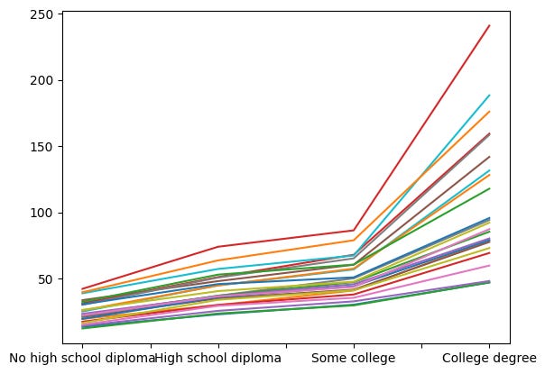
I removed the legend from the above plot, because it was covering most of the graph. But… this is totally useless.
What we need to do is pull out only the columns with a “Median” value in the multi-index. Once again, we’ll turn to “xs”:
df.xs('Median', level=1, axis='columns')The above indicates that we want to select only those parts of the data frame for which level 1 (i.e., the second level) of the column multi-index has the value “Median”. The data frame that we get back lacks a mention of “Median”, just as the string you pass to “str.split” doesn’t appear in the list of strings that it returns. Here’s what I got back:

So we can just go ahead and plot now, right? No, not really — because we’ll again get a line for each column, and the x axis will be based on the index.
We need to transpose the data frame, swapping the two axes. We can do that with the “transpose” method, or its alias “T” (which doesn’t take parentheses). Then, with that in place, we can create the line plot:
df.xs('Median', level=1, axis='columns').T.plot.line()Here’s what we get:
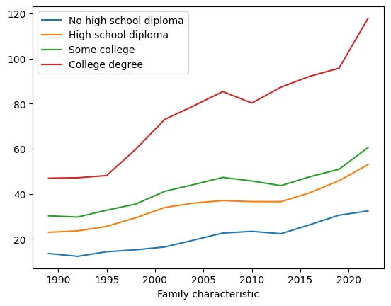
All educational levels have seen their median incomes rise over time. Not surprisingly, there is a strong correlation between the amount of education you got and your income. However, we see that in the last few years, the median income of college graduates has taken off, moving up and to the right very quickly, faster (it would seem from eyeballing it) than anyone else. People without a high-school education have seen their increases level off, becoming very close to flat.
Plot the mean vs. median income levels for each educational level. Again, the x axis should show the years, and the y axis should show the income. Show a separate plot for each educational level.
The above plot shows median income level. As you might know, mean and median both measure the “middle,” but they do it in different ways:
- We calculate the mean by summing the values and dividing by how many values we had, whereas
- We calculate the median by sorting the values and taking the middle one. If there is an even number of values, then we average them together.
The problem with the mean is that if you have a few outliers, it can pull the values up or down, giving you a skewed picture of the truth. This is illustrated in an old joke: Bill Gates walks into a bar, and on average, everyone in the bar is now a multimillionaire.
I was thus curious to know if we could see any difference between the mean and median incomes for each educational group. A higher mean would show that there’s a small number of outliers earning a great deal, and thus pulling the mean up. A lower mean would show that there’s a small number of outliers earning very little, thus pulling the mean down.
We could, in theory, plot all of these lines together. But that’s hard to read, and I thought that it would be better and more useful to see them separately, with a two-line plot (mean vs. median) for each educational level.
But how to go about creating such a plot? To start, I grabbed the data for “No high school diploma”:
df.loc['No high school diploma']When we ask for a single row from a data frame, we get a series back. The columns form the index of the series, which means that the columns of df (a multi-index with year + mean/median) are the index of the series:
Family characteristic
1989                   Median    13.568
                       Mean      19.533
1992                   Median    12.298
                       Mean      17.430
1995                   Median    14.337
                       Mean      20.930
1998                   Median    15.203
                       Mean      21.694
2001                   Median    16.456
                       Mean      25.110
2004                   Median    19.507
                       Mean      25.901
2007                   Median    22.625
                       Mean      31.348
2010                   Median    23.373
                       Mean      33.686
2013                   Median    22.333
                       Mean      30.127
2016                   Median    26.336
                       Mean      38.852
2019                   Median    30.545
                       Mean      39.613
2022                   Median    32.427
                       Mean      42.232
Name: No high school diploma, dtype: float64
If I want to plot the mean vs. the median, then I’ll need to take turn our multi-indexed series into a data frame, one in which mean/median (i..e, the inner part of the multi-index) are the columns.
Fortunately, Pandas has a great way to do that, the “unstack” method:
df.loc['No high school diploma'].unstack()After running that, I get the following:
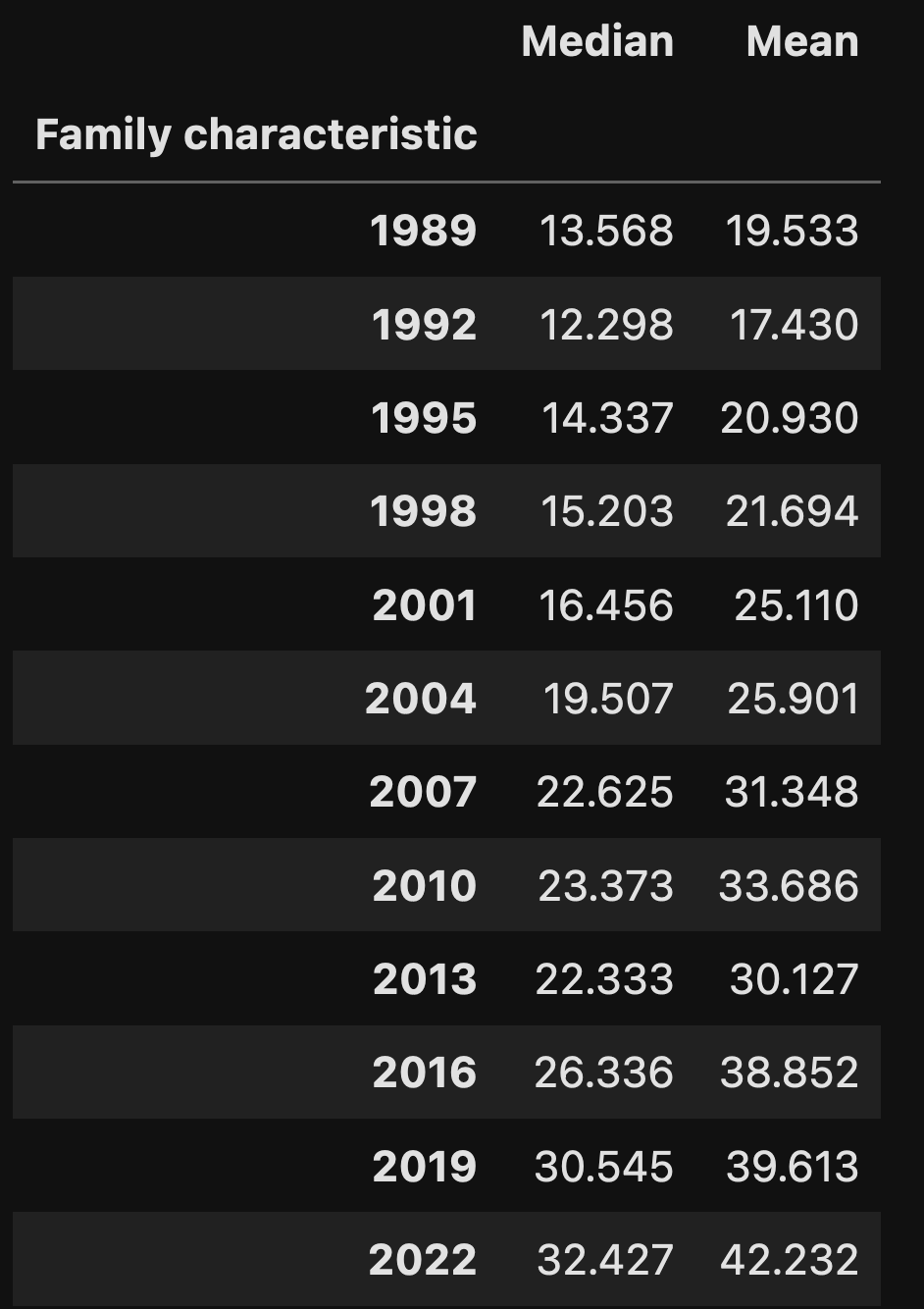
I now have the data in the form that I want, with two columns (median + mean), and the years in the rows. I can create a line plot:
df.loc['No high school diploma'].unstack().plot.line()And I get a great plot:
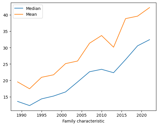
But wait: I want to get a separate plot for every one of the educational levels. How can I do that?
With a for loop:
for one_index in df.index:
    df.loc[one_index].unstack().plot.line(title=one_index)
Not only does the above code work, it also gives each plot a title based on the index, so that we can distinguish them from one another:
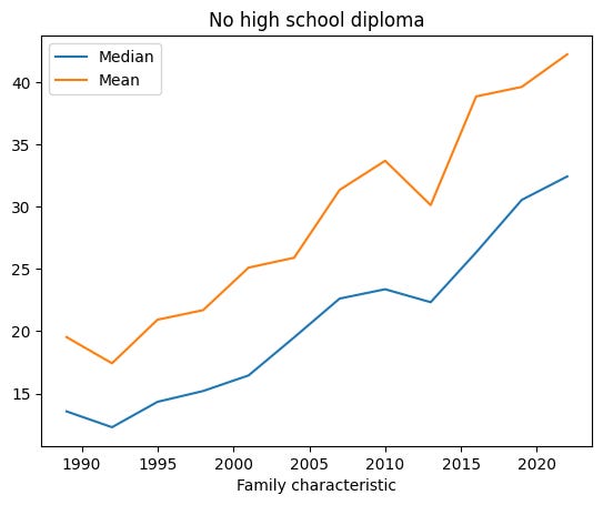
I won’t include all of the plots here, but we can see in all of them that the mean is always higher than the median. And we can see it pulling away, up and to the right, in the last few years. This would seem to indicate that while everyone’s income has been going up, people with more education are doing even better.
For example, here’s the graph for people with a college degree:
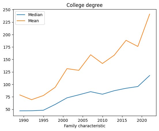
I don’t know for sure, but I’m guessing that people studying computer science and data science are the ones pulling the mean up.
Create a new data frame from the sheet named "Table 2," showing the amount of before-tax income for all families (column G). The columns of the data frame will be the survey years (as labeled in rows 7, 17, 27, etc.), and the index for the data frame will be the various income sources listed in column A, rows 8-13 ("Wages," "Interest or Dividends," etc., but not including "Total").
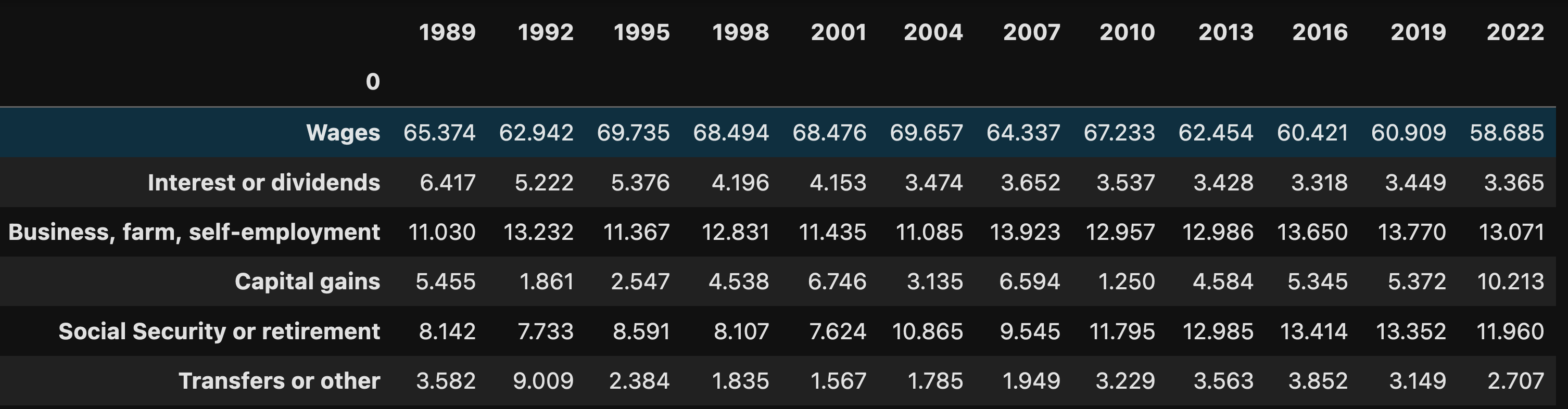
Next, I decided to look at Table 2, showing where people’s income comes from. This isn’t a dollar amount, but is rather a percentage — so by definition, the numbers will all add up to 100, and one always goes up at the expense of another.
The Excel spreadsheet that we have is great for looking at the data from each year. But I wanted to compare the “all families” information across different years. How can I create such a data frame?
I had a few different ideas, but in the end, I decided to use “read_excel” to get the spreadsheet’s first and seventh columns (A and G in Excel, or 0 and 6 in Pandas), skipping down to row 7 (i.e., 6 in Pandas) and not asking for any headers:
df = pd.read_excel(filename,
              sheet_name='Table 2',
             header=None,
             usecols=[0, 6],
             skiprows=6,
             index_col=0)
The above instructs read_excel to:
- Read from the sheet named “Table 2”
- Keep the generic, numeric column names, rather than grabbing them from anywhere in the spreadsheet
- Only use columns 0 and 6
- Ignore the first 6 rows of the spreadsheet
- Turn column 0 into an index
The result is a data frame with a single column. We want to grab values from that column in order to build a new data frame, one in which the years would be the column names and the six “all families” values from that year’s survey.
I decided to create the new data frame using a dictionary, one in which the keys are the years and the values are a series. I can get the years from the survey name (in rows 7, 17, 27, etc.) and the values from rows 8-13, 18-23, 28-33, etc.
See a pattern here? I did, and I decided to take advantage of it and create a “for” loop.
all_years = {}

for start_index in range(0,111, 10):

    one_year = df.iloc[start_index:start_index+8][6]

    # get the year
    year = int(one_year.index[0].split()[0])

    # assign to our dict
    all_years[year] = one_year.iloc[1:-1]
I started with an empty dict. I then iterated over the range of 0 to 111, increasing by 10 with each iteration.
I grabbed the values that were of interest to me via iloc, starting at “start_index” and going up by 8. I only wanted the items from the column named 6. That all went into the “one_year” variable.
Then I grabbed the index, whose first word I knew to be the year in which the survey was taken. I grabbed that, then turned it into an integer.
So I had the year, and I had the values. I added them as a key-value pair to the dict, trimming the first and last rows from the values, since I didn’t want the survey title or the total to be included.
I then created a data frame from this dict:
df = DataFrame(all_years)The result:
Create a line plot with a separate line for each income source; the x axis should be the years, and the y axis will be the percentages. Over the years of the survey, have the percentages from each income source remained constant? What has gone up, and what has gone down?
With this data frame in place, I was able to create such a plot without much trouble:
df.T.plot.line(grid=True)Notice that I once again had to transpose the rows and columns, to make sure that the years would form the x axis and the different types of income formed the different lines.
I also, added grid lines, just because I thought that they would make the plot easier to read. The result:
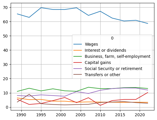
We see that for families as a whole, the proportion of income they get from wages has dropped a bit over the years, whereas income from capital gains (i.e., selling investments) has gone up. We also see a rise in Social Security income; I didn’t look at it carefully, but I wouldn’t be surprised if that has something to do with the large number of people retiring, and the general aging of the US population.
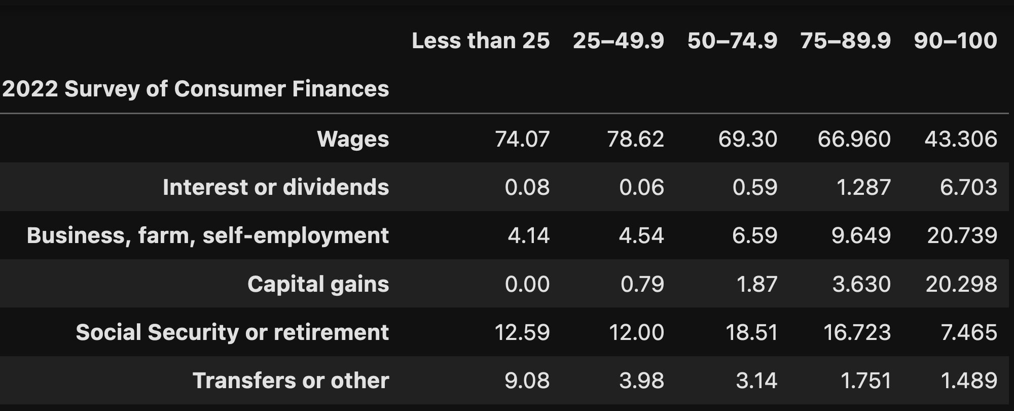
Create a new data frame based on the 2022 survey data on income sources. The index should (again) be the income sources, but the columns this time should show the names from row 5, labeling the percentile of net worth. Set the symbol in B121 to be 0.
I decided to look at the data for just the 2022 survey, to look at the income sources for people across different percentiles of net worth. This basically meant reading from A117 through G123 in Excel, and turning them into a data frame. How did I do that?
First, I wanted to get the data, which turned out to be a little tricky. I did it with the following code:
df = pd.read_excel(filename,
                   sheet_name='Table 2',
                   header=4,
                   skiprows=112,
                   nrows=6,
                   usecols=range(6),
                   index_col=0).replace({'†':0})
Here’s what I did:
- I read from sheet “Table 2”
- I told it that the header was on row 4
- I told it to skip 112 rows — since 4 + 112 = 116, which corresponds to row 117 in Excel (because of the off-by-one difference)
- I only wanted to read six rows
- I wanted to grab only columns 0-5
- The first column should become the index
- After we read the data, replace any occurrence of that funny symbol to 0
That created a data frame without any trouble. But the column names were totally off. I decided to read the same sheet into Pandas again, but only in order to get the column names, which I immediately assigned to df.columns:
df.columns = pd.read_excel(filename,
                           sheet_name='Table 2',
                           header=4,
                           usecols=range(6),
                           index_col=0,
                           nrows=1).columns
In other words, I created a 0-row data frame, grabbed its columns, and assigned them back. It worked:
For each percentile, what were the largest and smallest income sources?
Finally, given this data, I wanted to know each income percentile’s greatest and smallest sources of wealth.
Basically, I wanted to calculate the min and max for each column, and then get the index for each of those min and max values.
I can calculate more than one aggregate with “agg”. This method lets us pass a list of aggregation methods, and get a result for each. But the normal “min” and “max” methods won’t do what I want; I don’t want the value, but rather the index for each value. That’s where the “idxmin” and “idxmax” methods come in handy:
df.agg(['idxmin', 'idxmax'])The result:

In other words: No matter your net worth, you’re always going to earn the greatest proportion of your income from wages. But the minimum depends very much on how much you earn; the lowest earners don’t get much from capital gains (duh!), while the highest earners don’t get money from transfers.
And there you have it!
My Jupyter notebook is located at: https://drive.google.com/file/d/1zEvdZC_Kbn5Q8h6_34L-h0b_iI_OwzKW/view?usp=sharing
Please share comments, thoughts, and corrections.
I’ll be back on Wednesday with another set of Pandas questions based on current events.
Reuven