


There's been lots of talk of automated vehicles (aka "self-driving cars") over the last few years. Between Elon Musk pushing Tesla's full self-driving mode (which the company tells you shouldn't be allowed to fully self-drive the car) and self-driving taxis making the news in San Francisco, I feel like we're not far off from a day when half or more of the cars on the road will be self-driving. There will be lots of bumps along the way, and while I'm excited about the prospect of automated vehicles, part of me also worries about the prospect of autonomous, multi-ton hunks of metal zooming down the road at high speed.

The latest episode of Hard Fork (a New York Times technology podcast) spent a lot of time discussing them: https://www.nytimes.com/2023/08/18/podcasts/sam-bankman-fried-goes-to-jail-back-to-school-with-ai-and-a-self-driving-car-update.html One of the main points that host Kevin Roose makes is that self-driving cars will almost certainly be safer than human-driven cars. He points to some (admittedly not-the-best) data showing that to date, self-driving cars do indeed seem to be safer.
Moreover, this week’s “Make me smart” Tuesday edition did a deep dive on self-driving cars (https://www.marketplace.org/shows/make-me-smart/our-driverless-car-future/), and pointed out that while self-driving cars have been having all sorts of problems in San Francisco, they’re also getting far more attention than the human-driven cars.
This raises the question of how safe (or unsafe) regular ol' human-driven cars are. Are countries generally doing better at reducing deaths and injuries? Are some countries doing better than others? What trends do we see?
Data … and nine questions
This week, we looked at data from the OECD (Organization for Economic Co-operation and Development), what the Economist likes to call "a club of mostly-rich countries." They have collected a variety of road-accident data from their 38 member countries, giving us a chance to see who is doing well, who is doing poorly, and whether roads are getting safer over time.
The data comes in a single CSV file, which you can download from:
We'll also make use of the Wikipedia page that translates ISO 3-letter country codes into country names:
https://en.wikipedia.org/wiki/List_of_ISO_3166_country_codes
I gave you nine tasks. Let’s go through them, in detail:
Load the data from OECD into a data frame. We won't look at the columns named "INDICATOR", "FREQUENCY", or "Flag Codes."
First, I loaded up Pandas:
import pandas as pd
from pandas import Series, DataFrame
Then I loaded the file into a data frame, using read_csv:
filename = 'DP_LIVE_21082023023516184.csv'
df = pd.read_csv(filename)
But that gave me the entire file in the data frame. I indicated that I didn’t want three of the columns. Fortunately, we can use the “drop” method to remove rows or columns we don’t want. To remove columns, we also have to pass the axis=“columns” keyword argument:
df = pd.read_csv(filename).drop(['INDICATOR', 'FREQUENCY', 'Flag Codes'], axis='columns')I should note that we also could have expressed which columns we do want with the “usecols” keyword argument. Here, though, I figured that the number we wanted was much larger than the number we didn’t want. And thus, I used “drop”.
The entire data set is now loaded into Pandas. Let’s start with our analysis!
What is the most recent year for which we have data? Are there any countries for which the latest data isn't from that year?
This data is compiled annually, something that we could see from the “FREQUENCY” column that’s common to many OECD data sets. Since “FREQUENCY” only contained the letter “A”, meaning that the data was annual, I decided that we didn’t need it. The “TIME” column thus contains an integer, the year for which the data was collected.
Data is always messy, however, and it’s likely that not every country has provided us with data for all years. Indeed, it’s likely that some countries haven’t provided data in the most recent years. Which countries are these?
First, let’s find the most recent year for which we have any data, using the “max” method:
df['TIME'].max()Running this returns the year 2021.
Now we need to find the most recent year for which we have data from each location. Stated differently, we want to find the maximum value of “TIME” for each value of “LOCATION”. That sounds like a groupby, and indeed that’s what we’re going to do:
df.groupby('LOCATION')['TIME'].max()You can see, just by looking that there are indeed many countries for which we don’t have data in 2021. How can we find these? For starters, we can compare these per-location maximum values with our overall maximum value:
df.groupby('LOCATION')['TIME'].max() < df['TIME'].max()This returns a boolean series. We can apply the boolean series to “.loc” , and thus get selected rows from a data frame. But it’ll have to be a data frame whose index matches ours, namely the countries.
One option is to apply “.loc” to the data frame we got from the “groupby”:
df.groupby('LOCATION')['TIME'].max().loc[
    df.groupby('LOCATION')['TIME'].max() < df['TIME'].max()
]
This does indeed find all of the countries whose most recent data was earlier than 2021:
LOCATION
ARG    2017
ARM    2017
BIH    2020
BLR    2020
CHN    2019
IND    2017
KAZ    2020
KHM    2016
MAR    2018
MEX    2020
MNE    2017
ROU    2019
RUS    2020
UKR    2017
UZB    2020
Name: TIME, dtype: int64
By the way, notice that the index is sorted — that’s standard in the results from “groupby” operations, unless you indicate that you would prefer for them not to be sorted.
Which five countries have the greatest number of road deaths, on average, from 2017-2022, when measured per 1m vehicles?
In order to answer this question, we’ll need to pare down the data set:
- We only want rows describing traffic fatalities
- We only want rows from the years 2017-2022
- We only want the statistics per 1m vehicles
We can put together three different queries, each of which gives us a boolean series indicating which rows match:
df['MEASURE'] == '1000000VEH'df['TIME'].isin(range(2017,2023))df['SUBJECT'] == 'DEATH')Notice my use of the “isin” method, which is faster and easier to work with than multiple comparisons.
Because each of these gives a distinct boolean series as a result, we can apply the & operator to them, getting back a new boolean series whose values are True whenever we match all three criteria:
    ((df['MEASURE'] == '1000000VEH') &
    (df['TIME'].isin(range(2017,2023))) &
    (df['SUBJECT'] == 'DEATH'))
Notice that we need to use parentheses here to avoid getting into trouble with Python’s parser and operator precedence.
How can we use the boolean series we get back from the above expression? We apply it to “.loc” on our data frame, thus getting back only those rows that are of interest to us:
df.loc[
    ((df['MEASURE'] == '1000000VEH') &
    (df['TIME'].isin(range(2017,2023))) &
    (df['SUBJECT'] == 'DEATH'))
]
But now what? We want to calculate the mean count of road deaths in these years, per country. That again sounds like a job for “groupby”:
df.loc[
    ((df['MEASURE'] == '1000000VEH') &
    (df['TIME'].isin(range(2017,2023))) &
    (df['SUBJECT'] == 'DEATH'))
].groupby('LOCATION')['Value'].mean()
The above query gives us, per country, the mean count of road deaths per 1m people. But we don’t want all of them; we want only the five worst-offending countries. For that, we’ll have to run sort_values, and grabbing the top five with head:
df.loc[
    ((df['MEASURE'] == '1000000VEH') &
    (df['TIME'].isin(range(2017,2023))) &
    (df['SUBJECT'] == 'DEATH'))
].groupby('LOCATION')['Value'].mean().sort_values(ascending=False).head(5)
The result:
LOCATION
MAR    9.331246
CHL    3.550065
MNE    2.925606
MKD    2.745658
BIH    2.678434
Name: Value, dtype: float64
The worst of the bunch, by a lot, was Morocco. Which isn’t all that surprising to me, given that I was in Morocco in November of last year, and our taxi driver to the airport was watching (yes, watching) the World Cup game on the dashboard.
Which five countries have the greatest number of road deaths, on average, from 2017-2022, when measured per 1m inhabitants?
What if we measure traffic fatalities in another way — rather than by the number of vehicles, we instead measure by the population?
Truth be told, very little will need to change from the above query. All we need to do is change the MEASURE value:
df.loc[
    ((df['MEASURE'] == '1000000HAB') &
    (df['TIME'].isin(range(2017,2023))) &
    (df['SUBJECT'] == 'DEATH'))
].groupby('LOCATION')['Value'].mean().sort_values(ascending=False).head(5)
Here, we’re looking per 1000000HAB. Much to my great surprise, the results were completely different:
LOCATION
GEO    12.661899
ARG    12.305649
RUS    12.196730
USA    11.660817
KAZ    11.049232
Name: Value, dtype: float64
Maybe it’s just me casting aspersions on certain countries, but I’m not hugely surprised to see Georgia, Argentina, Russia, and Kazakhstan in this list. But the US? Really, it has among the worst record of traffic fatalities in the world?
I keep coming back to this data and wondering if I’m missing something here. Sadly, I don’t think so.
In which five countries have injuries increased the most, percentagewise, over the years? In which five countries has the percentage gone down most?
In this question, I tried to find out if there were countries that had gotten significantly worse over time, and also (on a more positive note) if there were countries that had gotten significantly better.
In order to find out which countries improved the least (and most), we’ll need a data frame in which the countries form one axis, years form another axis, and the values indicate how many injuries there were for that country and that year.
See where I’m going with this?
- I want the rows to represent years, the distinct values from the TIME column
- I want the columns to represent countries, the distinct values from the LOCATION column
- I want the values to represent the number of injuries, coming from the Value column
This is the definition of a pivot table!
And thus, we’ll start off by paring down our data to only include injuries:
df.loc[
    df['SUBJECT'] == 'INJURE'
]
With that in place, we can call pivot_table:
df.loc[
    df['SUBJECT'] == 'INJURE'
].pivot_table(index='TIME', columns='LOCATION', values='Value')
Now we have, as I indicated above, the number of injuries for each year, and each country. But how can we find out how things improved (or didn’t) from year to year? We can invoke the pct_change method:
df.loc[
    df['SUBJECT'] == 'INJURE'
].pivot_table(index='TIME', columns='LOCATION', values='Value').pct_change()
This gives us a data frame in which each cell describes the percentage change from the cell above it. If I want the total percentage change, from the start to the finish of the time period in our data frame, we can just sum together the values:
df.loc[
    df['SUBJECT'] == 'INJURE'
].pivot_table(index='TIME', columns='LOCATION', values='Value').pct_change().sum()
Now all that’s left is to sort the data and then grab the top five values:
df.loc[
    df['SUBJECT'] == 'INJURE'
].pivot_table(index='TIME', columns='LOCATION', values='Value').pct_change().sum().sort_values(ascending=False).head()
The countries that have performed the worst over time:
LOCATION
ROU    6.497036
TUR    3.147024
ALB    2.556847
BIH    2.532831
KOR    2.165797
dtype: float64
And the countries that have performed the best over time:
LOCATION
DNK   -1.974128
NLD   -1.697087
FRA   -1.471743
FIN   -1.225477
GBR   -0.917134
dtype: float64
Find the year in which each country had the greatest increase, per 1m inhabitants, of automotive deaths. What about the year in which each country had the greatest decrease? Are these numbers related?
Once again, we’ll have to start by keeping only those rows that reflect automotive death, measured by 1m inhabitants:
df.loc[
    ((df['MEASURE'] == '1000000HAB') &
    (df['SUBJECT'] == 'DEATH'))
]
I once again want to find the percentage change per country. This will again require that I create a pivot table with the years as the index and countries as the columns, and that I then calculate the percentage change per year, per country:
df.loc[
    ((df['MEASURE'] == '1000000HAB') &
    (df['SUBJECT'] == 'DEATH'))
].pivot_table(index='TIME', columns='LOCATION', values='Value').pct_change()
So far, so good.
But now, it’s a bit trickier: I want to find the maximum value per country. But I don’t want that value; rather I want the year in which that value took place. Fortunately, Pandas comes with the “idxmax” method. It finds the maximum value in a series, and returns the index associated with that value, rather than the value itself. And yes, there’s a similar “idxmin” method, as well.
Running idxmax on the result of our call to pct_change returns a series whose indexes are the three-letter country codes, and whose values are the years in which each country had the greatest increase in automotive deaths:
df.loc[
    ((df['MEASURE'] == '1000000HAB') &
    (df['SUBJECT'] == 'DEATH'))
].pivot_table(index='TIME', columns='LOCATION', values='Value').pct_change().idxmax()
Now we want to find out which year had the greatest increase across the most countries. To do this, we’ll run value_counts on the series we just got back:
df.loc[
    ((df['MEASURE'] == '1000000HAB') &
    (df['SUBJECT'] == 'DEATH'))
].pivot_table(index='TIME', columns='LOCATION', values='Value').pct_change().idxmax().value_counts()
This will return a series whose keys are years, and whose values represent the number of times each year came up. I can pare it down to the five worst years, when measured in terms of increase across countries:
df.loc[
    ((df['MEASURE'] == '1000000HAB') &
    (df['SUBJECT'] == 'DEATH'))
].pivot_table(index='TIME', columns='LOCATION', values='Value').pct_change().idxmax().value_counts().head()
Here’s the result:
2021    12
2007     7
1998     4
2018     3
2013     3
Name: count, dtype: int64
We thus see that in the year 2021, 12 countries indicated that they had the greatest increase in motor-vehicle deaths across the entire data set. The next closest was in 2007, when seven countries reported their biggest increase.
What about the years in which the change in traffic-related deaths went down the most (or up the least)? We can perform the same query, but using “idxmin” instead of idxmax:
df.loc[
    ((df['MEASURE'] == '1000000HAB') &
    (df['SUBJECT'] == 'DEATH'))
].pivot_table(index='TIME', columns='LOCATION', values='Value').pct_change().idxmin().value_counts().head()
The result:
2020    9
2008    7
2009    7
2014    5
2011    4
Name: count, dtype: int64
Notice anything here? The year 2020 was when a huge part of the world shut down, with people driving far less — in no small part because schools and workplaces were on pandemic lockdown. Fewer people driving means fewer traffic accidents, and thus fewer deaths. So it’s not a surprise that for nine countries, 2020 was their best-ever year in terms of traffic-safety improvements.
When countries started to come out of lockdown, more people drove. The increase in driving from 2020 to 2021 was pretty dramatic, and led — tragically, if not surprisingly — to an increase in deaths.
I don’t know about you, but I always find it amazing to see these sorts of news events reflected in the data.
Create a line plot showing the number of car-related deaths per year, as measured by 1m inhabitants, for the following countries: USA, France, Germany, Canada, the UK, Australia, Italy, Portugal, and Israel. Have they all reduced the number of automotive deaths in the last decade or two? Do any countries stand out as doing particularly worse than the others?
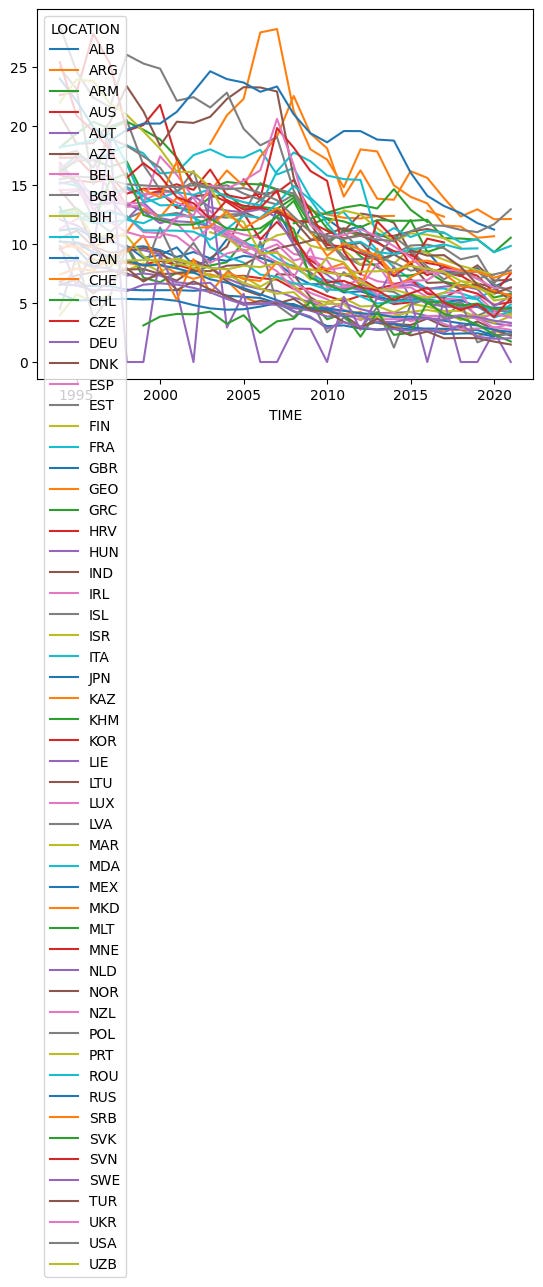
Can we post a line graph showing how many deaths there have been per countries, measuring per 1m inhabitants, for the entire data set? Yes, absolutely: We create a pivot table, and graph it:
df.loc[
    ((df['MEASURE'] == '1000000HAB') &
    (df['SUBJECT'] == 'DEATH'))
].pivot_table(index='TIME', columns='LOCATION', values='Value').plot.line()
The good news? This isn’t hard to do; we ran plot.line on the data frame, and got a graph.
The bad news? The graph is, um, a bit hard to read:
That’s why I decided to pare down the number of countries whose values we want to see. I chose a number of countries that I thought would be an interesting contrast with each other.
In particular, I was curious to see how Israel has done over the years, given that I live here and that traffic-related deaths are a constant topic on the news.
I also wanted to see how Portugal stacks up — since I drove there while on a family vacation several years ago, and found it rather challenging. I also remember being quite worried while driving there, after reading that Portugal had Europe’s worst rate of accidents.
I decided to take the pivot table that we created, and then select a subset of its columns:
df.loc[
    ((df['MEASURE'] == '1000000HAB') &
    (df['SUBJECT'] == 'DEATH'))
].pivot_table(index='TIME', columns='LOCATION', values='Value')[['USA', 'FRA', 'DEU', 'CAN', 'GBR',                                                                 'AUS', 'ITA', 'PRT', 'ISR'
]].plot.line()
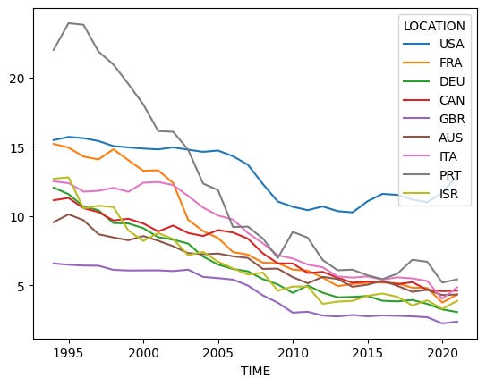
The result is obviously a bit easier to read and understand:
Two things struck me here:
First, it seems like Portugal might once have had a terrible record on traffic-related deaths, but that they have done an amazing job of reducing that number over the years. They still have a worse record than many other countries, but it’s a far cry from what used to be the case.
What really surprised me, though, was that the United States has so many more traffic fatalities than these other countries, and that while things have improved in the last 30 years, the improvement has been relatively minor. Moreover, we see that traffic fatalities have gone up (roughly) in the last decade. I’ve heard that people attribute the increase in accidents to use of mobile phones while driving, and perhaps that’s the case — but something tells me that countries other than the US also have mobile phones. And yet, we don’t see similar numbers there.
Also, these numbers are per 1 million residents. The US is a big country with a huge population, which means that the denominator for this calculation is quite large. That makes the situation in the US seem even worse, in my mind.
Create a data frame with 3-letter country abbreviations as the index and country names as the data, from the Wikipedia page of ISO 3166 country codes
You might have noticed that the OECD data identifies countries with three-letter abbreviations. I thought that it might be nice to get and display real names. That’ll require first creating a data frame with the abbreviations and country names.
Fortunately, Wikipedia has the data:
https://en.wikipedia.org/wiki/List_of_ISO_3166_country_codesBut the data is locked into this page on Wikipedia. How can we create a data frame from that? Fortunately, we don’t have to; Pandas has a “read_html” method that returns a list of data frames, one for each HTML table on a site. I found that the first (index 0) table on the site worked just fine:
country_df = pd.read_html('https://en.wikipedia.org/wiki/List_of_ISO_3166_country_codes')[0]Once I have that data frame created, I can start to perform various functions with it. The first thing I want to do is simplify the column names, which came to us as a multi-index, just thanks to how things were displayed and formatted in the HTML table:
country_df.columns = ['name', 'official_name', 'sovereignty', 'alpha_2', 'alpha_3', 'numeric', 'subdivision', 'tld']I then wanted to, as per the instructions, turn the 3-letter abbreviation into the data frame’s index:
country_df = country_df.set_index('alpha_3')[['name']]After doing that, I then selected the “name” column, getting rid of all of the other data. However, I used double square brackets, ensuring that I would get a data frame back from the query. If I had used single square brackets, I would have gotten a series, which cannot be joined.
But then I realized that actually, I don’t need to use “join”, that there’s another way to do this. I thus backtracked on my decision, and went with a series after all:
country_series = country_df.set_index('alpha_3')['name']The result is a series whose index contains the abbreviations and whose values are country names. The start looks like this:
alpha_3
AFG            Afghanistan
ALA          Åland Islands
ALB                Albania
DZA                Algeria
ASM         American Samoa
AND                Andorra
AGO                 Angola
AIA               Anguilla
ATA         Antarctica [b]
ATG    Antigua and Barbuda
ARG              Argentina
ARM                Armenia
ABW                  Aruba
AUS          Australia [c]
AUT                Austria
Name: name, dtype: object
Use this country-info data frame to display the graph in question 7 with country names, rather than three-letter codes.
I know, the question asked about a data frame. And yes, you can join two data frames together. But after I wrote the question, I realized that there was a better, more elegant way to solve things:
Remember that we created a pivot table, and then asked Pandas to produce a line graph on that pivot table. (On a subset of it, but that doesn’t matter.) The column names are the country abbreviations, and we want to rename those. That’s when it hit me: Why not use the “rename” method, which lets us rename one or more columns in a data frame?
Better yet: We can pass “rename” a dictionary as part of the “columns” keyword argument and it’ll translate whatever names it can. Where can we get such a dict? From the “to_dict” method, which we can run on our series:
df.loc[
    ((df['MEASURE'] == '1000000HAB') &
    (df['SUBJECT'] == 'DEATH'))
].pivot_table(index='TIME', columns='LOCATION', values='Value')[
['USA', 'FRA', 'DEU', 'CAN', 'GBR',
'AUS', 'ITA', 'PRT', 'ISR'
             ]
].rename(columns=country_series.to_dict()).plot.line()
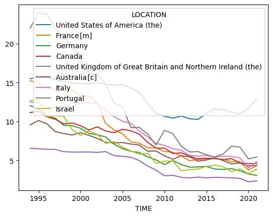
The above works just fine, except that the official name of the UK (United Kingdom of Great Britain and Northern Ireland) is a little big for our legend:
I thus decided to increase the figure size a bit:
df.loc[
    ((df['MEASURE'] == '1000000HAB') &
    (df['SUBJECT'] == 'DEATH'))
].pivot_table(index='TIME', columns='LOCATION', values='Value')[
['USA', 'FRA', 'DEU', 'CAN', 'GBR',
'AUS', 'ITA', 'PRT', 'ISR'
             ]
].rename(columns=country_series.to_dict()).plot.line(figsize=(10,10))
The result was a bit more readable:
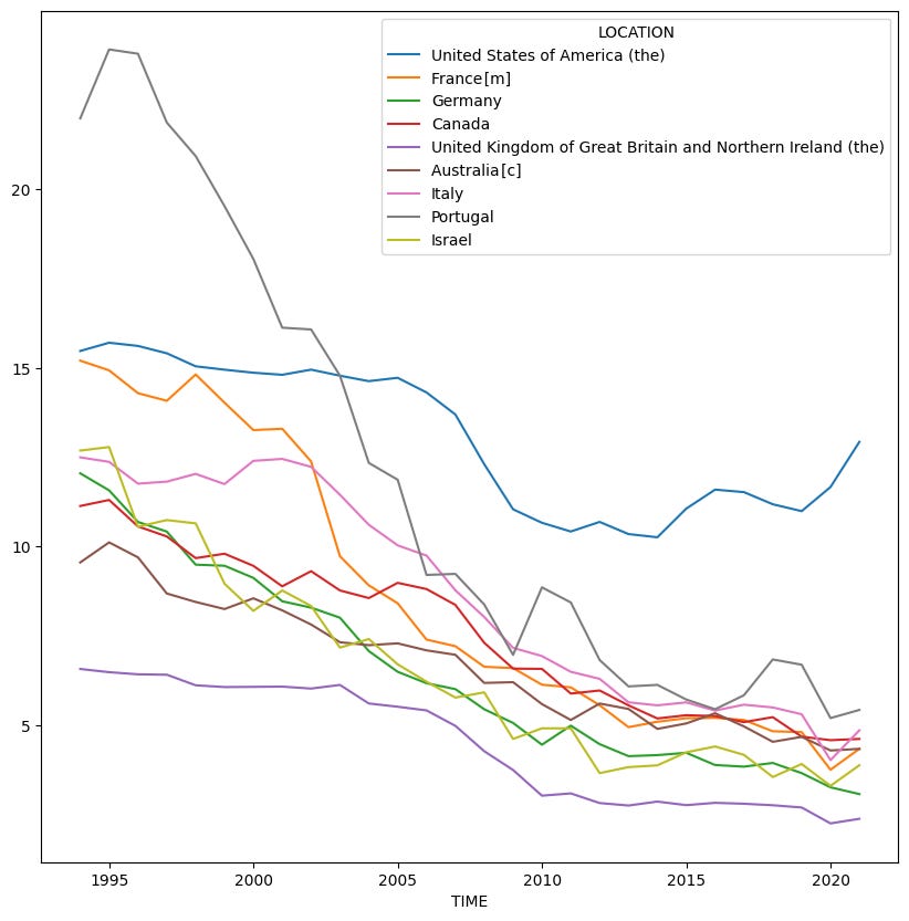
And there you have it! The graph of these nine countries’ history of motor-vehicle fatalities over time, with country names in the legend.
Comments or suggestions? Share them with everyone!
You can read my Jupyter notebook here: https://drive.google.com/file/d/1mCeC-XqQrDLZnvP0DBspwWrNO665rhFA/view?usp=sharing
I’ll be back next Wednesday with another set of questions.
Reuven