


This week, we’re looking at data from the US Bureau of Labor Statistics, an agency that tries to keep track of labor-related information in the US economy. The BLS recently released a report saying that women’s participation in the workforce was at an all-time high. That sounded like good news to me, but it also surprised me quite a bit, given that at the start of the pandemic, that number was rather low.
I thus decided that this week, we would take a closer look at the number of women participating in the workforce.
Data and questions
The data comes in the form of an Excel spreadsheet, which you can download from this page:
https://data.bls.gov/timeseries/LNS11300062
Normally, it’s possible to come up with a good link for downloading a document from the Internet. But because this page allows you to choose the date range you want, there isn’t a single URL you can use to download the data.
I thus asked you to go to this page, indicate that you want data from all years (starting in 1948, and continuing through 2023). Once you’ve done that, you can hit the “Go” button, then click on the Excel logo halfway down the page. That should trigger the download of the Excel spreadsheet.
And with that, we’re off to the races! Here are the questions I asked, along with my solutions.
Load the Excel file into a data frame.
As always, the first things that I executed was my standard Pandas startup line:
import pandas as pdWith that in place, I was able to define a variable with the filename, and then load that filename into a data frame using read_excel:
filename = 'SeriesReport-20230607082216_a26d78.xlsx'

df = pd.read_excel(filename)
However, if you actually run this code, you’ll have a few problems:
- You get a warning (not an error) from Pandas, saying, “Workbook contains no default style, apply openpyxl's default.” While you generally want to listen to warnings in Python programs, here I give you permission to ignore it.
- The columns are all unnamed.
- The values, at least in the first few rows, are all NaN (i.e., “not a number”).
The problem? Our spreadsheet’s data doesn’t actually start at the top. Rather, there are a bunch of lines with documentation and explanation. We thus need to tell Pandas to ignore the initial lines. Once we do that, the data will be tabular, and things should work better:
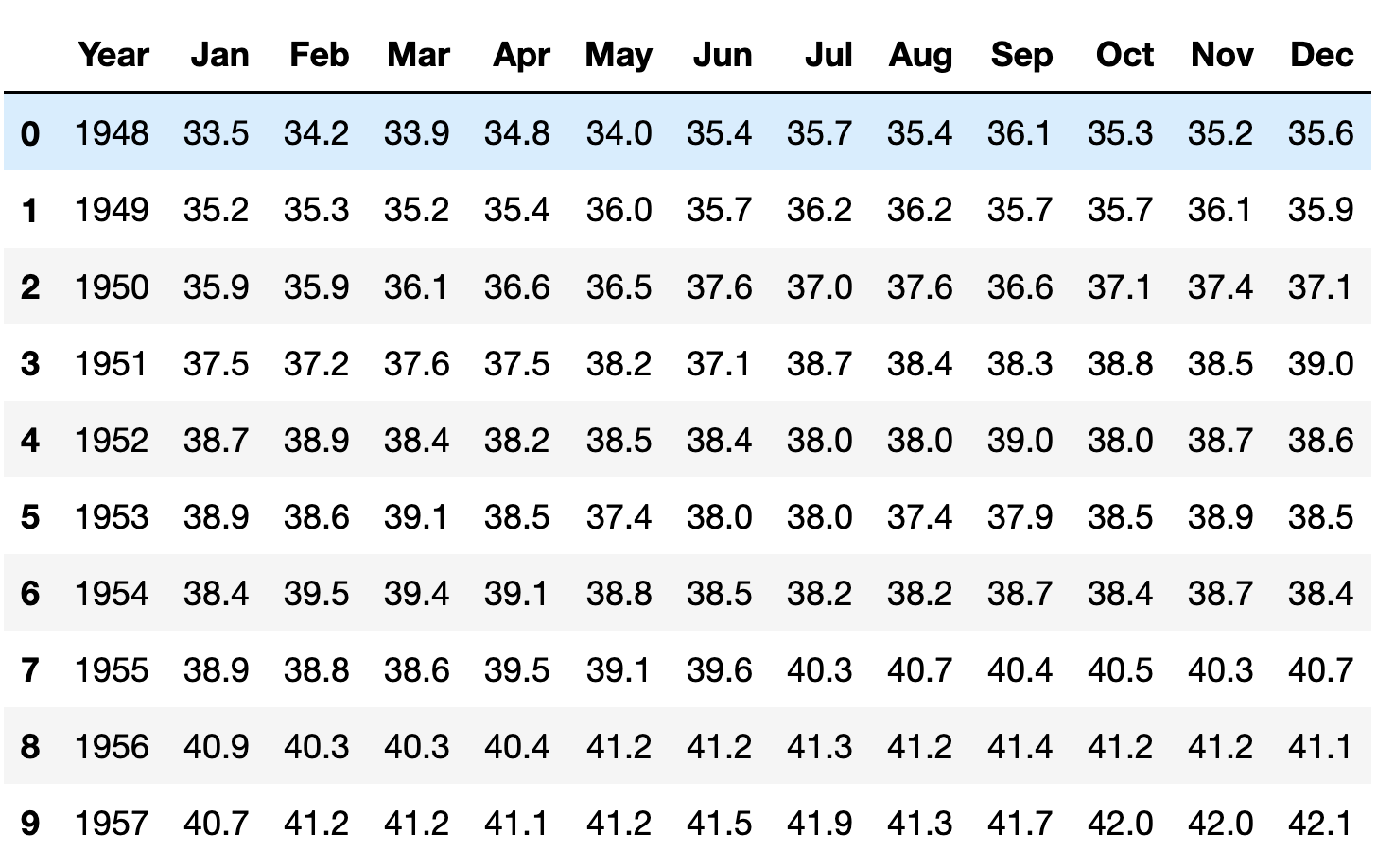
df = pd.read_excel(filename, header=12)After loading the data, this is what I get from running df.head():
Wrangle the data such that the index will contain a datetime, combining the year and month. (The day can always be the first of the month.)
What do we have now? A “Year” column, and 12 month columns. The data that we want is all here, but this format turns out to be extremely inconvenient if we’re looking to measure trends over time. For example, if I want to know which month and year had the highest participation rate, it’ll be annoying to find. If we want to find the month with the greatest increase from the previous month, then it’ll be even harder — because Pandas isn’t really designed for us to compare December 1999 with January 2000.
We’ll thus need to rejigger our data frame, such that we have an index containing years and months — or to make it simpler, just dates.
But how can we do that?
In the past, we’ve taken two categorical columns and a numeric column, and we’ve turned them into a pivot table, with one categorical column becoming our index, the second categorical column becoming our column names, and the numeric column being our values.
We want to do something here, turning our wide data frame into a narrow one. Instead of 13 columns (year + 12 months), we want three columns: Year, month, and value. It’s almost the opposite of a pivot table. And it’s possible with a Pandas method known as “melt”.
(And yes, I said yesterday that we would play with stack and unstack. But after a bit of playing around, I decided that melt would actually work better in this case.)
Here’s how melt is going to work:
- We indicate which of our columns will act as the anchor with the “id_vars” keyword argument. You can think of this column as the outermost part of a multi-index, even though no multi-index will exist here. In our case, that’s going to be our “Year” column.
- We then indicate which columns will be un-pivoted. Normally, we can pass this as the keyword argument value_vars. However, if you don’t pass the value-vars keyword arg, then all columns not mentioned as id_vars are taken. Since that’s precisely what we want, I won’t pass it.
- Finally, we indicate what we should call the new column that came from the un-pivoted columns, by passing the keyword argument var_name. Here, I’ll say that it’s “month”.
Our code thus looks like:
df.melt(id_vars='Year', var_name='month')As is often the case in Pandas, we get back a new data frame, rather than modifying the existing one. Which means that if we want our changes to stick, we need to assign the result of df.melt back to df:
df = df.melt(id_vars='Year', var_name='month')The result? A three-column data frame:
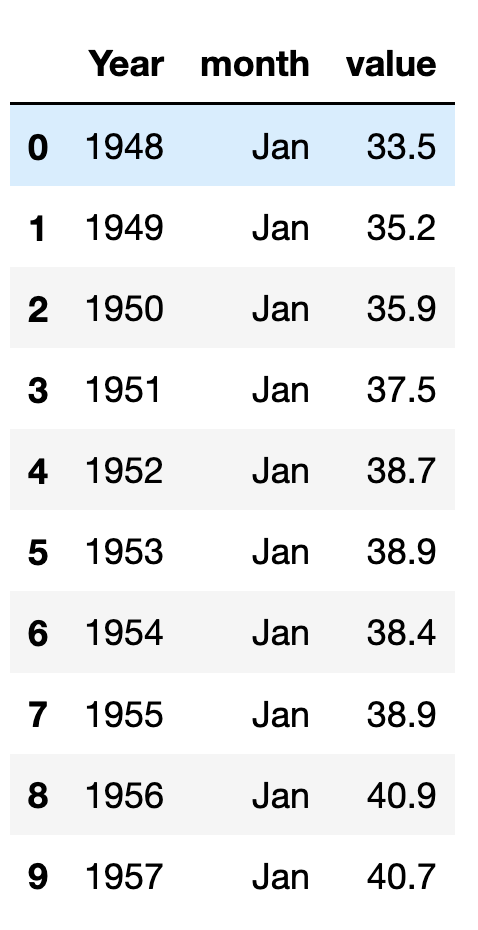
Notice the order of the rows: We’ll first get the January readings (for all years), then the February readings (for all years), and so forth. We’ll address this shortly, but right now, it isn’t much of a problem.
The good news is that we now have the year and months in columns next to one another. The bad news is that these are still just integers and strings; we’ll need to transform them into dates.
There are a few ways we can do that, but pd.to_datetime is often a good way to go. Even though to_datetime can handle many different formats, I decided that it might be worthwhile just to create strings in an easy format, and pass the string the function. Part of the issue is that pd_datetime expects to have a day (not just a year and month), and that it doesn’t always handle month names correctly.
I thus took the cheap way out, creating a string from each row’s year and month, adding a date of 1 (i.e., the first of the month). I could then pass that string to pd.to_datetime, and assign it to the index of our data frame:
pd.to_datetime(df['Year'].astype(str) + '-' + df['month'] + '-01')With the year and month now in the index, we no longer need them as separate columns:
df = df.drop(['month', 'Year'], axis='columns')And now that we have things properly in place, we can sort the data frame by its index, which will have the effect of sorting by date:
df = df.sort_index()Here’s what the first 10 lines look like at this point:
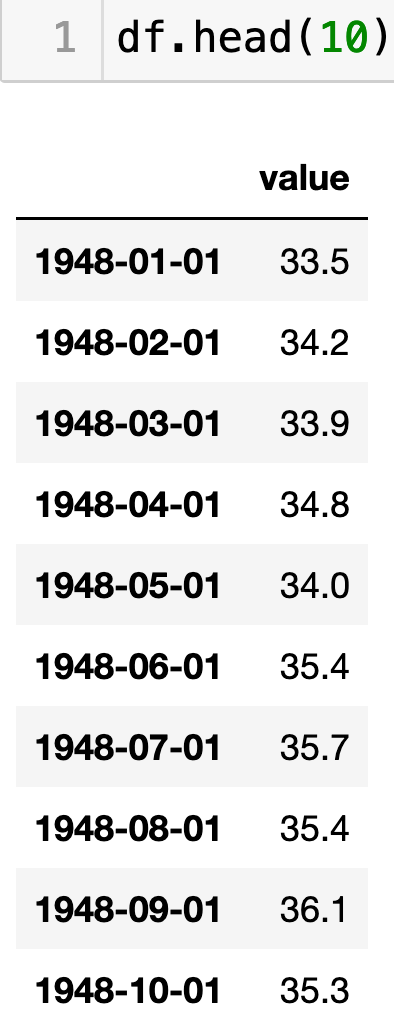
Our data is now ready for us to do some analysis!
At what month and year was women's workplace participation at its highest?
If you don’t read it carefully, this question seems surprisingly simple: Let’s find the maximum value in our data frame:
df.max()But of course, that returns the value that was highest. It doesn’t tell us when it was the highest, which would be in the index.
We could do a more complex query, finding all of the rows in which the value matched the maximum:
df.loc[df['value'] == df['value'].max()]Here, we find where the “value” column is equal to the maximum from the “value” column. That returns a boolean series, which we can then apply to “df” using “.loc”.
But there’s an easier way, namely the “idxmax” method, which returns the index associated with the highest value:
df.idxmax()With that index, we can retrieve the index and value together:
df.loc[df.idxmax()]The answer? May of 2023, the latest report, with 77.6. Which is exactly what the BLS reported earlier this month, that the proportion of women in the workplace has never been higher.
At what month and year was women's workplace participation at its lowest?
Let’s now find the opposite statistics. As you can imagine, we’ll use the “idxmin” method:
df.loc[df.idxmin()]The lowest percentage of women’s participation was in January 1948, the first time that this data was collected, with 33.5. Wow, that’s pretty low!
If we look only at the month of January in each year, when did we see the greatest percentage rise from the previous year?
Now let’s ask a slightly different question: Which January showed the greatest percentage rise since the previous January? Answering this requires that we do three things:
- We’ll need to retrieve only the rows having to do with January of each year.
- Then we’ll need to find out how much the numbers changed from year to year — not in absolute numbers, but in percentages.
- Finally, we need to find the largest percentage change.
Let’s start by finding which rows are from January. You might remember that if we have a datetime column, we can extract information about that column with the “dt” accessor, allowing us to grab everything from the year to the day of week for a given datetime.
Indexes containing dates don’t have a “dt” accessor, but do allow us to retrieve portions of the datetime object. For example, I can just say “df.index.month” to get the month values for each index element.
We can get a boolean series back with this type of comparison:
df.index.month == 1The resulting boolean series will contain True where the month is January (1), and False otherwise. I can then apply the boolean series as a mask index to our data frame via “loc”:
df.loc[df.index.month == 1]Now that we only have the January entries, let’s calculate the percentage change from one to the next. We can do that with the “pct_change” method, which returns a new series with the same index as its input — the first element will be NaN (since its the starting point) and then each subsequent element will be the percentage change from the previous value:
df.loc[df.index.month == 1].pct_change()Now that we have calculated these percentages, we can get the row (index and value) where it showed the greatest positive change:
df.loc[df.loc[df.index.month == 1].pct_change().idxmax()]Turns out, it in January 1956. I’m not sure why; I’m open to interpretations or historical events that might have influenced it.
If we look only at the month of January in each year, when did we see the greatest decline from the previous year?
Now let’s look at the opposite, using idxmin:
df.loc[df.loc[df.index.month == 1].pct_change().idxmin()]Wow; that was January 2021, just less than a year after the pandemic started, when people were working from home, children were on Zoom school, and many women were out of the workforce — because their work was gone, or because they were let go. Either way, the number declined super fast, leading to many descriptions of a “she-cession.”
Create a line plot showing the participation of women in the workforce through the entire data set.
Finally, we can create a plot easily just using the “plot.line” method:
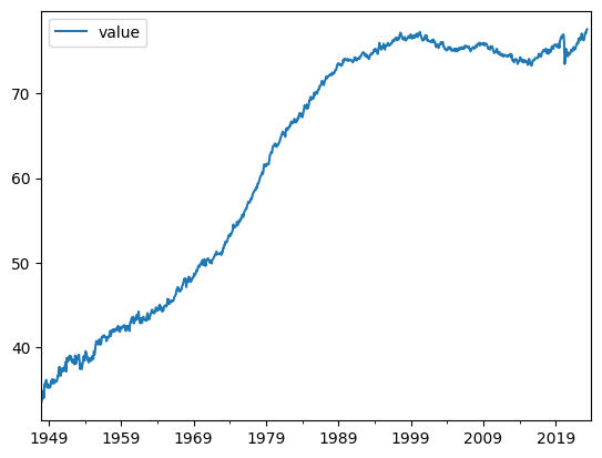
Wow — we can really see that dip at the start of the pandemic!
That’s it for this week. What did you think? Any questions or comments? Please send ideas and suggestions my way.
Meanwhile, here’s my Jupyter notebook for this week: https://drive.google.com/file/d/18QR2YaolAuF14CTYv_xQentMRLRCJ_rZ/view?usp=drive_link
I’ll be back on Wednesday of next week with a new topic and challenge.
Reuven